Sticking to conventional combinations may be the most efficient route to colour harmony, but it certainly doesn’t hurt to inject some excitement with a daring palette that will make for a more engaging visual experience. Make an impression with these eye-catching fusions that will convince even the most colour-shy homeowner to abandon their love for neutrals.
Jewel tones
At first blush, a mixture of purple, turquoise and blue can seem overwhelming, or even garish, to some homeowners. But this can be fixed by turning up the saturation levels of these hues to give them a more grounded vibe. In addition, decorating with this daring combo brings the advantage of injecting boldness into your interiors, giving them a classy look all year round.
For instance, pairing teal with turquoise is a fitting way to create drama in a bathroom as this combo calls to mind the dark depths of the ocean.
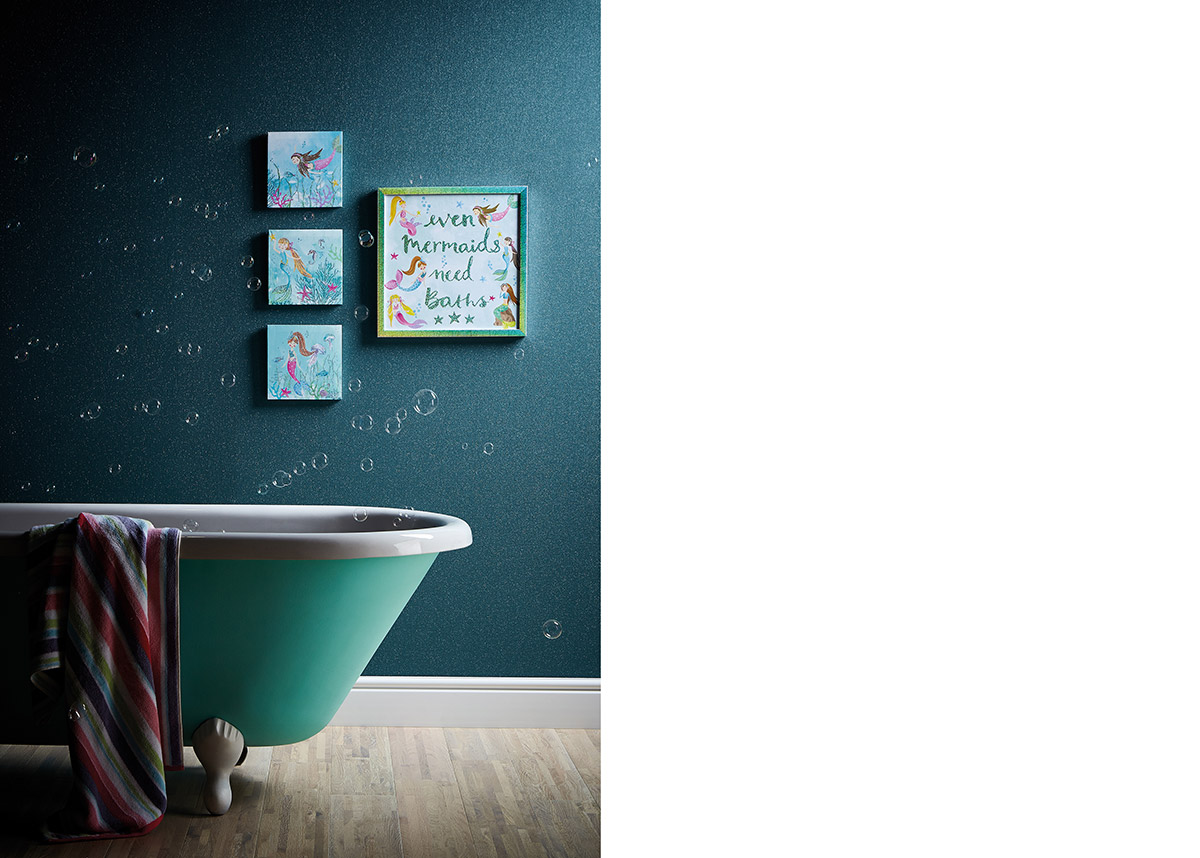
Image credit: Arthouse
Jewel tones can also dial up the style factor by adding elegance and class to a neutral backdrop.
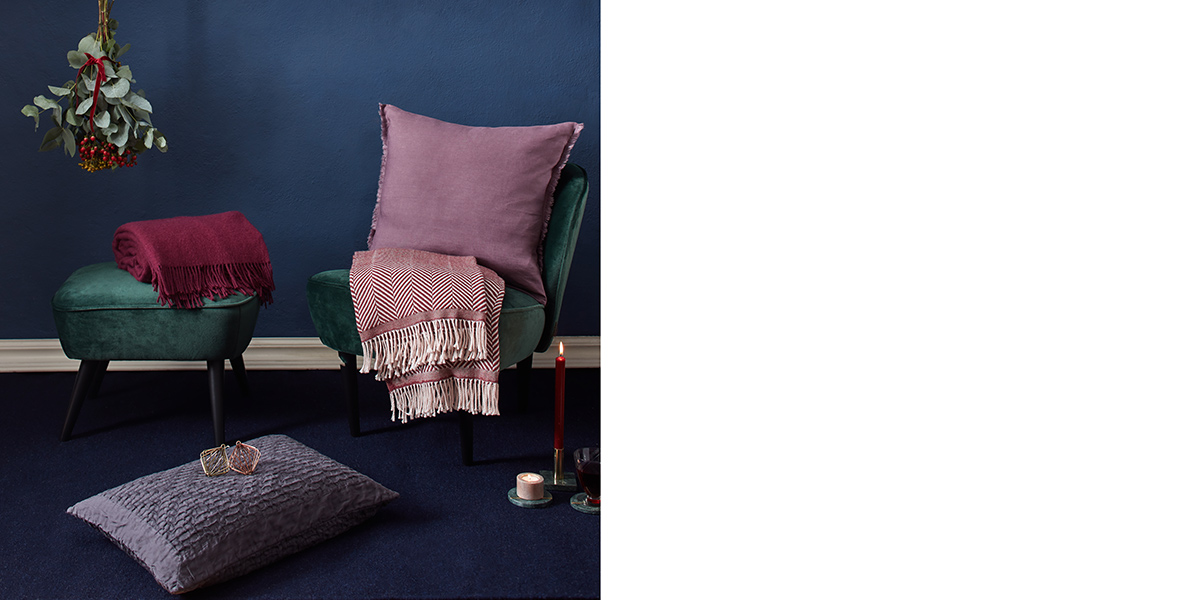
Image credit: Urbanara
Coral crush
While it may be reminiscent of the red-and-green combo that we so commonly associate with Christmas, the pairing of coral and green is anything but tacky. Aside from its refreshing vibrancy, this beautiful combination is also useful for adding a fun highlight within a room due to the inherent contrast between cheery coral and the relaxing hues of its counterpart.
Green walls alone will look pretty dull, but when paired with a coral accent piece – such as a sleek chair or sofa – they can go a long way in creating a stylish living room that stands out from the norm.
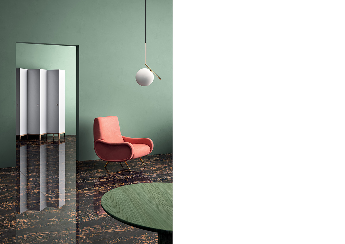
Image credit: Graniti Fiandre
While green typically plays a background role in this colour duo, opting for coral as the dominant hue is a surefire way of leaving a lasting impression on first-time home visitors. To ensure visual variety, include blue-green floral motifs that help to break up entire blocks of red in a quirky manner.
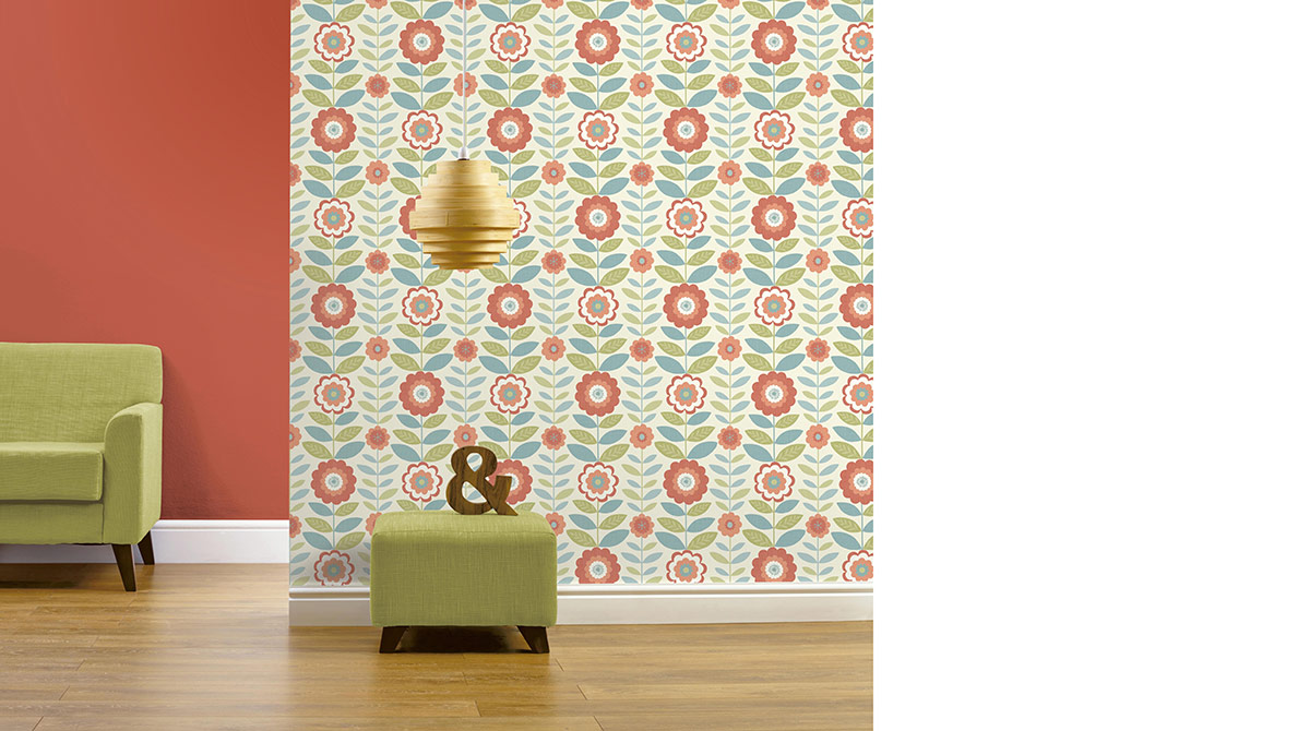
Image credit: Wilko
Yellow, black and white
It may not come as an exact surprise but pairing neutrals with an attention-grabbing colour is one way to keep things from becoming boring too quickly. In the case of yellow, this bright-on-dark effect is further enhanced by its warm glow that offsets the restfulness of neutral hues, creating a perfect balance between calm and glam.
An abundance of horizontal stripes and vertical lines adds visual appeal to this study by conveying a sense of movement and energy. The same can be said for the room’s stimulating colour scheme of black, white and yellow, which is incorporated into the surrounding decor for maximum effect.
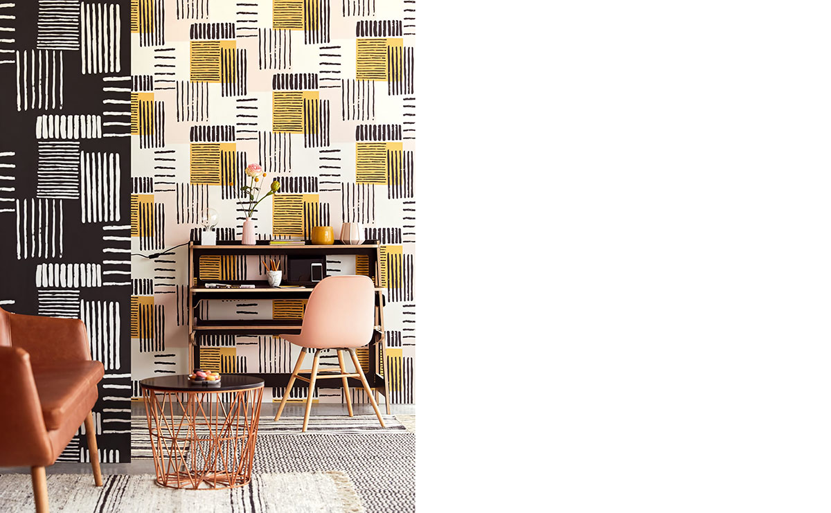
Image credit: Wallhub
Take a cue from this cosy bedroom that brings together light, medium and dark shades of grey to create a boudoir that is filled with calming warmth. Meanwhile, saturated yellow fabrics make great bedfellows with their neutral surroundings as they add the right touch of vibrancy – one that is not overwhelmingly bright – to the space.
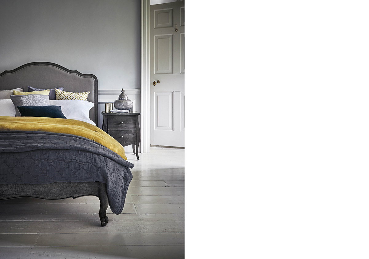
Image credit: Feather & Black
Ice-cream shades
Paired with each other, shades of light blue and pink create a trendy combination that is great for a fun home update. The gentle, but undeniable appeal of this tranquil palette can too be found in its versatility, which is in turn evident through its usage – both as an alluring accent and as a stimulating backdrop.
Although the star of this bedroom is none other than its light blue-and-pink wall, the choice of dark wood fittings aids greatly in calling attention to the pastels as they “pop out” more when juxtaposed against the deep brown of these nearby structures.
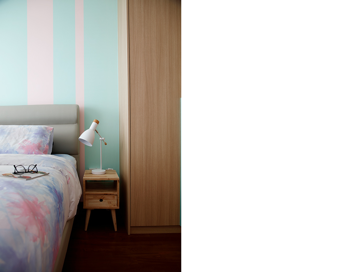
Image credit: Free Space Intent
Using pastels (or any other colour type or combination for that matter) as part of your home’s decor doesn’t mean that you have to adhere to it all the time. Feel free to change things up as you see fit. For instance, a bold blue armchair can make for a striking addition in a pastel-filled living space.
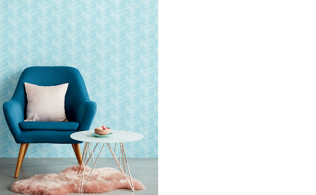
Image credit: Wallhub
This was adapted from an article originally published in the October 2017 issue of SquareRooms.
")


