From trendy neutrals to therapeutic brights, here are the 4 colour trends to add that much-needed punch to your interiors.
1. Edgy neutrals
Yes, neutrals are no longer hiding behind the shadows and are standing out loud and proud. There is a certain tonal effect which separates the usual suspects from the pack though. As attested by Dulux’s brand new Colour of The Year 2017 Denim Drift, it is an eye-catching tone of greyish-blue. The double-colour quality shows how a simple, restful shade can be versatile yet impactful at the same time.
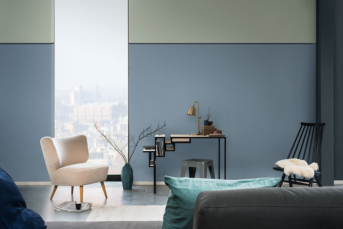
Painting a picture of calm, Dulux’s Colour of The Year 2017, Dulux Denim Drift 87BG 27/077, is a wonderfully versatile hue that will add volume to your space. Image credit: Dulux
2. Nature-inspired brights
With the release of Pantone’s Spring 2017 colour report, the fresh colours of the blooming season will move forward into 2017. Their designers have identified invigorating colours that offer a sweet escape into the open arms of nature. So, come on and bring the vast outdoors into your humble abode.
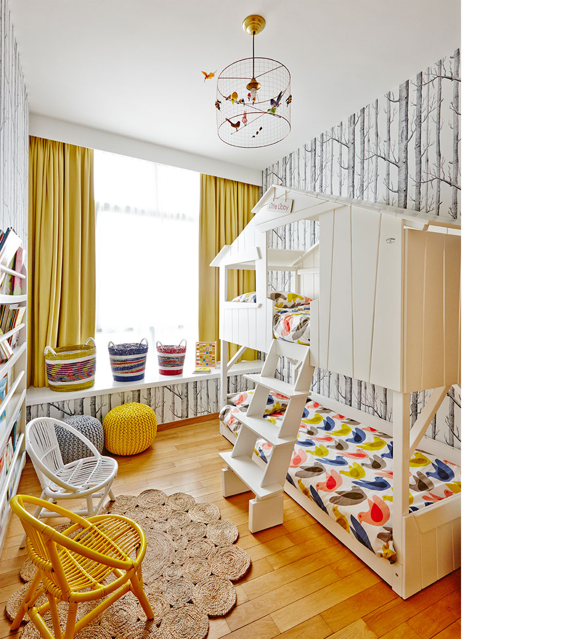
Enjoy the sunny warmth of Primrose Yellow by applying it in small but stunning doses. Besides wall treatments, adding this colour into your space with curtains or loose furniture will work equally great. Image credit: E&A Interiors
3. Tech tones
With smartphones and gadgets getting sleeker by the minute, their colours definitely play a huge role in the grand scheme of design. Rose Quartz, for instance, has been seen everywhere from the new iPhone 7’s rose gold shade to furniture, shoes and buildings. Cool blue is also a strong contender, with the metallic tone making an appearance on the latest gadgets and in Pantone’s Spring 2017 colours.
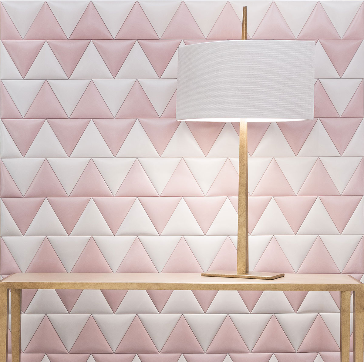
Pink is no longer sweet and innocent-looking but rather, sleek and sophisticated with this metallic leather wall covering. Image credit: TATUM
4. Healthful hues
Popping up in Pantone’s Spring Report 2017 are not just spring colours but wholesome hues inspired by healthy foods. One of which is kale, plucked literally from the popular leafy green, but also appearing in the world of architecture with vertical gardens and rooftop greenery. Whether or not you are into healthy eating, your interiors will get a robust shot of style with these chosen colours.
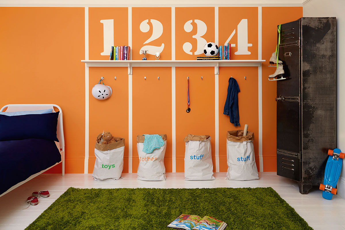
A colour of such youthful exuberance, this is best used in limited measures. Think rooms that encourage high energy levels, such as the family activity room or dining room. Image credit: Dulux
This was adapted from an article originally written by Disa Tan published in the November 2016 issue of SquareRooms.
")


