Create the illusion of a larger living space with these four colour schemes.
Monochrome
This two-tone scheme can seem restricting and probably flat to those who love colour but with the right colour treatment, it can be bold and impactful. Designer Joey Khu from Joey Khu Interior Design thinks that while using white tones alone is a safe and classic option for small spaces, it can be too clean and clinical. “Most people shun dark colours in fear that it can diminish their small rooms,” he says. “To not let the colour close the room in, assess the natural light source of your space and use white for that area to amplify the natural lighting. You can then consider using black for the other walls.”
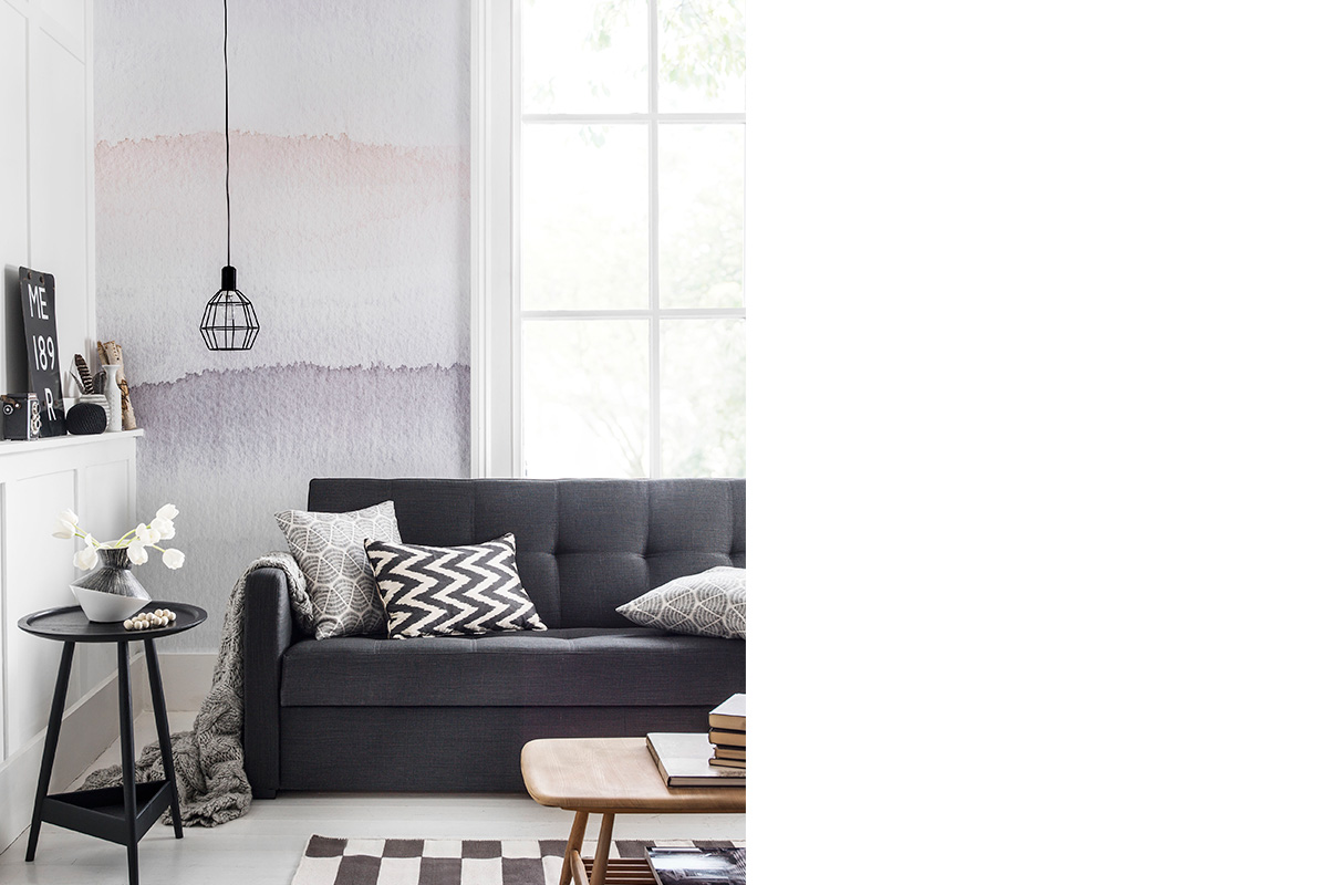
Image credit: Amara
Masculine
Tough and rugged, masculine colour palettes can be simple but carry plenty of character. Some suave colour choices include black, dark grey and blue. The key to balancing the style is to have a good contrast of softer, clean tones like white or neutrals. This will tone down the severity of the more saturated colours without making the space look dark or cramped.
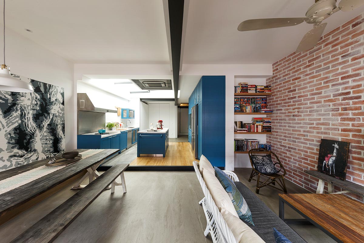
Image credit: Piu Design
Pastels
These dreamy, ice-cream tones are perfect for those who love something energetic and playful. And yet, with the right colour and application, it can conjure something soothing and charming. “Pastel colours are a great hit with young couples,” says Design Director Kate Ng from Design Neu. However, the biggest problem pastel colour schemes have is that it is mostly associated with a children’s or nursery room look. To ward off all these childish vibes, Kate suggests using only three pastel tones at any time and with complementary colours like white or very light grey.
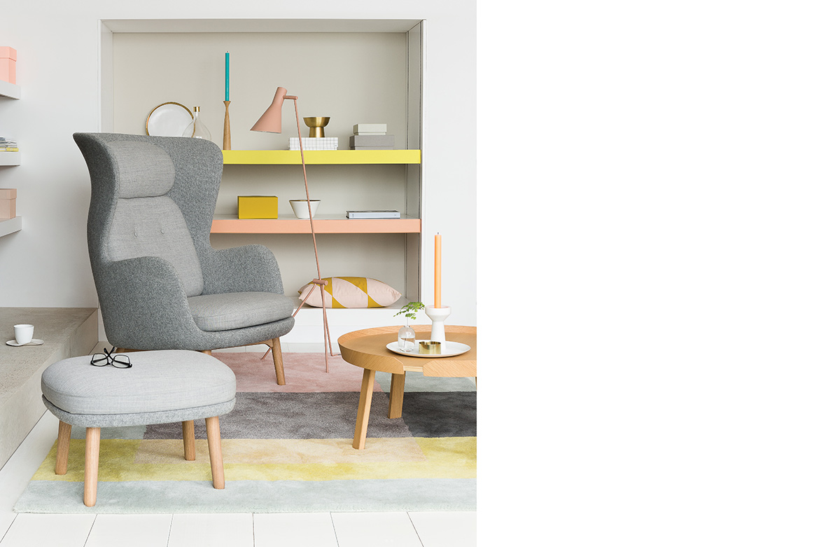
Image credit: Dulux
Neutrals
The basics of neutrals are pretty straightforward; there are cool neutrals and warm neutrals. As the two names suggest, cool neutrals work up a sleek visage while warm neutrals are more about relaxation. Worried about the bad rep that neutrals have for being dull or humdrum? Managing Director Alicia Koh from I.Poise Design advises that accenting neutral colours with textures can go a long way in creating a strong visual impact. “It brings tonality to a previously flat colour setting,” she says.
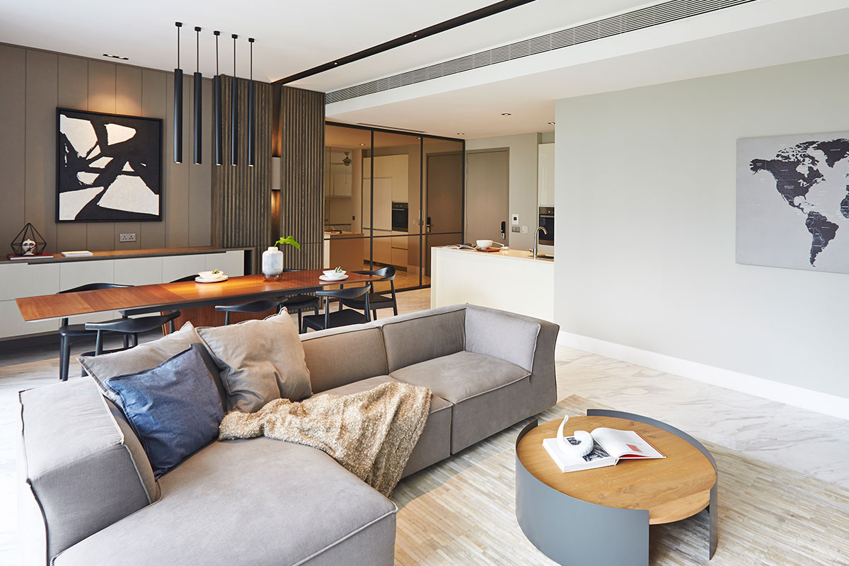
Image credit: Joey Khu Interior Design
This was adapted from an article originally written by Disa Tan published in the March 2017 issue of SquareRooms.


