As a toast to a new decade, the Pantone Colour Institute has revealed PANTONE 19-4052 Classic Blue as the much-anticipated Colour of the Year for 2020. Soothing and reassuring, Classic Blue seeks to ground us in this bustling world today. Simple yet elegant, Classic Blue also gently reminds us of a serene, boundless sky at dusk – familiar and yet full of possibilities.
When used in home interiors, the alluring Classic Blue imbues a sense of tranquility and calm. This deep hue can also add a tinge of sophistication and style into your living space. Here are some examples of how you can introduce the Pantone Colour of the Year 2020 into your own home.
In the cookspace
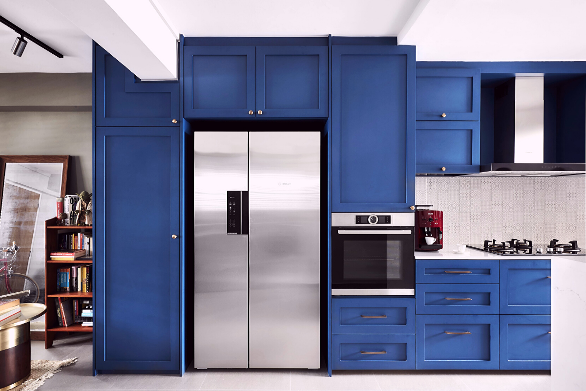
Image courtesy of Rezt & Relax
Giving your kitchen a creative burst of colour can add visual interest into an otherwise mundane utilitarian zone. Shaker-style cabinets clad in rich blue laminates, coupled with textured tiles on the backsplash, effectively makes a visual impact on anyone who walks into this contemporary cookspace.
Statement furnishings
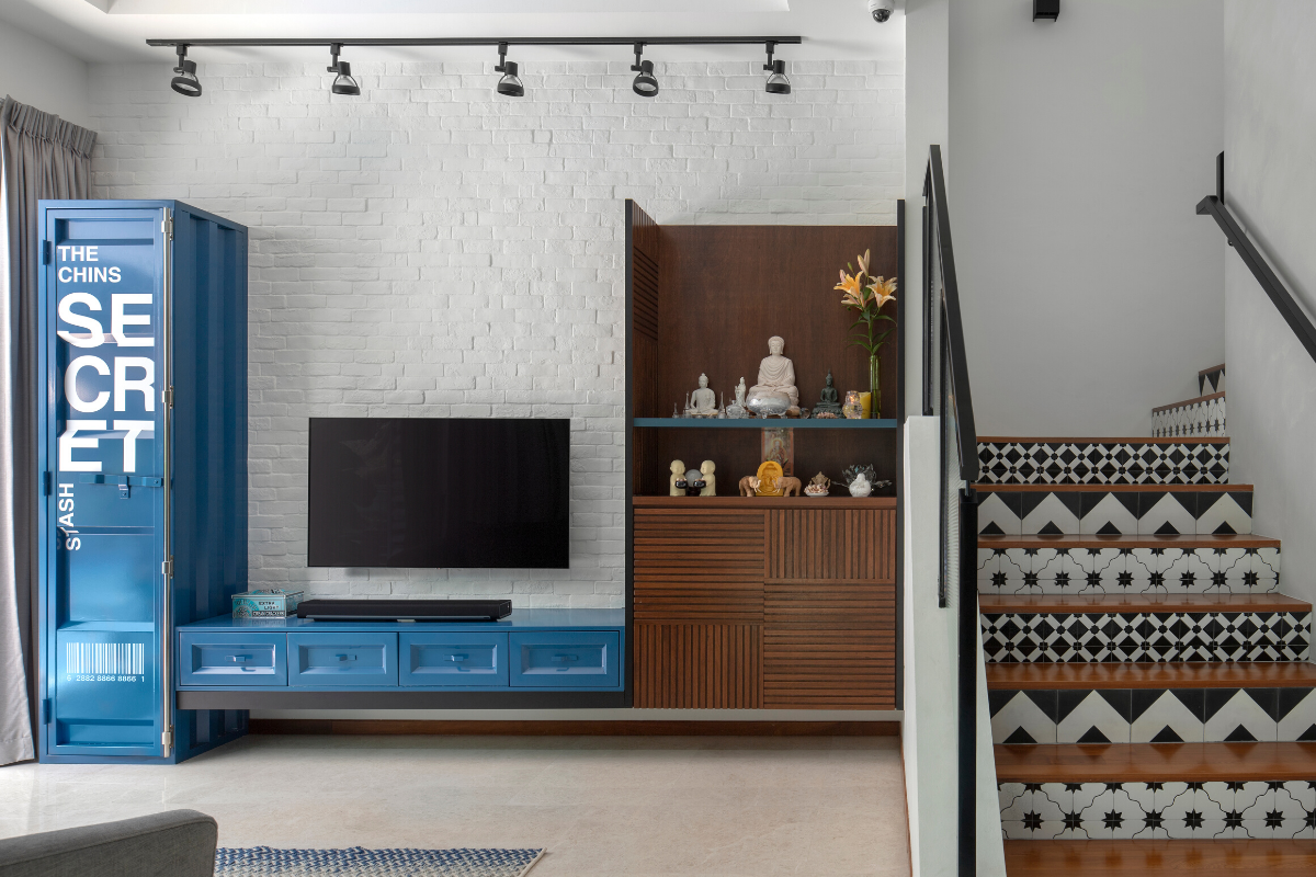
Image courtesy of Prozfile
Add a not-so-subtle pop of colour into your home with a statement furniture piece, washed in a captivating shade of blue. To align with the eclectic theme of the rest of the home, a blue TV console and safe box crafted from powder-coated steel plate were incorporated into this communal area. The distinctive blue hue of the fixture stands out brilliantly against the whitewashed brick wall.
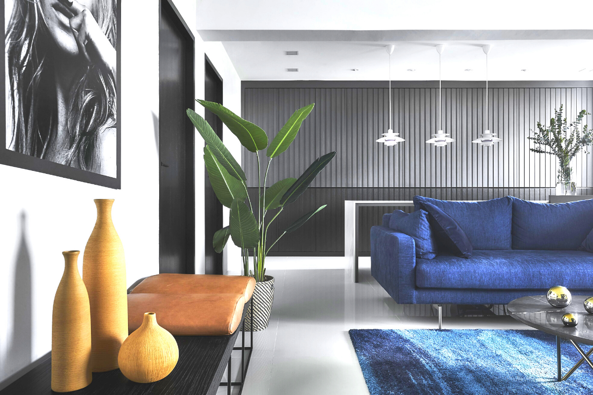
Image courtesy of Dan’s Workshop
For this modern yet masculine abode, the sofa and soft furnishings feature washes of blue that set themselves apart from the rest of the space. This clever addition of colour – that is not too bold or overwhelming – prevents the entire space from looking overly grey and gloomy.
Private Sanctuaries
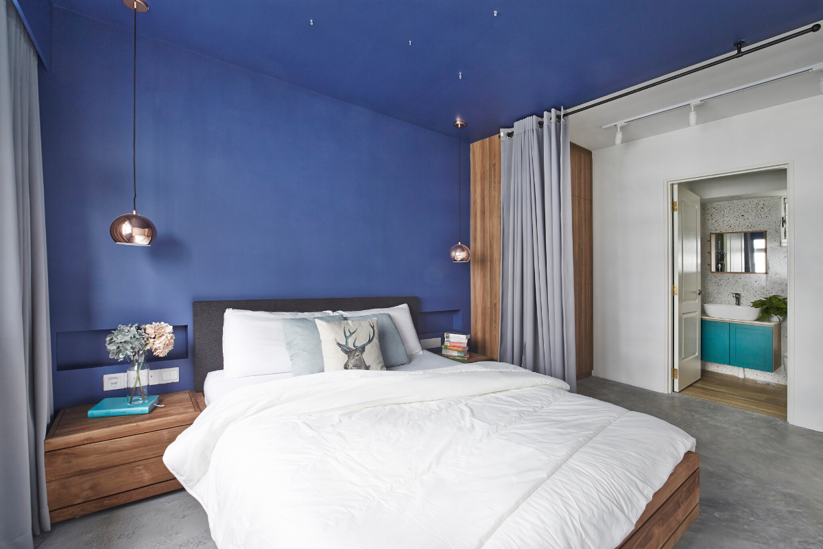
Image courtesy of Free Space Intent
Blue is the perfect colour to implement in the bedroom for it can reduce blood pressure and calm the heart rate, making you feel more relaxed and at ease to drift into sleep.
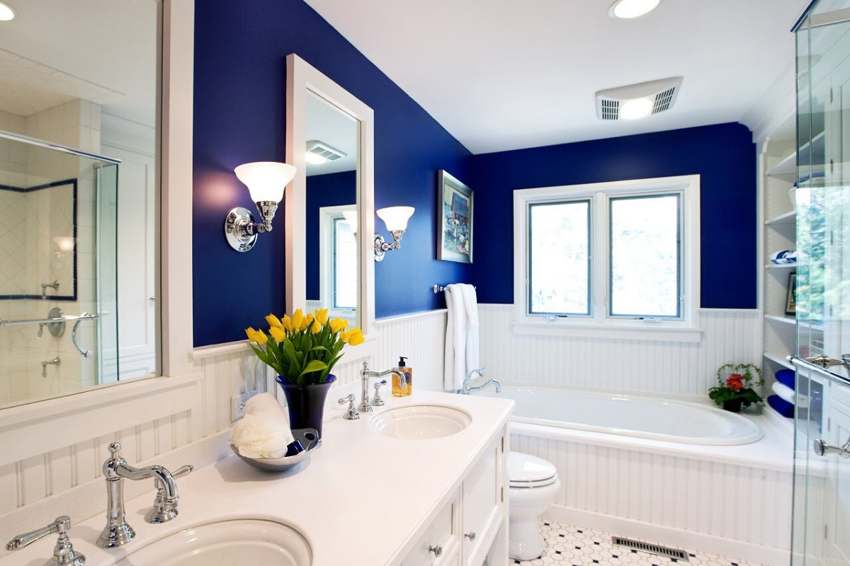
Image courtesy of Drury Design
As a soothing colour that does not overwhelm the senses, blue allows you to find peace and unwind after a long day, which makes it ideal to be used in the bathroom. When paired with more extravagant furnishings, blue can also give your lavatory a luxurious feel, that is not unlike the bathrooms of 5-star hotels.
Children’s playground
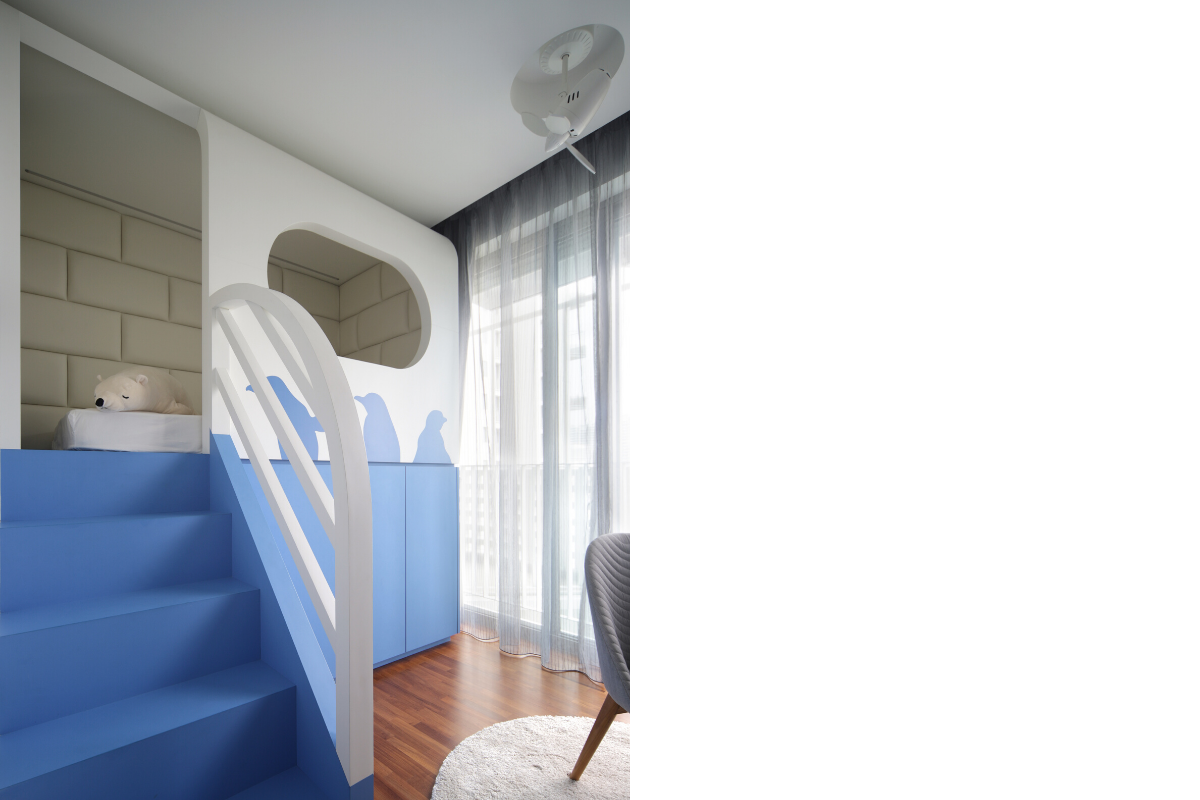
Image courtesy of D’Marvel Scale
If you’re thinking of a fun colour to add to the rooms of your little ones, blue is one option you definitely should consider. A soothing blue can sufficiently add life to a space without being over-stimulating, making it a good choice for a child’s bedroom – a zone for both play and rest. This little girl’s bedroom features a loft dressed in white and blue laminates, with adorable penguin motifs lining the exterior.
Focus zone
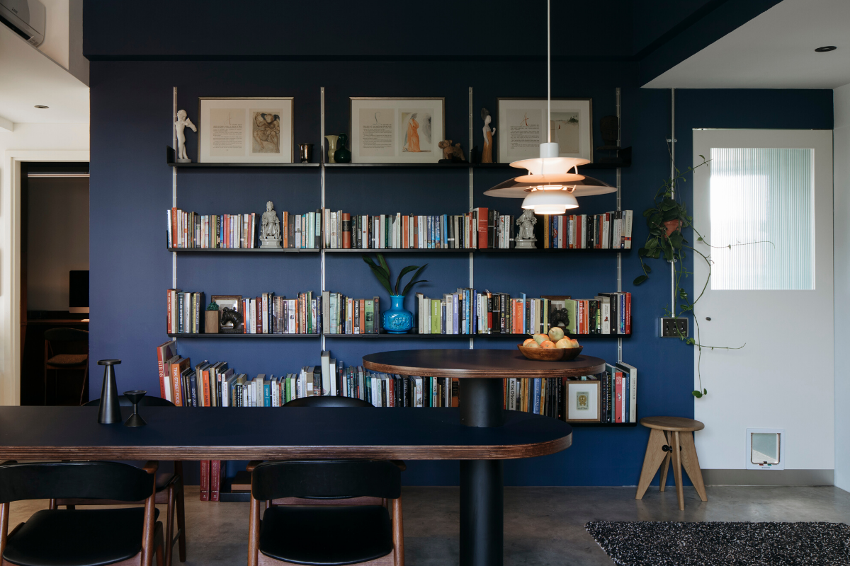
Image courtesy of The Monocot Studio
Add charm and personality to the workzone by having an eye-catching blue feature wall. Line the walls with books and your treasured trinkets to prevent the space from looking too monotonous.
Think outside the box
Blue is perfectly charming and versatile, blending well with other colours, textures, and furnishings. Thus, you can definitely afford to be creative when trying to incorporate the colour into your home.
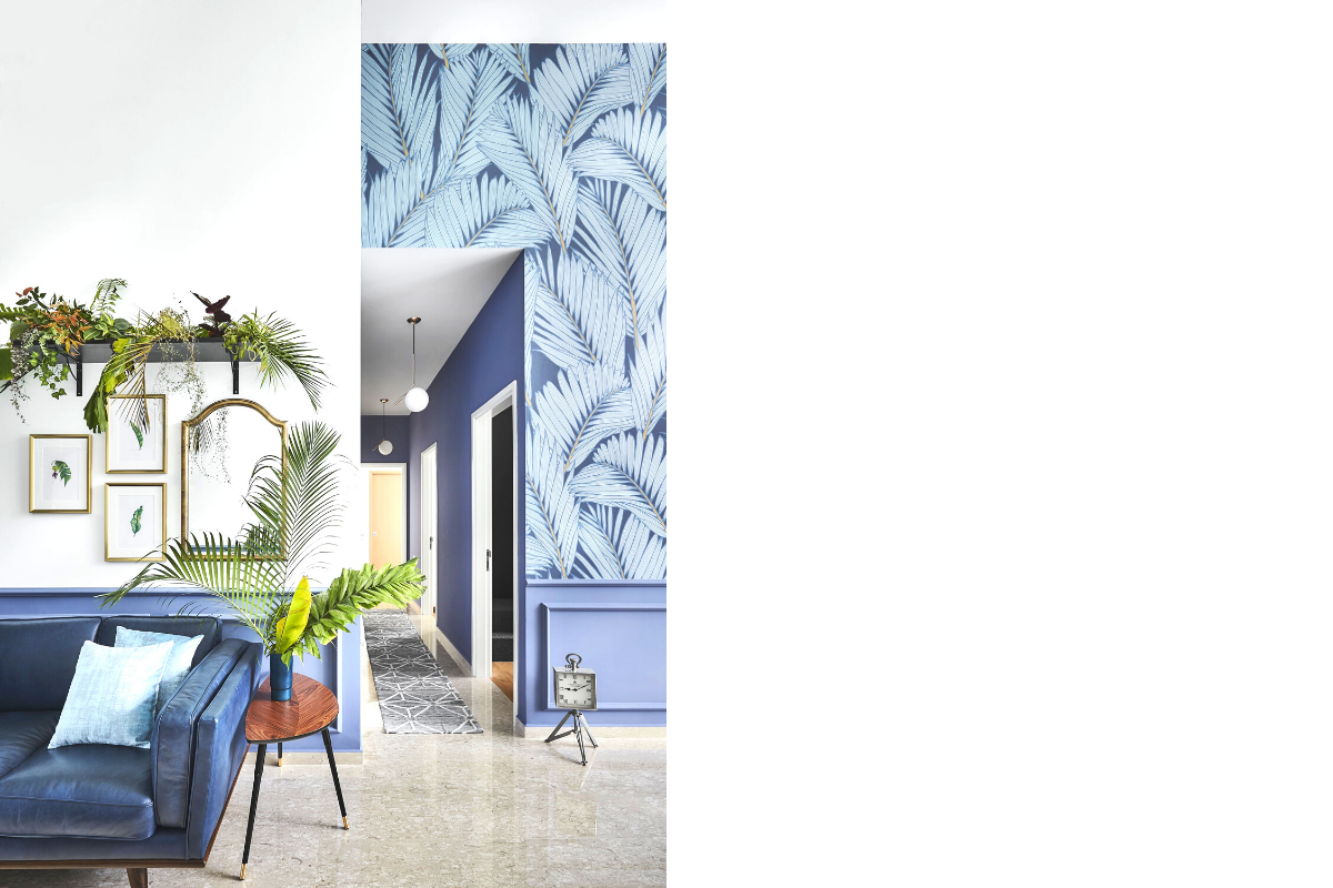
Photography by Wong Weiliang
Match the colour with an array of decorative plants and it will give rise to an urban jungle in your home. Blue-based wallpaper with a fern motif also helps to bring out the beauty of nature in this botanical-themed home.
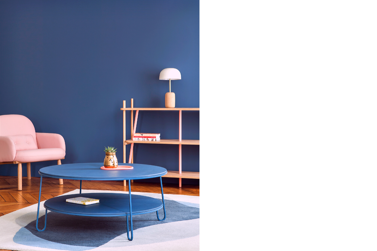
Image courtesy of LifeStorey
When used alongside pastel furnishings, the deep blue wall becomes a stunning contrasting feature to the soft hues of the blush chair and earthy console.


