Sure, you can embark on a renovation or resort to some hacking works to free up some space at home. But what if you could create the illusion of having more space in your abode just by adopting a new colour scheme? Here are 5 colour schemes to visually open up a tiny interior without resorting to harsh measures.
- Shift to neutral
Apart from paint, neutral colours can be introduced via natural elements such as linen, wicker, rattan or even ceramic. You could also elevate your palette with a hint of gold – either through furniture detail or accessories. We love how these textures don’t just add layers of colours, but imbue character and depth into the interior for a gorgeously lived-in vibe.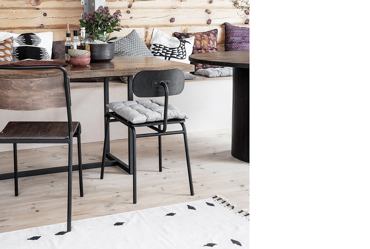
Image credit: Lagoon
- Ice-cream flavours
Delicious sorbet hues like strawberry pink, lavender, frosted blue and mint green make a delightful option for homeowners who wish to go light yet still want to enjoy a touch of colour indoors. Pastels have long outgrown the nursery room and can easily be injected into any part of the house via feature walls, furniture, accessories or lighting. The goal is to open up an interior – thus, cohesiveness is key.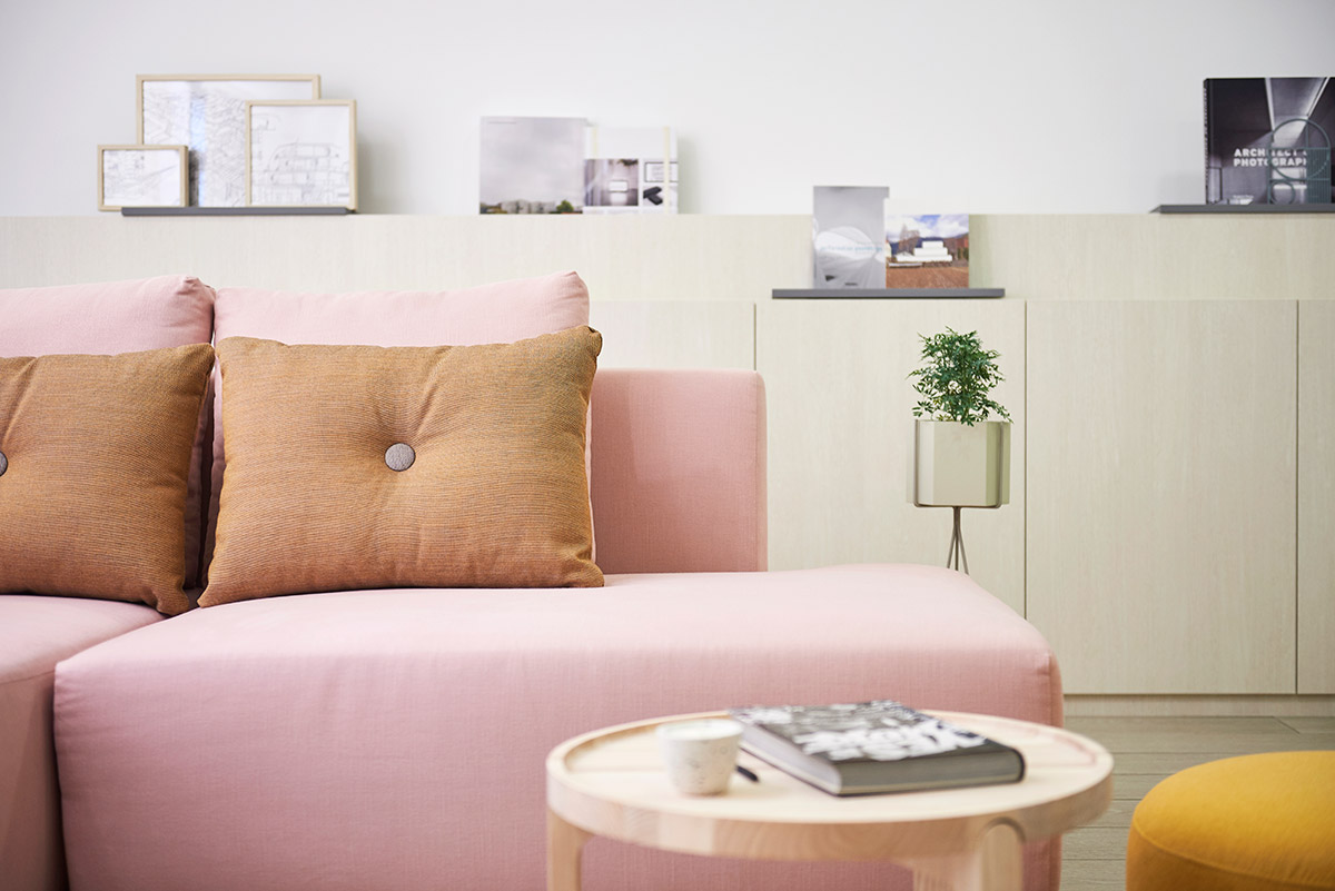
Image credit: Studio FortyFour
- Lighten up
Barely-there hues are more reflective, which is why they’re great for opening up a tight space. As an achromatic hue, white is the fairest of them all and mightiest to boot too in respect to its light-reflecting prowess. Not only does it do wonders in breathing light into cramped quarters, but this neutral also boasts a versatility that makes it the perfect canvas for many decor styles, whether you love a minimal look or prefer a beautifully layered modern-boho setting. No wonder it is a popular go-to hue for both decorator and owners of small-sized apartments alike.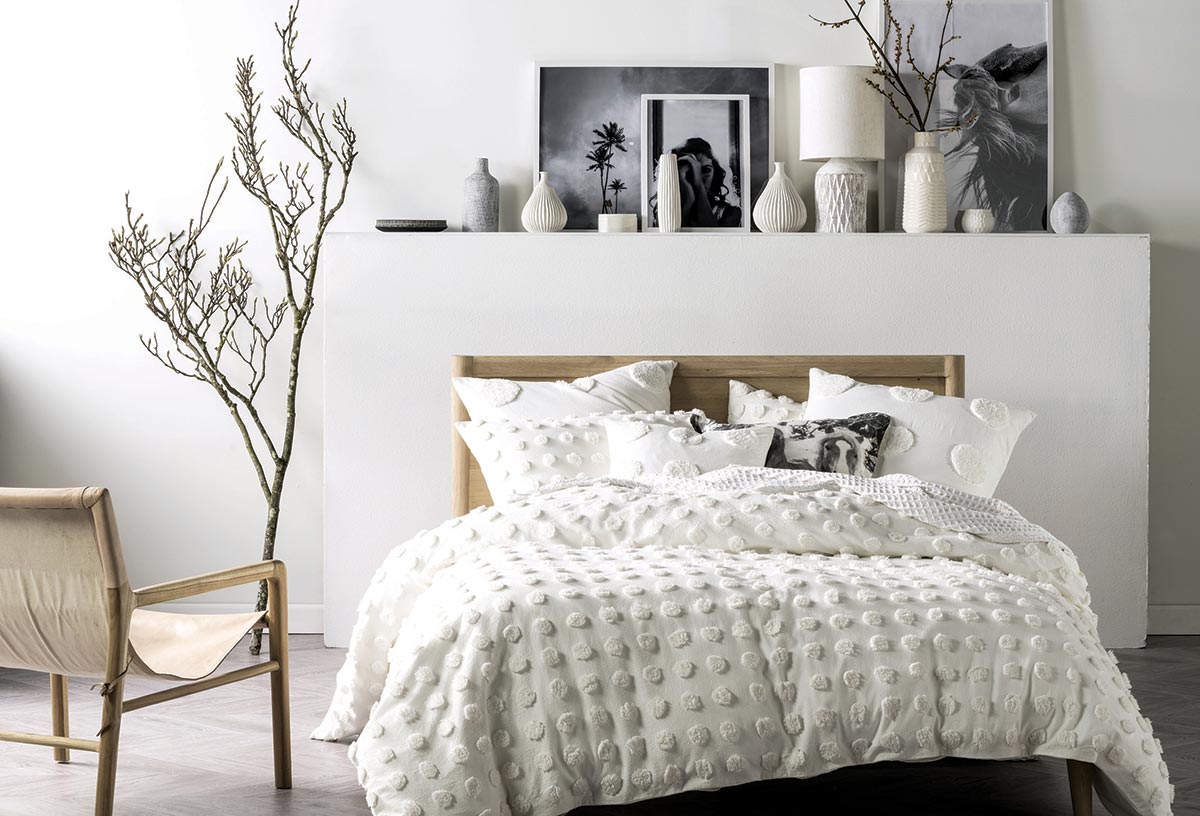
Image credit: The French Bedroom Co
- Grey matter
We liken greys to white, but with a steely edge. Paler hues share similar light-reflecting abilities as their pristine cousin, except they possess duskier nuances that endow them a more atmospheric facade. Go for a warmer, richer tone to give the sleep space a cosy cocooning effect.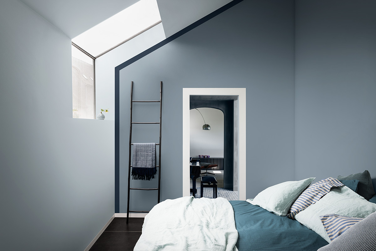
Image credit: Dulux
- Into the woods
Neutrals aren’t simply resigned to a swatch on the colour wheel. Wood tones have long been a source of inspiration when it comes to setting an interior’s colour scheme. Take for instance Japanese inspired dwellings or modern farmhouse style homes. With pale toned wood as the main constituent, these settings not only feel airier and more open, they also boast a down-to-earth vibe that promotes a more calming environment indoors – the perfect antidote to a small, stuffy space.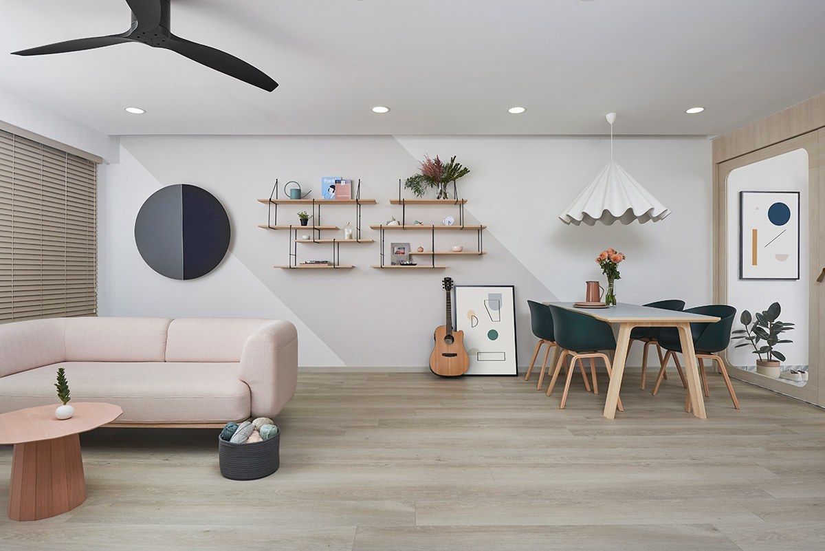
Image credit: Studio FortyFour


