Join us in conversation with Cheryl Yeo of Roomable Studios and her client, Bao Hui, as they share the deliberate choices that shaped a living space for the latter and her granny.
Rarely is shopping for an interior designer a “one- shot, one-kill” matter, but when Bao Hui met Cheryl Yeo of Roomable, she was sold.
“We were originally going to engage only a contractor because we already had ideas of what we were going to do,” said Bao Hui.
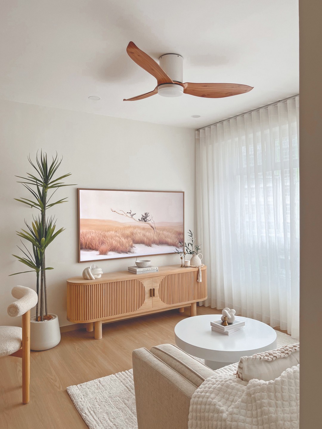
The 32-year-old had envisioned her 4-room BTO flat in Yishun, where she now lives with her 84-year-old granny, to be bright, airy, and with a neutral palette. Coincidentally, or shall we say, thanks to social media algorithms, the photos Cheryl had posted of her own place checked all the boxes.
“It was easy to decide as we shared a similar sense of aesthetics and, most importantly, I felt comfortable speaking and discussing with her. Cheryl remains the first and only ID we contacted.”
Trend and tradition
Cheryl describes what she had done with Bao Hui and her granny’s flat as a modern farmhouse look – a direction that was clear as day from the moment she laid eyes on their mood board. But one item stood out from typical provisions like feature walls and loose furniture: an altar Bao Hui’s granny had requested.
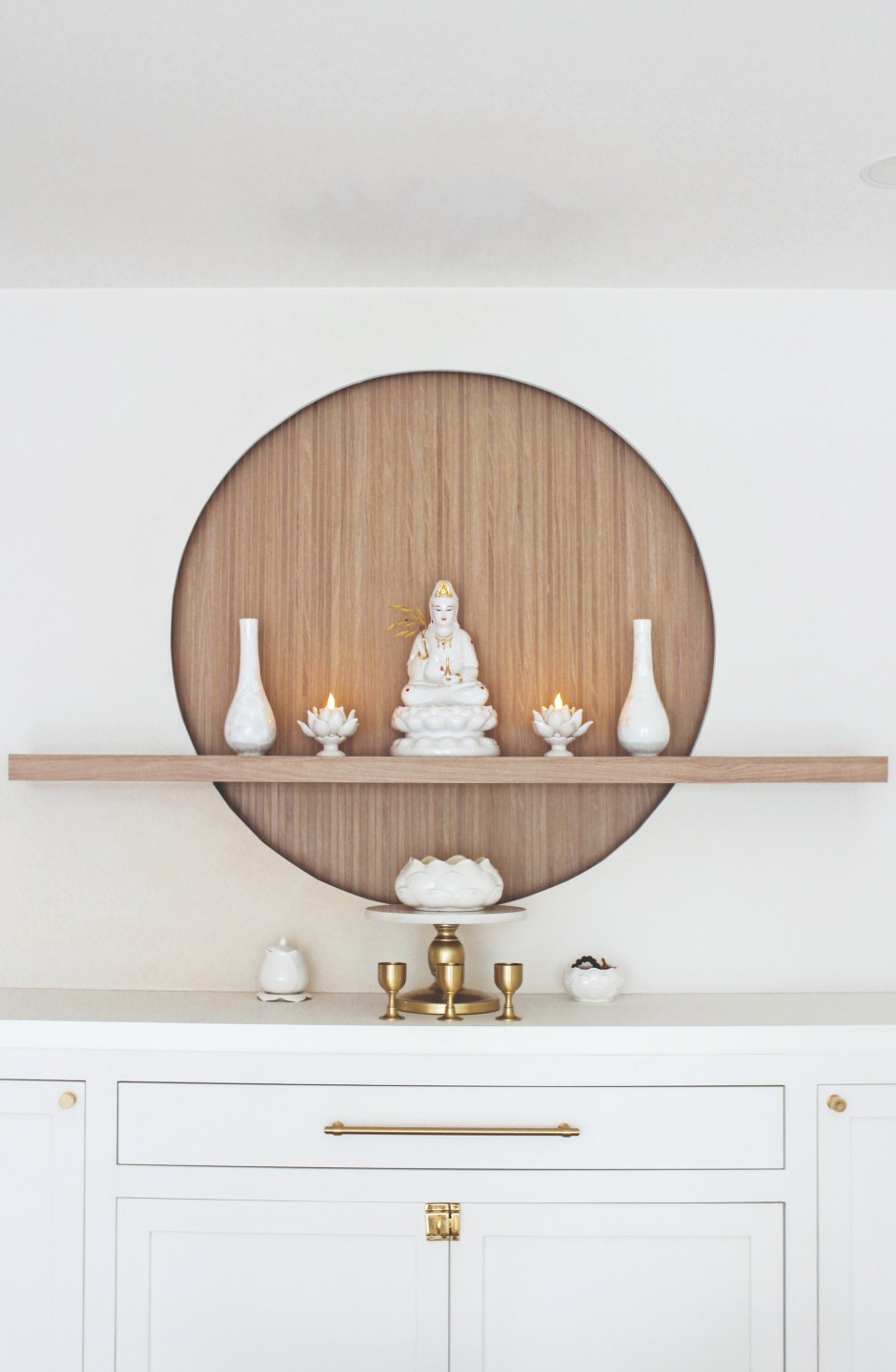
“Given that I have not designed an altar before, it really posed the biggest design challenge for this home,” Cheryl admitted.
This was foreign territory for the interior designer who had not lived in a home with an altar. What is the standard size of an altar? At what height should the statue sit? How will it fit into the theme? The fact that it was a religious installation called for immense attention to detail.
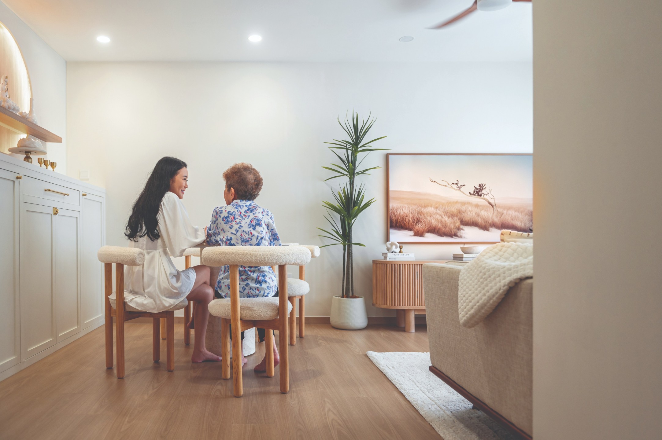
“We actually started off with an arch design, but eventually decided to go with a circle as it resembles a full moon, especially with the LED lights at the back. At the final stage of styling, we also proposed the tea cups, incense holder, lotus lamps, and vases to complete the look,” she explained.
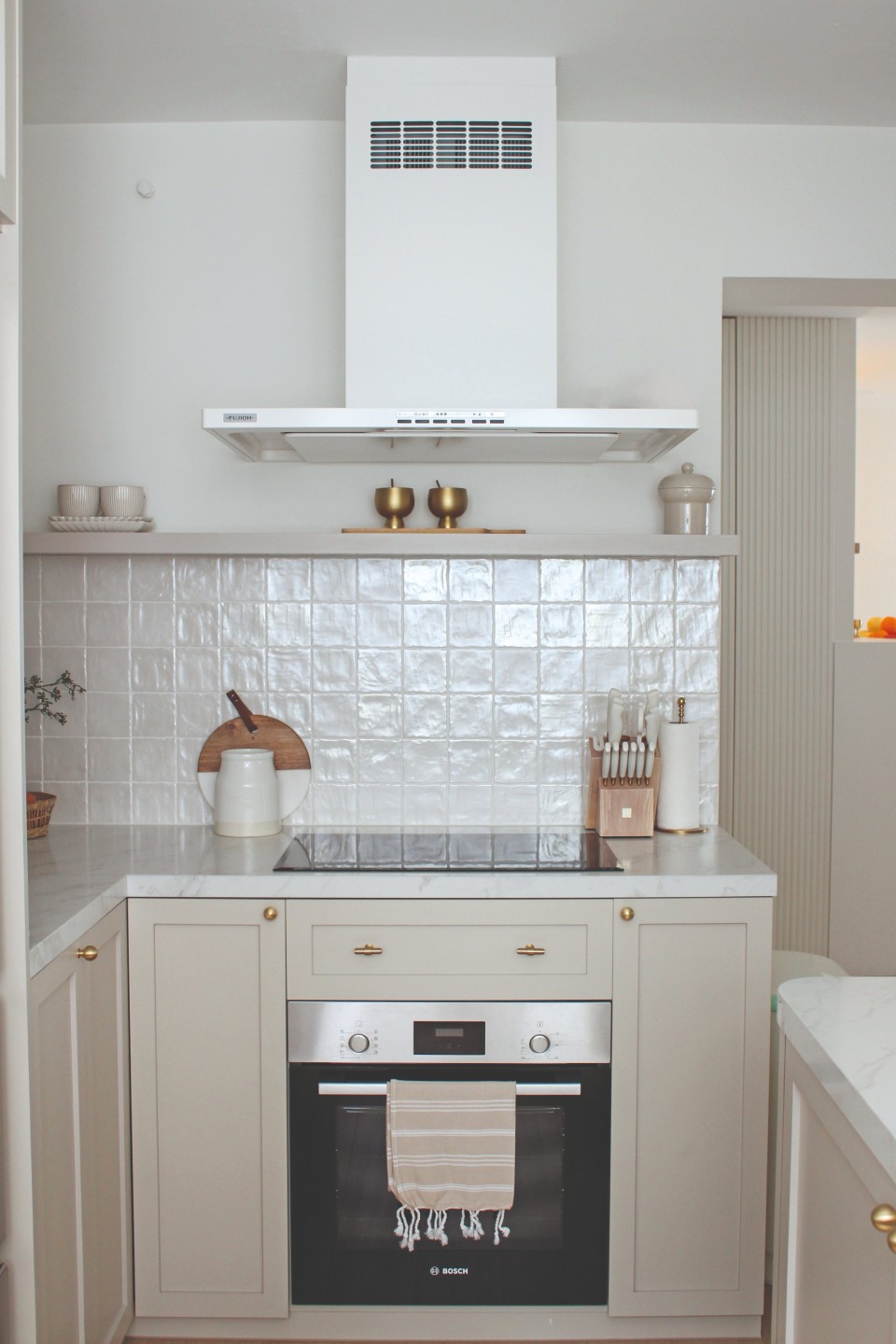
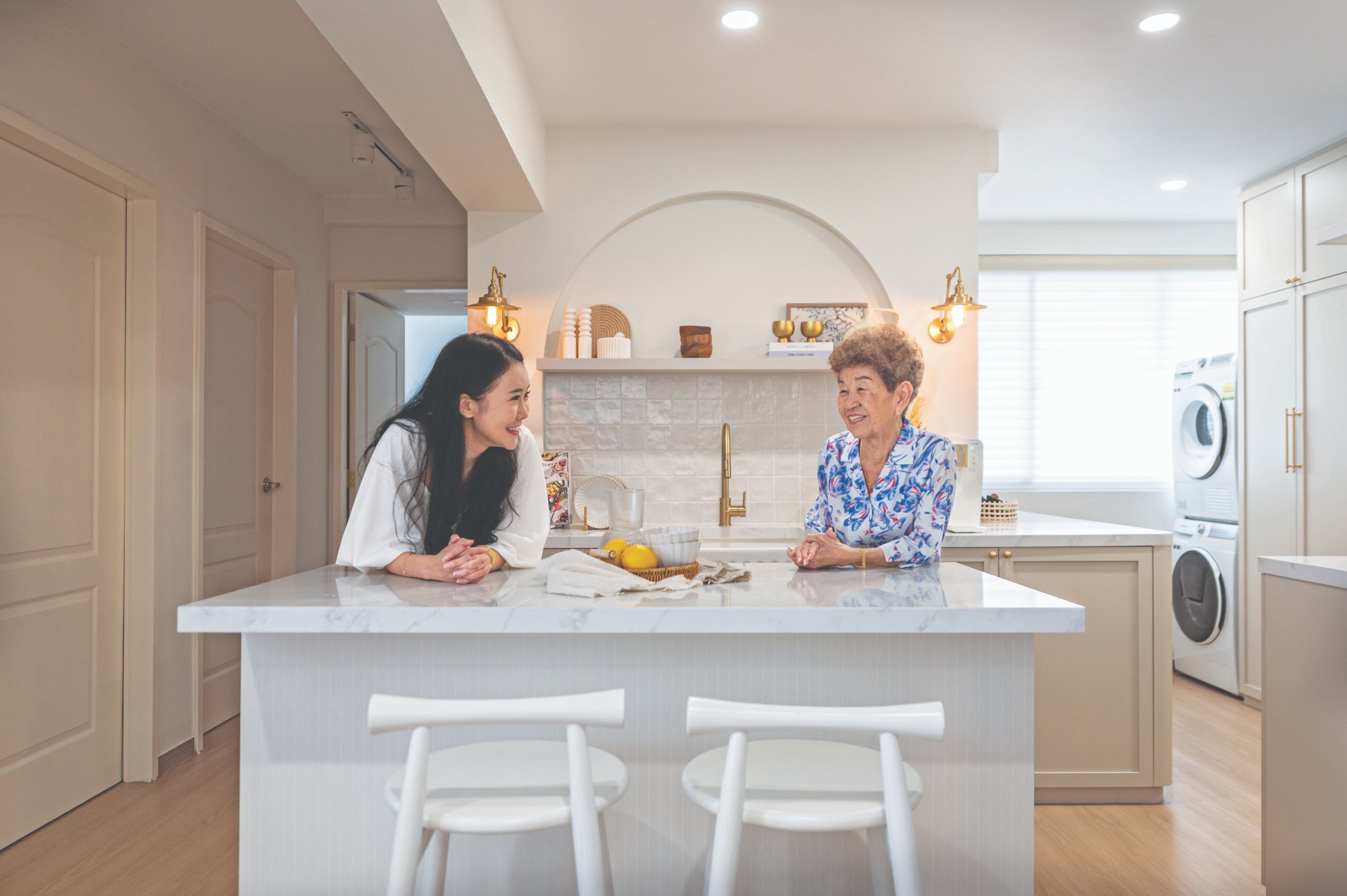
Apart from the altar, Bao Hui and her granny also wanted to enlarge the kitchen, which was originally “small and narrow.” To make this happen, Cheryl did away with part of the kitchen wall and the service yard doors. Noting that her client fancied both the modern luxe and vintage farmhouse styles, she chose materials that would blend both.
“We tried to incorporate both by choosing a beige laminate for cabinet colours, using gold and brass fittings, and using marble-like quartz for the countertop for a ‘luxe’ feel. As for the vintage farmhouse style, we chose a white, neutral-coloured square tile with shade variations to bring out this ‘country’ or ‘cottage’ feel and added art prints and decor to bring out these elements on the open shelves.”
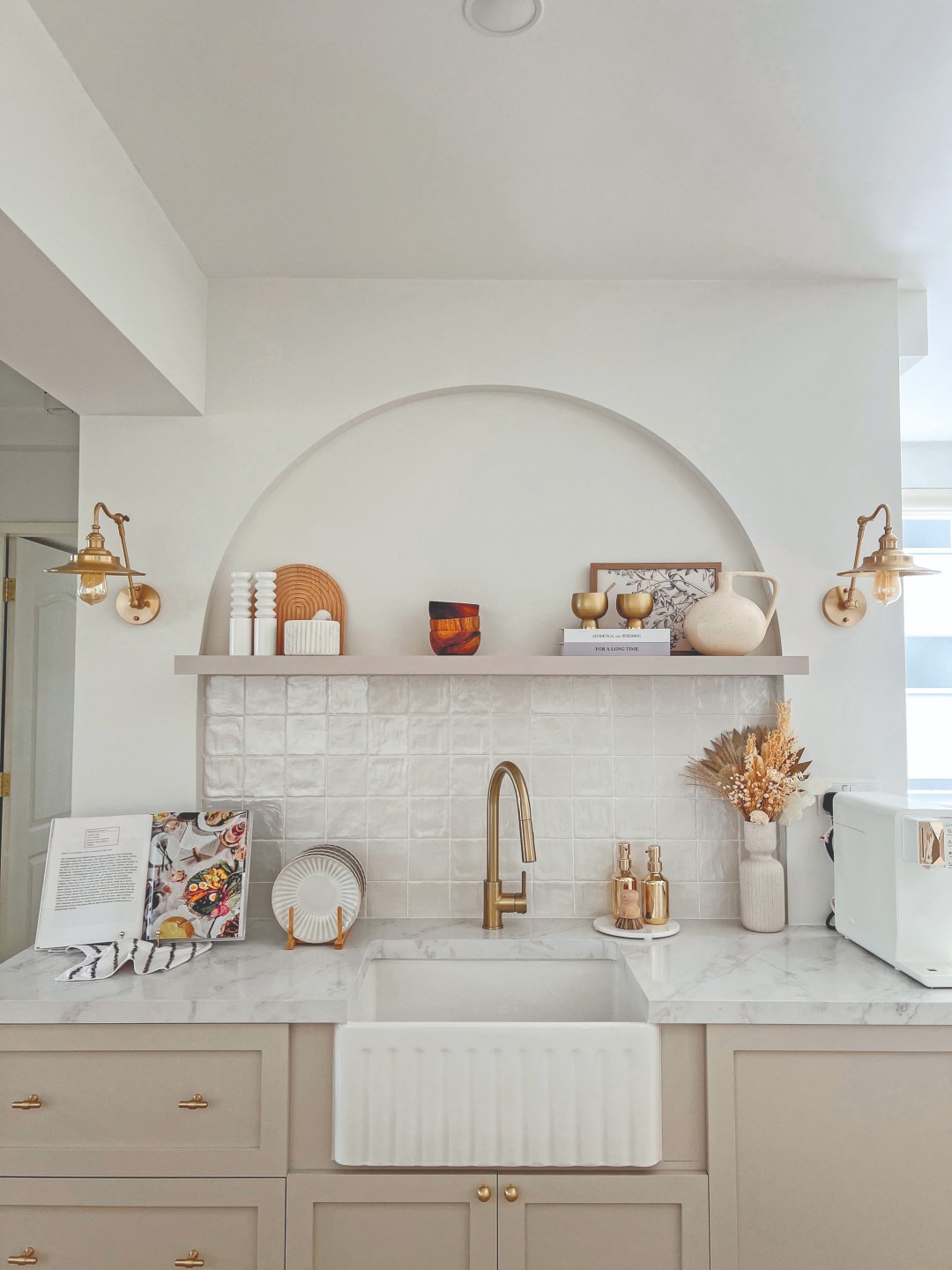
It’s obvious that Cheryl’s efforts paid off. While Bao Hui went with an open kitchen concept thinking they wouldn’t be cooking much, they have since fallen head over heels with the space and now cook nearly every day.
Safety first
In the living room, Cheryl proposed a round dining table, a round coffee table, and a TV console with curved corners. Her decisions aren’t purely aesthetic, though they do help to soften the edges of a small space. Rather, they help make it safe for Bao Hui’s granny to navigate.
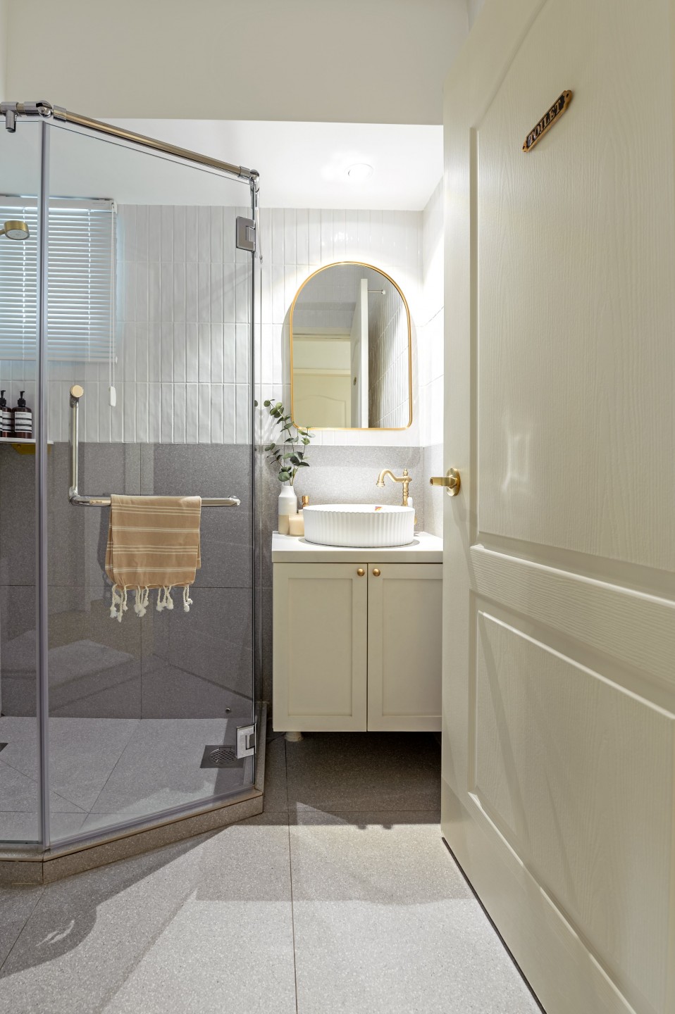
Elderly-friendly provisions were given particular importance in the bathrooms. Apart from the usual grab bars and anti-slip tiles, the guest bath features an angular shower area to separate the wet and dry floors.
“Bao Hui requested for a full shower screen instead of a single fixed glass…However, she did not like a typical L-shaped or corner shower screen so we had to create an angular shower area. This actually helped to save some space in the dry area without making it look too squarish or bulky,” said Cheryl.
Compared to the guest bathroom, where white subway tiles and grey terrazzo tiles add a playful touch, the master bathroom looks more luxurious. But safety remains a priority that coexists with its marble walls and navy kit-kat tiles – the shower area was deliberately kept spacious in the event that a wheelchair enters the picture.
Function and form
When it finally came to furnishing, Cheryl assisted Bao Hui in striking a balance between the needs and wants of both occupants – as exemplified in their choice of a sofa from Prestige Affairs.
“Cheryl and I wanted a light-coloured fabric sofa for a softer look to fit the theme, and it cannot be too soft so that it is easier for my granny to get up from. I didn’t want to buy one online without trying, so I brought my granny out for a sofa-shopping trip thrice before we found one that is within our budget,” Bao Hui recounted.
Their attempt to find one bed frame to rule them all, however, wasn’t so smooth sailing. It would have to be king-sized and tall enough for granny to get up from, yet compact enough to fit a dresser slash TV console at its foot.
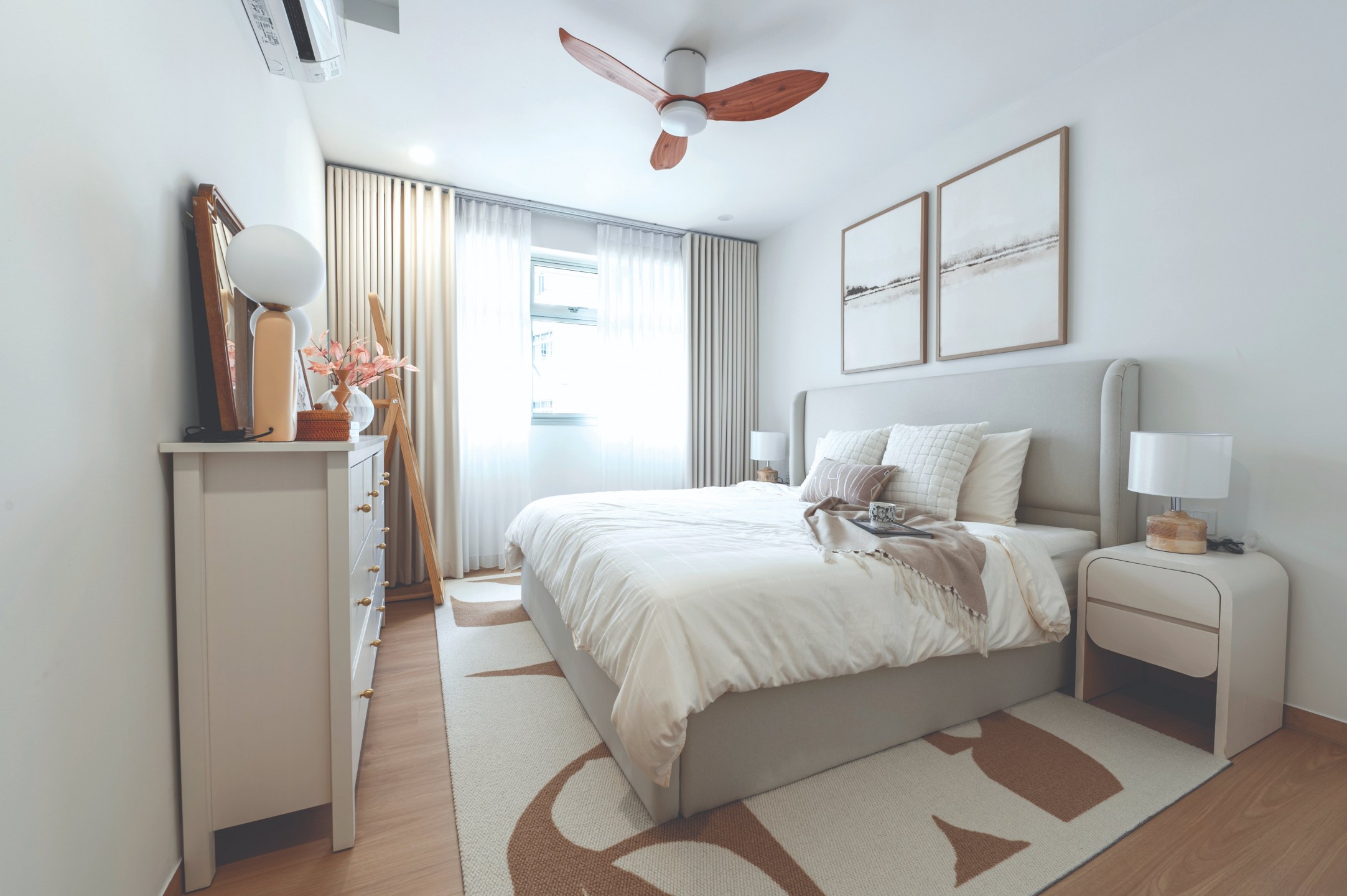
“My granny loves watching TV and I really wanted to get one for her in the master bedroom. To accommodate this idea, we had to customise both the bed frame and the dresser on Taobao. However, the bed frame we ordered arrived with mould infestation due to wet weather during the shipment.” Bao Hui said.
Already pressed to move in, she had to decide between waiting for an exchange or giving up on the dresser slash TV console altogether and getting a bed frame from a local store. In the end, she chose the former.
“I am glad Cheryl encouraged me to go with the first option, because we love the colour of the bed and it fits so well with the theme,” she said.
In these moments, having a second opinion from a reliable professional can go a long way. But some may wonder: Are interior designers obliged to address complications that are out of their hands?
“As interior stylists and designers, we do not assist our clients in post-reno shopping. Rather, we are the ones who source and propose furniture, furnishings, and all styling items over the course of the project while the renovation is still ongoing.”
If we’re being real, not every interior designer shares the same view. Some may be eager to wash their hands off and move on to the next project, whereas others like Cheryl take it upon themselves to ensure that she puts the finishing touches on her own work of art.
“By the end of the renovation, it’s really just about sprucing the entire home with art and decor pieces to fill the open shelves and bring out the look of the design.”


