A feature wall and dark colours turn this BTO flat into a cosy home.
When these homeowners got the keys to their BTO flat, their main aim was to make it a place they would live in for the foreseeable future. So the next step was to renovate it, to turn it into a home the couple would appreciate a lot more than the blank canvas they were given.
“We initially wanted to go with a contemporary look, but after browsing through some materials online, we realised we had specific ideas for our home that didn’t fit that theme,” they reveal.
One of their suggestions that did work though, was to have a red brick wall. This is now a feature wall in the dining area, which the design team from Ovon Design created with tiles. Design consultant Zee reveals that they couldn’t use real bricks as it would be too bulky so sourced for similar-looking tiles. This material was chosen as it gives IDs the flexibility of being able to create a particular look, in a more conventional way.
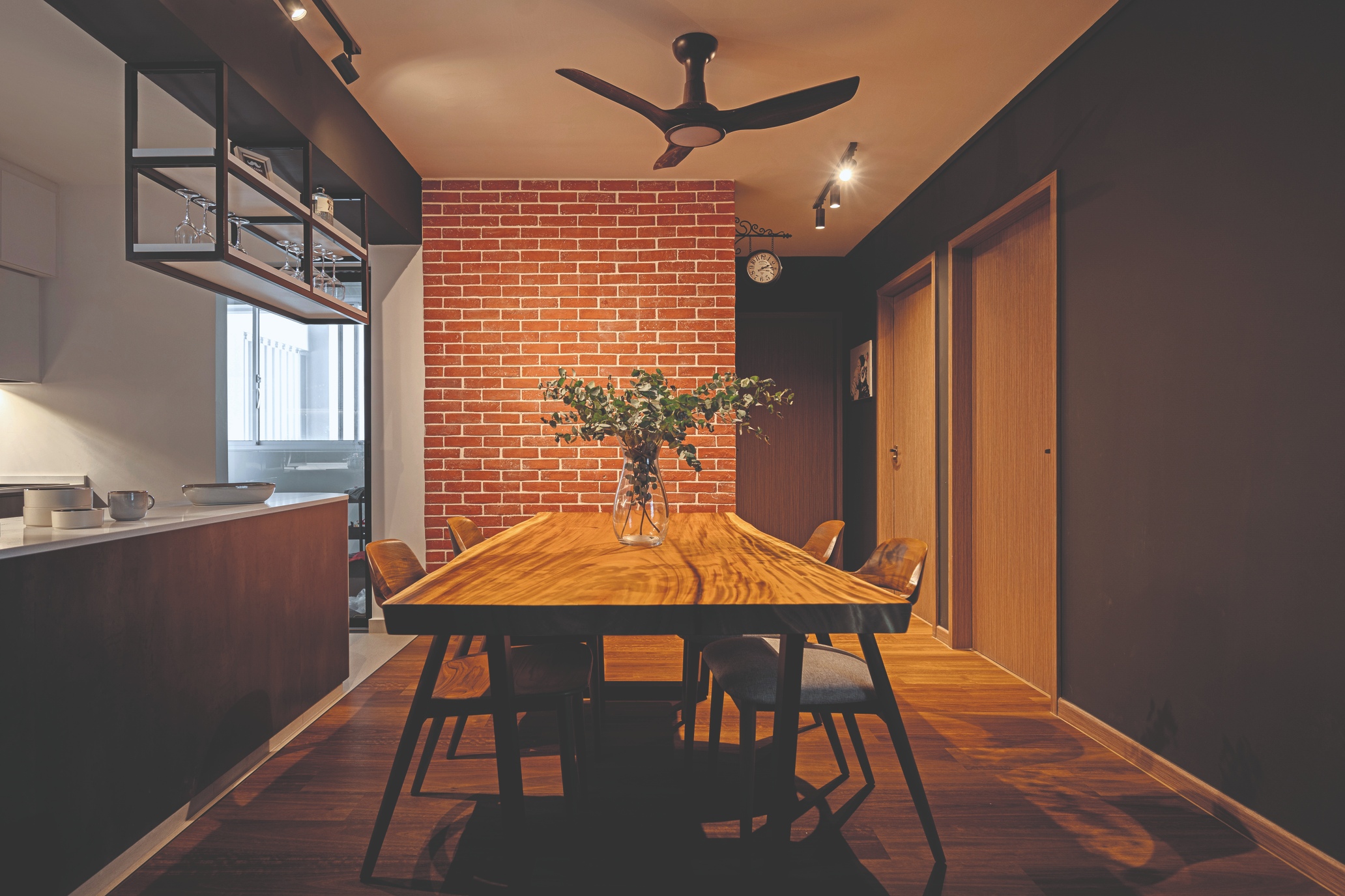
The feature wall is certainly a highlight in the home. The bold red colour blends in with the dark walls, creating a sophisticated look. Zee explains this space was chosen for the feature wall as it is facing the dining area, which is where people interact the most, aside from the living room. Therefore, having this beautiful wall gives it a more cosy setting.
When the homeowners were planning what to change in this area, they had a specific dining table in mind, which matched the wholesome look they wanted to achieve. So the design team worked out a plan around this piece of furniture and also ensured that the nearby walkway blends in well.
Zee chooses this dining area as the room that went through the best transformation and it’s also the homeowners’ pick. “We feel that it really ties the place together and adds some colour to the house,” they elaborate.
Fancy, functional kitchen
The kitchen wraps up the refined feel in this part of the home. Zee explains that creating a U-shaped kitchen enhances the space and having the flyover shelf gives it a fancy touch. And, even though the sink area is just a basin with a concealable space above for drying dishes, the addition of LED lights here adds to the ambience.
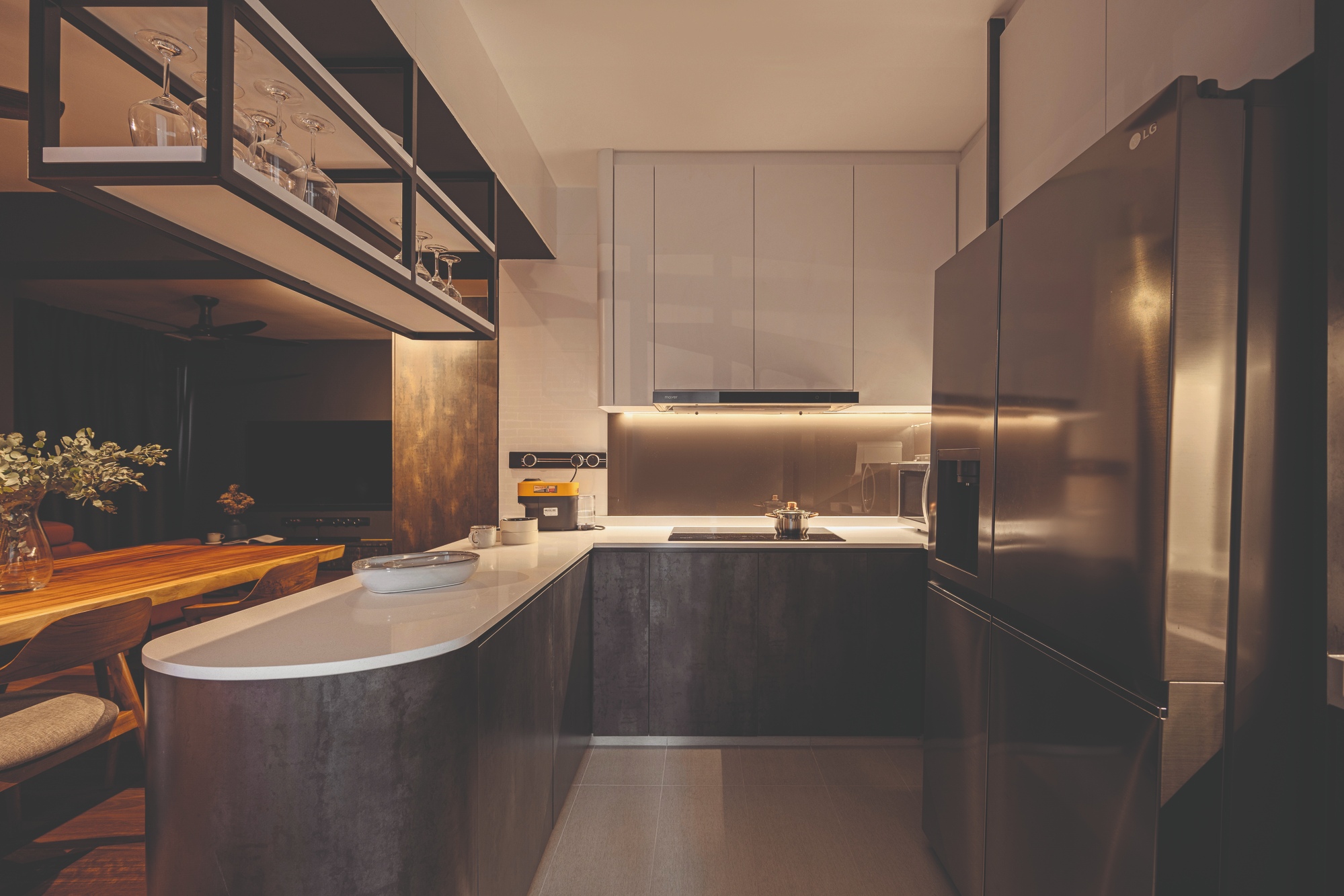
“The U-shaped kitchen gives the homeowners more storage space,” Zee shares. “We also shifted the fridge to the middle of the wall so that it doesn’t block the ‘view’ in the home. We used quartz as a table top as there’s a variety of colours to choose from. The flyover shelf was the cherry on top; that was the final detail that completes the whole look.”
Even though the homeowners didn’t have a specific theme in mind when they briefed the design team, one thing they did mention was that they wanted a darker living space. They chose a bold grey for the walls, which isn’t a stereotypical colour for a living room. Zee admits that not many homeowners are into such a shade for this space but, looking at the end result, the colour actually makes the living room look more elegant.
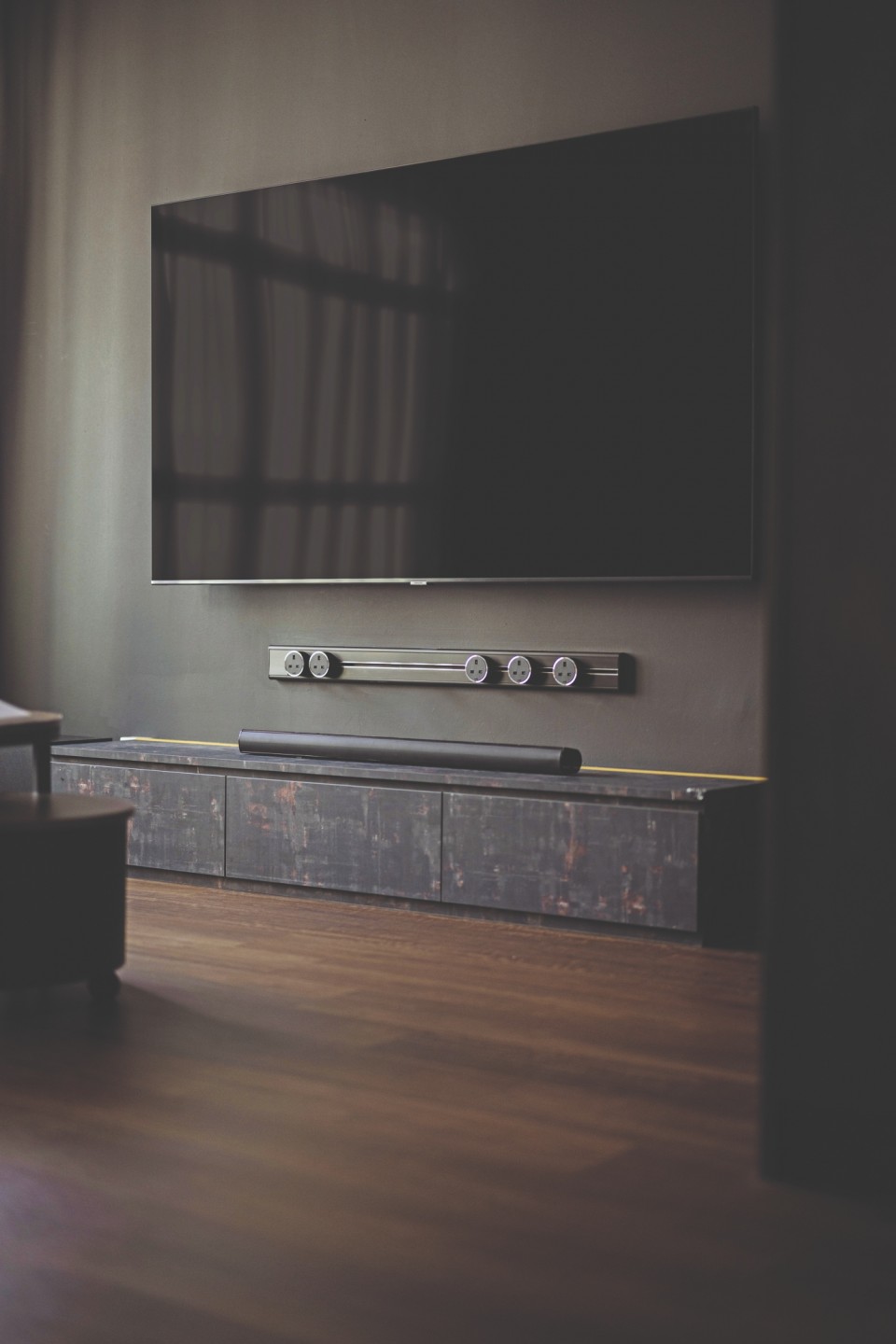
Between the wall-mounted television and the cabinet on the floor sits a power track from Eubiq. The design team chose it to create a sleek look and also because it’s extremely convenient as the sockets can be moved around to fit comfortably.
Dark vs Light
The dark theme is clear in the home office too. The only request the homeowners had for Zee here was for it to be dark – close to black, if possible. Zee likens this new space to entering a virtual world where it only lights up when the technology is switched on. Therefore, the room truly comes to life when the LED lights around the coved false ceiling or the gadgets on the work desk are in use.
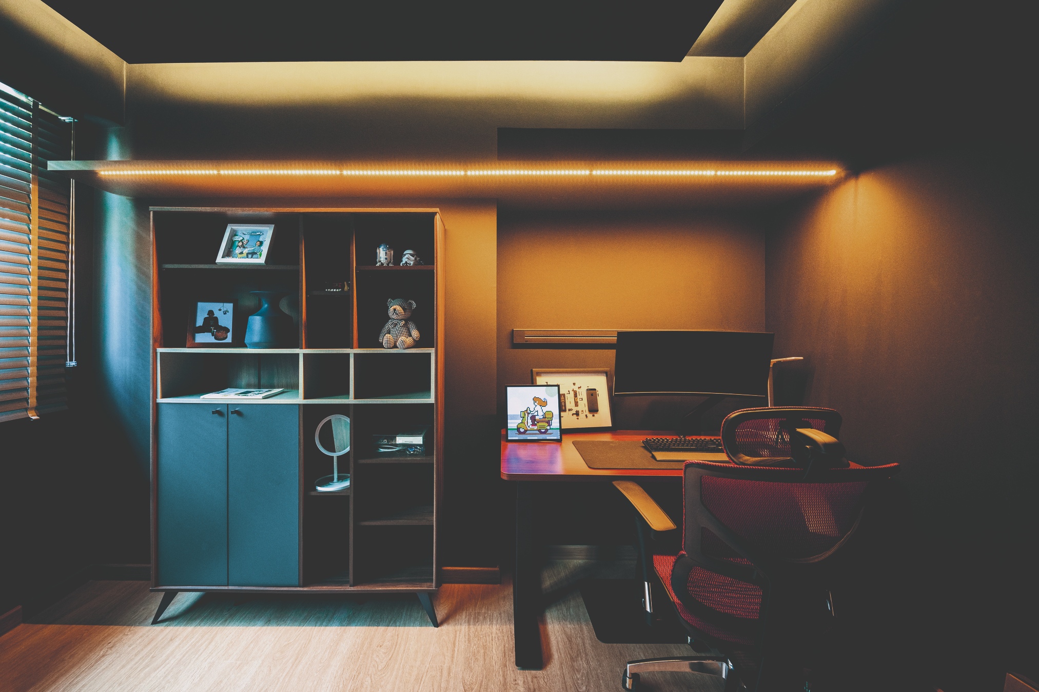
The homeowners love the contrast of the different looks in their home as it suits their lifestyle: “Having different designs creates a different mood for each section of the house. For example, having black day curtains in the living room makes it cosy even in the day, while the design of the dining area has a warmer ambiance for gatherings.”
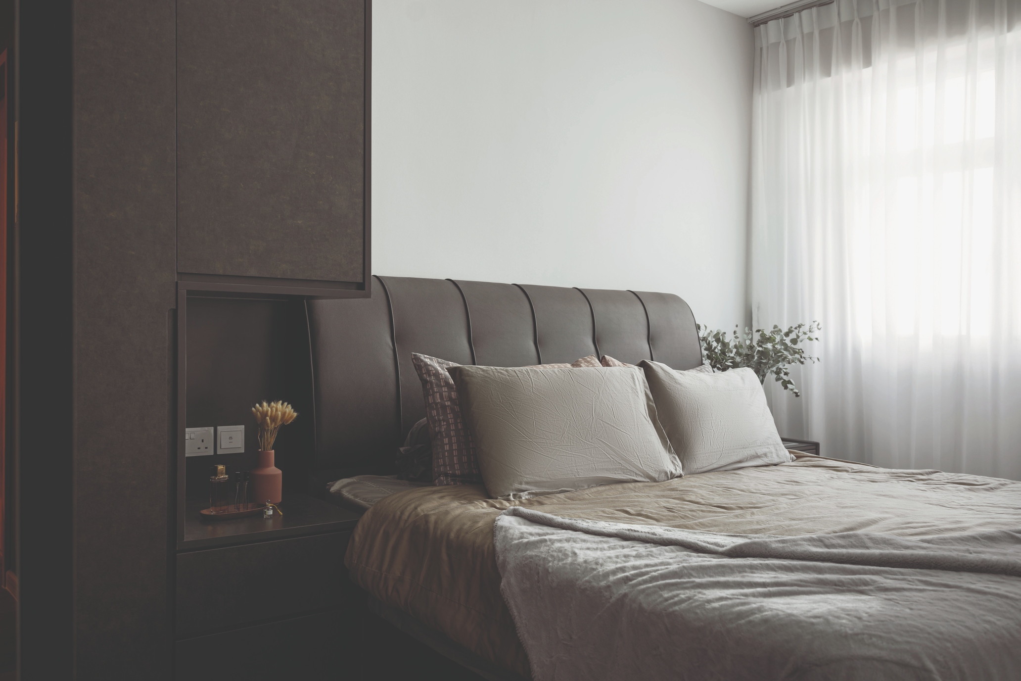
The living and dining areas boast new flooring – an overlay of vinyl is a fresh look compared to the previous ceramic flooring. There is also a new wardrobe in the master bedroom, with a functional bedside niche, so the homeowners didn’t have to purchase a bedside table with this feature incorporated into the cabinetry.
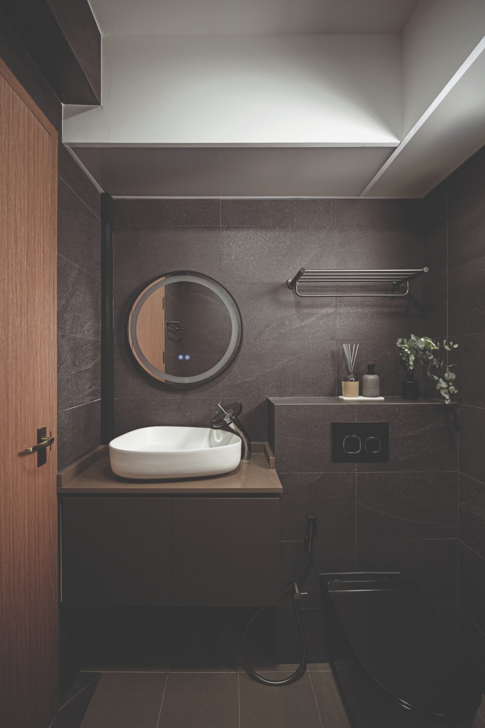
The ensuite had a complete overhaul and now has a dark theme too. The homeowners wanted a black toilet bowl and requested to design the rest of the room around that. An overlay of tiles now gives it a dark, modern look, while a white basin adds a pop of colour. A bathtub was also added, to make the space more functional for the whole family.
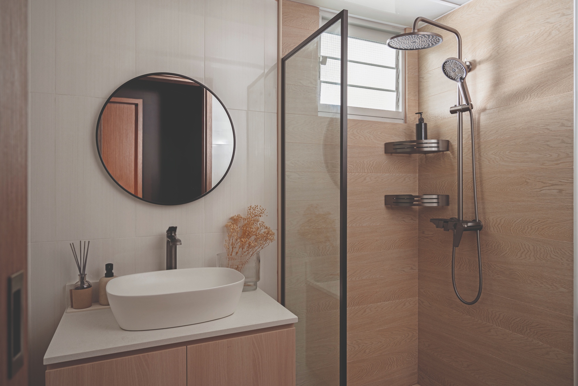
The main bathroom is a contrast to this space, as it’s decked mostly in light brown and white. The designers aimed for a Scandinavian mood here and retained the existing white tiles but added wood tiles to the shower area. The homeowners reveal they decided on a lighter colour palette “to make it more cheery for a child”.


