This HDB flat blends timeless minimalism with Scandinavian and farmhouse influences.
Wanting to capture a harmonious vibe for their house, the homeowners’ first request to their designer, Valentina Loh of Hello House, was to draw inspiration from a warm, minimalist aesthetic for the redesign. As they particularly enjoy dropping by local Aesop stores and browsing the products in the curated interiors, they wanted to recreate the feeling of comfort that the brand exudes in every outlet. Since this would be a home, farmhouse and Scandinavian elements were introduced to warm up the space and make it feel cosier and more lived in.
Bringing in the light
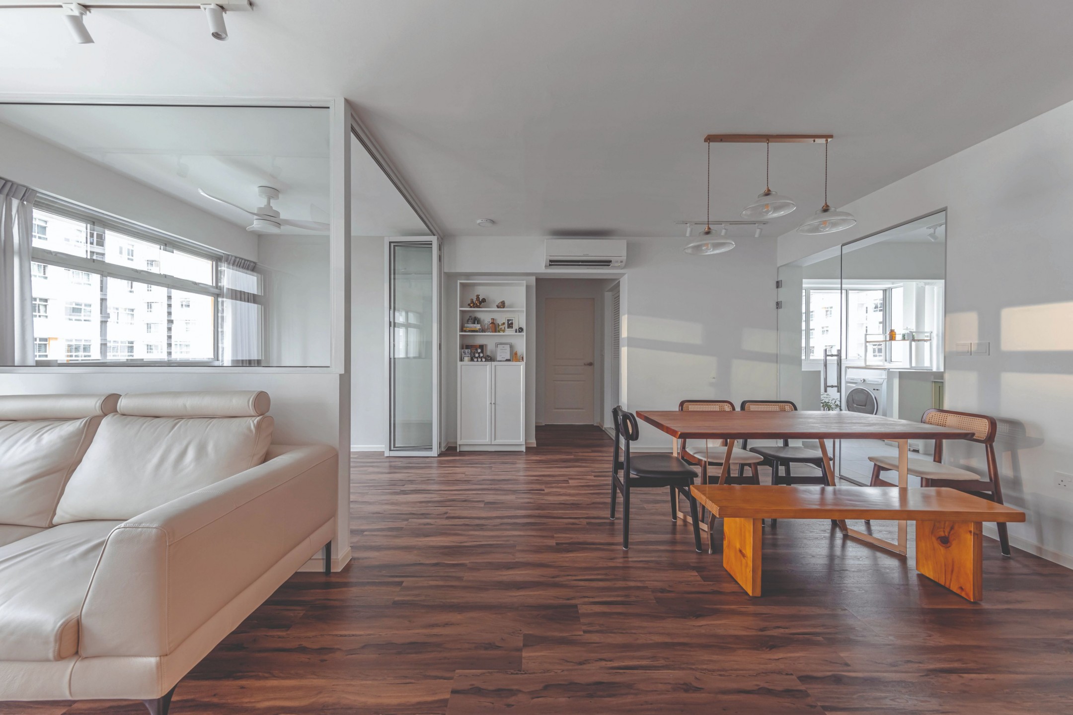
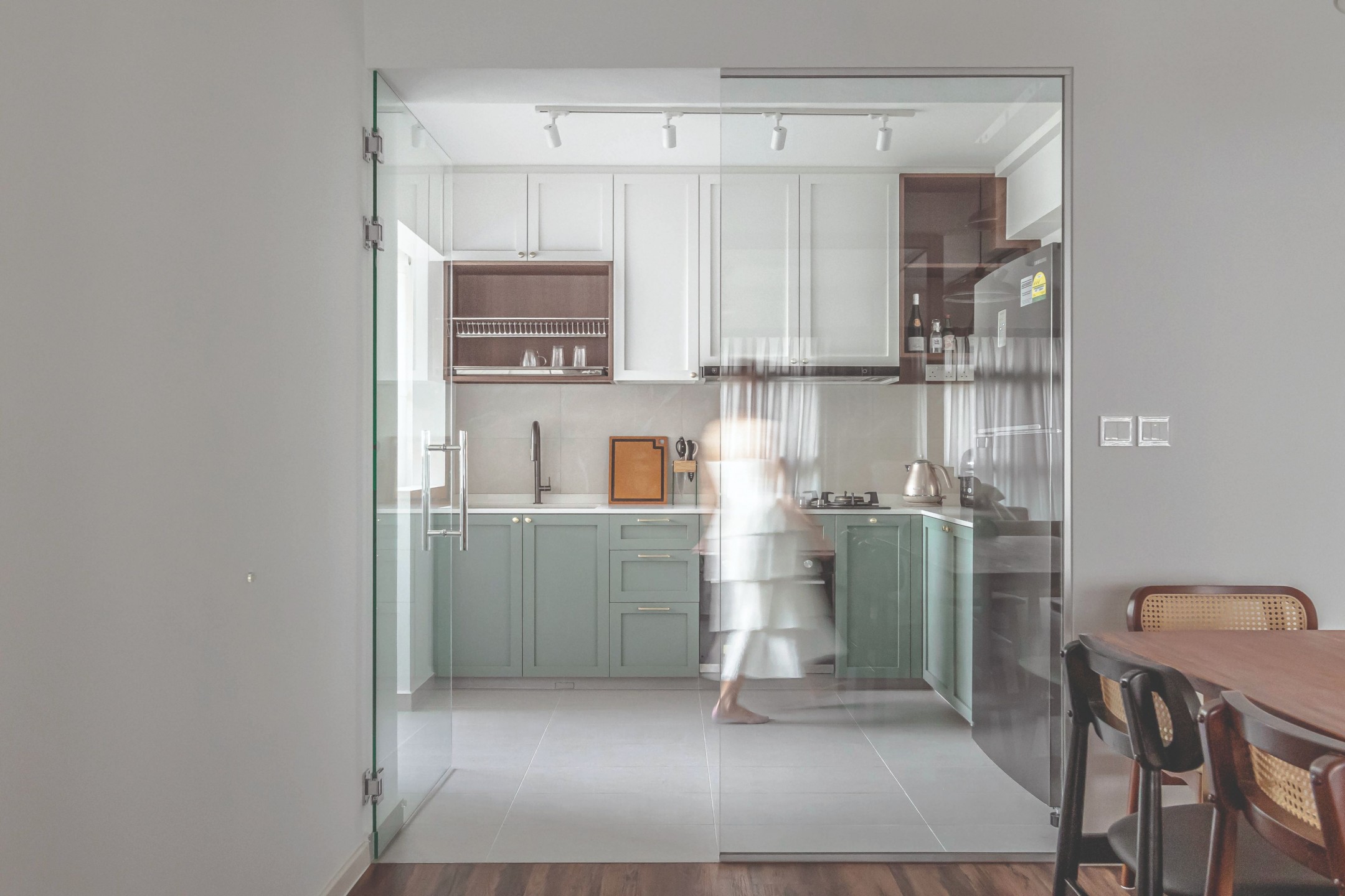
Switching out the kitchen entrance and the walls of one bedroom with glass panes brought tremendous light into the communal areas. Now light freely streams into the previously dim dining zone from two directions. The compact kitchen also feels roomier and more connected to the adjacent spaces now that the entrance has been shifted to face the living room and constructed with glass.
The airy aesthetic carries through the living room, where light-hued and clear furnishings evoke a breezy and uncluttered feel. While the shared spaces have a predominantly white palette, the vinyl flooring from Wood Culture lends warmth and grounding balance with deep cocoa hues chosen to meet feng shui specifications.
Sticking with the minimalist vibe and offering the couple more flexibility, Valentina decided not to create too many built-ins for the home. In the living room, a singular row of cabinets built against the household shelter features sleek, white panels. “I wanted the cabinets to match the base,” the designer tells us, “so I added borders in the closest colour to the vinyl tone.”
Maximising a compact kitchen
The homeowners asked for a practical kitchen with shaker-profile cabinetry and a pop of green, Valentina shares. Because of its limited footprint, the cooking zone had to have a pared-back design with ample storage units to stow away kitchen essentials and nix clutter. Appliances sit flush against the built-ins, presenting a neat appearance.
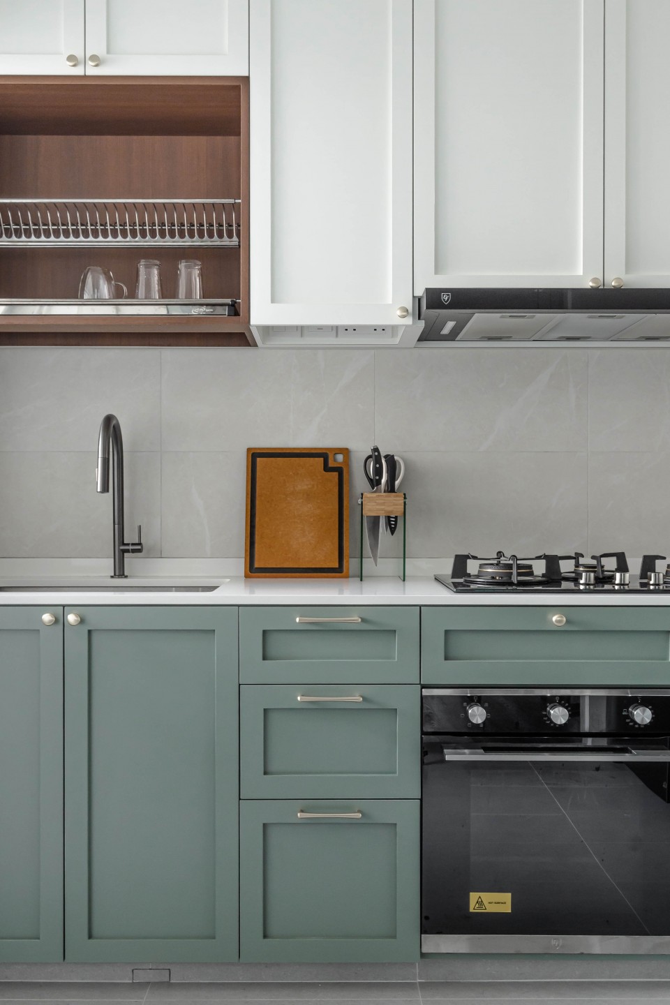
“The original kitchen entrance was beside the main door, and there wasn’t much light coming through from the service yard. By changing the entrance, we created more openness and made the space brighter,” shares Valentina. “We were also able to add additional countertop and storage space.”
The homeowners preferred a specific shade of green, so Valentina had to find a laminate that most closely matched the tone. Several complementary hues were then chosen to provide visual interest without making the kitchen appear too busy. The stone-look, off-white tiles used for the backsplash are from Hafary and the laminates on the cabinetry were sourced from TAK and EDL.
A clean slate for the bathroom
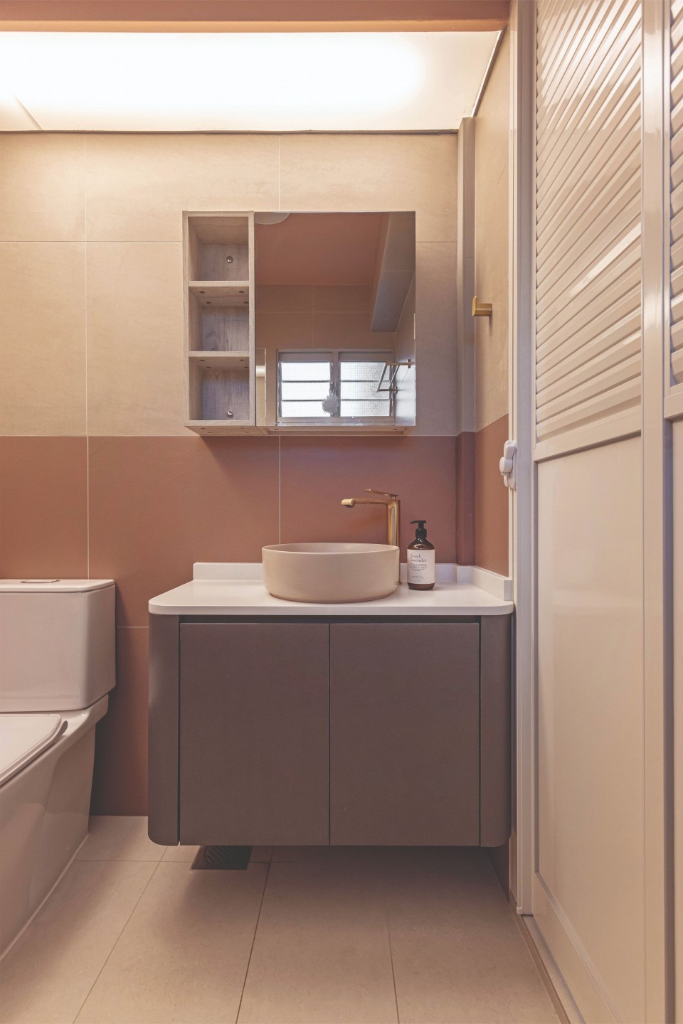
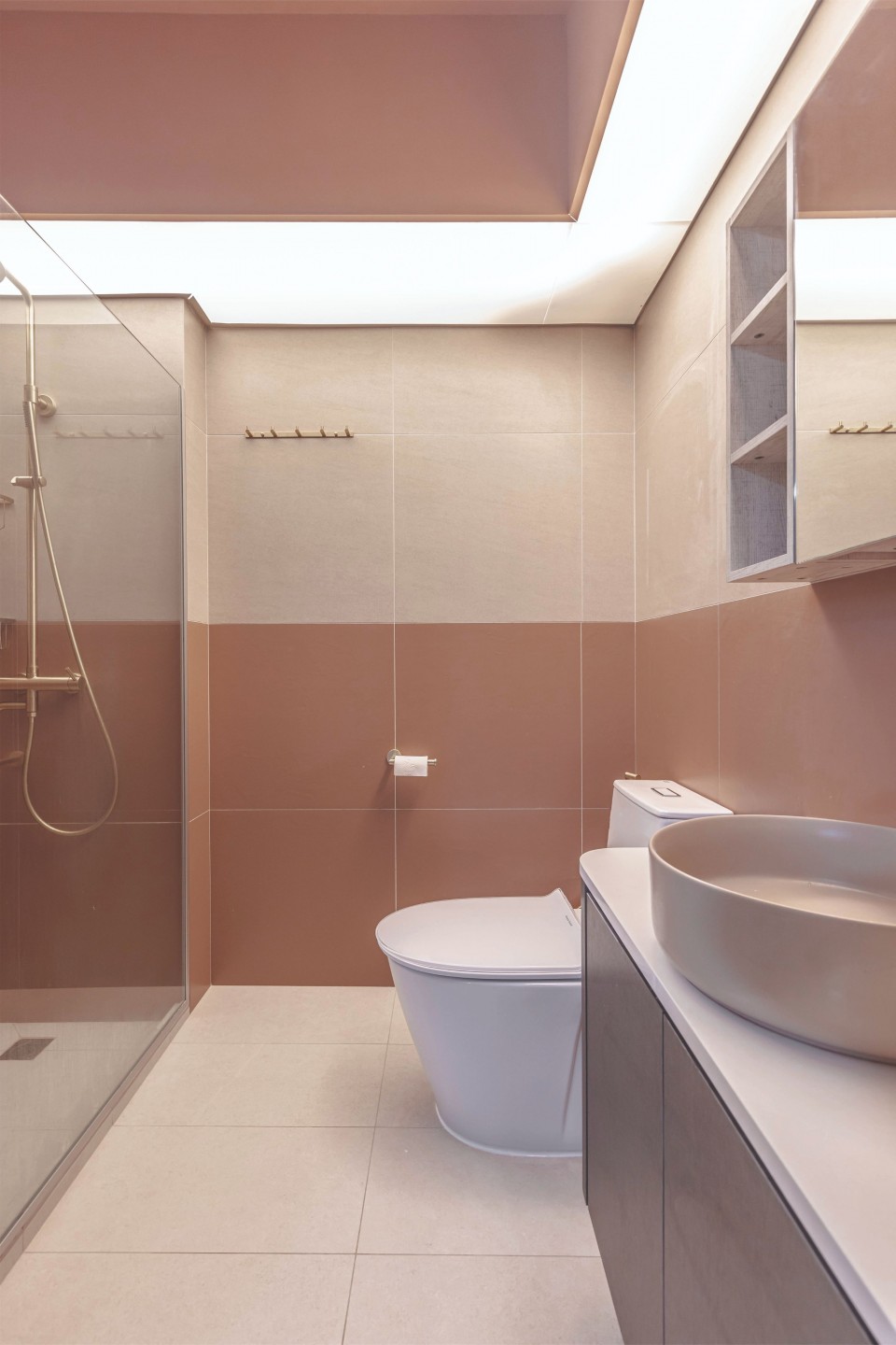
The main bathroom primarily drew inspiration from the warmer colour scheme of the Aesop store at Marina Bay Sands, complete with gold sink and shower fittings. The tiles sourced from Hafary were inspired by the store’s peachy colouring, and the vanity calls to mind the brushed steel cabinetry in the shop. The Bubble Tea Hera Sink was sourced from Viva Nueva.
A minimalist retreat
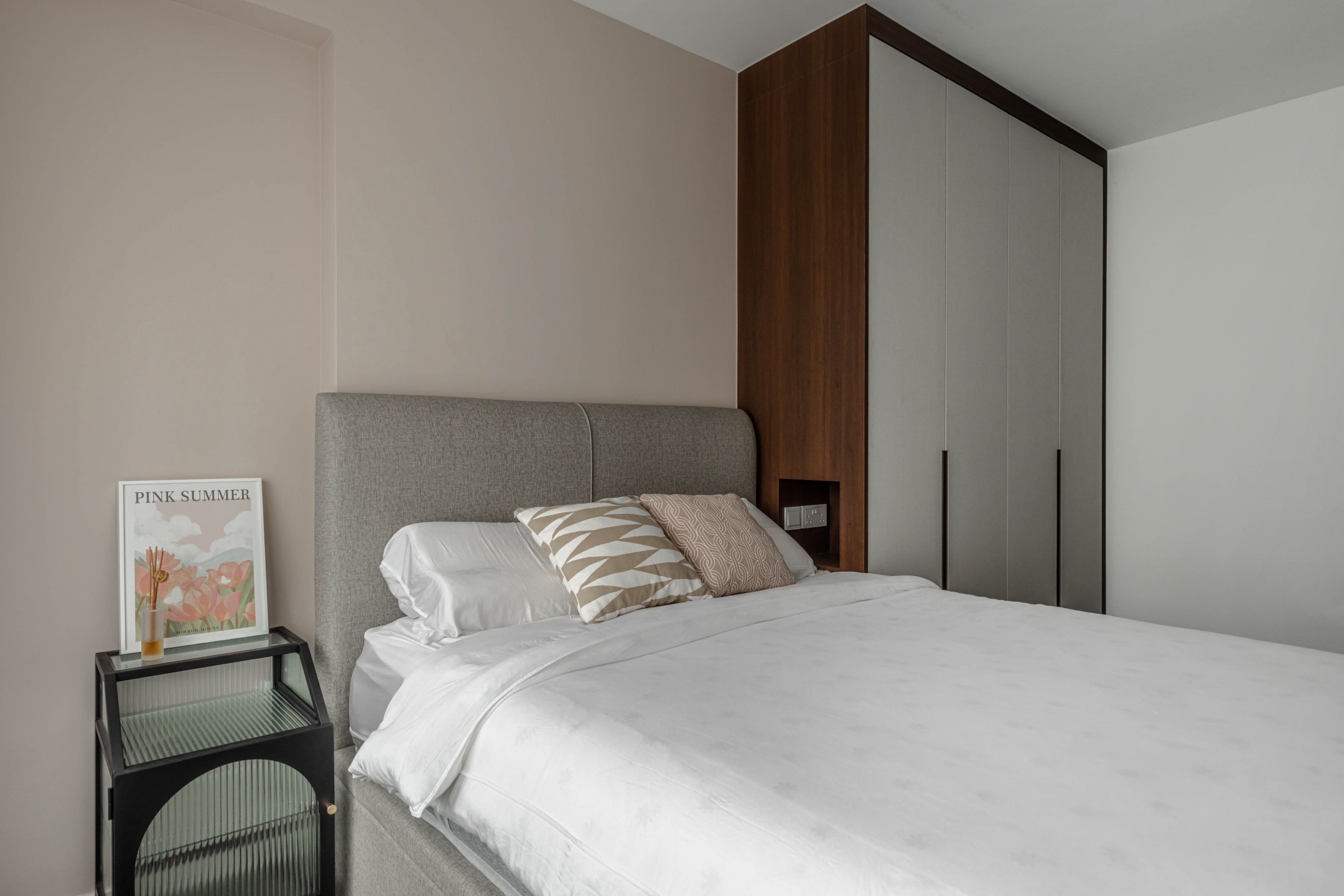
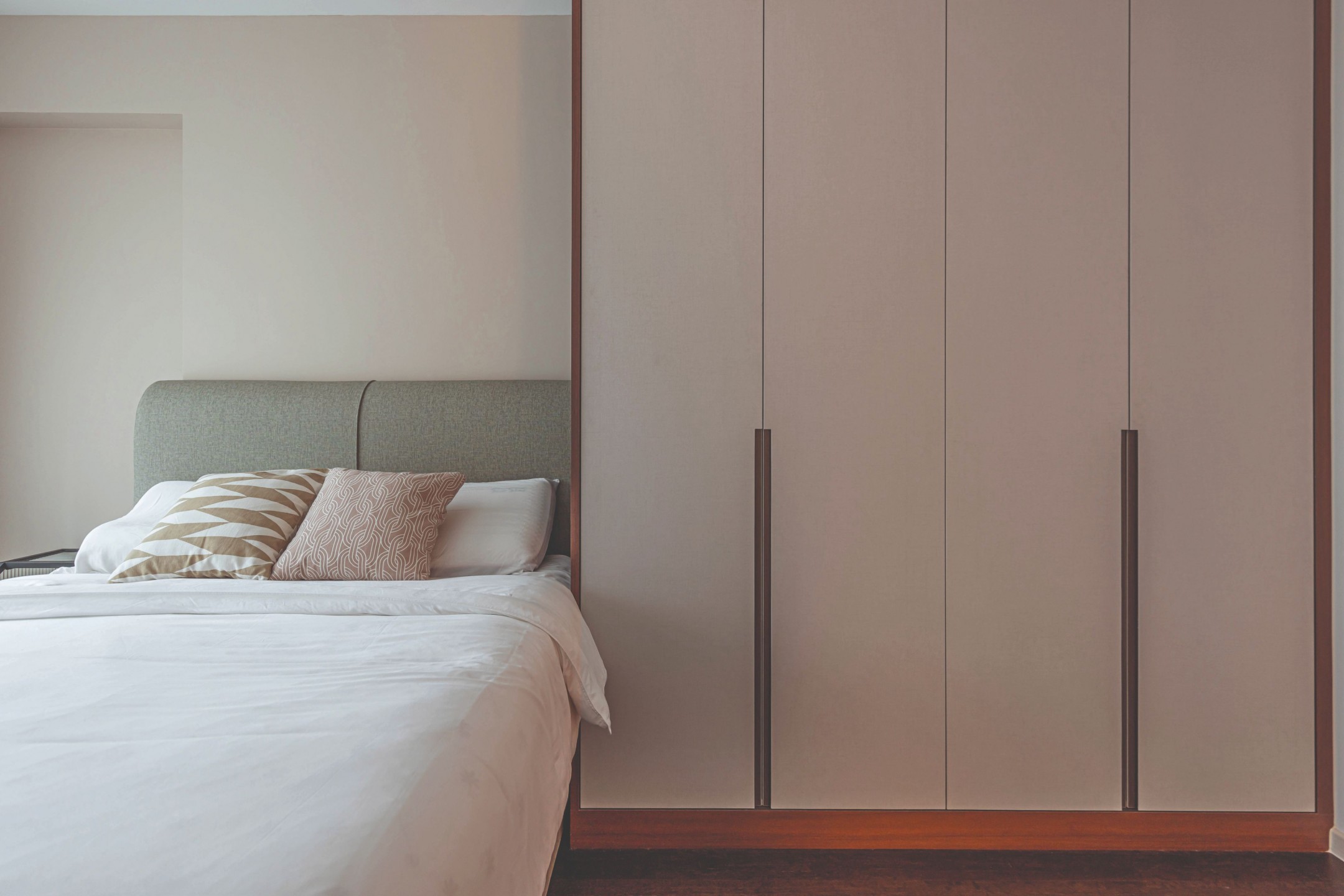
The bedroom was kept to the bare essentials to create a tranquil spot focused on rest and rejuvenation. A fluted glass nightstand sits on one side of the bed while a row of cabinets occupies the other, fitted with a niche to hold night-time essentials.
With a minimalist approach that highlights natural light, functionality and simplicity, this home offers endless appeal and envelops its occupants in an atmosphere of quiet serenity.