Vivid hues and traditional elements pack a punch in this roomy resale flat.
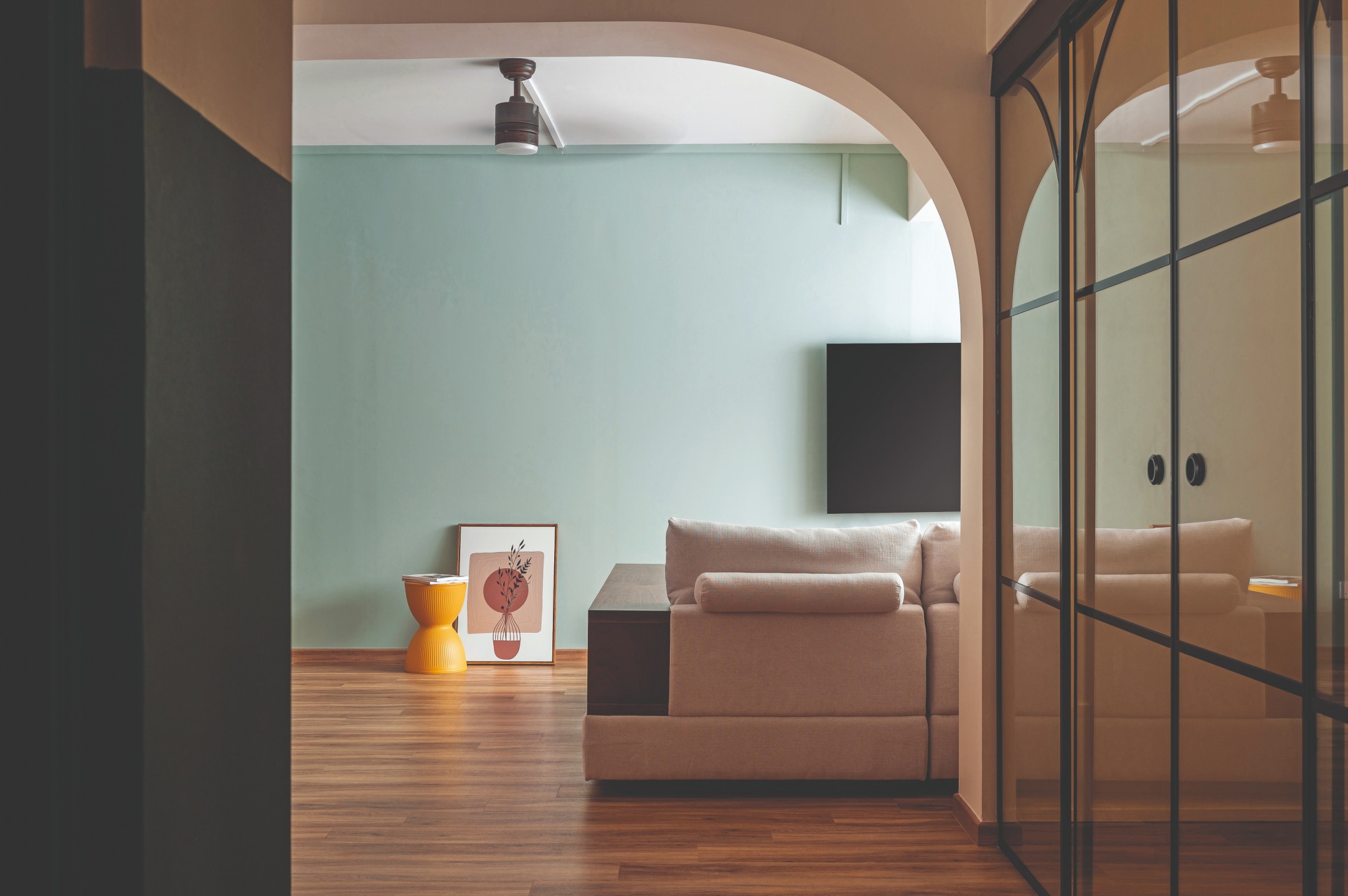
Fond of curves, terrazzo textures and earthy hues, Elaine and Zul were keen on incorporating these elements into their five-room resale flat when they embarked on a renovation. Aware that a mishmash of so many distinct elements could cause an incoherent look, they engaged a professional to conceive of a tasteful interior design that would seamlessly blend their aesthetic choices as well as accommodate their lifestyle needs.
To tie in the seemingly disparate elements, Ivonne Goh, senior designer of The Alchemists Design, intuitively understood that there needed to be a common visual theme underpinning the design. From the vinyl flooring to the cabinetry, the recurrence of the home’s warm wood hue is the common thread that ties the otherwise distinct spaces together.
Vibrant spaces
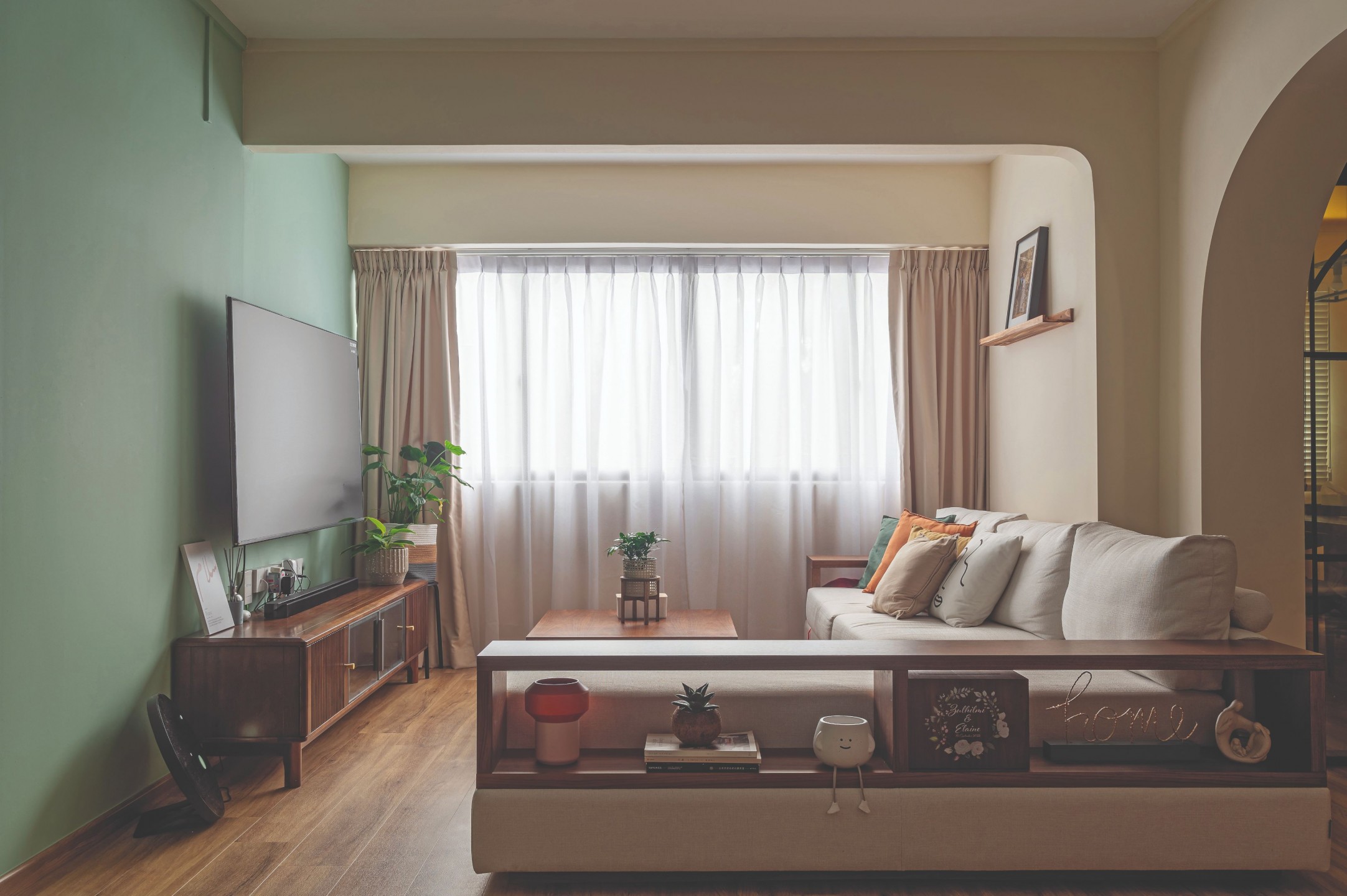
The owners’ interior taste is immediately clear upon entering the home. Emanating an inviting atmosphere, the sitting room is framed by soft downward curving beams and soothing tones of sand awash the walls, with a punch of mint on the TV wall for contrast. Adjacent to it, the former study has been transformed into the dining room.
As the couple enjoys hosting friends and family for meals, having a dedicated dining room was imperative to them. An unassuming six-seater wooden dining table holds the court in the simple space, which is livened up by a wash of perky apricot demarcating the far-right corner of the room.
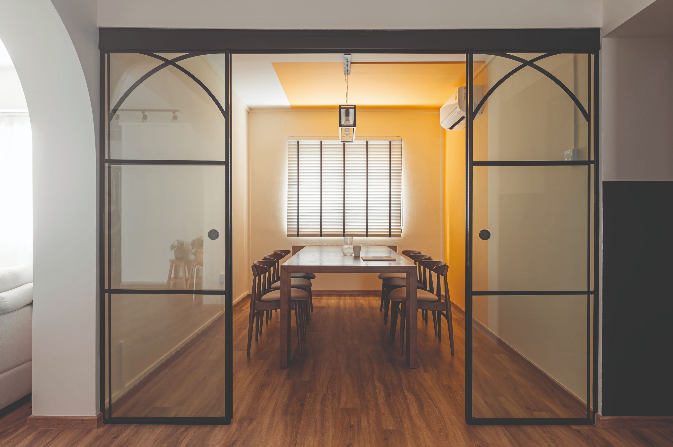
Black-framed, arched sliding glass panels have been installed at the threshold, allowing the room to be enclosed when needed whilst keeping it visually open.
“The inclusion of the peninsula was a deliberate design decision to create a showstopping feature.”
A pop of colour in the kitchen
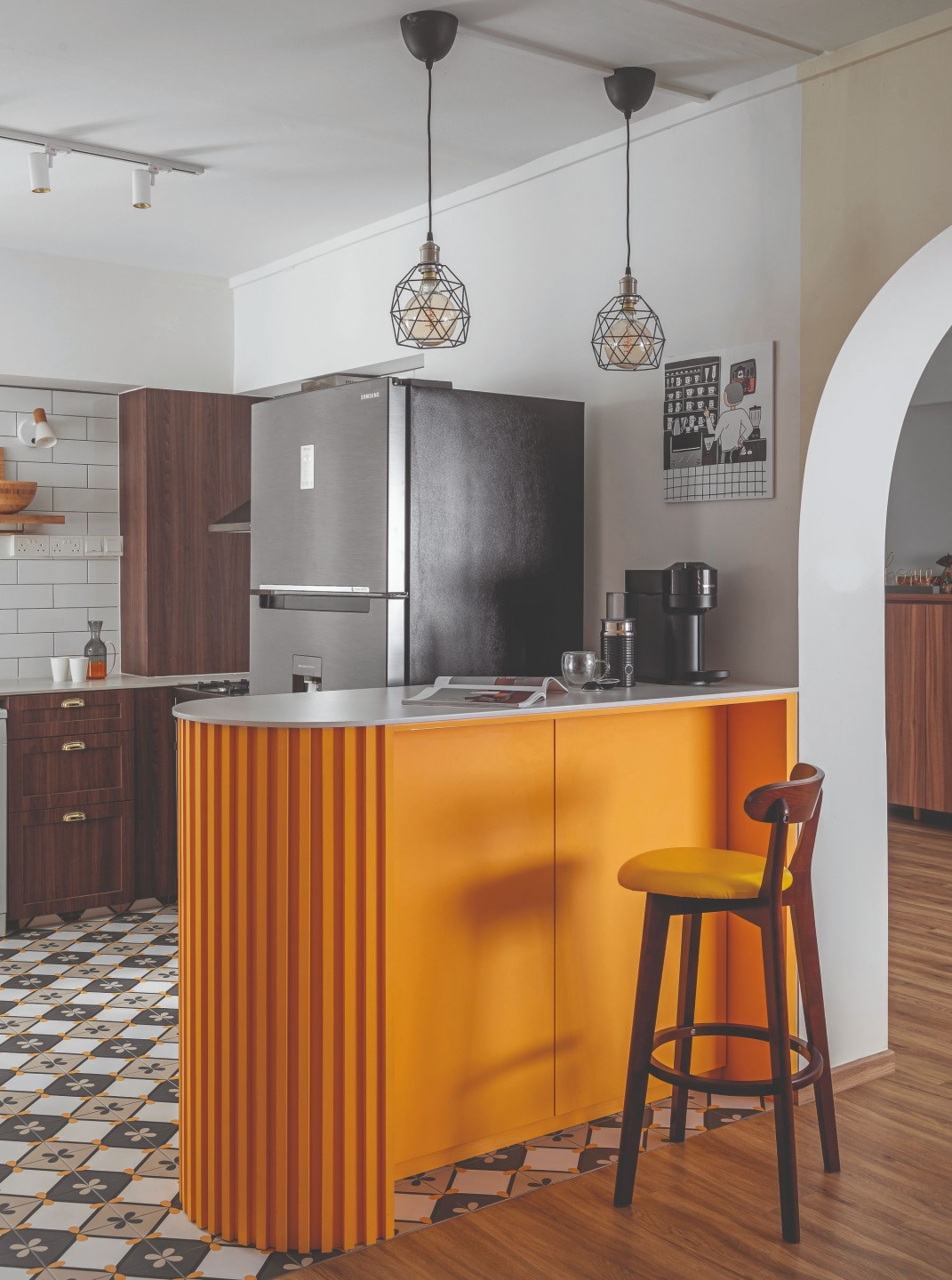
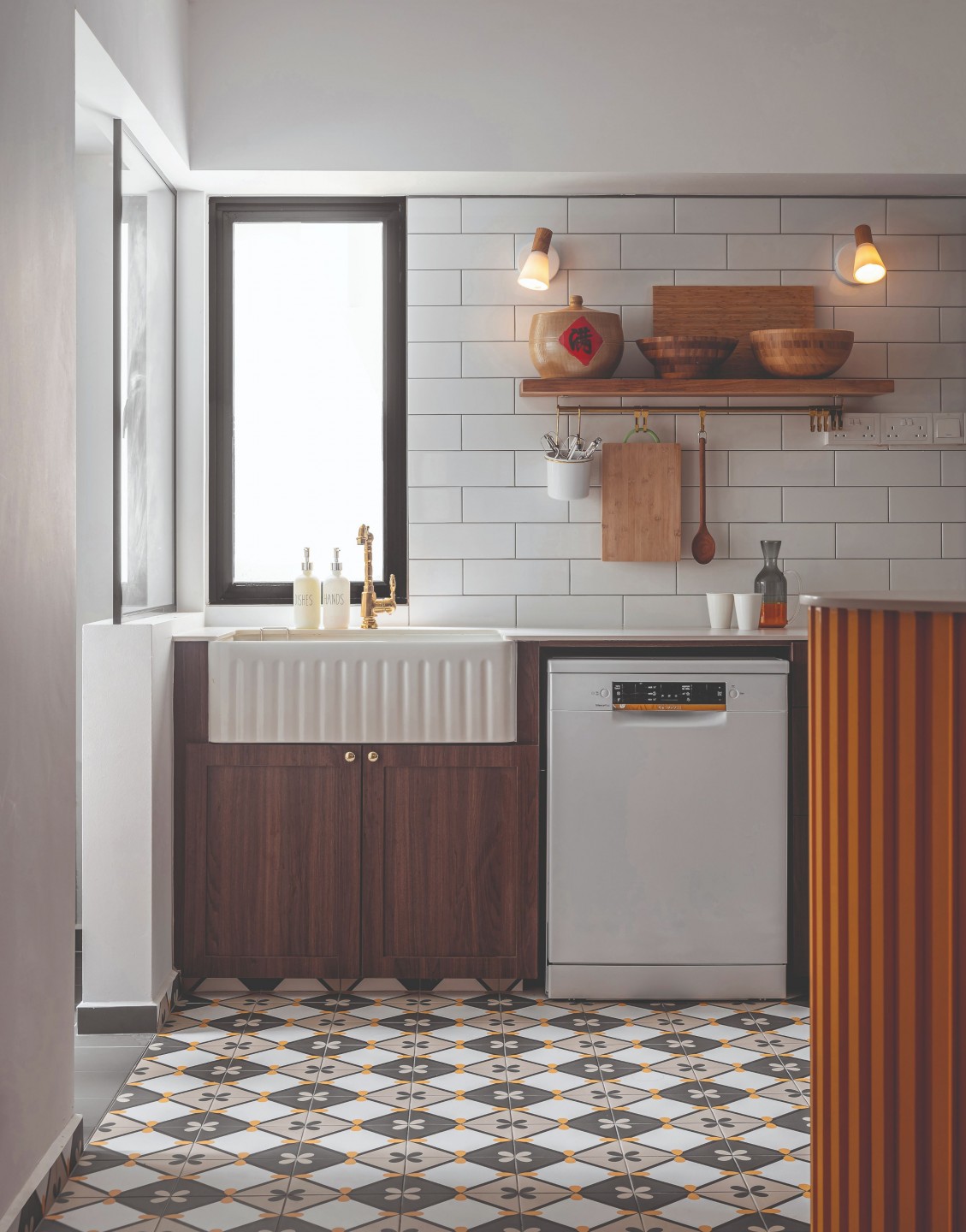
The compact, open-concept kitchen boasts an eclectic theme that lends traditional styles a modern twist. While the farmhouse sink and classic white subway tiles evoke a quaint farmhouse flair, the apricot peninsula makes a definitively contemporary statement in the kitchen.
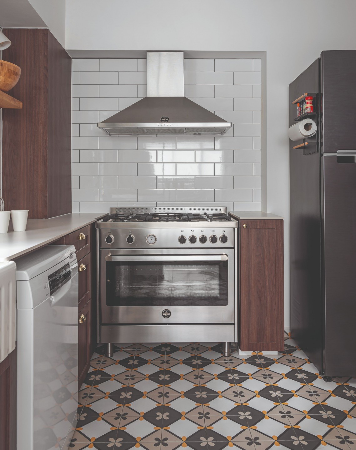
“The inclusion of the peninsula was a deliberate design decision to create a showstopping feature,” says Ivonne. “The cheery apricot juxtaposes yet complements the grainy walnut cabinetry, enlivening not just the kitchen but the entire communal space.”
Private spaces with personality
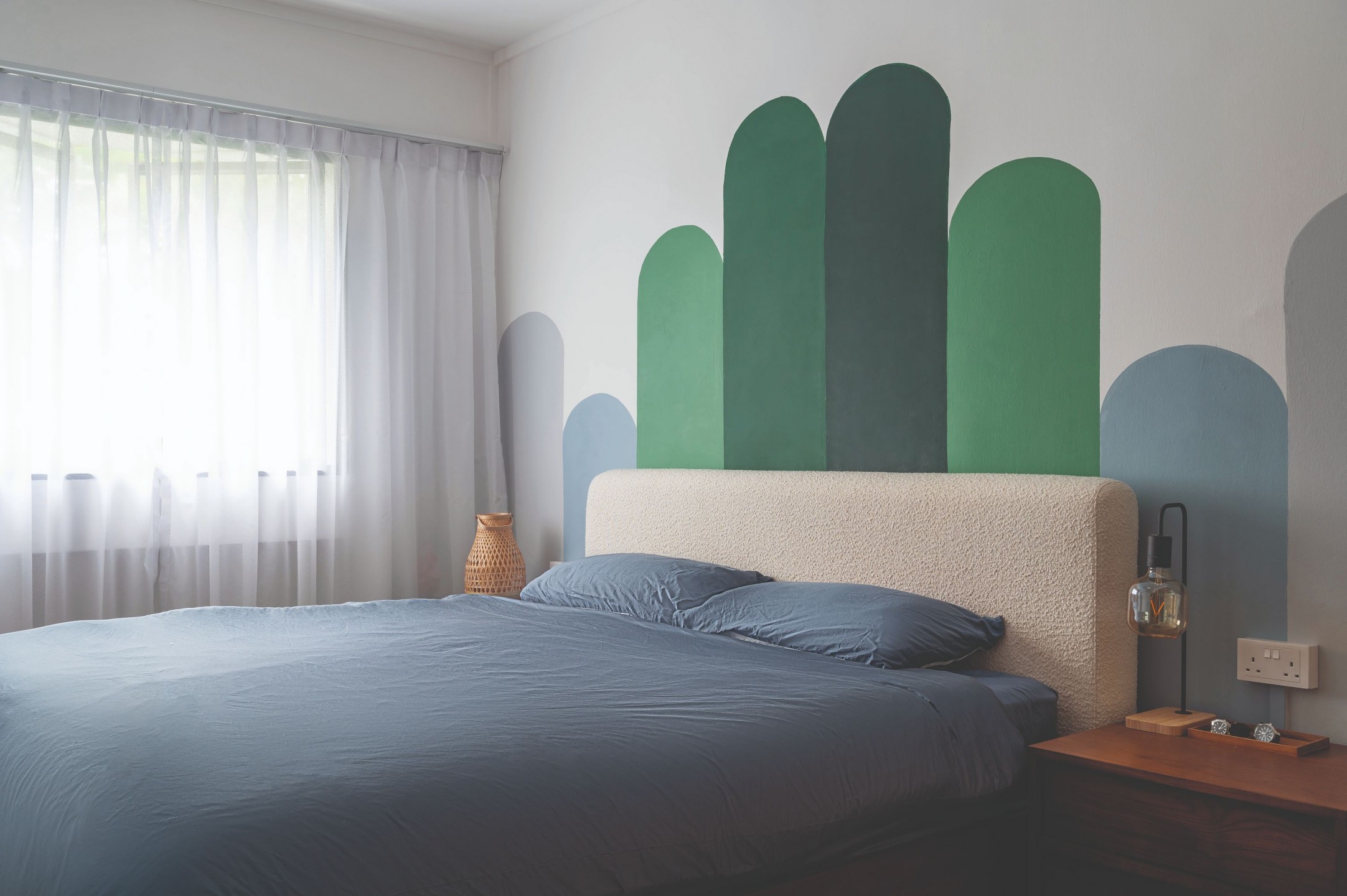
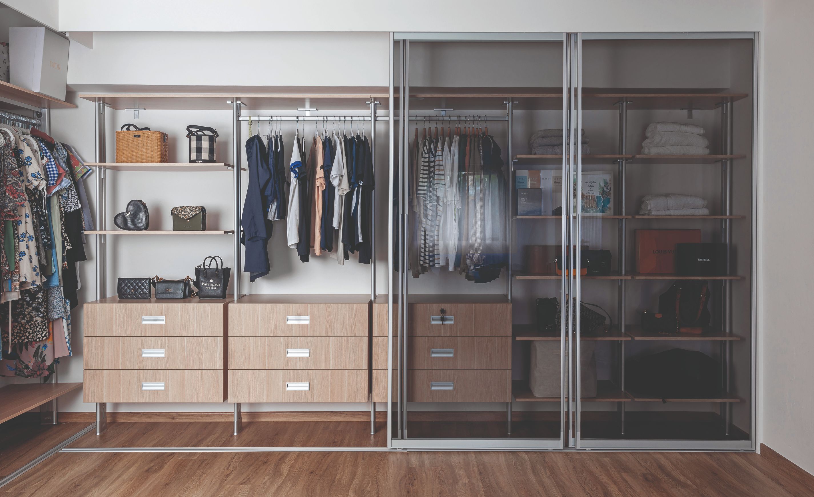
This approach of harmoniously complementing the colour scheme yet providing a dash of contrast extends to the private spaces of the home, such as the primary bedroom and bathroom.
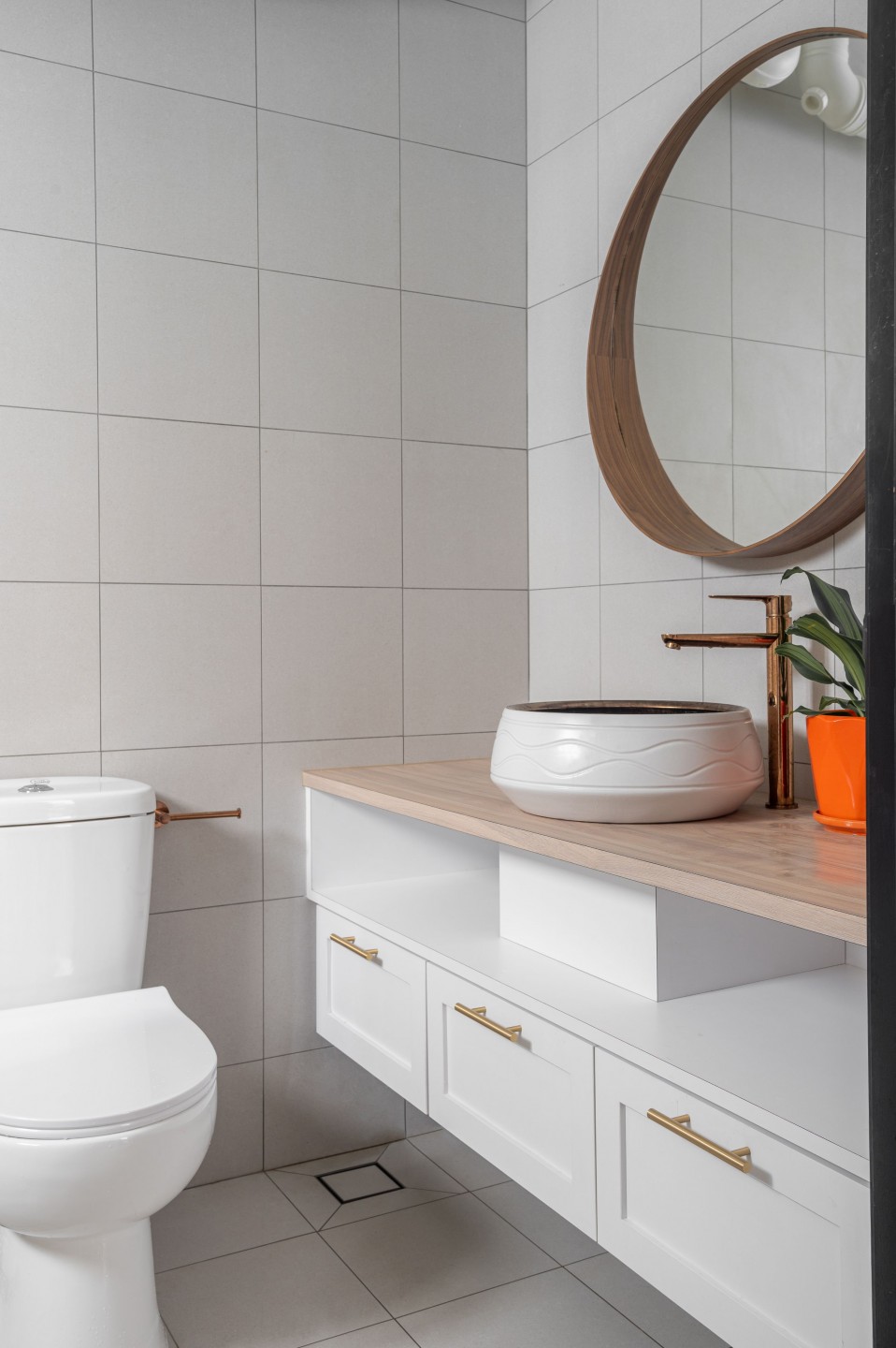
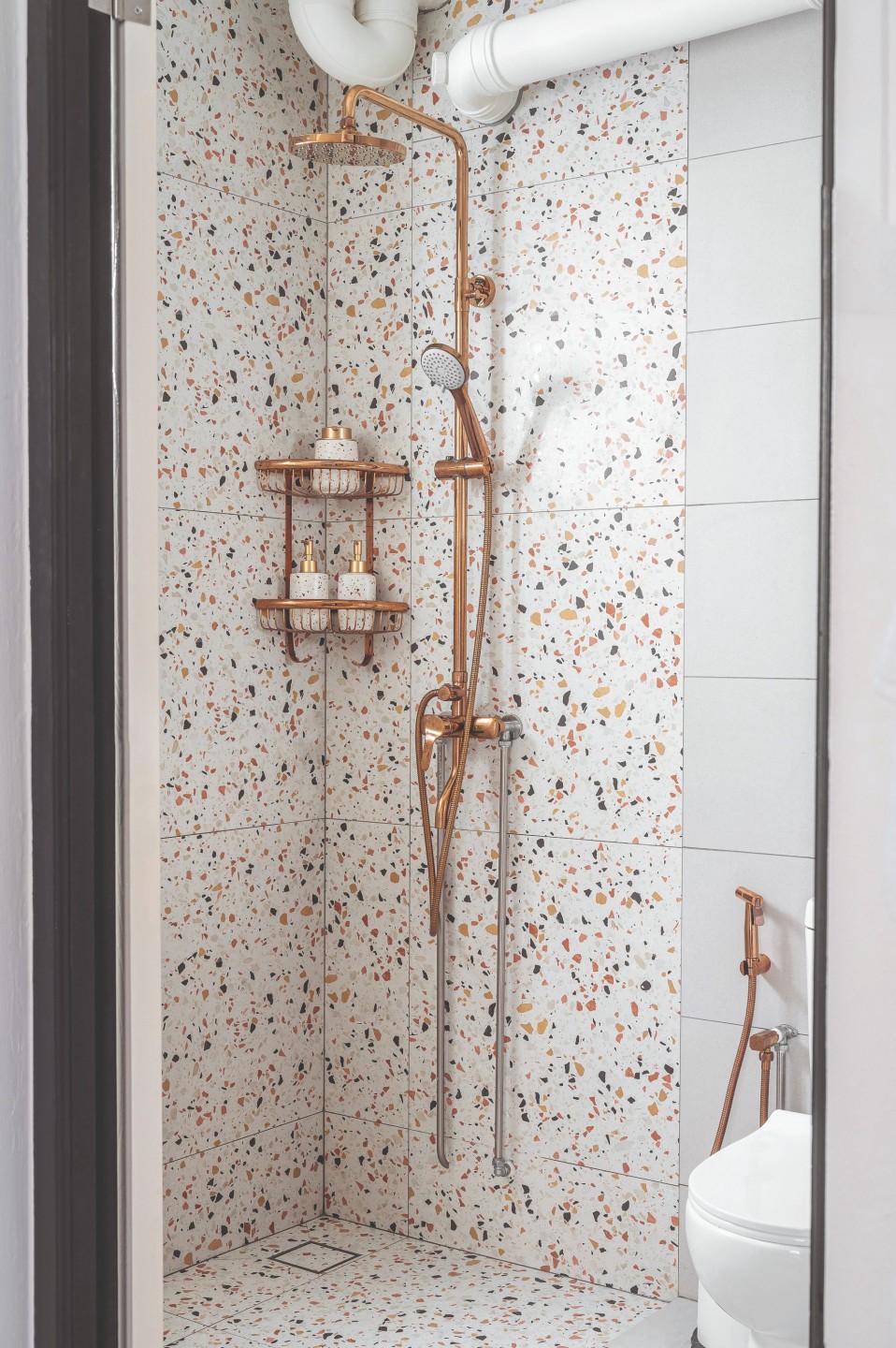
A colourful custom mural dresses up the bedside wall, adding visual interest without overstimulating the senses by keeping the palette cool, ensuring a relaxing ambience for rest. The primary bathroom indulges the owners’ penchant for terrazzo, the shower walls lined with pretty terrazzo tiles.
Admittedly a challenge for the design team when initially presented with the brief, the colour palette is now clearly the heart of the home, the key ingredient determining its overall atmosphere.


