Influencer Melissa C. Koh’s new family home was transformed into a serene and welcoming space that fosters connections with loved ones.
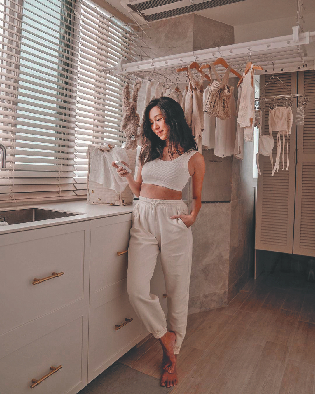
With young kids and expanding work-from- home responsibilities, influencer Melissa Celestine Koh and her husband, James Chen, felt they had outgrown the two-bedroom space they lived in as newlyweds and were ready to move somewhere bigger. They landed on this centrally located condo, situated close to family and in an area James grew up in.
Given that the pair run a busy household, having a clean, inspiring space was of utmost priority. Their house also needed to be inviting, as being able to connect with friends and family on a deeper level mattered greatly to the duo.
Tidplus Design was brought on board for the renovation, but with a clear idea of what they wanted, Melissa and James took on a more collaborative role, sharing mood boards for each area of the home to clear up any style misconceptions. Ahead, the couple shares more about their vision.
SquareRooms: How did you come up with the look for the house?
Melissa and James: We wanted a more luxurious and elevated look for our home. We drew a lot of inspiration from our travels but largely leaned towards more neutral colours and natural wood tones as these are really calming to us.
What were the biggest challenges with this project?
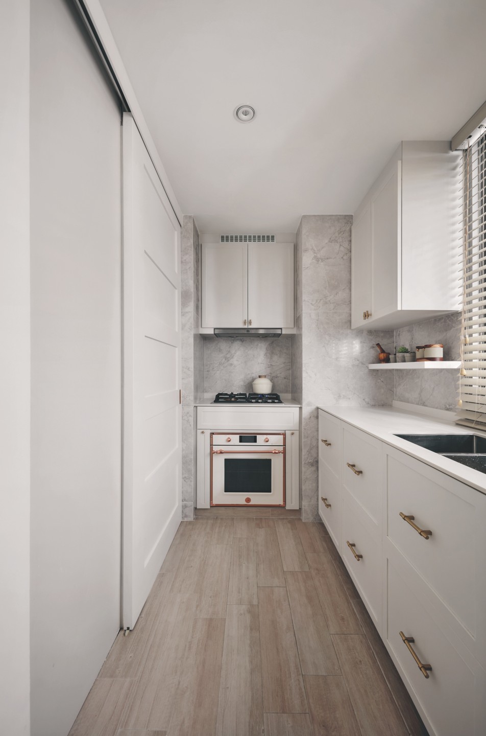
Storage and space planning were two things we had to put more thought into. The kitchen was also a challenge due to space limitations but we managed to overcome it with the help of our ID. The timeline was an issue as this project took place during the pandemic.
However, we learned to let go and trust the process, so trying to finish it within a certain timeframe wasn’t our biggest consideration.
How was the furniture chosen?
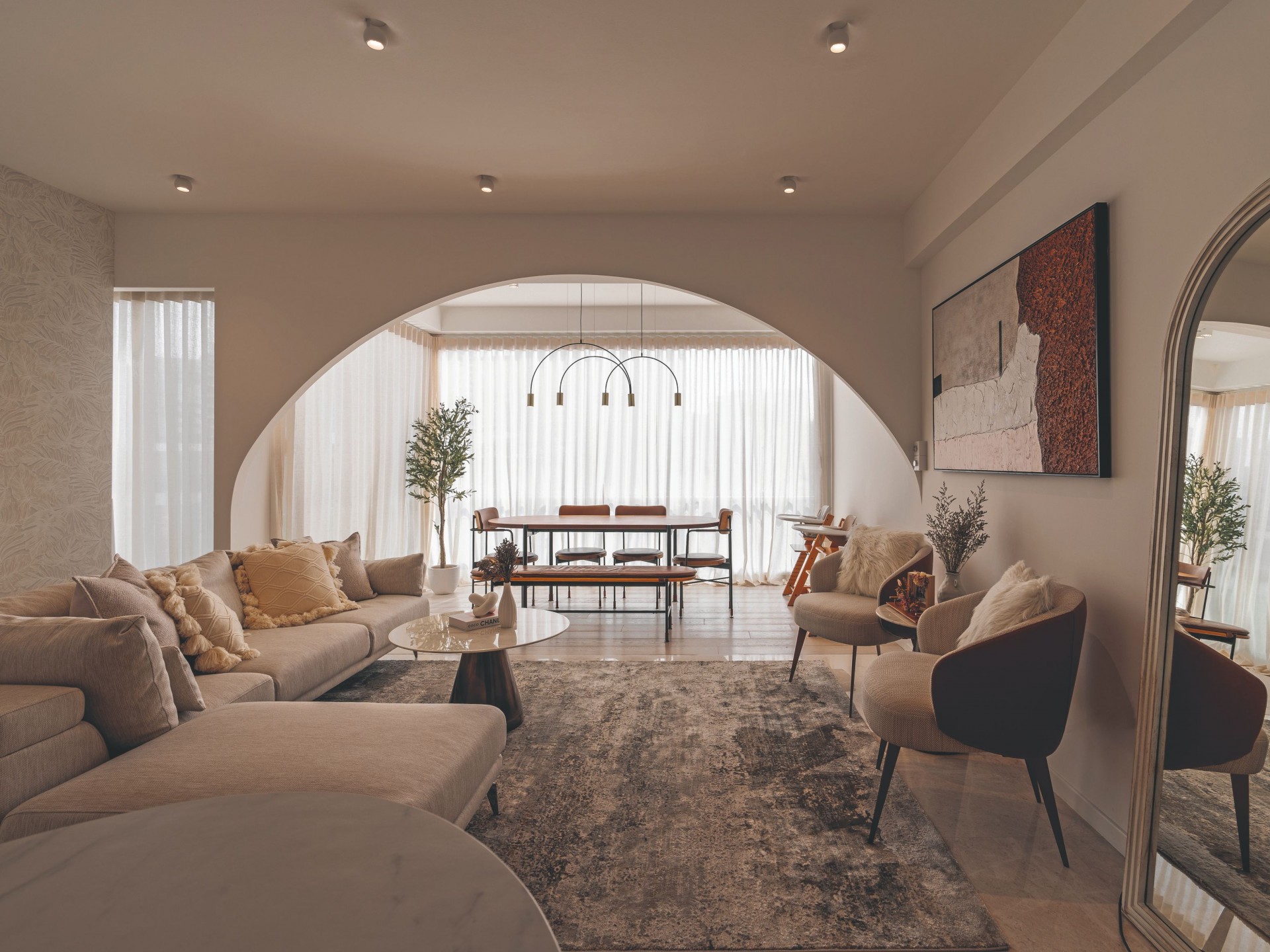
It might sound obvious, but the choice of furniture was driven by our needs and likes. We love hosting and having friends over, which meant that we needed a sizeable couch and armchairs in the living room for everyone to gather.
Mel loves styling and changing things up so a large shelf for our mementoes and styling pieces, as well as small plants, was also a must.
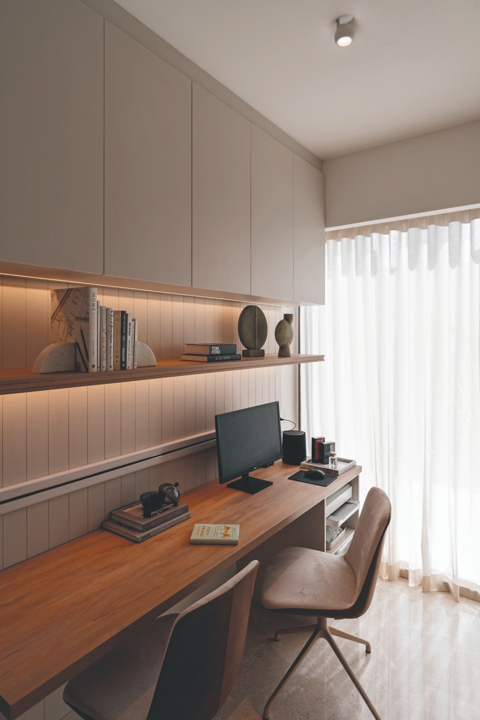
We wanted more storage space, so we looked for a bed with a storage compartment. We also wanted office chairs that were slim yet comfortable given that our work area is relatively small. Of course, the furniture needed to fit our aesthetic too.
Can you tell us about the lighting?
Our lights are from Sol Luminaire. Their lighting is designed to set the right ambience and optimally illuminate the different features of a home, from the wall art to the various rooms and corners.
The lights also have a dim-to-warm feature, which gives us the ability to lend the home a softer, warmer and cosier vibe.
Our smart home system from Home-A-Genius allows us to group lights together and automate them, so we can set specific moods. For example, we can adjust all the lights in our living room and turn on the air conditioning for movie nights with just one command.

Which is your favourite room?
James really enjoys the living room because that is the first sight that greets us when we enter the house. It’s spacious and it’s a place where we gather often with friends and family.
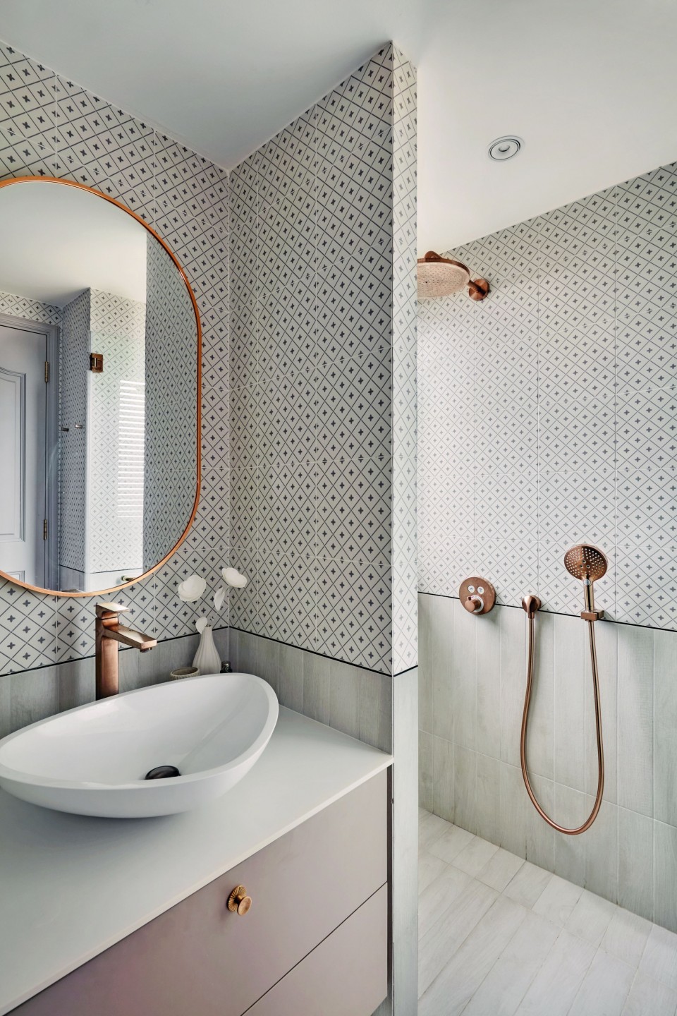
Mel’s favourite room is the main bathroom, as that is where she gets a lot of her personal space and time. We invested a lot in high-quality bathroom fittings and accessories from hansgrohe so she really values her showers and baths.
Entertaining meets privacy
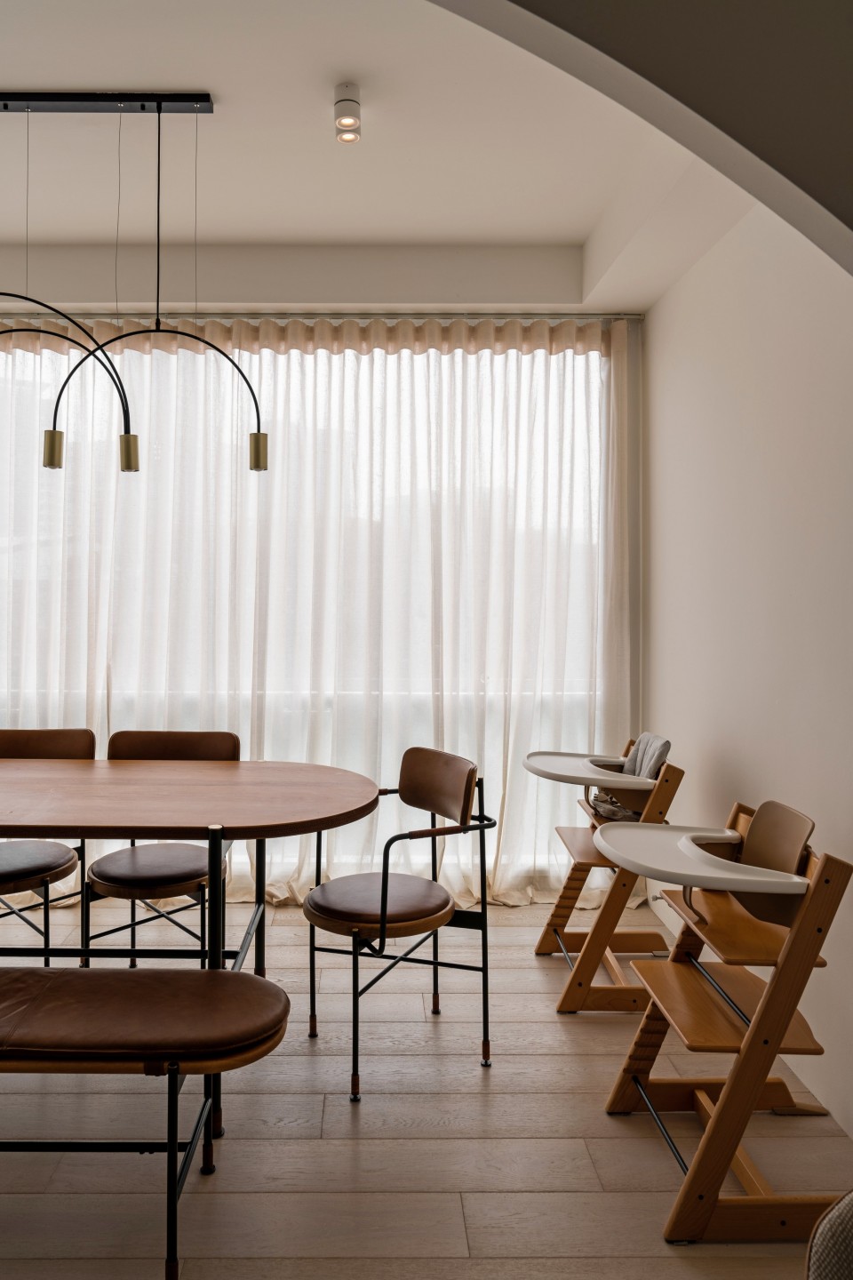
The balcony is an instant highlight as one enters the home, subsumed into the main living space and now used as a bright and cosy dining nook. As this spot was previously a step down from the interior zones, the floor was overlaid with engineered wood to make it level with the living room.
Glass panels that can be opened or closed were also installed, allowing the family to use this area as an expanded indoor space or to enjoy alfresco dining.
One of the couple’s beloved features in the home is the arch between the dining and living zones. “It adds an extra dimension to our living space and segregates the living from the dining area,” they explain.
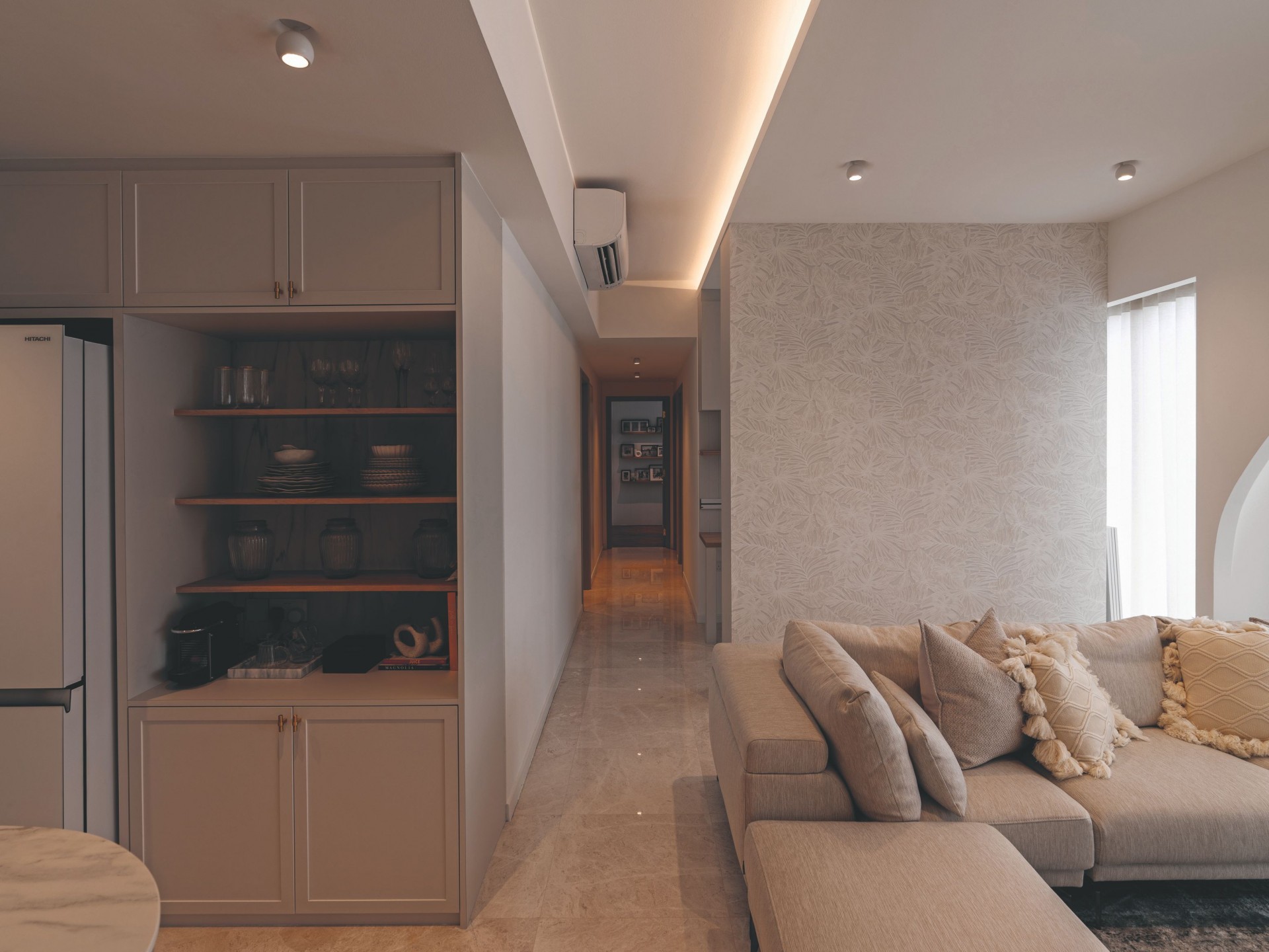
Given that the balcony was merged with the living room, part of the capacious communal space was transformed into a tranquil working zone. A partition wall was put up and fitted with cabinetry, creating plenty of storage space for files, office supplies, shoot props and equipment.
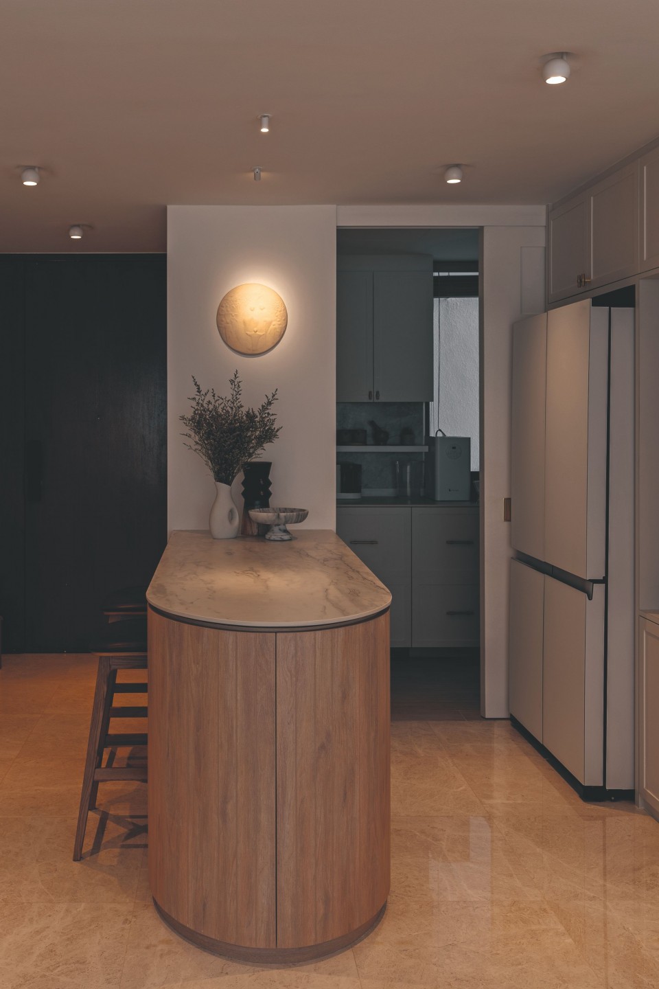
While the wet kitchen is tucked behind a sliding door to minimise messes and smells, the dry kitchen offers a comfortable and convenient spot to enjoy drinks, grab a snack and chat.
Sol Luminaire’s Voli Gypsum Long downlights are dotted throughout the open plan, adding a sculptural and kooky touch.
Sanctuary of rest
The ceiling and several walls of the bedroom were clad in a clay finish, evoking a cosy, cave-like atmosphere. This is accented by Sol Luminaire’s Voli Gypsum Long downlights and Blok V2 spotlights above the bay window, as well as a sideboard from Castlery facing the bed.
Storage was a major consideration for this family as they wanted to be as space-efficient as possible while reducing stress and maintenance. “Our king-sized bed can be lifted open to reveal more storage,” shares Melissa. “We keep all our winter wear in there.”
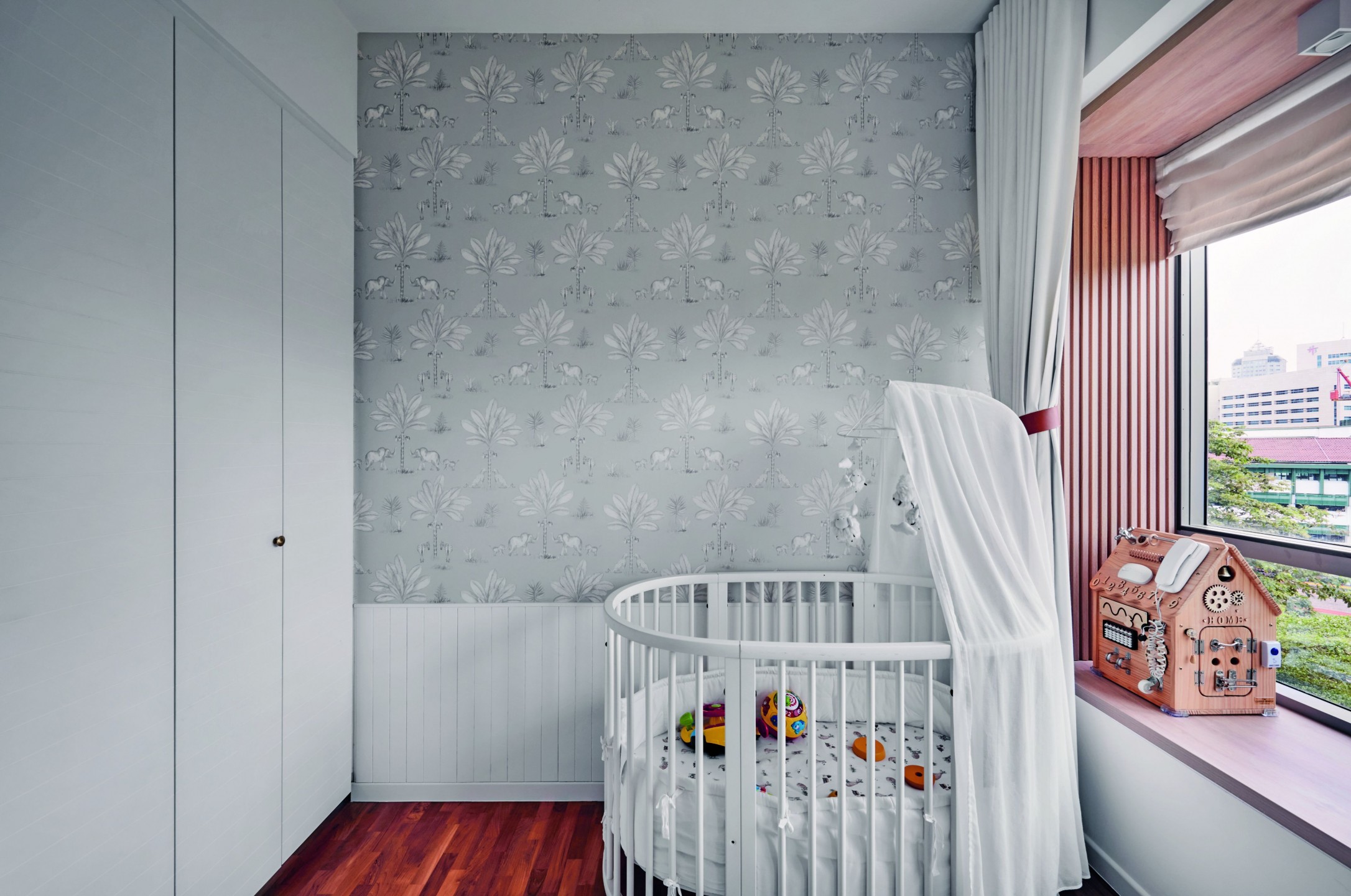
Next door, the children’s room has been furnished with simple and versatile pieces that can grow with the little ones, such as a Stokke Crib from Mothercare that can be turned into a child’s bed and an armchair with a timeless design. The wallpaper is from Goodrich Global.
Mum’s indulgences
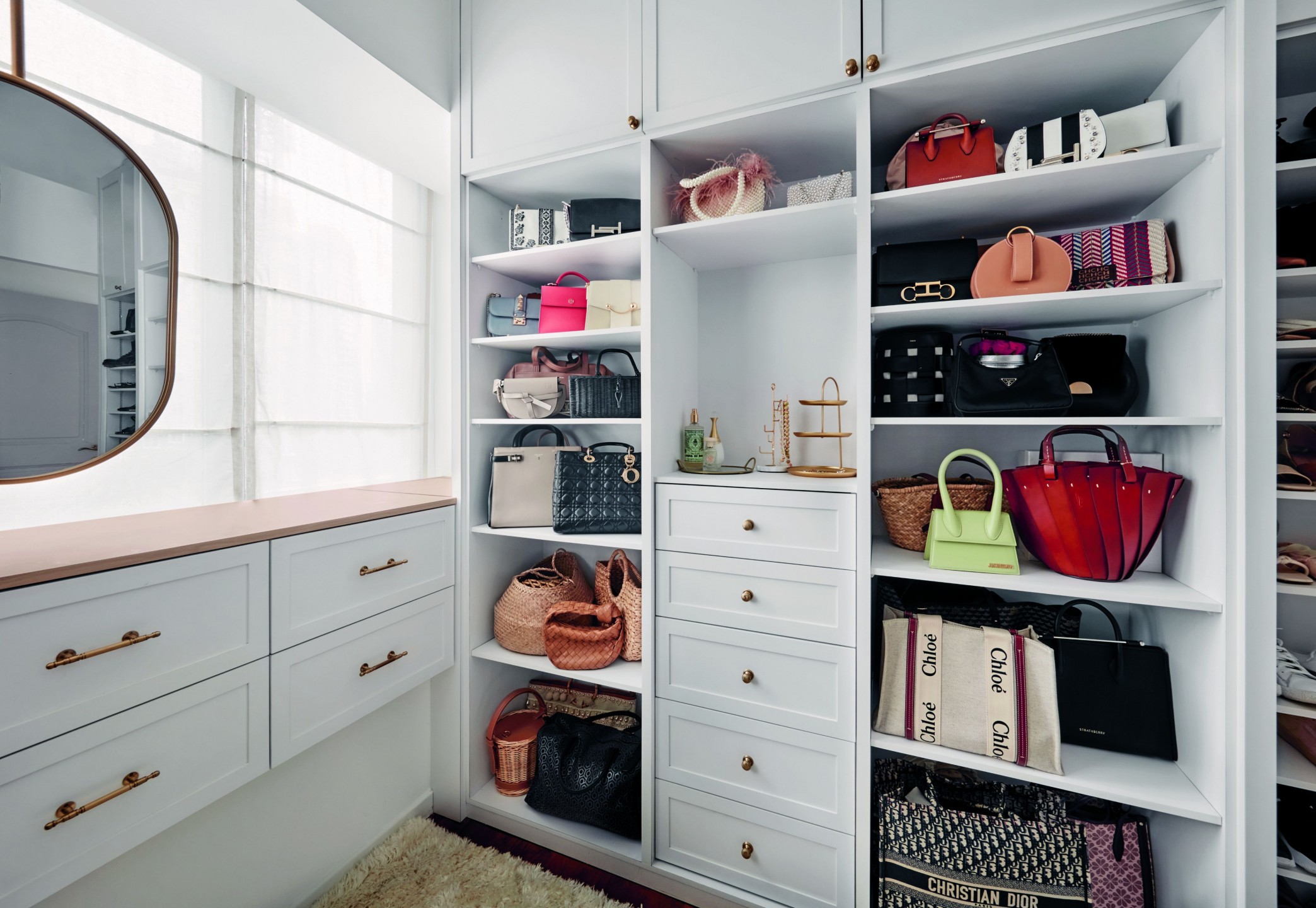
While this space is often overlooked, Melissa also took great care to design a space-savvy walk-in wardrobe. “My walk-in closet’s cabinetry is floor- to-ceiling. We built six drawers on top of the bay window that I use to house my skin and hair care products, accessories and makeup. This also doubles up as a dresser for me,” she reveals.
Moving on to the en-suite bathroom, she requested a double sink and a large bathtub, so the bathroom had to be extended and reconfigured. As Melissa highly values her showers and baths, the couple splurged on high-quality fittings and fixtures from hansgrohe to elevate the experience.
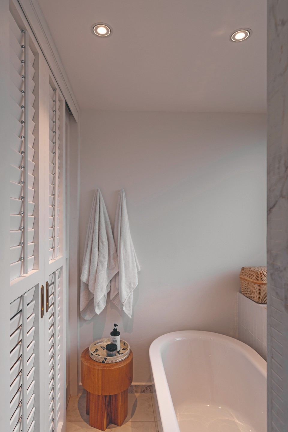
The common bathroom got a similar luxe refresh, with glints of gold and subtly patterned tiles that add flair to the neutral palette.


