From a custom-designed dog bath to non-slip flooring, here’s how a couple turned a one-story penthouse into a playground for their toddler and two dogs.
Good things come to those who wait. Take it from Jayce and Janice, who only recently settled into the home they fell in love with five years ago.
“We saw the layout of this unit during the condo’s launch around five years back,” said Jayce.
“During that time, the penthouse unit was out of our budget, but it still left a deep impression on us. Hence, we feel quite fortunate that this unit was up for sale and that we had the opportunity to make it our home.”
Unique among penthouses, their 2,465 sqft abode spanned a single floor, perfectly suited for the couple, their energetic Rough Collies, and their young daughter.
“The layout is perfect for our dogs to run around the house. Considering that our daughter will start walking soon, we thought it would also be safer compared to having stairs within the house,” he added.
With their sights set on a Hamptons take of the modern farmhouse, the couple enlisted Collette from The Interior Lab, drawn to her previous farmhouse themed projects. But before diving into design, the interior designer had to get a few things out of the way.
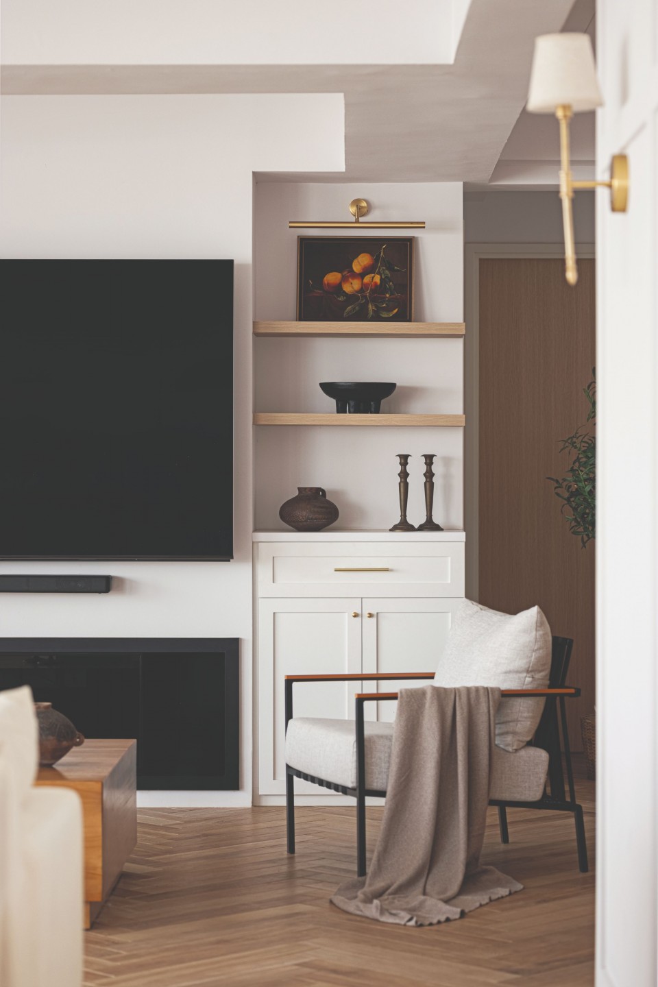
“The space originally spanned two units connected by the living room. Despite being expansive, it felt disjointed and constrained,” Collette described.
“Legally expanding the space to align with the clients’ lifestyle required collaboration with the condominium’s management and professional engineers. After gaining approval for the living room extension, our focus shifted to optimising the communal area.”
Puppy paradise
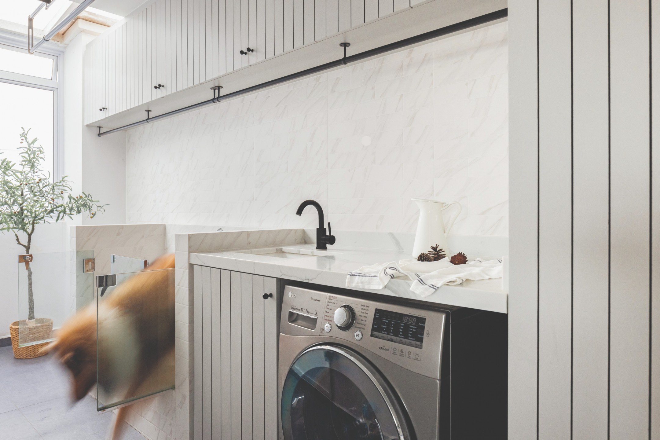
Collette’s redesign notably improved flow, starting with a service yard turned mudroom. In a traditional farmhouse, a mudroom is where one removes their outdoor clothing and soiled shoes before entering the house. But in its modern counterpart, it’s been dedicated to their canine companions.
“The mudroom makes it convenient for us to shower our dogs and also wash their feet after walks every day before releasing them into the house,” Jayce explained.
Apparently, Colette and the homeowners referenced many designs before deciding on one with both front and back openings, perfect for medium-sized dogs like Robin and Hayley.
“It is an interesting experience to measure the dog’s height and length, and let them try out the step before sealing it off with anti-slip tiles,” Colette adds.
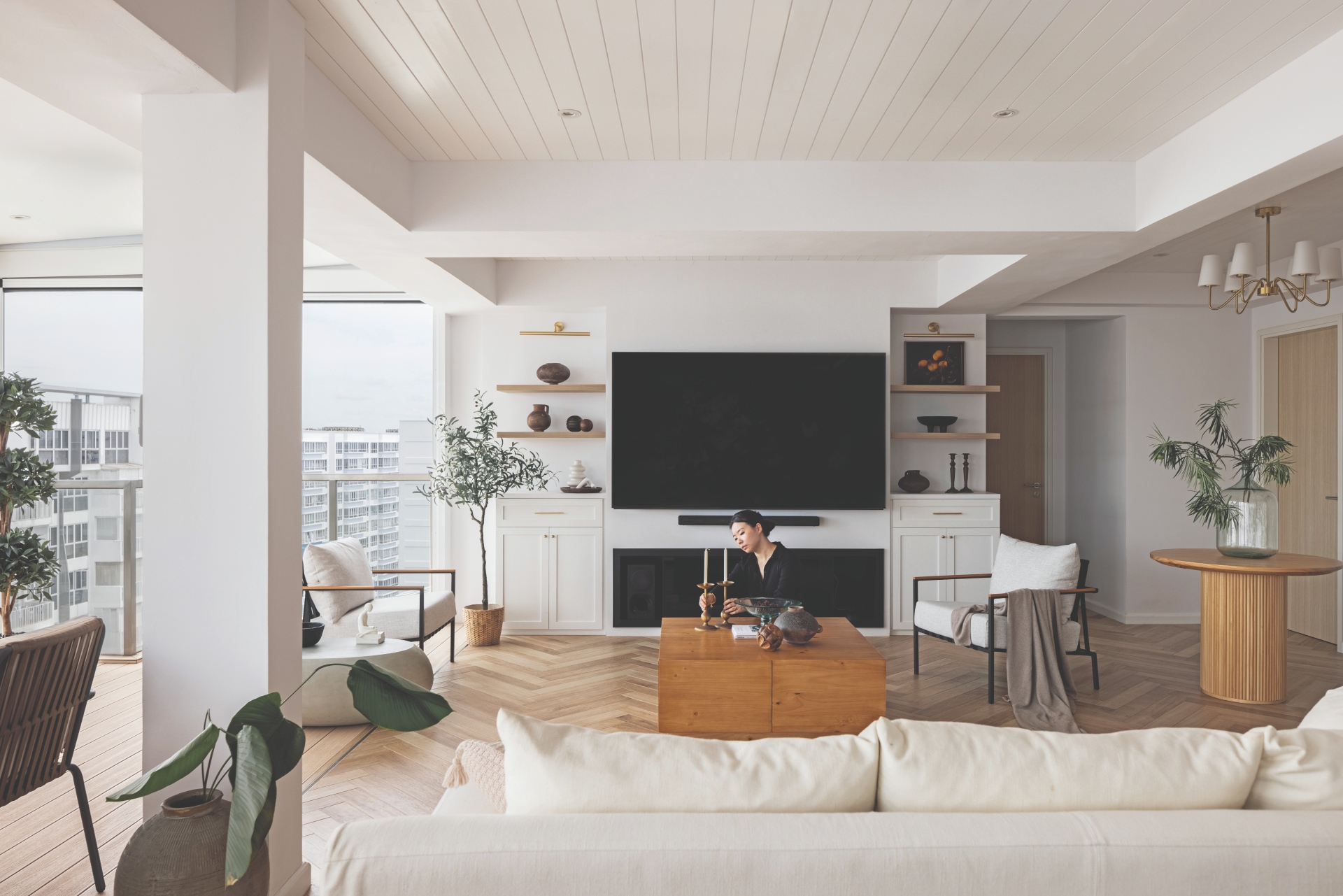
The foyer, adorned with a chandelier, features a round table facilitating seamless navigation through the house. It leads to the sprawling communal area, elevated by a herringbone tile layout – a deliberate departure from vinyl flooring in their first home, which was slippery for the dogs and didn’t bode well for their hips and postures.
“Besides having a high slip ratio, the tiles’ wood- grained texture and herringbone pattern give more traction for our dogs to run and play around the house,” remarked Jayce.
High-rise haven
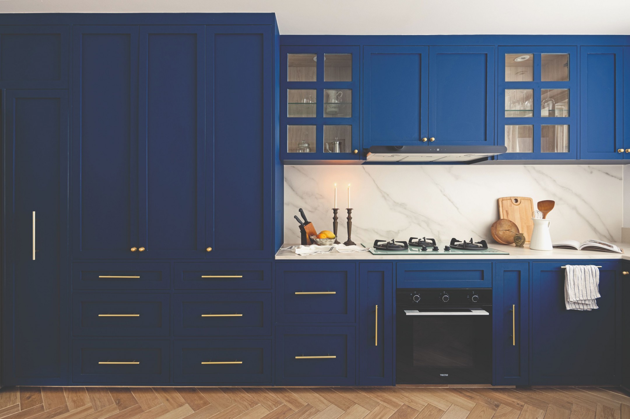
As the top-floor unit faces south, it gets plenty of breeze, making it the perfect spot for relocating the dining area. This turned out to be the “best decision” they had made, as it allowed the homeowners to comfortably host friends and family around a ten- seater dining table.
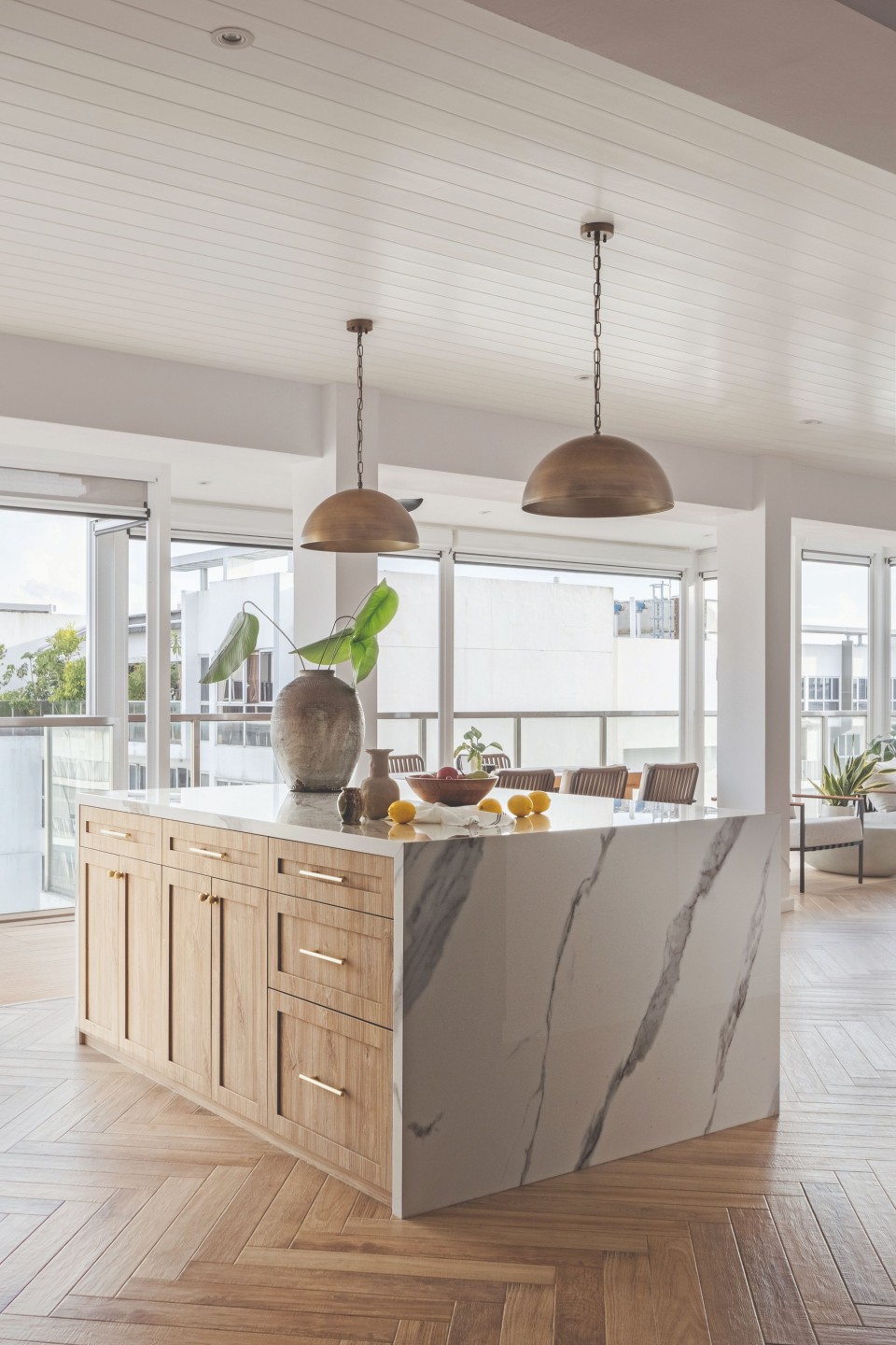
Consequently, the former dining room was converted into a functional dry kitchen with an oversized island, where the homeowners can prepare quick meals without letting the playful ones out of sight.
“We feel connected although we might be in different parts of the house,” Jayce added.
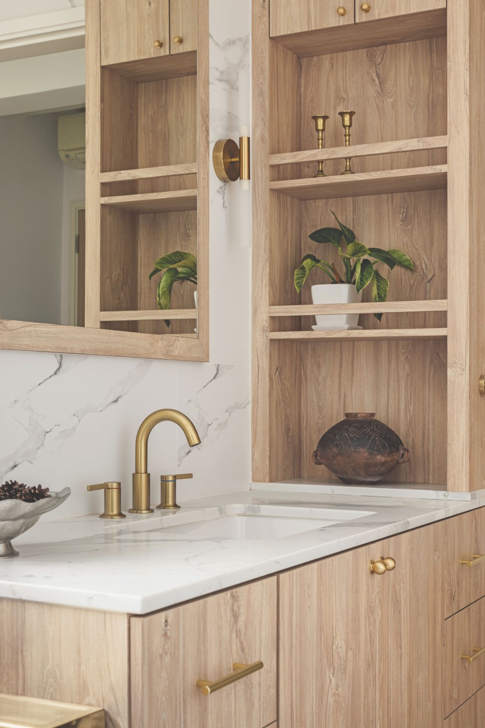
The communal area is the star of the show, but the enclosed spaces haven’t been neglected either. In the wet kitchen, a deep blue laminate evokes seaside vibes, offering a low-maintenance backdrop for the couple’s culinary adventures.
In the master bedroom, an attached balcony had its walls removed, enabling Colette to redistribute the space within so it appeared more balanced. To work around the lanky layout of the master bathroom and its scarcity of storage space, she designed a waterproof niche on top of the vanity.
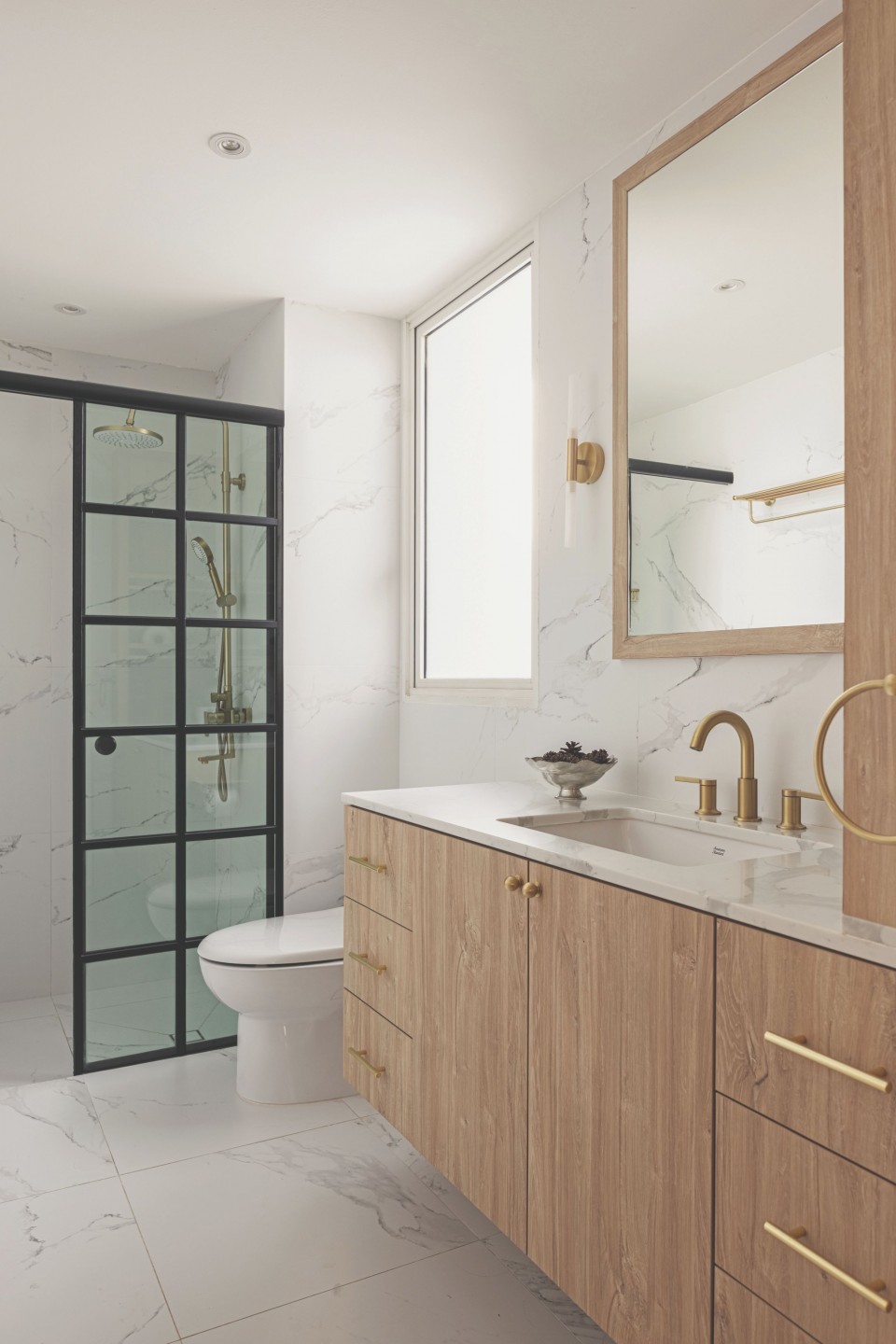
Even though the same marble tile was laid across the bathrooms, Colette was intentional about varying the materials to achieve a different atmosphere in each one.
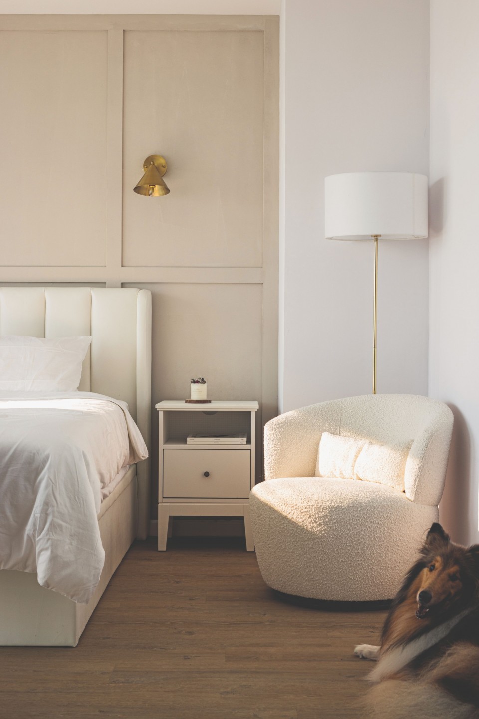
“For the master bathroom, the clients wanted an all-white look with hints of gold and wood to ‘enlarge’ the space. The guest bathroom is a change of scenery. With dark wood panels dressing up the wall, it feels a lot moodier and luxurious.”
From the outset, Jayce and Janice emphasised a homely atmosphere rather than a hotel-like environment. Through a stroke of luck in acquiring the unit, the lessons learned from their previous home, and the creative expertise of Colette and her team, their vision has been successfully realised.


