What choices might an interior designer make in their own home? Joshua’s family home in Punggol Northshore offers a glimpse.
Japandi, Industrial, Mid-century modern—these are some of the themes that come up when Joshua, a 32-year-old interior designer at Threehaus Works, chats with his clients. But when it came to designing a home for his family and Joji, a 5-year- old Corgi and Sheltie mix, he drew a blank.
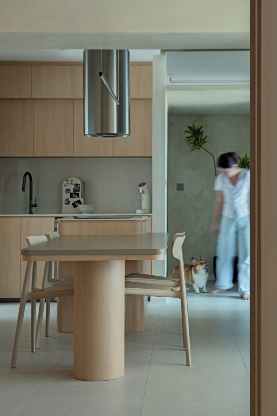
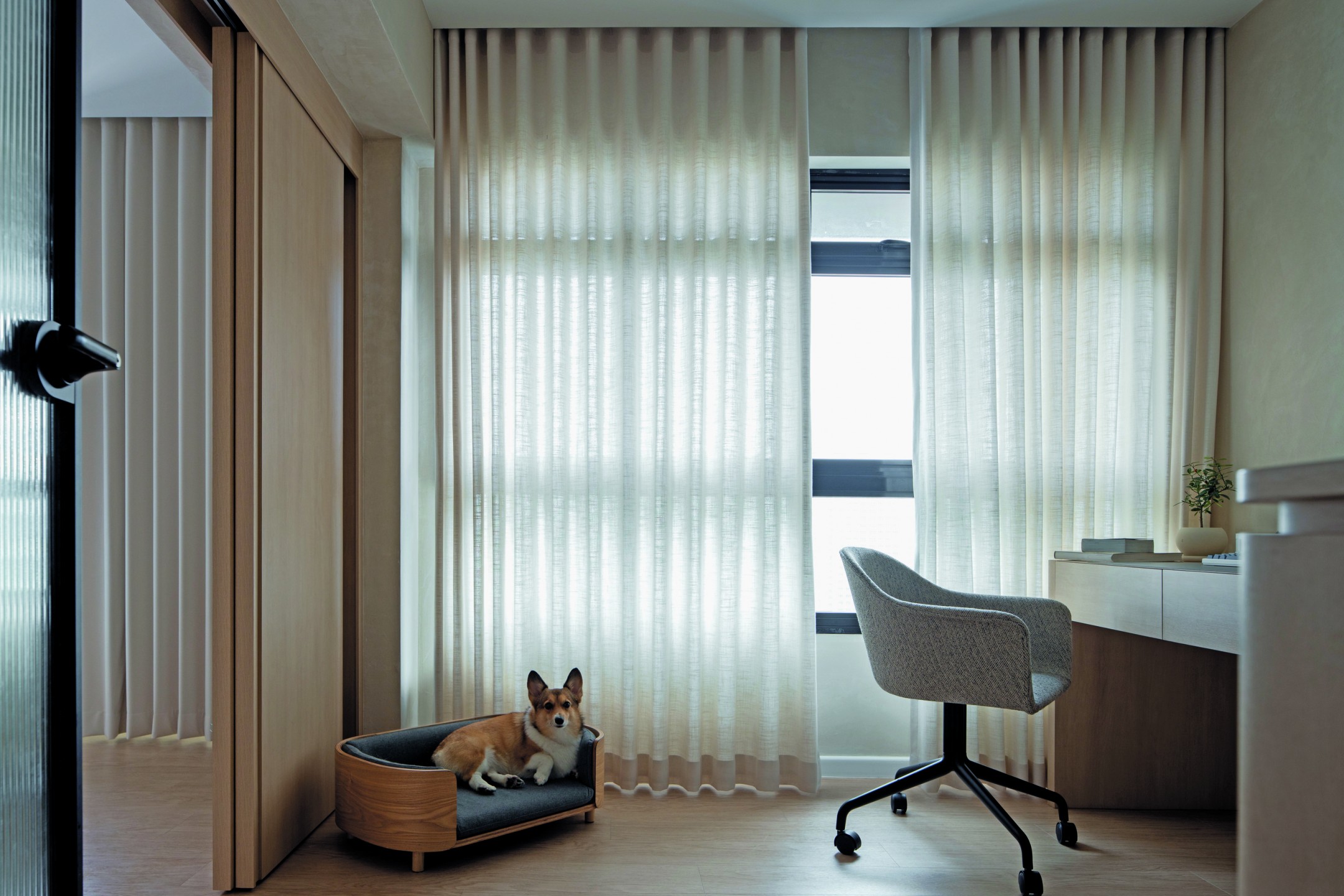
“To be honest, I didn’t have a specific theme in mind. It was more about designing the space around our kids and the dog,” he said.
“It’s very cliche, but we wanted the space to invoke a sense of calm.”
At first glance, you would notice that Joshua had gone big on the carpentry—an expense typically shunned by homeowners who plan to flip their properties after the 5-year Minimum Occupancy Period (MOP) is up. We thought it might have been because Joshua plans to make this house his “forever home,” but that isn’t the case.
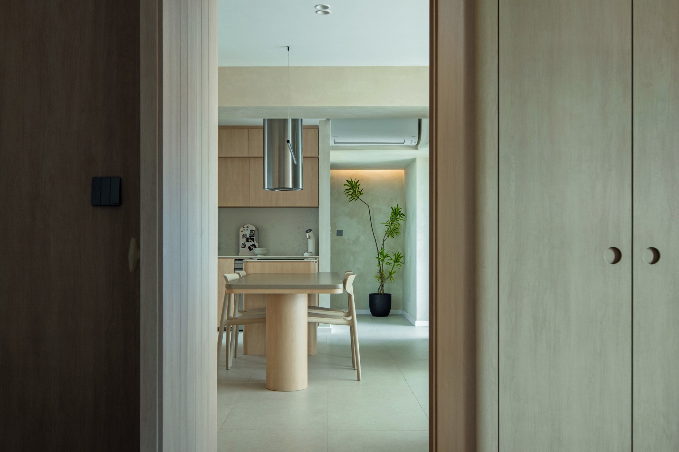
“It’s easy for me to say this because I’m an ID, but even if it’s just five or ten years, it’s about the quality of life. This is where my family and I will spend the majority of our time, so I feel it’s something worth investing in.
If one can spend $100,000 on a car and spend around three hours a day in it, then why not a home?”
As Joji sheds a lot, carpentry also ensures that minimal fur and dander get stuck between loose furniture pieces and the flooring, making the investment worthwhile.
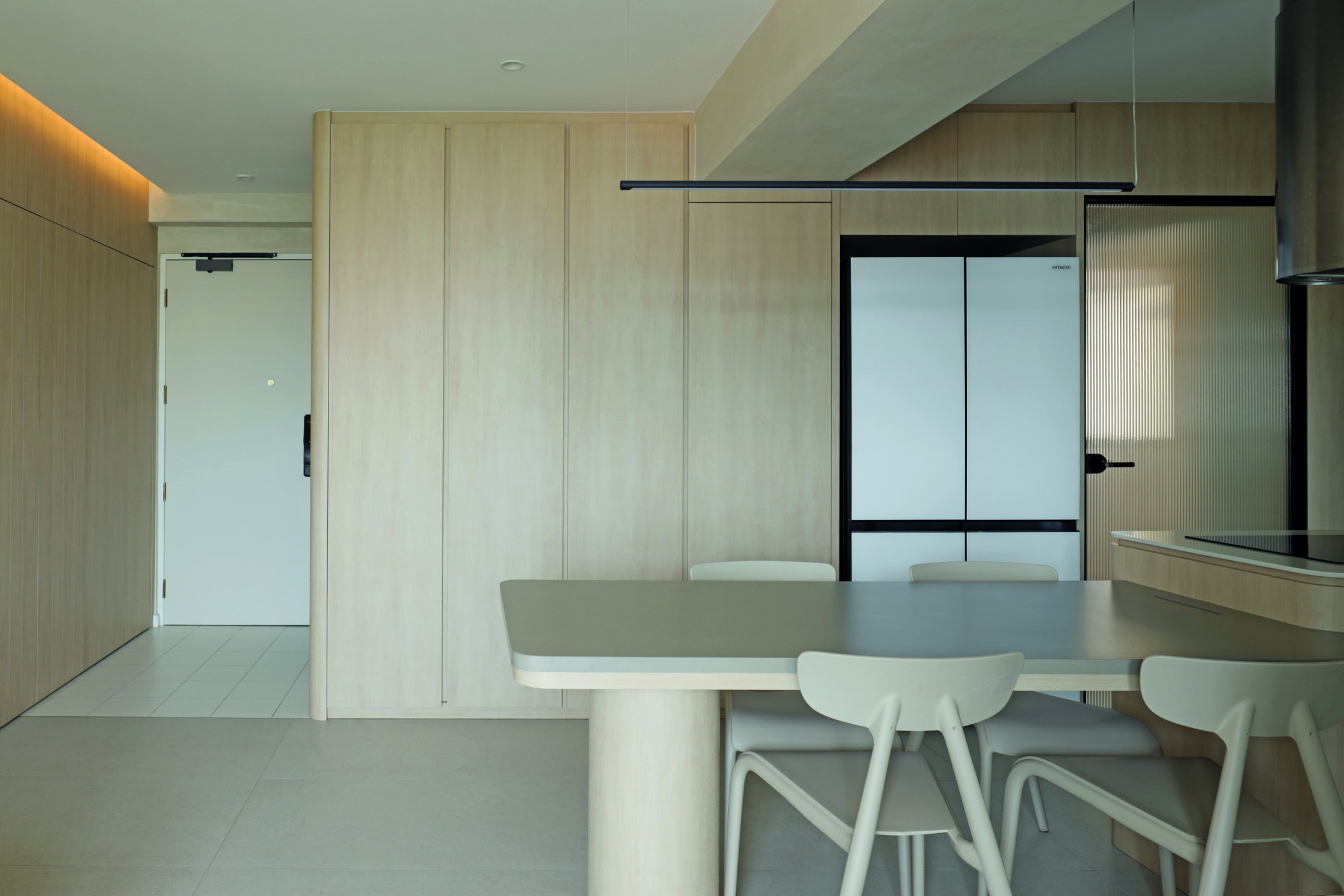
But it isn’t just about costs. For some, doubling down on carpentry may seem unwise when it comes to maximising a 4-room flat—let alone one for a family of four and their furkid. Yet, even with the built-ins, the space maintains a sense of lightness with natural materials, neutral tones, and rounded edges.
“The curves reduce the chances of Joji getting hurt during zoomies or if the kids accidentally bump into things,” Joshua added.
Remarkably, even though the same laminate (Light Loft Birch by Panaplast) features heavily throughout the space, the outcome is anything but dull.
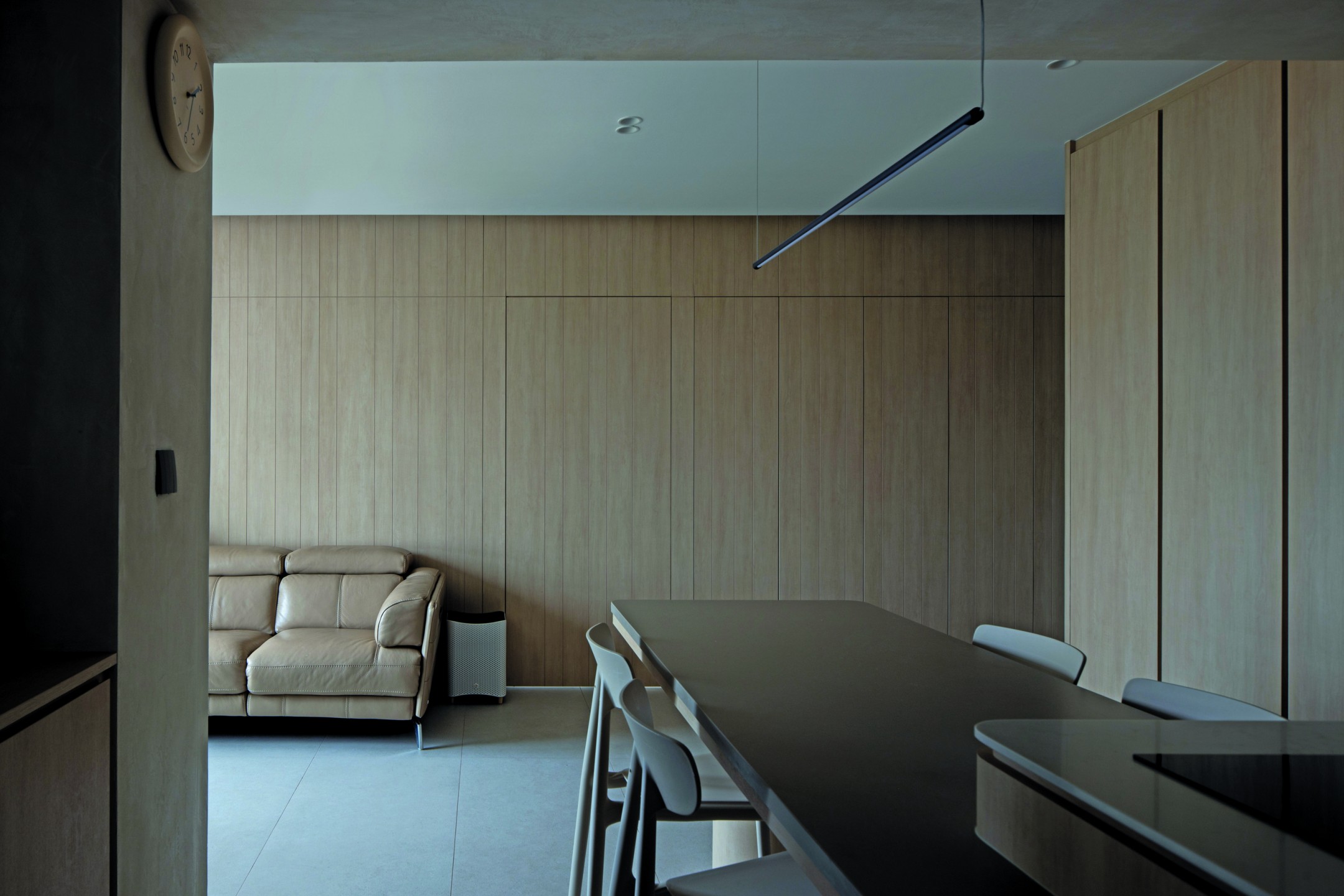
“I think we achieved that thanks to the unique layout. It helps more than people would expect,” he said.
Unlike most 4-room BTO flats, the space featured a dumbbell layout, which sandwiches the living area between two rooms.
“I liked that it was different, and thought it would be fun and challenging to design something with that.”
The first order of business was to introduce textures – a quick fix for elevating any space, he said. In the living room, plain white walls have made way for lime plaster, reflecting the natural light beautifully and making the living area appear larger than it really is.
If you own a pet, you’ll know the hassle that comes with fabric upholstery. This is why Joshua had gone with a leather sofa in the living room and wooden dining chairs around the kitchen island, above which a cylindrical cooking hood hovers.
“We went with one from Teka because it’s plain and simple. I mean, I could’ve gone for any other hood but I wanted something that looks good and performs well,” he explained.
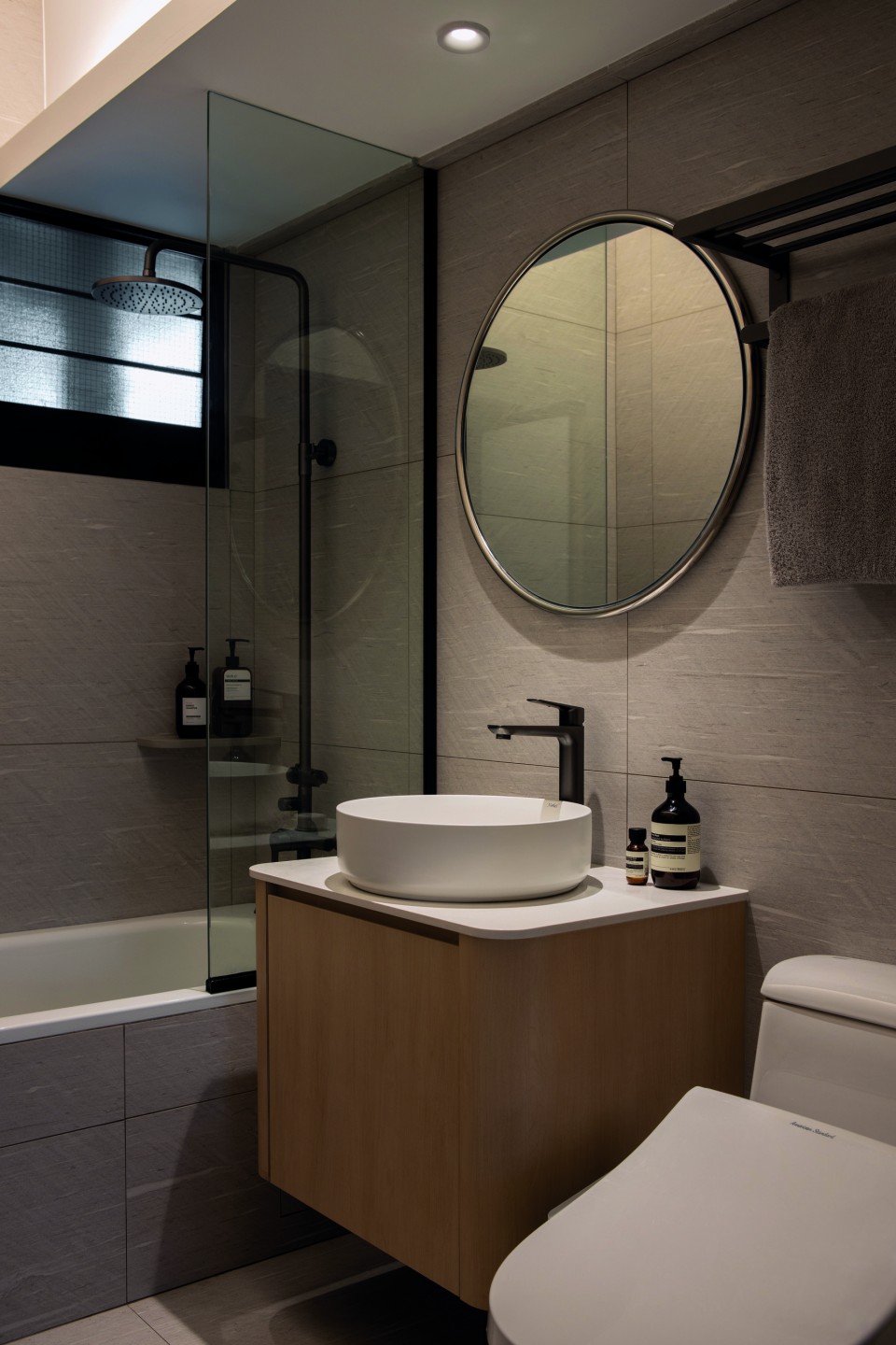
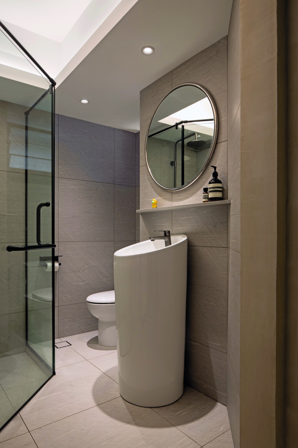
The cylindrical form also finds its place in the common bathroom, where Joshua installed a pedestal sink instead of the usual vanity to free up space. This enabled him to accommodate both wet and dry areas within a tricky layout.
By now, you might be wondering how a household of four conceals their clutter. Their secret? Hacking the wall between the dining area and study rooms.
“I built another wall in its place that ‘ate’ more into the study room so that I could introduce storage on both sides of the wall. And since I was doing up a new wall, I took the opportunity to introduce texture in the form of kit-kat mosaic tiles,” Joshua explained.
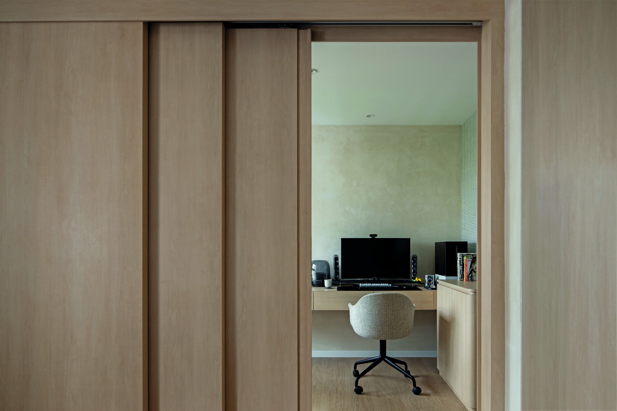
Likewise, the adjacent wall in the study was replaced with a sliding door, providing easy access to the master bedroom and opportunities for interaction. After all, the master bedroom is his wife and kids’ favourite part of the house. (Joji’s is the living and study rooms, for those who are wondering.)
“If I were working and (my wife) were chilling on the bed, we could still feel connected and engage in conversation.”
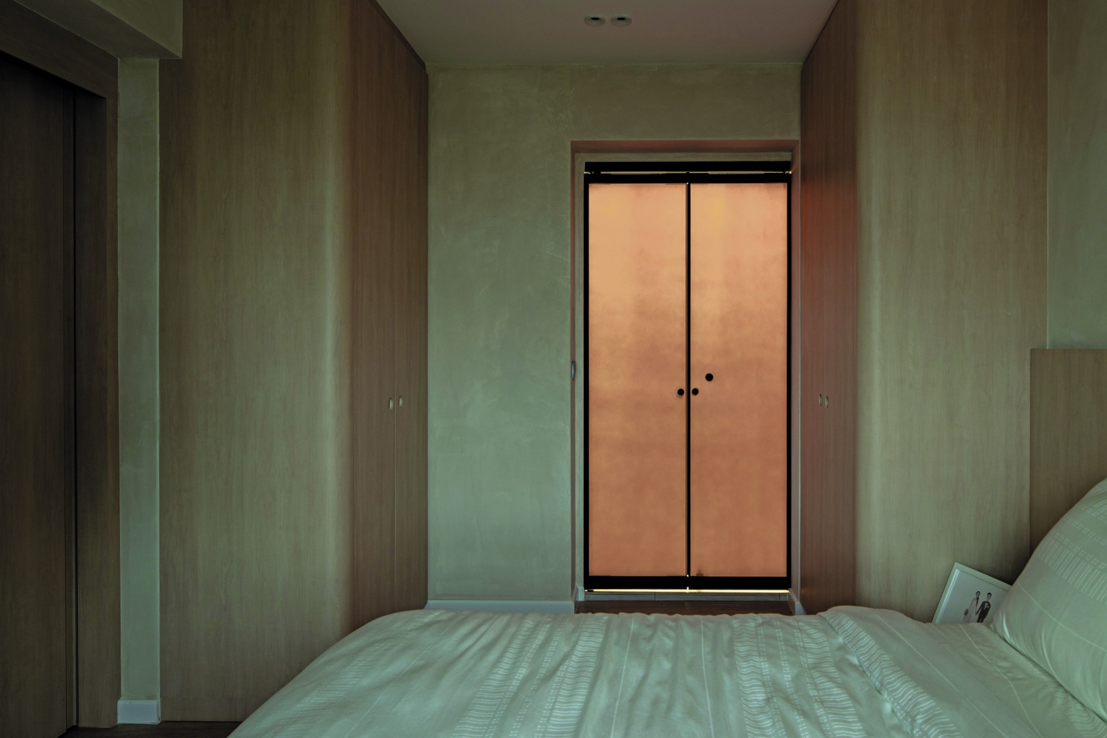
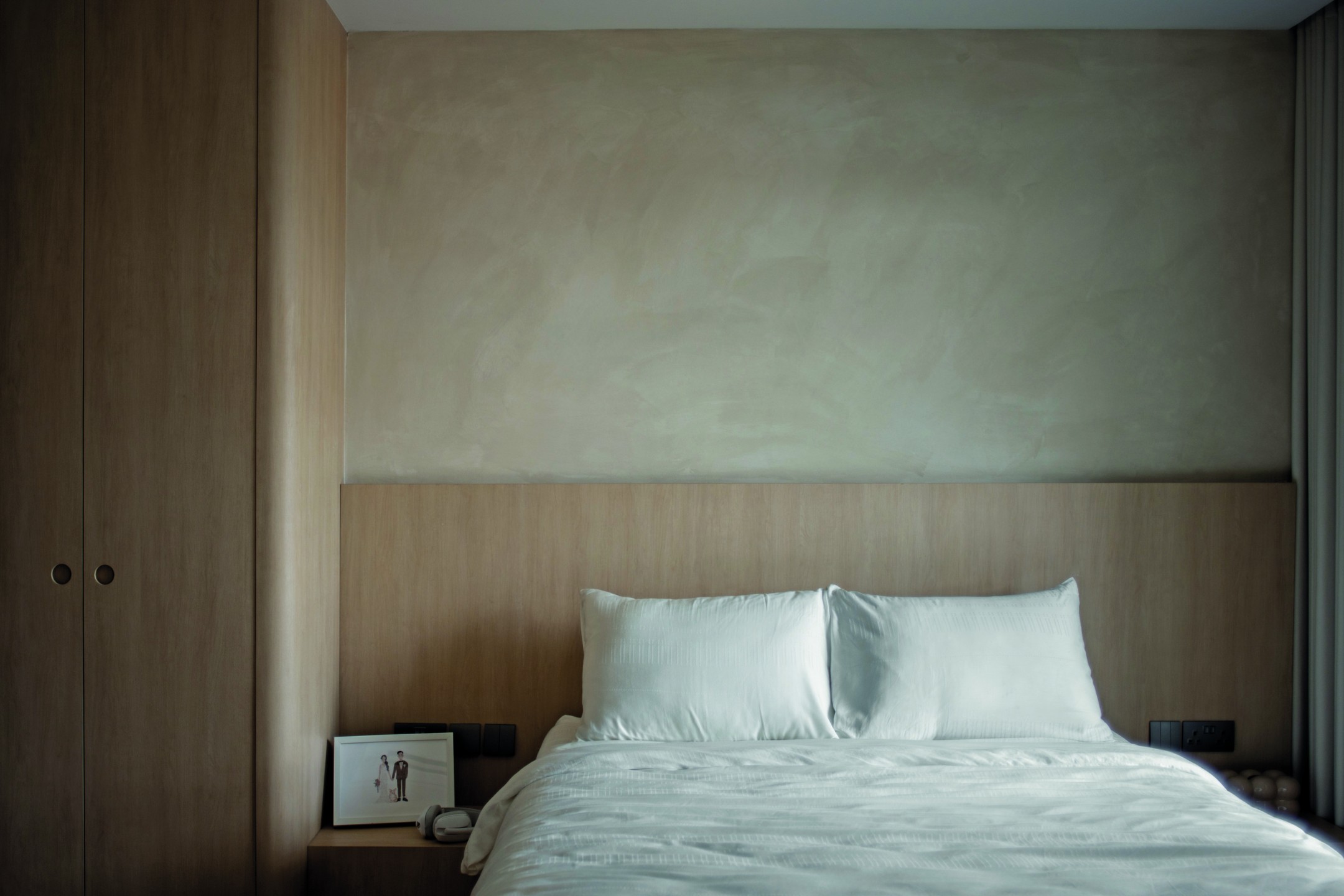
The bed in question is also – surprise surprise – built-in. Whereas some homeowners opt for a loose item to save costs and keep things flexible, Joshua has a different view.
“Contrary to popular belief, fabricating a bed frame doesn’t necessarily cost that much more than getting one off the shelf. And honestly, when it comes to apartment living, there isn’t space to manoeuvre a bed into a whole new position,” he shared.
“Plus, I’m big on ambient light. So I factored LED lighting into the bed head and also the bottom of the bed frame.”
In the master bathroom, a bathtub was the missus’s decree, and her wish was Joshua’s command. Besides, who better than her interior designer husband to make room for one?
“That was a non negotiable, but that being said, I agreed with her. We planned to use it for fun bath times for the kids and Joji, and we have!”
You know what they say: Happy wife, happy life.


