The homeowners’ love of natural materials guided the transformation of this 46-year-old flat.
It can be tough to move into an old home and make it your own – especially one that is 46 years old and has never been renovated before. But the couple who owns this flat was determined to turn it into a space that they were comfortable in and could also change easily in the near future.
“Our three-room HDB flat was built in the 1970s; it needed a renovation as there were cracks in the old terrazzo flooring, carpentry that needed to be overhauled and walls that needed to be plastered over,” they share. “We were set on this home being our forever home and thus it needed a massive reset.”
They worked with Roy Zhuang and Edmund Yap from Insight.Out Studio, giving them the following keywords as a guide – ‘warm’, ‘raw’ and ‘natural materials’.
“We didn’t want a style that was too specific and mainly picked design elements that were to our taste. We avoided picking a particular theme so that we could easily redecorate our home if and when our design preferences change,” they add.
The refreshed look is clear as soon as you walk through the pink front door. The design team chose this unique colour for the home’s entrance because it contrasts with other paint colours in the house. It also blends in with the home’s overall vibe.
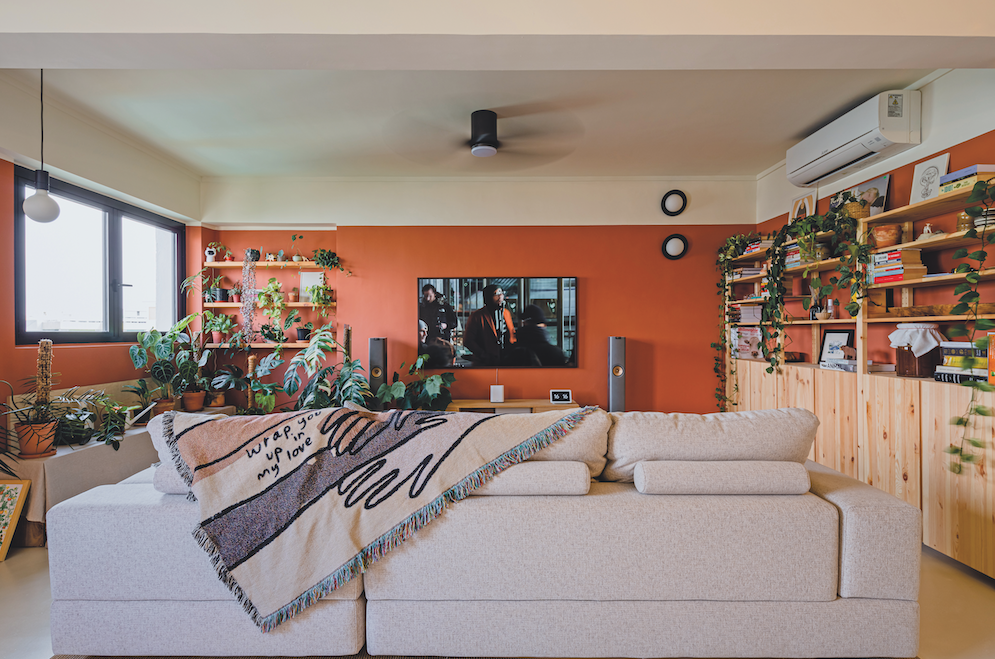
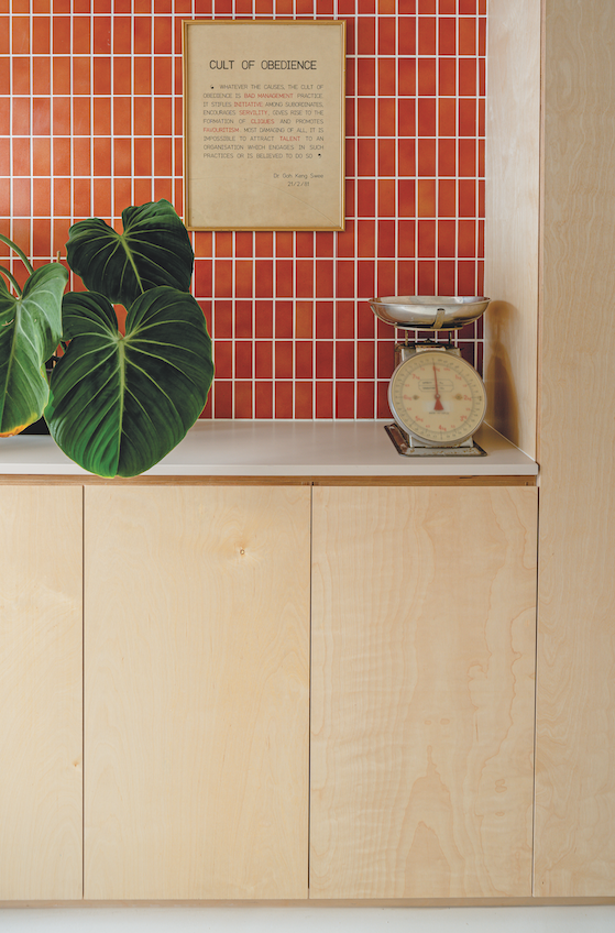
Colour plays a big part in this home’s renovation. The designers adopted the theme of “raw finish with terracotta” as the owners are fans of terracotta. This evidently serves as inspiration, once you see the reddish hue in the living room. The walls painted in this shade add a bright touch to this space. Plus, with only three walls here in this colour, it also clearly marks out this area as separate from the rest of the home.
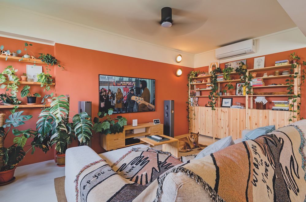
The cosy ambiance is further enhanced with shelves and cabinets which display the couple’s books and knick-knacks. Plants are scattered all around the room too; the homeowners admit they are fans of gardening and “enjoy tending to plants and watching them grow”.
A challenging restoration
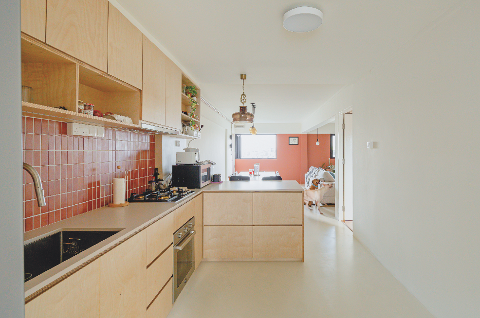
Next to the living room is the kitchen, which the design team choose as the space that went through the best transformation but was also the most challenging. A full overhaul was done here, with new flooring and carpentry. The terracotta theme is seen here too, with the backsplash in the same reddish hue as the living room.
One difficulty here was the material used for the kitchen cabinets. The design team used birchwood to build up the cabinets instead of plywood with laminate, which is typically used. It was chosen because they wanted to show the side profile, where layers of the wood can be seen.
“However, because it is a natural material, we can’t cover any flaws or defects – if any – so we have to make sure where we cut and drill is precise,” they explain.
The kitchen now boasts sleek new appliances as well as counter space for food prep or even having a quick meal, instead of sitting at the dining table next to it. There’s a shelf above the sink for easy dish drying, with more shelves at the kitchen’s entrance too.
At the back of the kitchen sits a storage area with a countertop and cabinets. The gorgeous reddish backsplash is used here too. Next to this cabinetry is the laundry area.
Modernising a mature home
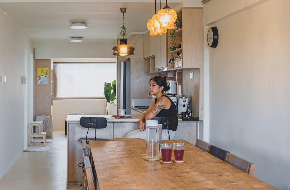
The upgrade here is so impressive that the homeowners pick it as their favourite: “Before this, there was a wall separating the main hall from the kitchen area. We knocked this wall down, evened out the flooring and made it one long, seamless space.
“This helps with cross-ventilation, especially with our windows at the two opposite ends of the home. We really like the spaciousness accentuated by the birch plywood carpentry. The open-space countertops also give us lots of surface area for food prep, as we are both avid cooks,” they add.
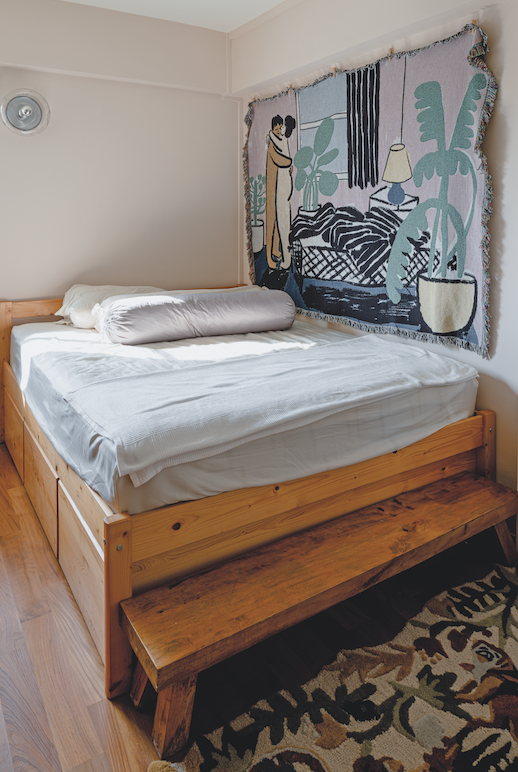
The entire home’s flooring was hacked and replaced. Microcement was laid out in the living room and kitchen, with parquet installed in the bedroom.
Another modern replacement here is the lighting. The design team didn’t want to use typical ceiling lights or false ceiling down lights, so pendant lights and wall lights were fitted throughout the home.
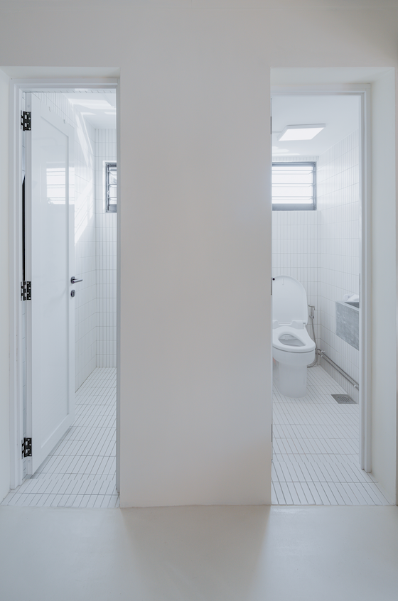
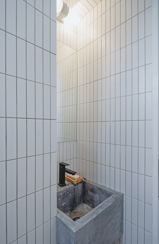
A minimalist design was chosen for the bathrooms, to make them look bigger. White subway tiles adorn the walls, pipes are boxed up to keep things neat and a concrete sink gives the space a unique touch. The sink was the first bathroom accessory chosen, firstly because
of space constraint but also because of the homeowners’ love of nature and raw materials.
This post was adapted from an article originally published in the Idealhomes2024 issue of SquareRooms.


