The brief was “cosy and colourful,” and interior designer Yun Yang nailed it by expertly blending bold colours like pink, green, and terracotta.
Since Rita and her family relocated from Hong Kong to Singapore five years ago, they have been living in their family home. Recently, she and her husband Hansen got a fresh start as they received the keys to a new 5-room HDB flat in Choa Chu Kang.
“When we bought our own place, we were really excited to finally be able to do what we wanted with it. We didn’t really have a specific theme in mind, but I knew that I wanted something cosy,” Rita said.
When the couple first met Yun Yang, their interior designer from Project Guru, she was enthused about incorporating a variety of colours into her new home, perhaps to reflect the liveliness of her two children, aged 7 and 10. For Yun Yang, the freedom to mix and match hues distinguished this project from all his past endeavours.
“It was an interesting project that allowed me to play around with different colours. I carefully selected these colours to complement the overall design and maintain a cohesive look. I’m very happy with the final product,” he said.
A multifunctional feature
To make the foyer feel more inviting and fun, Yun Yang used lighter-coloured wood vinyl flooring laid in a herringbone pattern. This design not only demarcated the entrance but also serves as a transitional area for occupants and guests to remove their shoes.
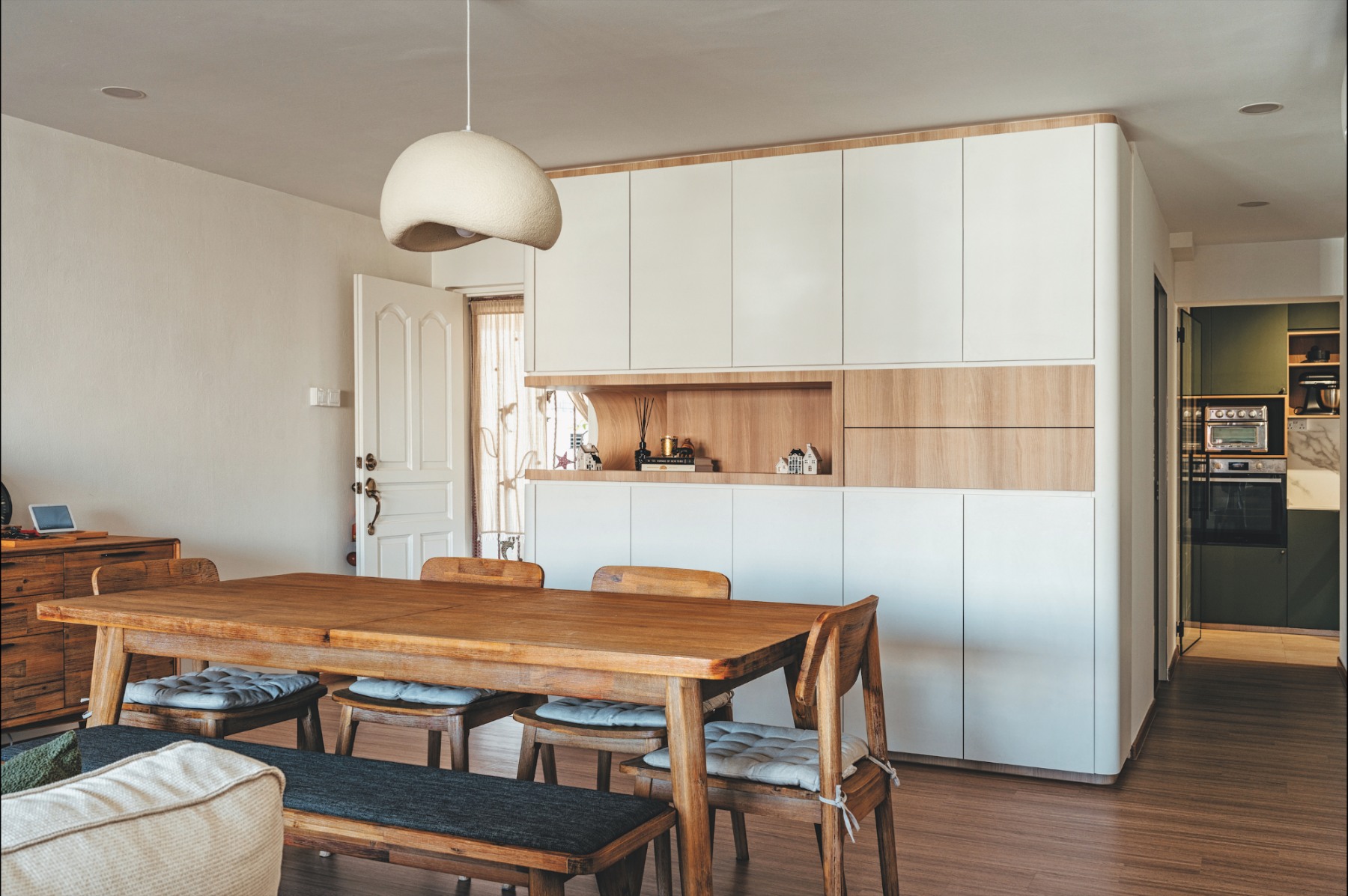
Rita loves the abundance of shoe storage Yun Yang has catered for the household of five, especially the open compartment at the bottom of the L-shaped storage unit, perfect for stowing frequently worn footwear or bedroom slippers. A curved niche serves as a space for homeowners to drop off trinkets, seamlessly becoming part of the backdrop for the six-seater dining table.
“We love the stretch of white carpentry in our dining area because it provides a lot of additional storage and conceals much of our mess. Also, we are fans of board games, and being able to arrange them neatly is very satisfying,” Rita said.
In addition to being functional and aesthetically pleasing, the full-height cabinets also serve to separate the helper’s room from the dining area.
“To save space, Yun Yang reconfigured the size of our helper’s room and built a louvre swing and slide door that complemented the design and provided additional ventilation. His attention to detail really showed through the little things we never thought about,” Rita said.

Clever solutions
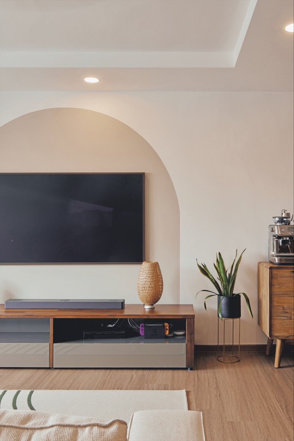
Yun Yang’s expertise is especially evident in the living room, where he concealed the TV cables without using an elaborate feature wall or a protruding panel. Instead, he used Plasterboard – a gypsum panel designed to hide pipes and wires while staying flush with the wall’s surface – to achieve a smooth finish. This kept the console free of clutter, allowing the painted arch to stand out and, in Yun Yang’s words, “add a touch of creativity and personality.”
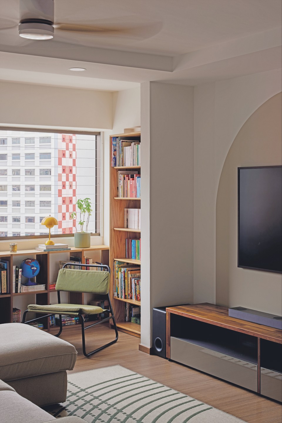
Likewise, the adjoining balcony brims with character – featuring loose book cabinets that store the household’s collection of books and knick-knacks.
“The balcony ground is levelled, so it has become an extension of our living room. Since our place gets very good airflow, we wanted to open our windows completely, and the invisible grille makes it safe for us to do so,” Rita said.
As a result, the reading corner offers a panoramic view of the neighbourhood, while the communal areas are flooded with natural light, creating a bright and airy atmosphere despite the dark vinyl flooring.
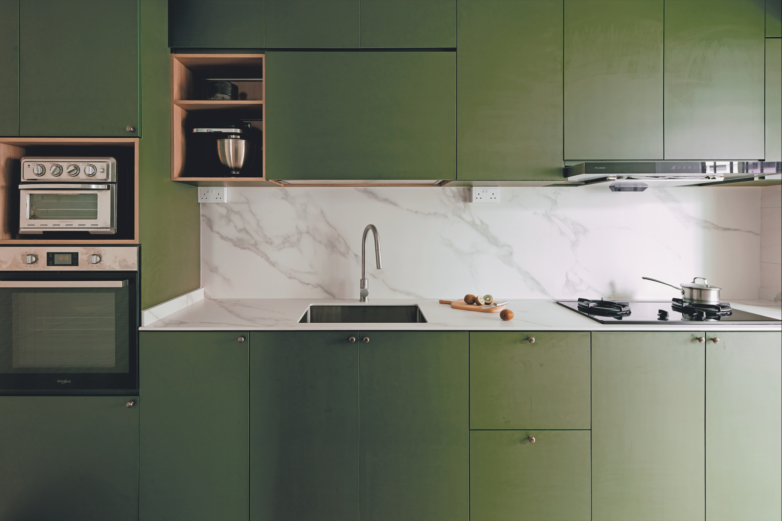
In contrast, the kitchen features light- coloured tiles with a travertine-esque detail, boldly paired with matte green cabinets configured to suit the household’s cooking routines and accented with silver knobs to match their appliances. Yun Yang also incorporated ambient lighting that, when switched on, bathes the white marble backsplash and worktop in a gentle glow. During cooking, the kitchen can be enclosed by a glass door with a black frame, a stylish combination that continues to feature in the bathrooms.
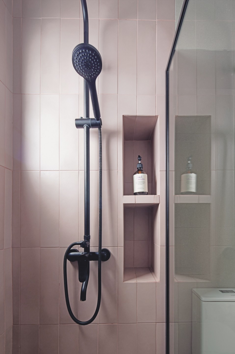
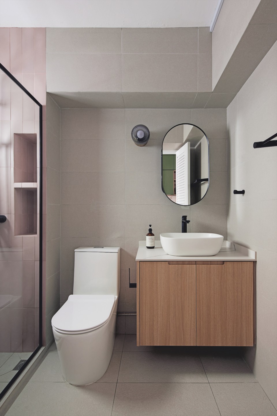
“We love how the black frames of the shower screens look against the tiles, which are pink and grey in the common bathroom and terracotta and grey in the master bathroom. My favourite thing about our bathrooms has to be the colours.”
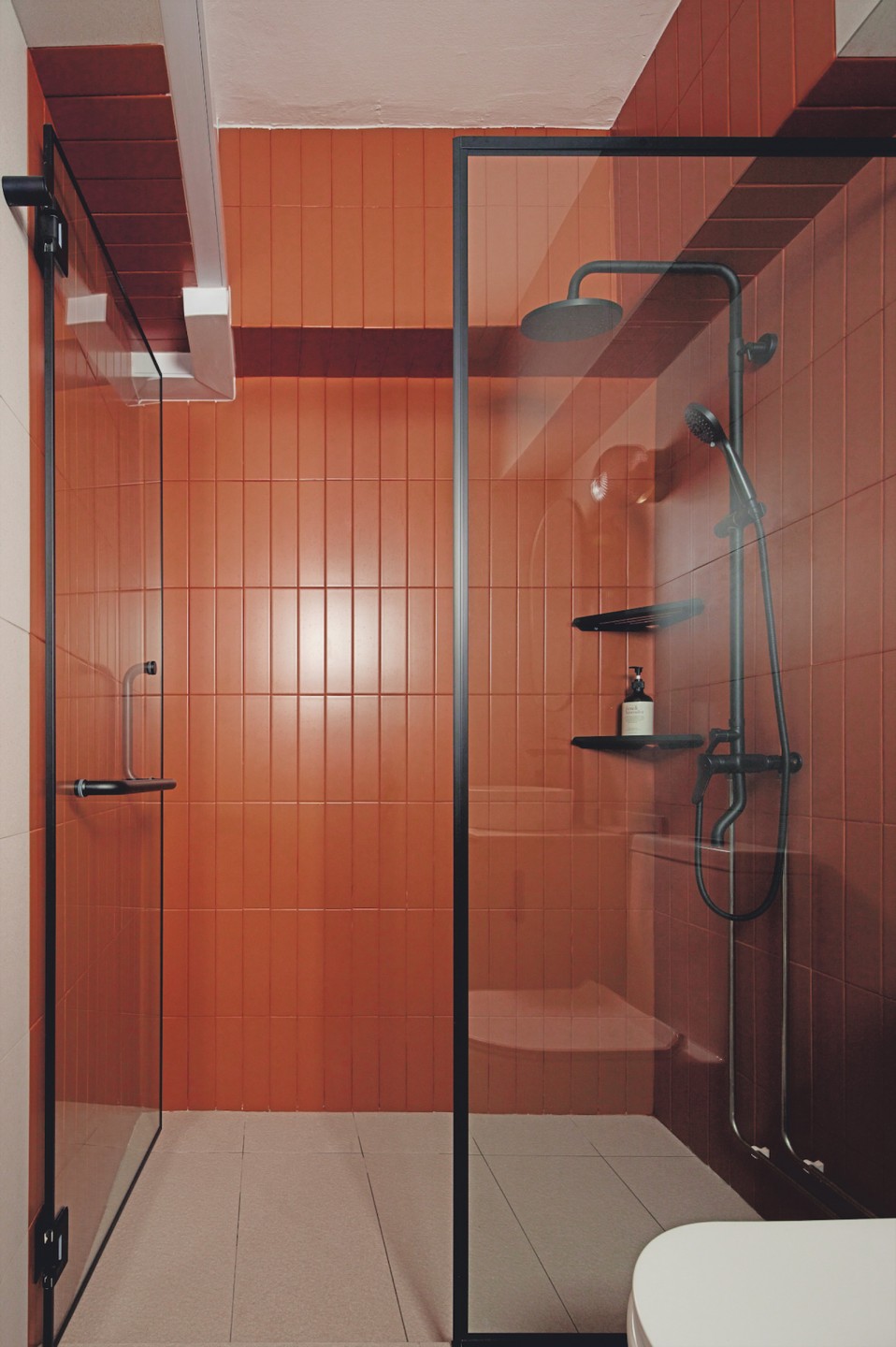
In what Yun Yang considers his favourite part of the project, he selected these colours and a holophane glass wall lamp to add a touch of subtle romance. To maintain this atmosphere, he cleverly concealed toiletries in wall niches and existing pipes in box-ups. The result is bathrooms that wouldn’t look out of place in a boutique hotel, making Rita feel like coming home is a special treat.
“We recently came back from a week-long trip and I didn’t think we would miss our home so much. It feels nice to be back in our own space.”
For more interior design work, visit projectguru.com.sg or follow them on Instagram @projectguru.interior.


