When Vivien and her fiancé moved into their new home, they were excited to give it a fresh, modern touch. Their 29-year-old resale condominium had seen little renovation since its original launch, and as Vivien pointed out, it still had its original tiles. The space was a true relic of the nineties, though not quite in a charming, retro way. Regardless, the couple wasn’t interested in preserving the past—they were focused on creating a space that reflected their shared love for the Japandi interior design style. This choice was not just trendy; it held personal meaning for them.
“My fiance lived in Sweden for a while and fell in love with Scandinavian design, and we both adore Japanese aesthetics, so the Japandi style was a natural choice for us,” she said.
With Colin from Renozone as their interior designer, they were able to achieve the perfect balance of aesthetics and functionality, starting right at the foyer. However, there was one issue: the main door was positioned too close to the storeroom door, making the storeroom the first thing guests saw when entering. “Colin came up with a brilliant solution to conceal both the wall and the storeroom door using a fluted panel, which I absolutely love,” she said.
Recreating spaces
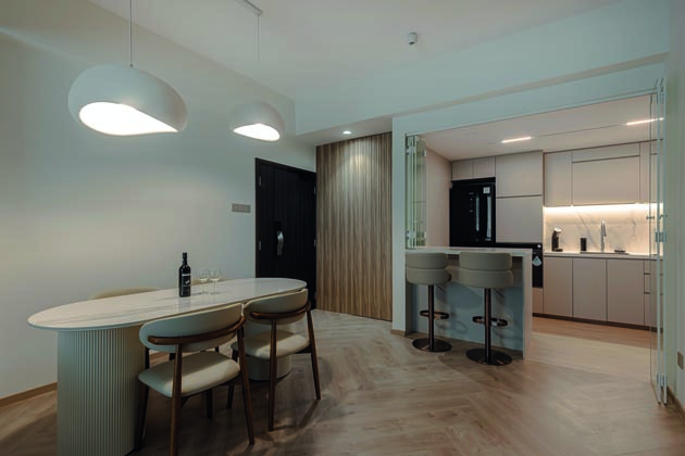
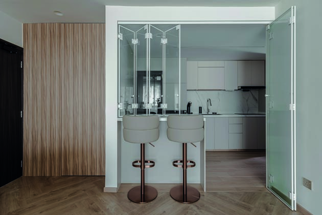
“Coming home is like stepping into our own private retreat. The moment I walk through the door, the stress of the day instantly washes away.” Emphasising the Japandi theme’s bright and airy vibe, the couple decided on an open-concept kitchen. But the renovations didn’t stop at its entrance. “We reconfigured the original layout because the kitchen and yard space were quite cramped and dark due to the existing walls.
So, we removed them and the yard door to create a long, open kitchen,” Viven explained. While an open kitchen is visually appealing, it can pose challenges for those who cook often. Even with a reliable hood, lingering cooking odours could spread throughout the apartment—a problem their reed diffusers would struggle to combat. To address this, they installed foldable windows and see-through glass doors, which kept the kitchen connected to the dining room and allowed them to engage with guests while preparing meals.
Vivien considers the living room her favourite part of the home, and it’s easy to see why. Like many homeowners, she wanted to conceal the unsightly cables that often clutter the TV wall. But instead of opting for an elaborate feature wall, they stayed true to their bright and airy theme by choosing a simple, asymmetrical design, complemented by a matching TV console.

The minimalist approach in the living room allowed for vibrant touches of green through soft furnishings and decor, all illuminated by natural light during the day and mood lighting in the evening. “The lighting on the feature wall and the partial false ceiling create a cosy atmosphere. I love sinking into our sofa, which is perfect for unwinding with a good movie or catching up on our latest binge- worthy series.”
Sanctuary of serenity
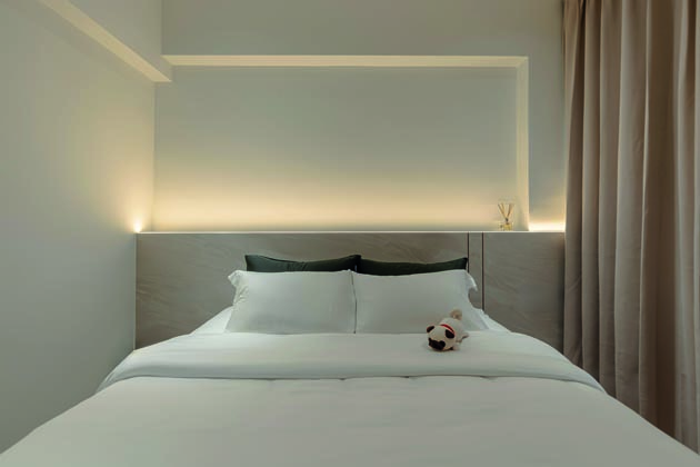
One advantage of purchasing a condominium from the nineties is the relatively spacious master bedroom, which the couple utilised to its full potential. “The long layout of our master bedroom allowed us to incorporate a walk-in wardrobe, which was in our brief from the start,” she said. For the wardrobe, they selected off-white laminates and recessed handles to make the walkway feel more spacious. The back of the wardrobe also serves as a partition wall that doubles as a projector screen, with a corner transformed into a vanity area.
“The built-in vanity table features a long mirror, storage drawer, a spotlight, and power sockets for my beauty devices. It also marks the transition from the wardrobe to the bedroom area,” said Vivien. In place of traditional bedside tables, they opted for a built-in headboard, which Vivien describes as the centrepiece of the bedroom. The headboard integrates power points on each side, allowing them to conveniently charge their devices at the end of the day while keeping them within reach. “We chose a soft, neutral colour palette so it can go with various coloured bed sheets and allow us to change the mood of the room easily,” she added.
A bold choice, a smart lesson
These earthy tones extend into the adjoining master bathroom, where the couple made an unconventional choice to install a top-hung cabinet above the toilet instead of the basin—a lesson learned from experience.
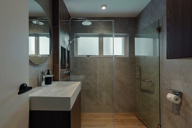
“My partner’s parents’ home has a vanity cabinet right above the basin, which makes the space feel tight and sometimes leads to accidental bumps,” she explained. This arrangement not only freed up space around the basin but also provided easy access to their toiletries while keeping the area clutter-free. “The thoughtful design of our space, from the concealed storage to the soothing colour palette, makes every corner feel inviting. The hotel-like atmosphere we’ve created makes it feel like a mini-vacation every evening,” Vivien quipped.


