Tim Kobe is the distinguished designer behind Apple Stores around the world. Let’s get to know this founder of Eight Inc better, and how he came to work for the late Steve Jobs.
Tell us a bit on how you developed your style. Who or what are some of your influences?
Early in the development of the studio, the main influence that was most important for us was the Eames office in California – Charles and Ray Eames, specifically. Their studio was a multi-disciplinary studio. They had people from all sorts of disciplines, from designers to filmmakers. So I think as a studio, we modelled that multi-disciplinary approach not knowing where it was going to lead knowing they produced great work and they consistently challenged the norm, be it traditional designs or traditional disciplines.
We understand you had a close relationship with the late Steve Jobs. Can you shed some light on this partnership?
Steve hired us in 1997 when he came back to Apple. He originally hired us to do Apple’s events, and I wrote a white paper on why Apple should do their own retail program before giving it to him. He then hired us to start working on the retail program. We worked with him basically every week for 12 years until he was too sick to come into the office. We got to know him for that many years, not only on a professional level but also on a personal level. The things we discussed ranged from the issues that he had around his illness to transforming Apple and the world with the products that he was creating at that point of time. For us, it was a very important part of validating the kinds of approach we had towards design. His approach of design being a hybrid of art and science was very much in line with our beliefs, similar to that of the Eames office.
Can you tell us more about how you approached the design of the Apple Store?

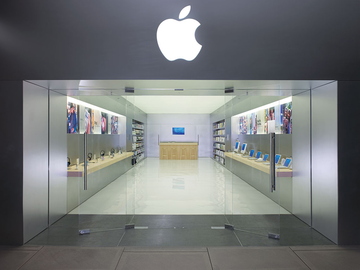
The Apple Store’s design is part of Apple’s brand experience, with approachable layouts to welcome people to connect to the products.
When we created the Apple Store, we wanted it to be an extension and a touchpoint for the brand. The store itself must be part of the brand experience. The ideal scenario is that consumers have an experience that reinforces why that brand matters to them and we have a way of getting feedback from that interaction. The Apple Store has a touchpoint online and on mobile devices. All that information that Apple is getting from consumers helps them to understand them better and make sure that the experience they are getting is the best that they can create. Regarding the store as just something on its own is to misunderstand the value of company touchpoints. It’s not just a store. It’s a part of this ecosystem of being able to carry on a conversation with the customers and people you want to connect to.
The Apple Stores feature an airy concept that allows entry of large amounts of natural light. Can you tell us more about this?

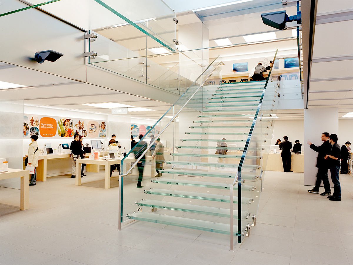
The sculptural transparent glass staircase found in Apple Stores combine advanced technology, engineering and art.
The new stores are an extension of many of the values and systems we’ve created earlier on. The notion of introducing greenery is a way to make the stores a more urban public space today because people have taken to the Apple Store almost as a social space as much as it is a retail space. I think that imagining the stores as an extension of its surroundings helps to connect Apple to the space and that transparency goes back to the very beginning, which was the fact that Steve wanted to stores to be very open and welcoming. He wanted the stores to be very democratic and not catered to only people who could afford the price tag. And so the humble tables, the openness and the lighting of the product were considered to reflect the values of the brand.
What do you want buyers to experience when they first step into the store, and how did you plan your designs accordingly?

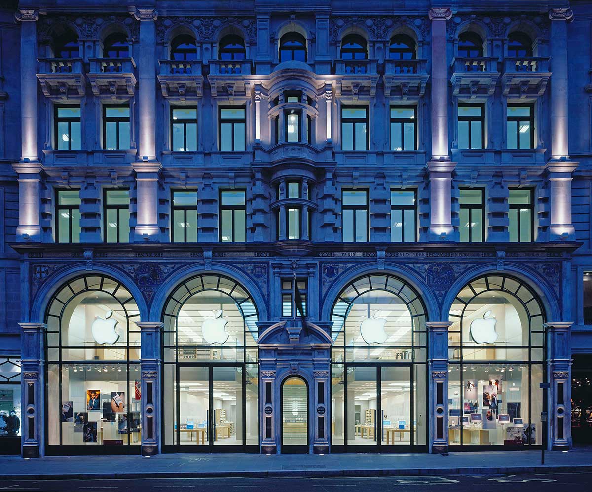
Apple Stores are designed to be open and welcoming to anyone.
Whether it’s the new one in Singapore or the older versions which we were involved in previously, the idea behind all the stores is to reflect the qualities that Apple represent: openness, accessibility and ease of use. All the qualities reflected in the product and technology on display should represent this while space should further reinforce these ideologies. When it comes down to decisions about materials, lighting and everything related to physical space, all designs are implemented to reinforce the qualities that Apple stands for. We light the products with special lighting technology that makes the product look as good in real life as they do in photography. If the photography looks great, but the product doesn’t in real life, there’s an issue of integrity and trust.
This was adapted from an article originally published in the August 2017 issue of SquareRooms. Photo credits: Eight Inc


