When Gene and SH successfully landed a BTO flat on their fifth try, they knew at once that their ID was going to be Debbie from Loco Division. She was, after all, a childhood friend of SH.
“This project was incredibly personal to me—I’ve known SH since we were 13,” Debbie said.
“From being classmates to navigating adulthood together, I’ve been part of many significant chapters in her life. So, being asked to design her first home felt like coming full circle.”
Given that both Debbie and the couple have a soft spot for the nostalgic nineties, it was inevitable that they would wind up with a retro-modern look. But syncing up the couple’s style was a bit of a journey. Gene was drawn to the lightness and simplicity of Scandinavian design, while SH was drawn to the warmth and richness of mid-century modern.
“Rather than compromise either style, we focused on finding a shared rhythm: using warm wood tones as the common thread, and layering in clean lines and pared-back detailing to balance both preferences,” Debbie added.
This approach can be seen in the foyer, where a feature wall conceals the entrance to the household shelter. While its dark wooden tones serve as a nod to SH’s love for mid-century design, its clean lines speak to Gene’s love for simplicity.
“We weren’t sure if the feature wall would be worth the extra cost initially, but we have no regrets as it’s a big part of the whole look,” Gene said.
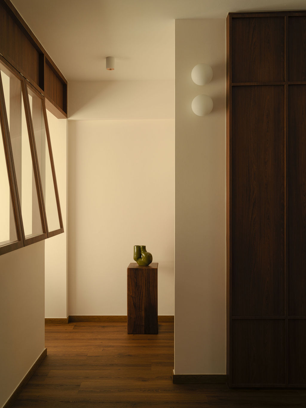
To make the entryway extra welcoming, they installed globe sconces providing soft, ambient lighting whilst gently guiding visitors towards the study. This spot, along with another work zone in the master bedroom, lets the couple handle work calls at the same time when working from home.
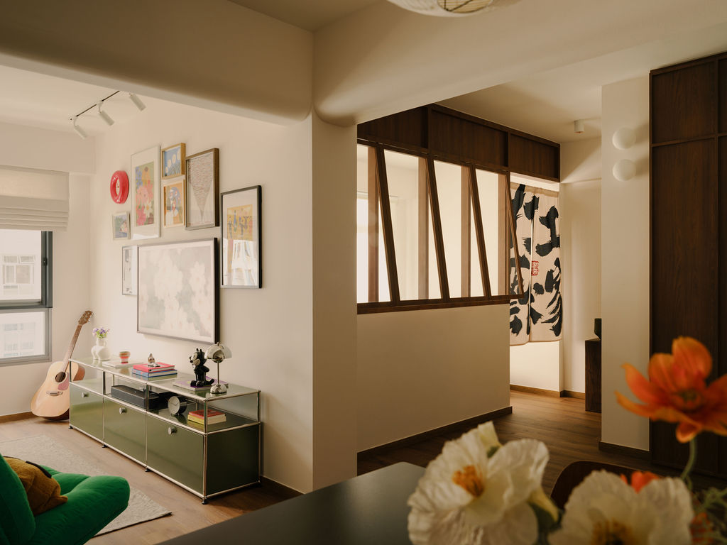
The study itself sports a row of half windows with timber frames that give a shout-out to SH’s love for cafe-hopping. But it’s just as much a functional choice as it is an aesthetic one, as it brightens up the entryway while maintaining an openness between the study and hallway.
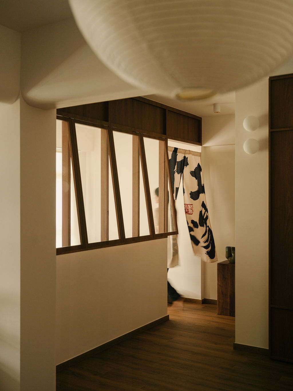
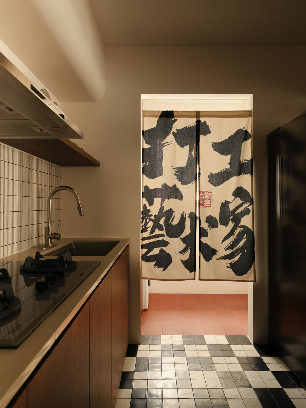
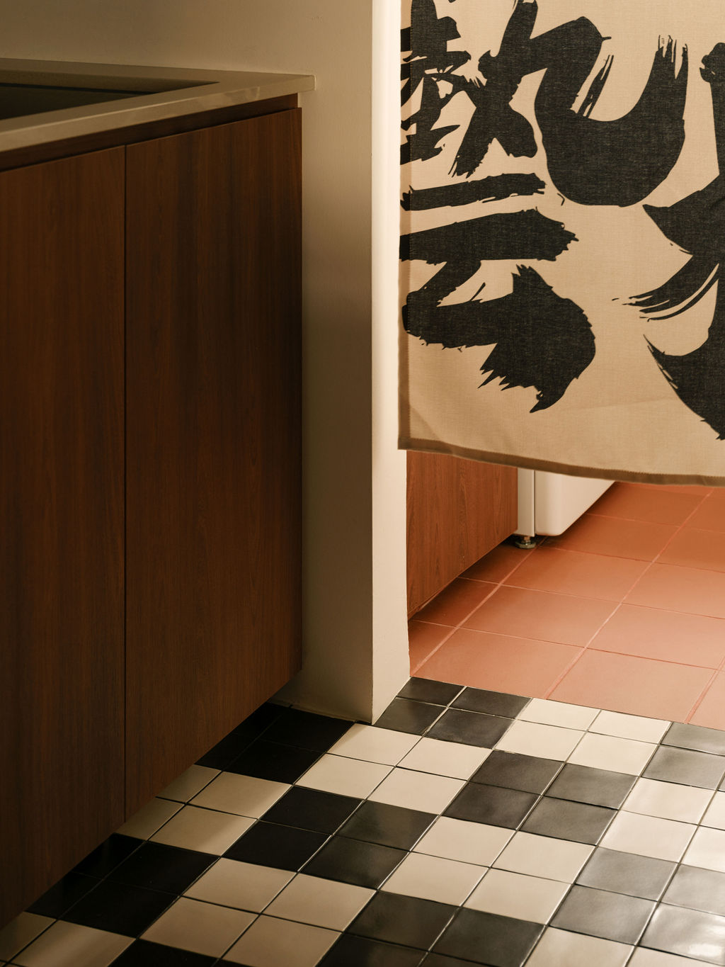
“Rather than using traditional solid doors to close off areas, we opted for Japanese-style Noren curtains in the study and yard, enhancing a sense of flow and informality through the shared spaces,” Debbie said.
With SH’s study occupying the original living room, they transformed the first bedroom into a communal space. It’s small, but its close proximity to the dining area and kitchen makes it perfect for hosting. Plus, it fits Gene and SH’s collection of cool stuff like a glove.
Artworks and prints adorn the gallery wall, while vintage finds and personal pieces sit on a utilitarian console. A DYVLINGE swivel armchair—a reissue of IKEA’s 1967 MILA design from the Nytillverkad collection—adds a graphic quality that complements the patterned floor tiles nearby.
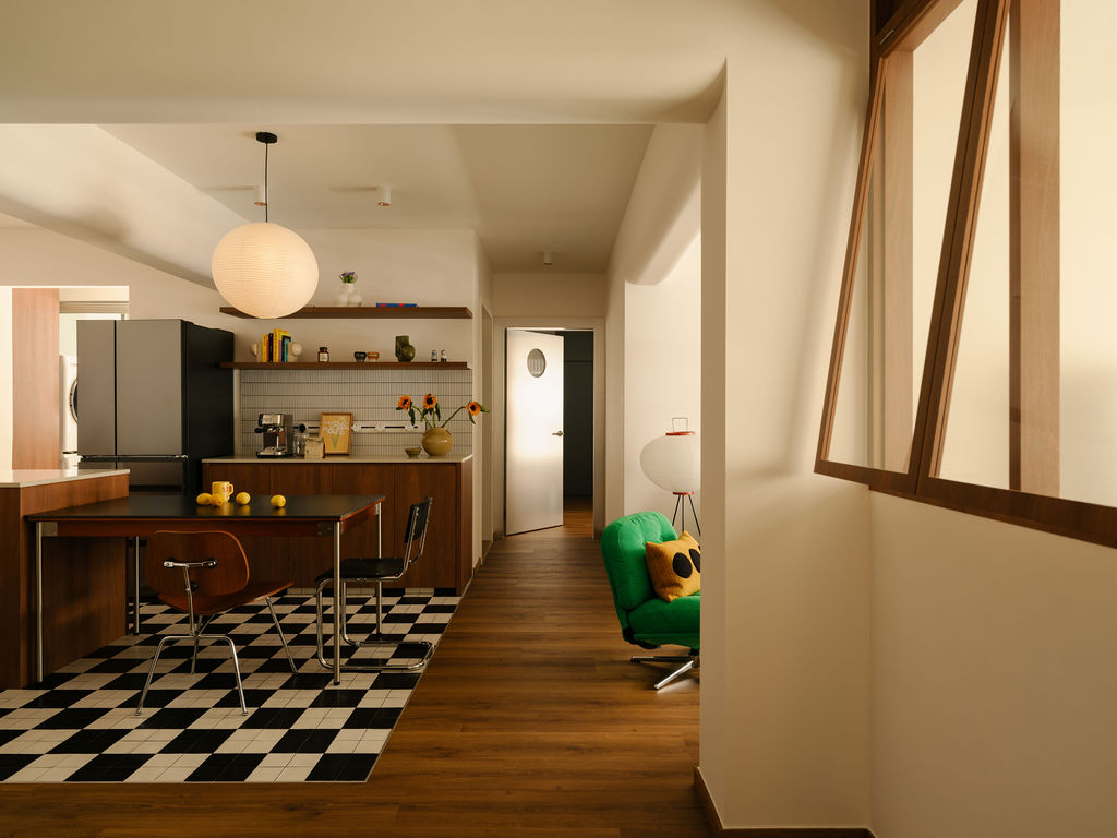
“The checkerboard floor in the kitchen is such a mood—bold without being loud, playful without trying too hard, and unapologetically retro in the best way,” Debbie said.
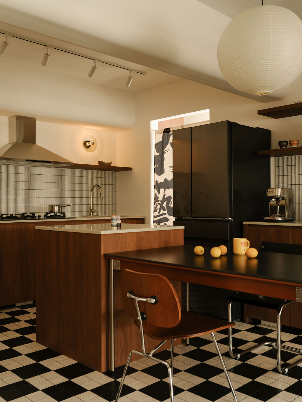
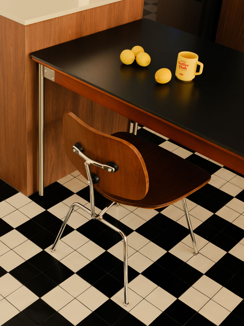
To balance out the bold tiles, Debbie kept the kitchen looking sharp with clean lines, light colours, and open shelving. And to fulfill SH’s wish for a kitchen island without overwhelming the space, Debbie created a compact one that connects with the dining table.
“My sister-in-law likes to joke that it is a tiny island, just like Singapore,” Gene quipped.
To keep the retro vibe going strong, the chrome door concealing the bedroom features a porthole, offering a glimpse of the green walk-in wardrobe behind it. Combining two original bedrooms, the master bedroom also houses Gene’s study and gaming nook. “This approach maximised the function of the two rooms—separating rest, work, and play without needing additional square footage,” Debbie explained.
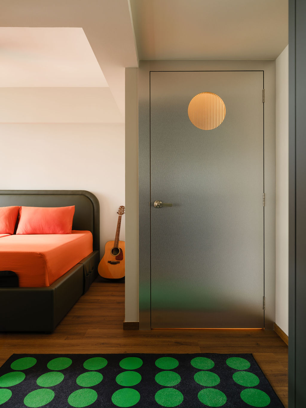
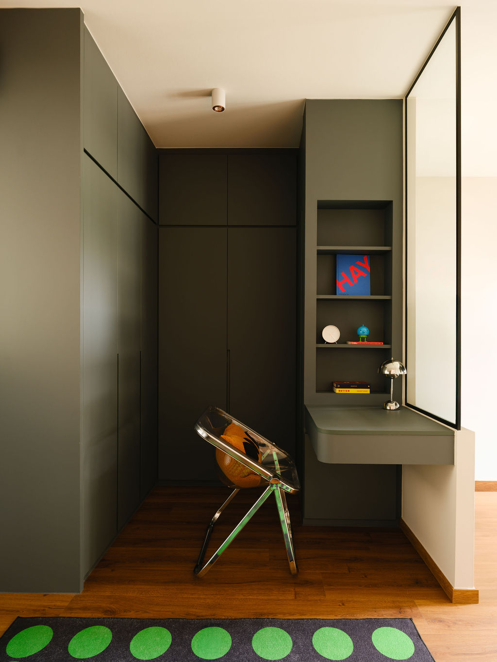
“Furniture selections in this room were also deliberate: from the transparent desk chair to the bold green polka-dot rug, each piece was chosen to inject personality and lightness into a room that could easily have felt too serious.”
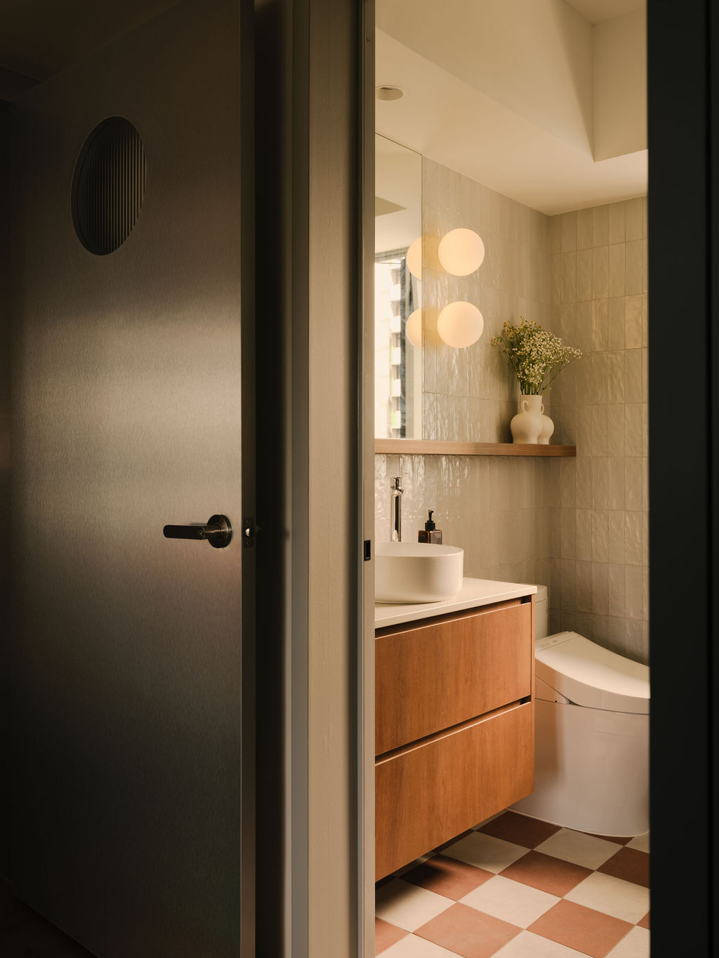
The homeowners also requested for separate bathrooms—a practical solution to SH’s concerns about sharing her private sanctuary with guests. Consequently, each bathroom became a “quiet expression of their taste”, said Debbie.
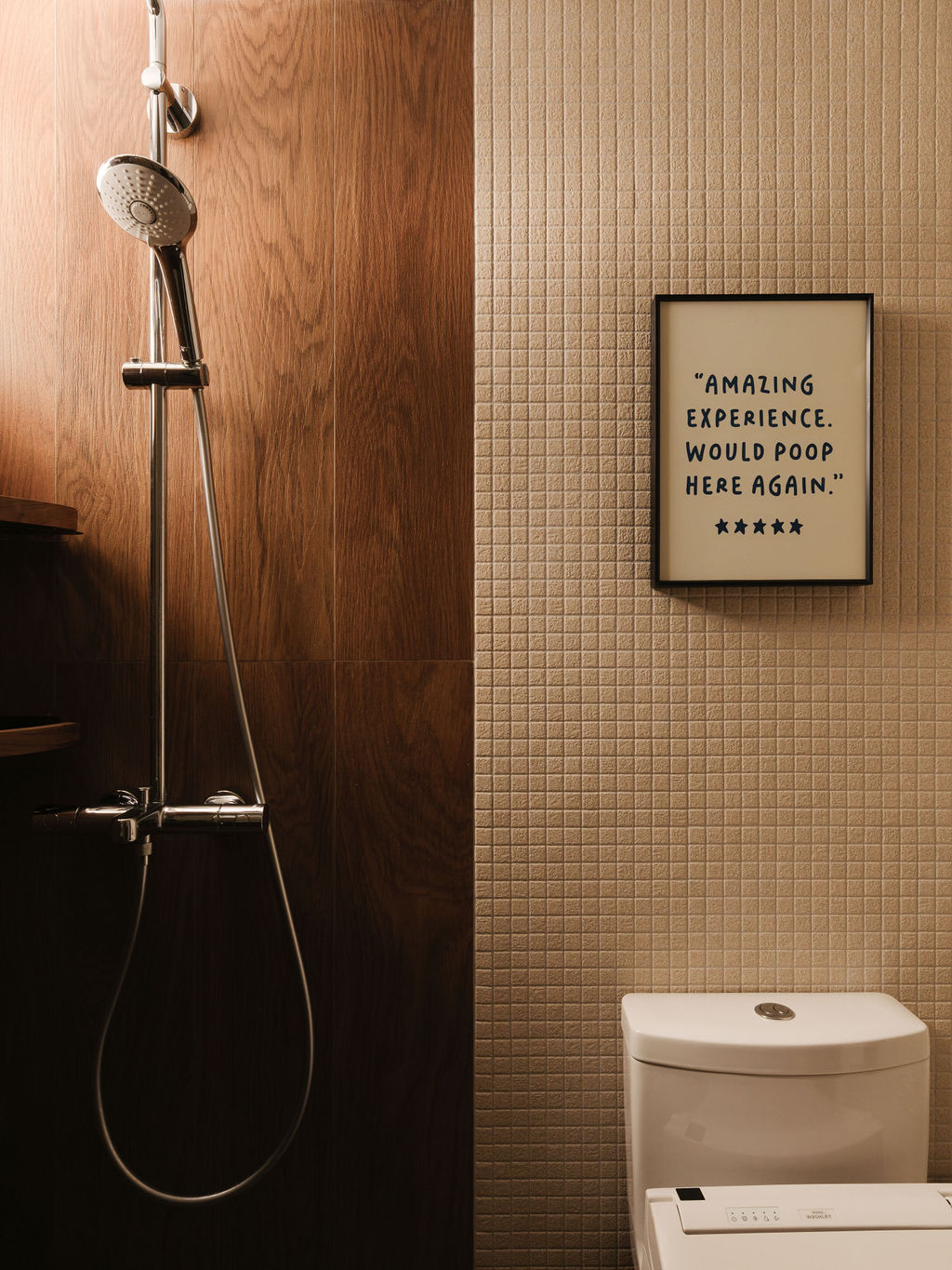
Gene’s common bathroom is all about clean lines and calm restraint, starring a cheeky quote he handpicked and framed as a reminder that even the most functional spaces have room for a bit of personality.
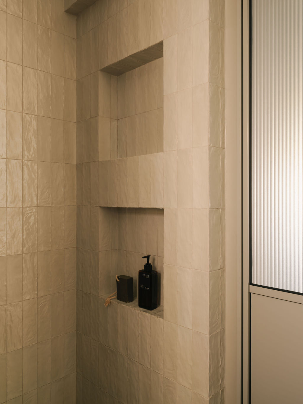
Debbie’s master bathroom features an aluminium door with a fluted-glass top panel, offering privacy while letting in ambient light that softly illuminates the red and white checkerboard tiles.
From contrasting styles to personalised corners, Gene and SH’s matrimonial home reflects the give-and-take of a true partnership—and the beauty that comes from meeting in the middle.
“The result is a home that doesn’t try to force their styles into one, but instead allows them to coexist thoughtfully—with contrast that feels intentional, layered, and uniquely theirs,” Debbie said.
Words: Joyce Yang