Desiring a timeless and serene abode with a connection to nature, these homeowners and their designer drew inspiration from European homes replete with rustic details.
For this family of six—a couple with two young kids, a helper and their hale and hearty 21-year-old cat— the allure of this home lies in its roomy layout and proximity to nature.
Located right by Bukit Timah Nature Reserve, the spacious 1,238 sq ft condominium unit offers a serene atmosphere and a connection to the outdoors, things that immediately resonated with the homeowners.
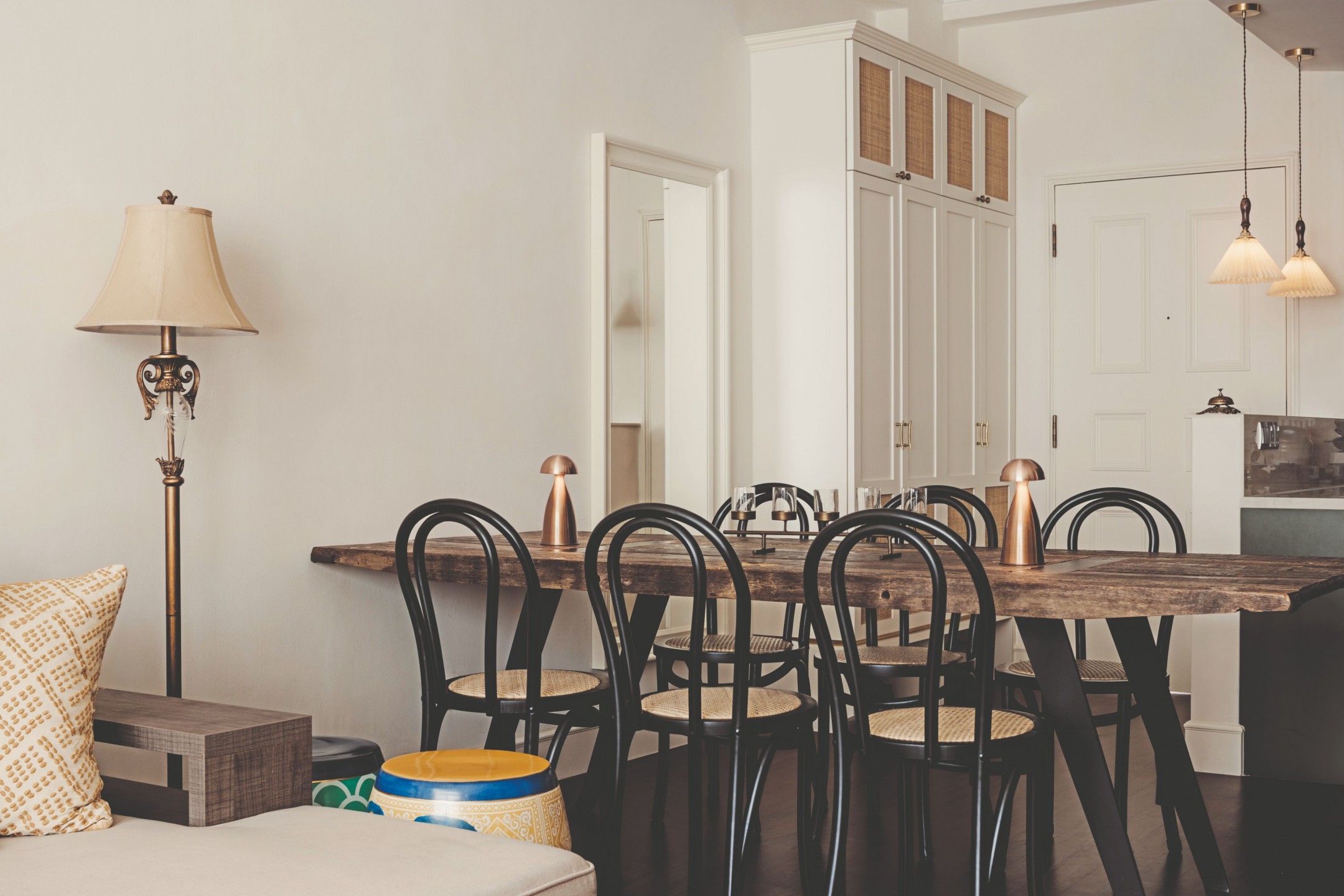
The wife shares: “I have a deep interest in staging, styling and aesthetics, often drawn to visually pleasing designs and compositions. Nature, along with exploring new places and experiences, is something I’m passionate about that holds a special place in my heart.”
When it came to updating the flat, the missus shares that selecting Studio Elar was an “easy choice” given their sincere approach, strong work ethic and shared commitment to continuous improvement.
Moreover, their “mutual sense of style” assured the homeowners that the collaboration would result in “creative and successful outcomes.” Lillian Hoang, Creative Director of Studio Elar, took the lead as their designer, and Just Build was roped in as the main contractor to carry out the renovation works.
Timeless touches with a modern spin
The couple asked for a French-style home incorporating textures and architraves, utilising a hint of vintage to make it all come together. They presented Lilian with reference images of homes brimming with rustic European charm, she recalls.
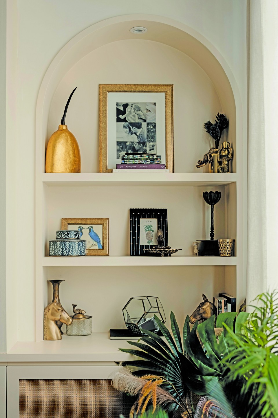
“It was nice to receive a project brief that was different to what we’ve previously worked on. We loved the details that the clients wanted to implement, so we followed that and moved away from the typical clean lines you would see in most of the homes today.”
Indeed, the house in its original state already boasted some of those classic elements that you don’t often see nowadays, such as cornices on the ceiling and wainscoting on the doors. The designer dialled up these details to add character, further maximising storage space throughout and enlarging the kitchen to make the property function better for the family.
“The clients were quite set on having dark wood flooring and brass elements,” says Lillian. “These were the two main things that drove the design.” The existing floors in the communal areas were replaced with stained solid Burmese wood, and the designer went with textured terracotta tiles in the kitchen to set the cooking zone apart.
“Everything else was kept a little more muted so that it sits nicely with the limewash paint on all the walls, without being too heavy.”
Layered and comfortable gathering zones
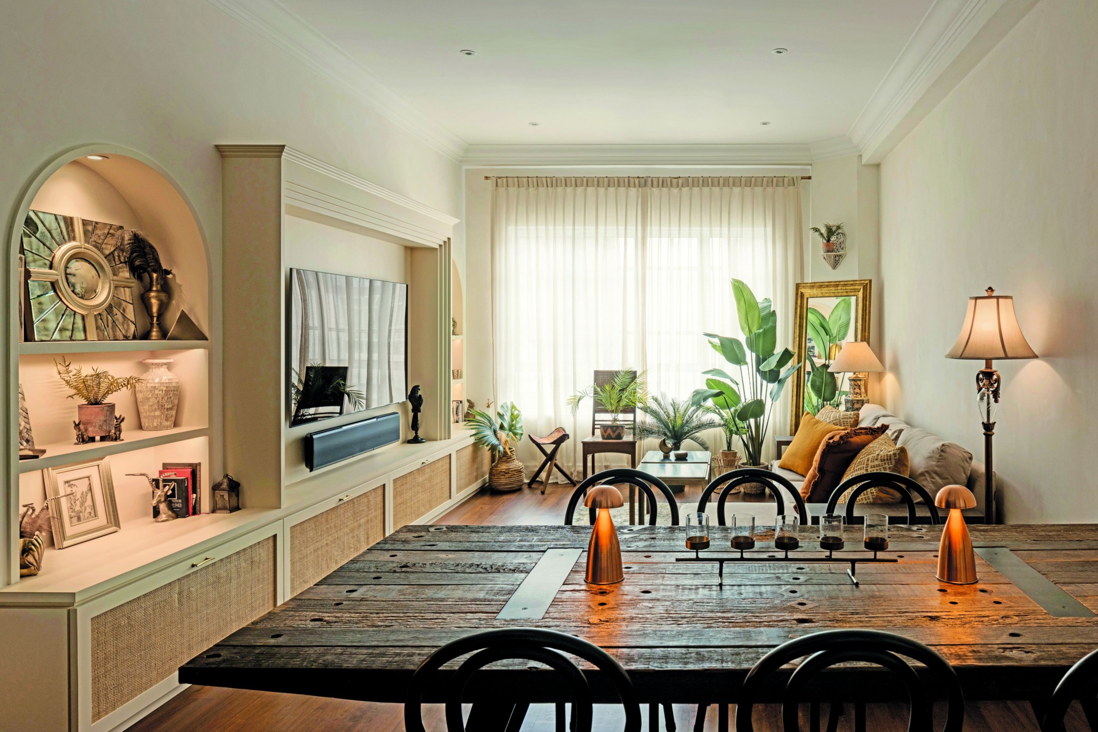
As a testament to the clients’ good taste, all of the furnishings were sourced by the homeowners, Lillian tells us. Most items came from their previous home but seem perfectly suited to the family’s new dwelling, with their earthy tones and textures warming up the spaces.
The dining area, which greets guests when they enter the home, is helmed by a table from Crate and Barrel. The living room expertly blends a mix of high and low-end finds—the sofa is from Cellini while the lamps are partly from LIMS Legacy and partly thrifted from Turf City. Finishing off the corner of the living area is the Levanger floor mirror from IKEA, a lovely piece since discontinued.
Across the lounging space, Lillian built out the wall so that the team could create shelving displays with a carved-out look to hold decor and keepsakes. In the middle, she framed a TV with a border that resembles a fireplace, a common sight in European living rooms.
A kitchen with dramatic flair
While the living and dining areas are special in their own right, the cooking zone practically steals the show with its deep emerald cabinetry and statement hardware—a far cry from its initial appearance.
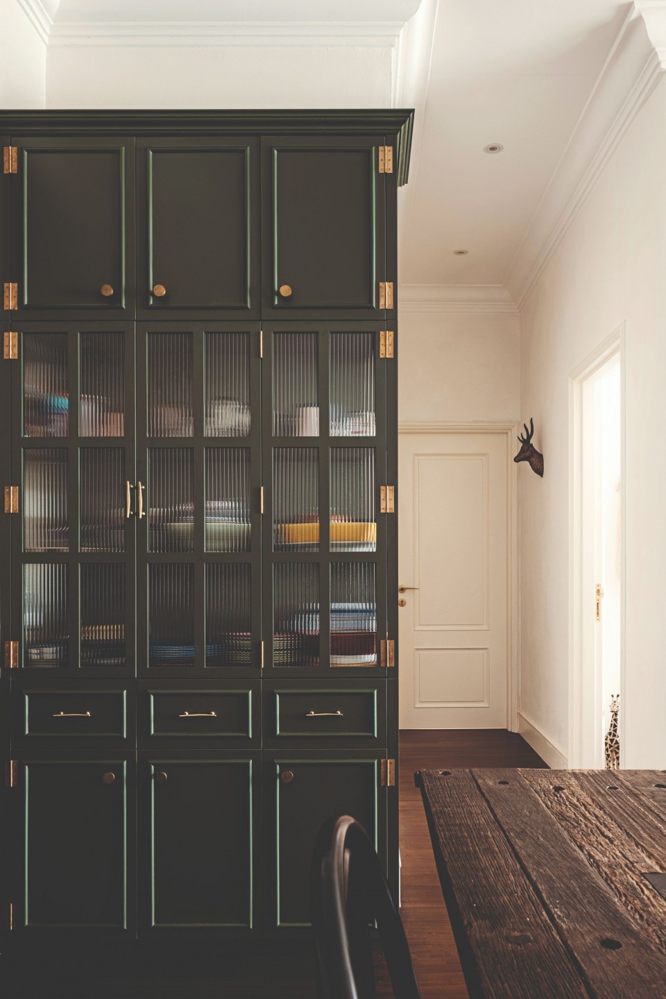
“The kitchen was enclosed and started much further in than what you see now, so there was quite a lot of potential there,” Lilian shares. “We ended up opening up the kitchen and pulled everything out. The idea was to have as much room as possible. We knocked down a wall to create a larger space and were able to have the storage cabinetry spill over and overlap with the dining area.”
The clients had their own vision of a cottage- like kitchen with some interesting colour combinations and textures, Lillian tells us. That said, there was no specific colour choice for the cabinetry. This was later narrowed down after choosing materials for different areas of the house. “We ended up with this beautiful, rich green laminate from EDL,” she shares.
“We felt the kitchen would end up being the heart of the home so it was nice to inject a lush green colour to complement the terracotta flooring. It would also keep the colour scheme a bit more timeless.”
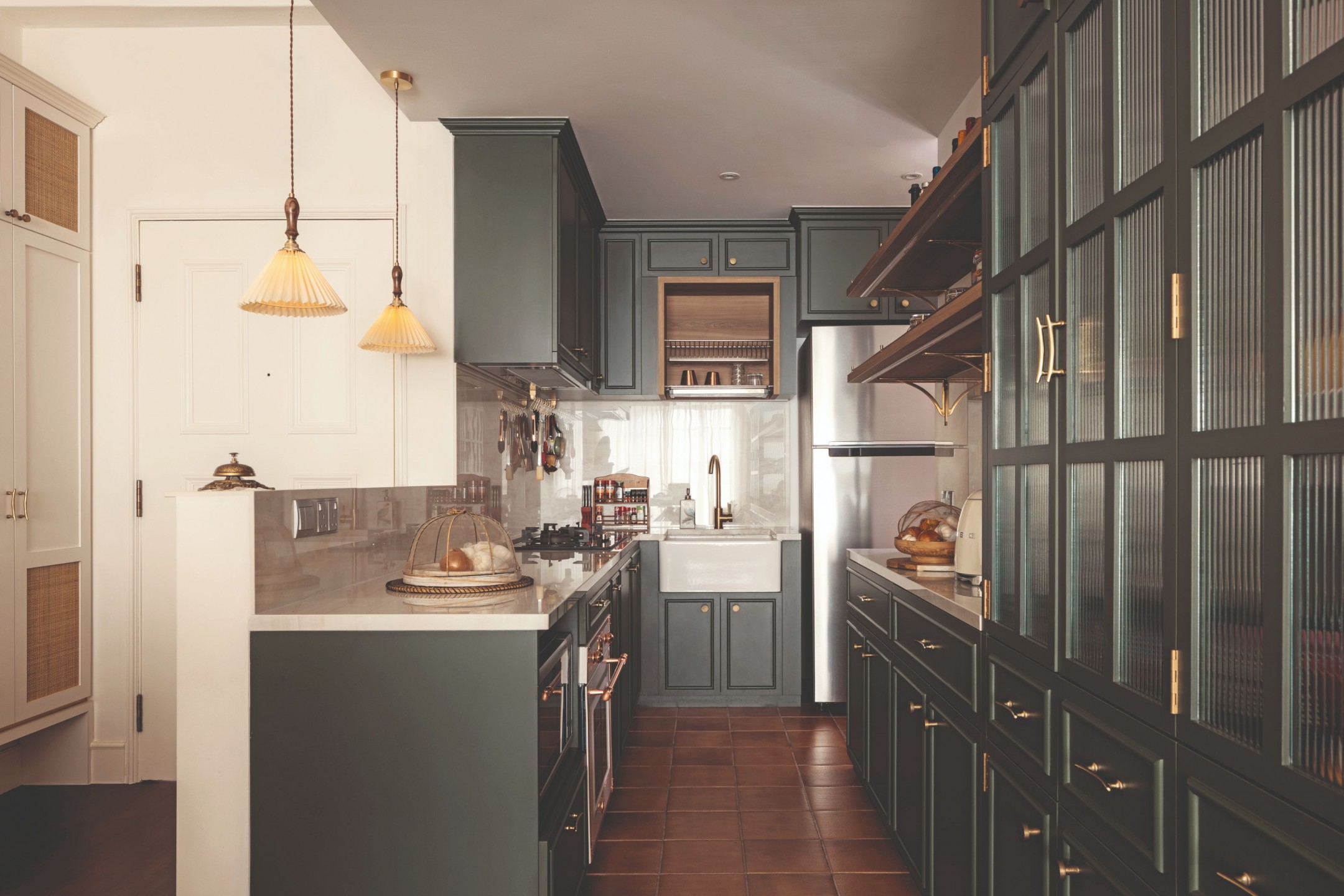
Building storage units shallower than the standard 60cm depth for base cabinets made the most of the modest footprint. This provided the homeowners with enough room to hold their large appliances and even display their nice tableware.
Finishing the cabinetry with brass hinges, brackets and handles took the design to the next level, Lillian points out. “They’re probably one of the main highlights of the space as they really help elevate the look to give it more character.” The exposed brass hinges were sourced by the carpenter and the handles were sourced by the clients from Anthropologie.
Ageless bathroom design
With its glazed tiles and vintage-inspired accessories, the common bathroom calls to mind chic powder rooms in trendy eateries.
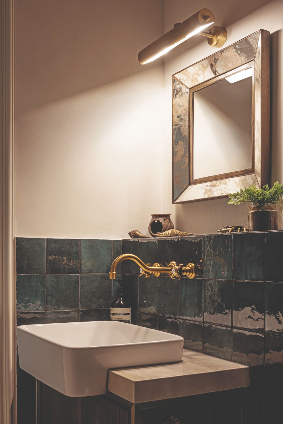
The clients had a particular look they were going for, where the glossy tiles from Hafary paired with dark grouting would be the key feature. Bauwerk limewash paint was used on the upper walls for an organic effect and mood lighting was installed to create a relaxing ambience.
As the bathroom was quite tight, the designer had to find a sink small enough to fit the space without it looking too tiny, ultimately sourced from AG Hardware. An aged mirror from Crate and Barrel adds another touch of nostalgia to the setting.
A multipurpose bedroom
The primary suite is one of the homeowners’ top spots in the house, the wife shares. “Thanks to Lillian, it is so much more than a place to sleep. It has a study area, a roomy wardrobe, a king-sized bed and even a cot. It’s like a mini oasis within the home.”
Here, loose pieces such as the table from Crate and Barrel and a stool thrifted from Carousell are combined with sleek built-ins that boost storage and wardrobe space. White laminates from Keminates were used to craft the shelving and wardrobe doors.
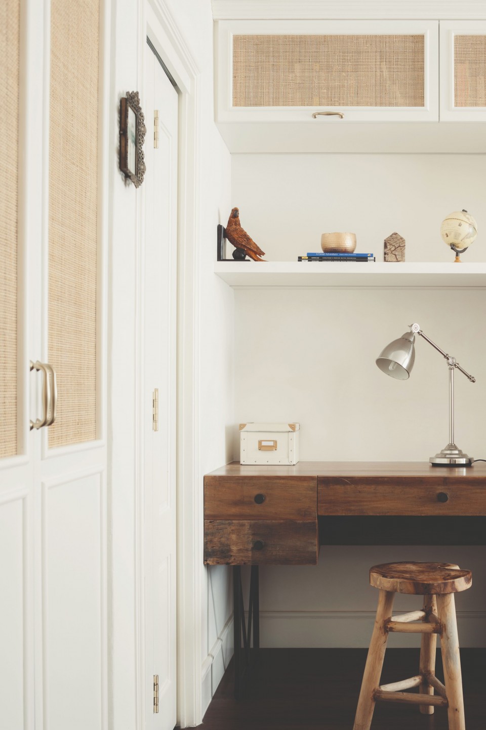
“Anything that we weren’t able to use laminate for was painted to match the laminate colour. We also used tight-weave rattan for the wardrobe doors to give them some texture,” Lilian explains.
Living out their dream
The family moved into their new home just over a year ago. They now tell us that living here has been an “absolute delight.”
While hosting friends can be “a bit of a juggling act” due to the presence of the couple’s young children, the wife mentions that guests who come over consistently comment on the earthy elements and beauty of the home, praising its calming and peaceful vibe.
“This has been very heartwarming to us,” she says. “The tranquillity and peacefulness is exactly what my husband and I were hoping for… we couldn’t be happier with it.”


