Inspired by the homeowners’ personalities, this home features a compelling mix of joyful hues and funky decor.
Attracted to this unit’s spacious 1,130sq ft layout, its proximity to an MRT station and the unit’s original terrazzo tiles, home seekers R and J sealed the deal on this space and reached out to Knock Knock Studio for its revamp.
They’d discovered the interior design firm’s works on Instagram and found their works to be unique and versatile, bringing on Jade Cham and assistant Yu Jia to oversee the home’s renovation.
“Our very first request was probably that we needed lots of storage space,” share the homeowners. “We wanted a bright home that allowed natural light to come in, and we wanted to incorporate colourful, funky furnishings.”
“We shared a deck filled with images from Pinterest that showed a balanced use of bright furniture, unique tiles and accent walls,” they continue. “Knock Knock understood what we wanted immediately and from our first meeting, we worked closely every step of the process to select the colours, materials and finishings for the house.”
To ensure the flat reflected the homeowners’ personalities and interests—the wife enjoys lounging and watching crime dramas and romcoms, while her husband loves jiu-jitsu and action movies—Jade didn’t bind herself to too many design rules. “It allowed the homeowners and I to really play around and have fun throughout the process,” she explains.
An airy refresh
Jade managed to visit the house before the couple collected their keys. Her first impression wasn’t particularly positive, she admits.
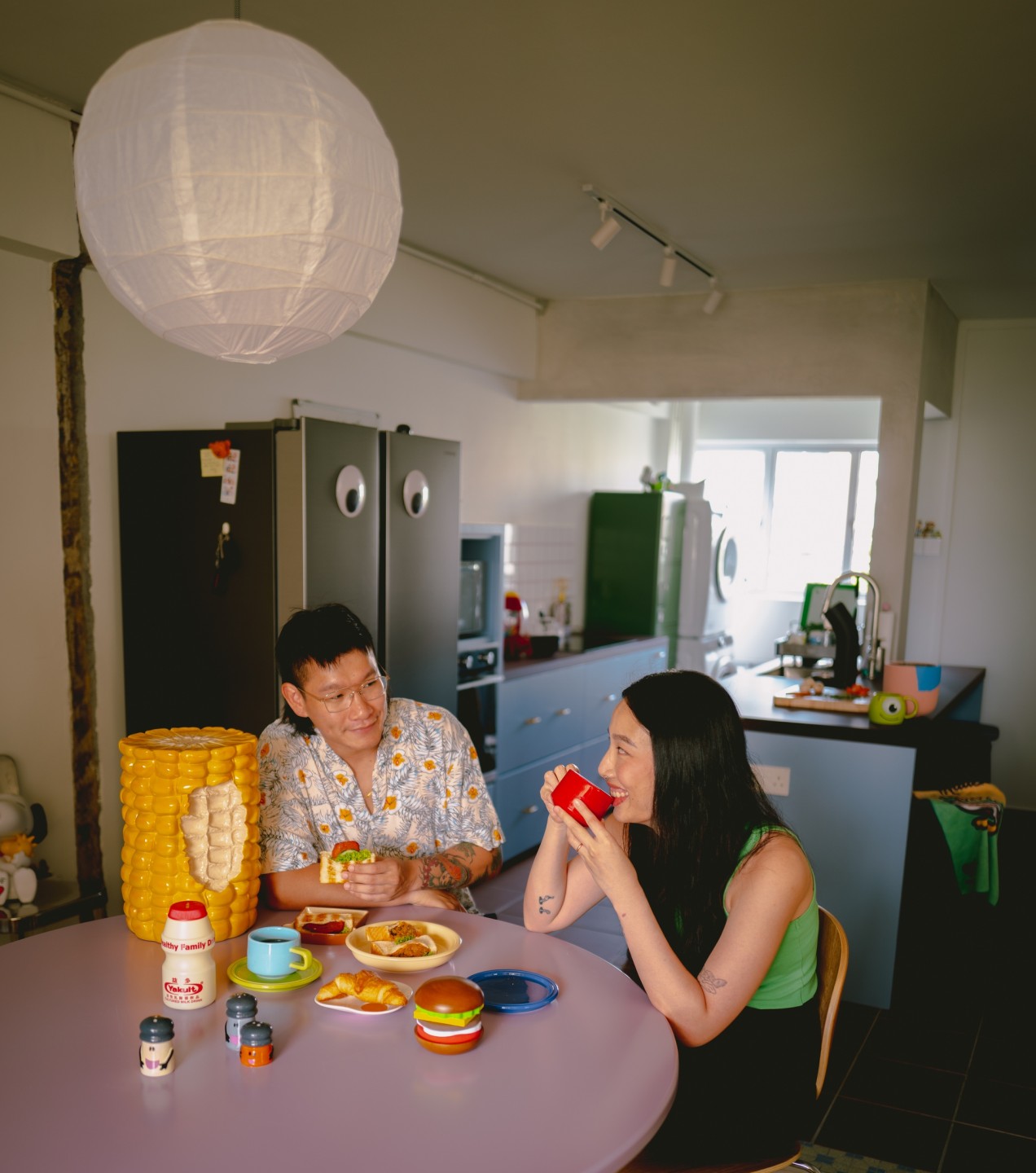
“It was very gloomy, dark, and did not feel nice, especially in the dining area, so we knew we had to demolish the walls between the dining area and living room. It now looks very welcoming, bright and cheery. I love it!”

Instead of patching up the wall, Jade suggested leaving the raw concrete to indicate the change made. “It’s actually a conversation starter,” share the homeowners. “Guests ask ‘What happened to the wall?’ or ‘This wall not finished ah?’”
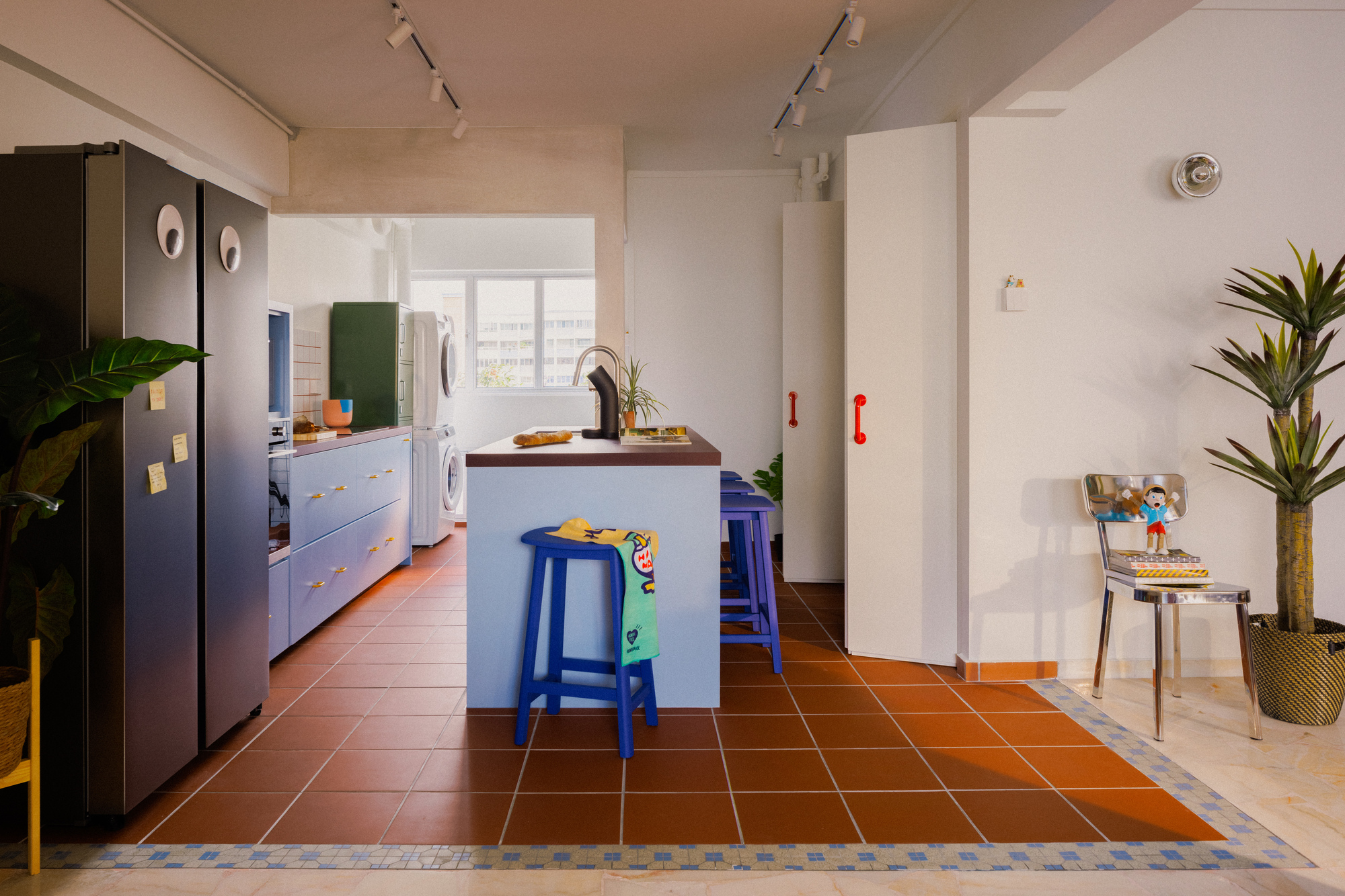
The couple is also thrilled with Jade’s idea to use different tiles as room borders and to mask the hacked portions. “We love how it demarcates the space and helps to add an extra pop of colour.”
Another key highlight is the main door frame, which had to be hacked so red mosaic tiles were used to patch the damaged section.
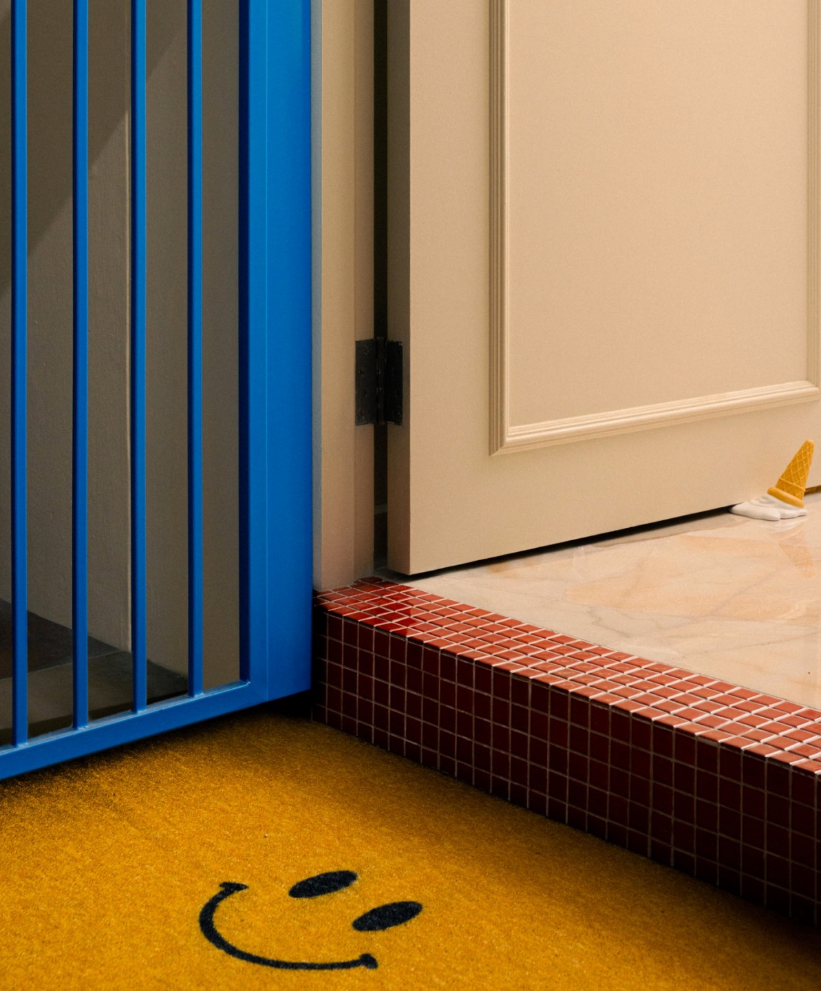
“People always talk about it when they first enter the space,” Jade tells us. “We really like the combination of the striking blue and red colour at the main entrance. Not something you’d miss from afar.”
Honing in on the living room
The terrazzo flooring was a major selling point for the couple and adds interest to the living area. Jade polished the floor to bring back its lustre, sharing that the terrazzo can easily be repolished if it turns dull in future.
“I love that the floor is shiny,” she tells us. “There’s a huge contrast between the solid colours and the furniture and it creates a more dynamic space.” Bumping up the visual interest, the doors were painted in hues that call to mind The Powerpuff Girls.
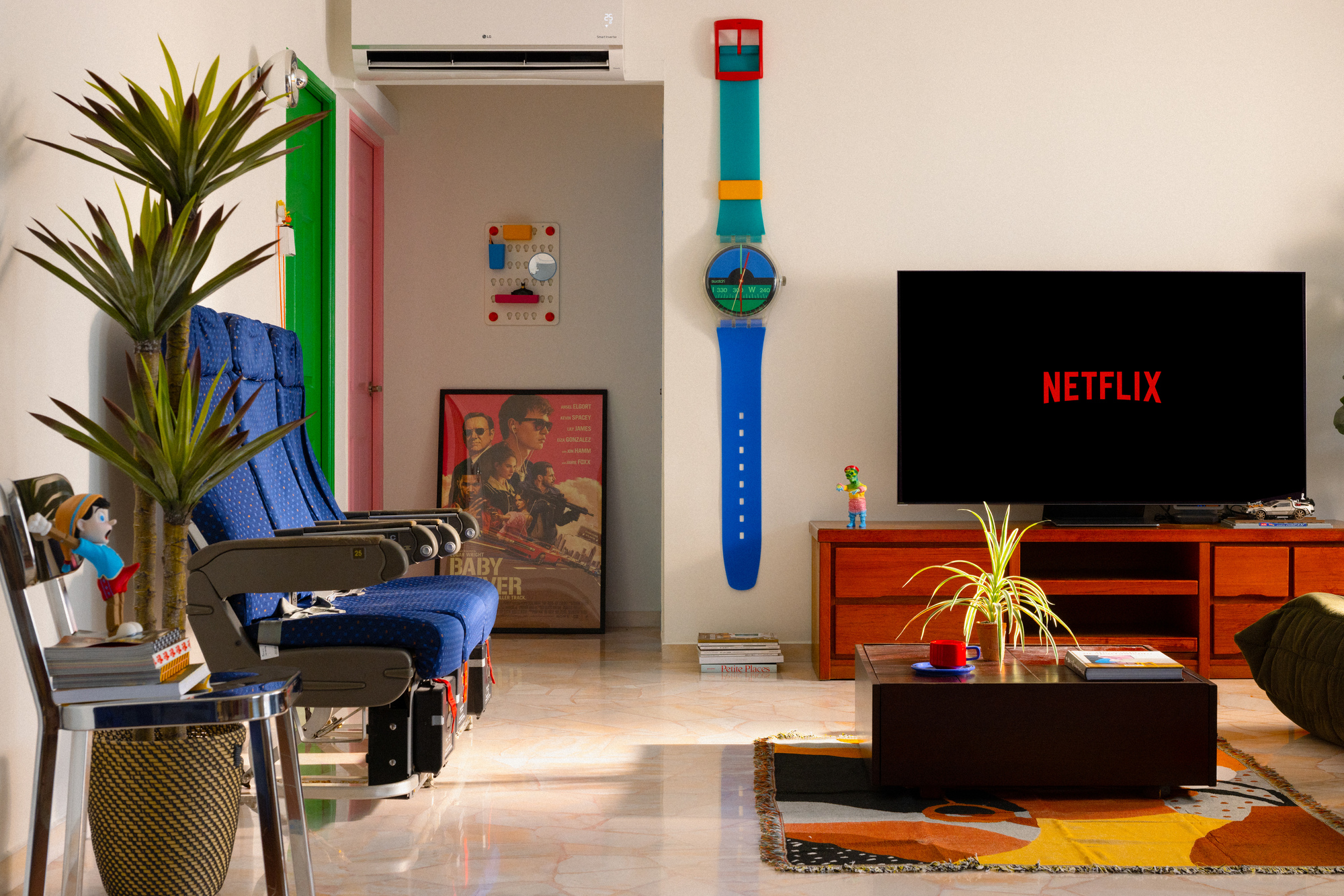
The media console, coffee table and large Swatch watch were purchased from Carousell after Jade advised the couple to stretch their budget by shopping for secondhand pieces online.
The plane seats, on the other hand, were a prop for a shoot that the husband was on. The homeowners are fans of the movie Baby Driver and felt the poster would fit perfectly with the adjacent pink door.
Playful cooking and dining
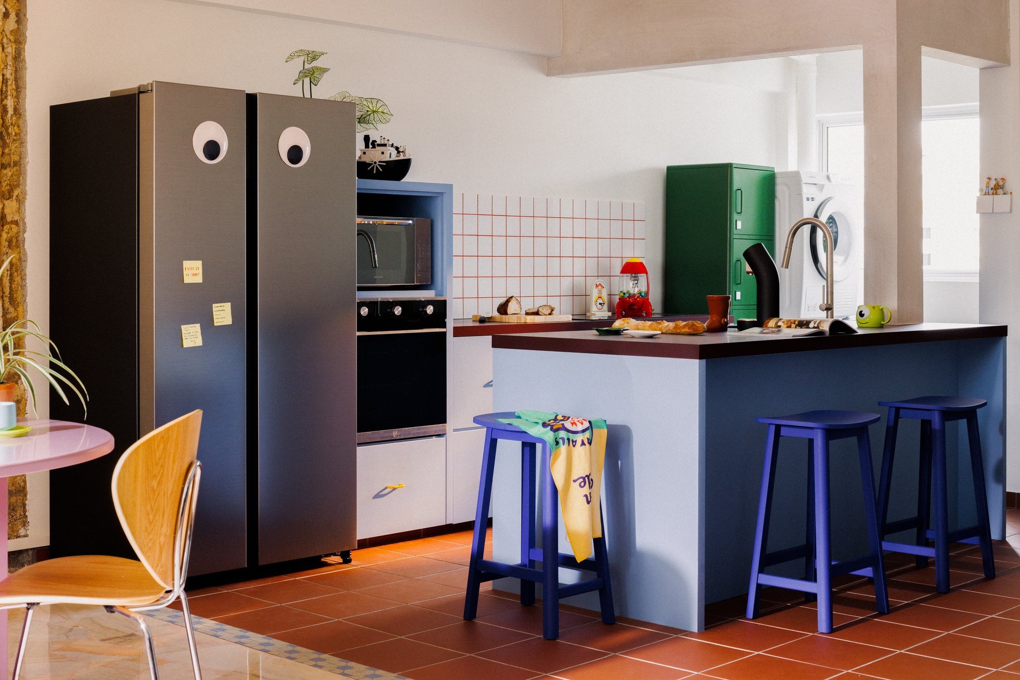
The clients wanted a “huge kitchen with a long island,” shares Jade. “The open space allows communication from the original service yard to the kitchen, dining and living room.”
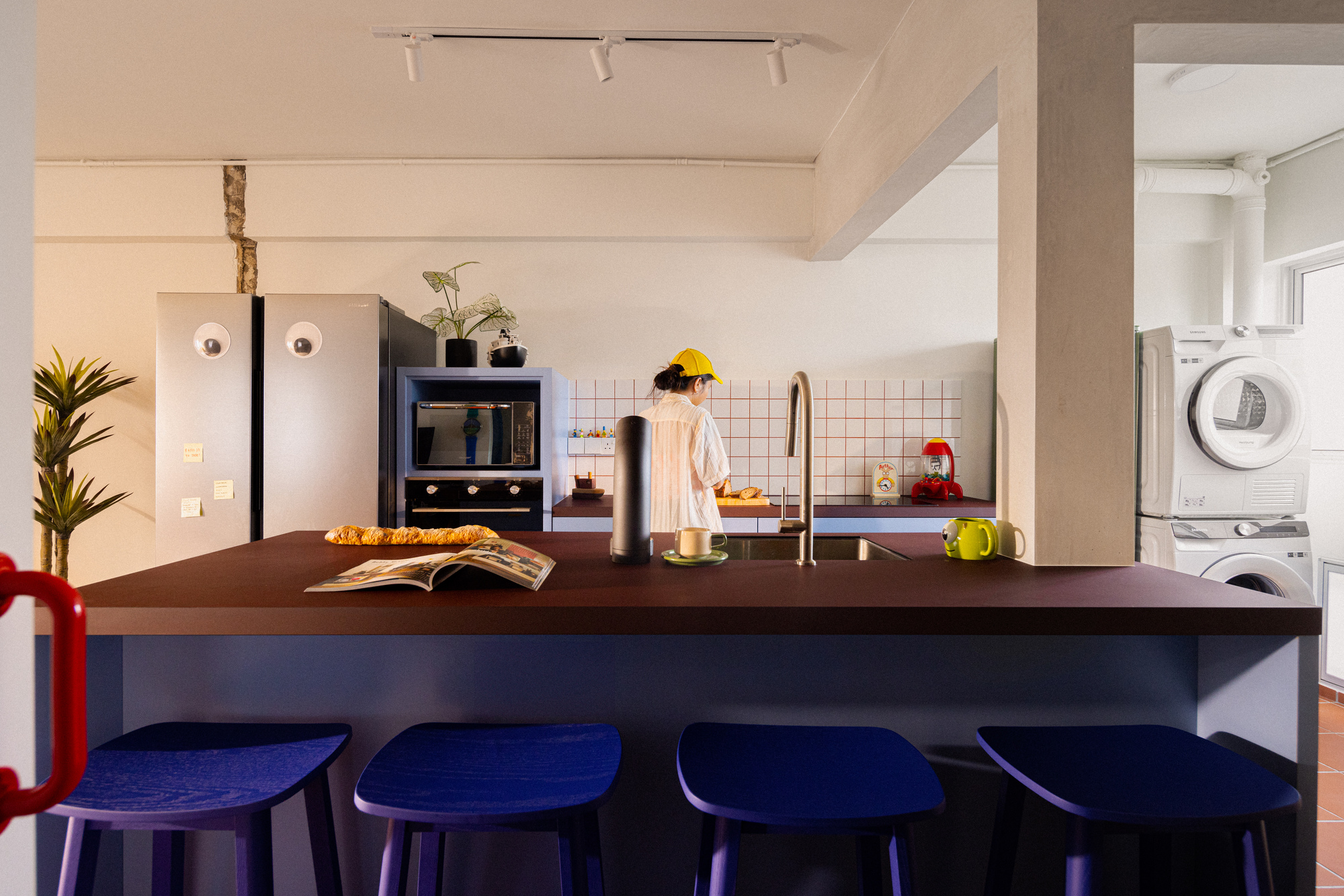
Instead of heavy-looking upper cabinets, the designer added storage space by extending the row of drawers under the stove and lengthening the island. Now the kitchen is the homeowners’ favourite spot.
“The island is multifunctional, acting as a cooking prep space, work table, gathering spot and a potential hotspot area,” they tell us, pointing out that they will test the latter soon. “Friends who’ve visited have all become guinea pigs for our cooking!”
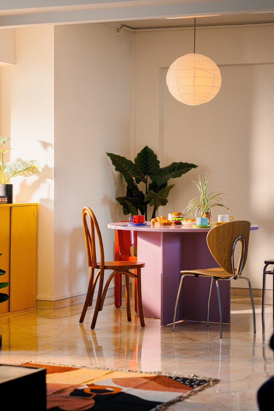
When it came to furnishing the dining area, they were inspired by Gustaf Westman’s playful and colourful designs, scouring Taobao listings to find all the pieces that resemble their favourites. The pendant light and yellow shoe cabinet (originally white but painted by the homeowners) are from IKEA.
“We moved in late March and it has been great so far! We’re morphing into neat freaks and we’ve been exploring the neighbourhood quite a bit too.”
Bathrooms on the quirky side
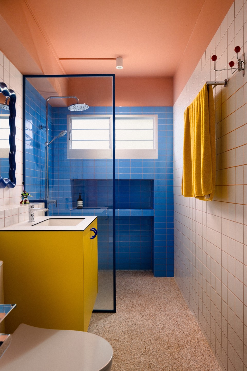
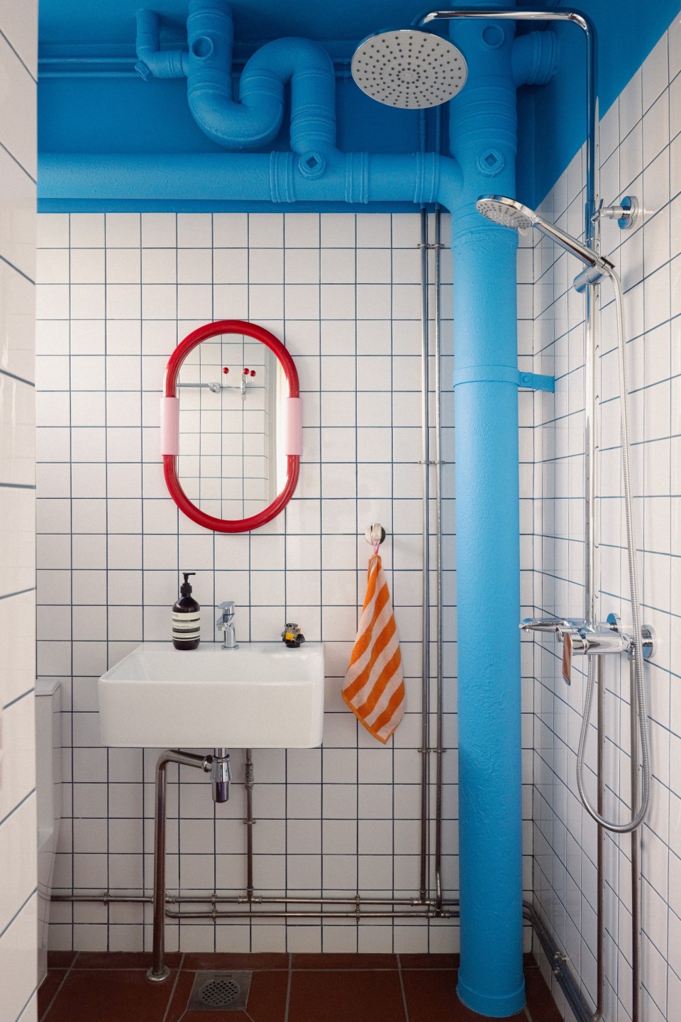
“We knew we wanted coloured grout for the bathrooms,” say the homeowners. “When Jade brought us to the store and we saw the colours and tiles available, we played around with the combinations and decided on the blue tiles and pink grout for the main bathroom on the spot.”
“For the common bathroom, we wanted to create contrast with the kitchen and decided on blue grout with white tiles. Never goes wrong!” they continue. “The paintwork for the bathroom ceilings was a spontaneous suggestion from Jade and we went for it. Everything matched perfectly.”
In the primary bathroom, the countertop was crafted from KompacPlus, complemented with an under-mount basin that makes it easier to sweep water from the surface into the sink.
Setting up the bedroom
The storeroom was downsized to make the primary bedroom larger and the wardrobe longer since closet space was a main concern for the wife. The doorway to the primary bathroom was also changed to create a more suitable spot for the bed.
“By changing the doorway and shifting the wall of the storeroom, it changed the flow of the space,” Jade tells us. Now the owners can get changed easily after stepping out of the bath as the wardrobe faces the bathroom entrance.
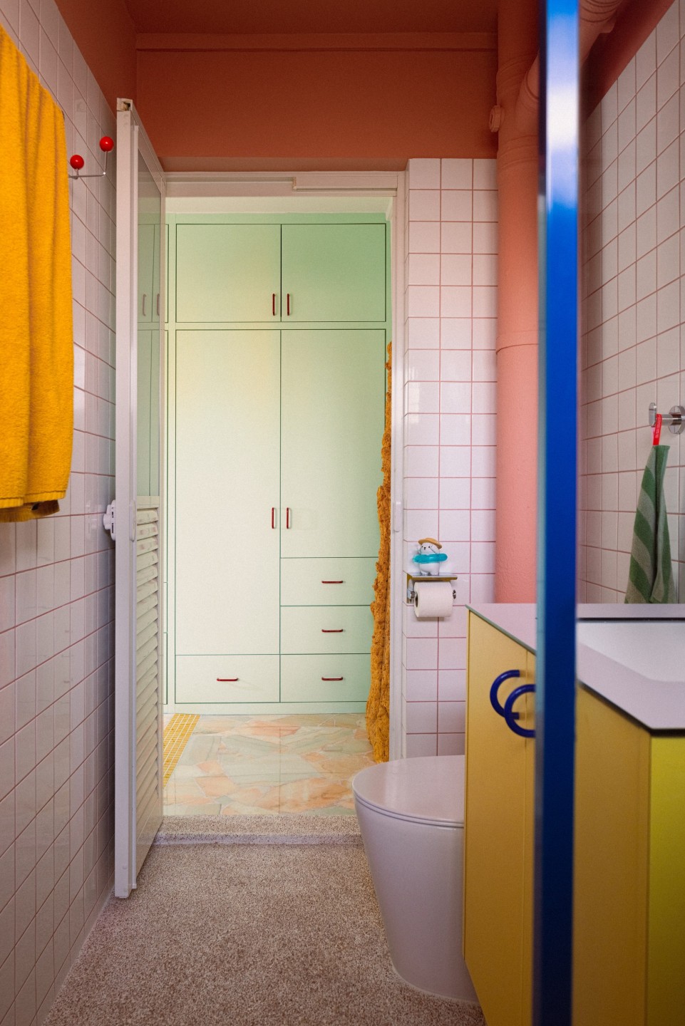
Since the floors of the storeroom and bedroom were not on the same level, a slight slope was created and covered with a border of yellow mosaic tiles.
Careful planning pays off
With disparate tones coming into the house, Jade needed to ensure they wouldn’t clash with each other. “This was the biggest challenge for this project, to be honest,” she reveals, remembering her careful planning and envisioning every part of the space.
Her disciplined yet playful approach worked out well for her clients. The couple shares: “We moved in late March and it has been great so far! We’re morphing into neat freaks and we’ve been exploring the neighbourhood quite a bit too.”
*Designer, Jade’s kitchen essentials*
Four things designer Jade recommends implementing in your kitchen.
Cabinet handles
Ideal for cooks as they are easier to clean than the seamless, 45-degree cut-out handles.
Under-sink concrete support
Eliminates the common issue of wood rot around the sink due to water seeping into the gap between the sink and countertop.
Bifold storeroom doors
They allow easy access and don’t block the walkway.


