Having stayed in this flat unit for more than 10 years, the family of four decided it was time for a revamp. “Their kids are much older now and they wanted to modernise the space to cater to their lifestyle changes,” said the Story of Us design team who was commissioned for the renovation. However, before the renovation works commenced, the designers took time to gain a deeper understanding of the family’s lifestyle requirements.

“It was a year-long affair to nail the design brief,” said the team matter-of-factly. “The homeowners have amassed a large collection of books and needed a lot more storage. They also specified a welcoming Scandinavian style to embrace their love for colours.” The last thing to check off their design brief was a home of easy maintenance and that included tucking their washer and dryer neatly under the kitchen counters.
Retaining the existing flooring, the team had to factor in some of their current furnishings and fixtures into the new design plans. Using a versatile Nordic-inspired colour scheme of light wood textures and other soothing neutrals, they managed to blend the new and old furnishings and fittings effortlessly together.

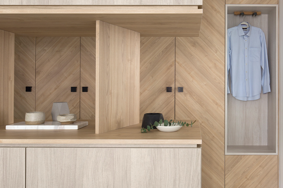
The refreshed colour scheme draws out a larger expanse of space from the new open-concept kitchen. By integrating a row of full-height cabinetry from the front entrance to the single galley kitchen setup, this fully maximises the storage space spanning across the wall length. “This series of closed storage cabinets allows the homeowners to store anything from shoes to their daily cleaning essentials,” shared the designers of the generously-scaled storage units. Forming an asymmetrical pattern with the compartments of different sizes, this functional wall of storage also works as an understated feature accent.
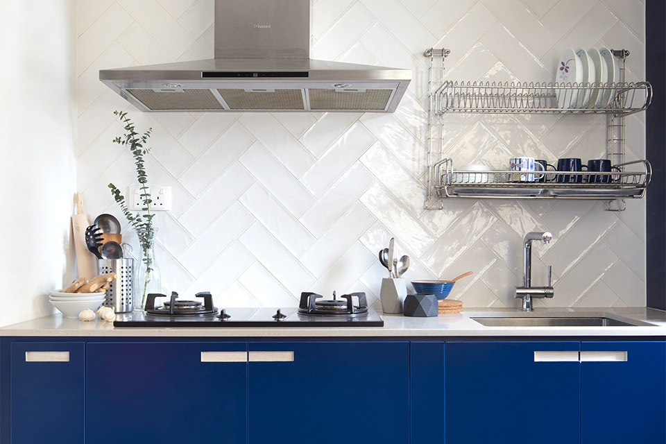
Moving over to the kitchen, the matte laminate finish of the cabinets in royal blue makes a striking statement amidst the sea of warm wooden textures. A lighter style treatment was then rendered with the choice of glossy subway tiles in an opaque white tone for the backsplash. Together with the light-coloured quartz countertops, this ensemble sets off a light and airy impression which increases the expanse of space.

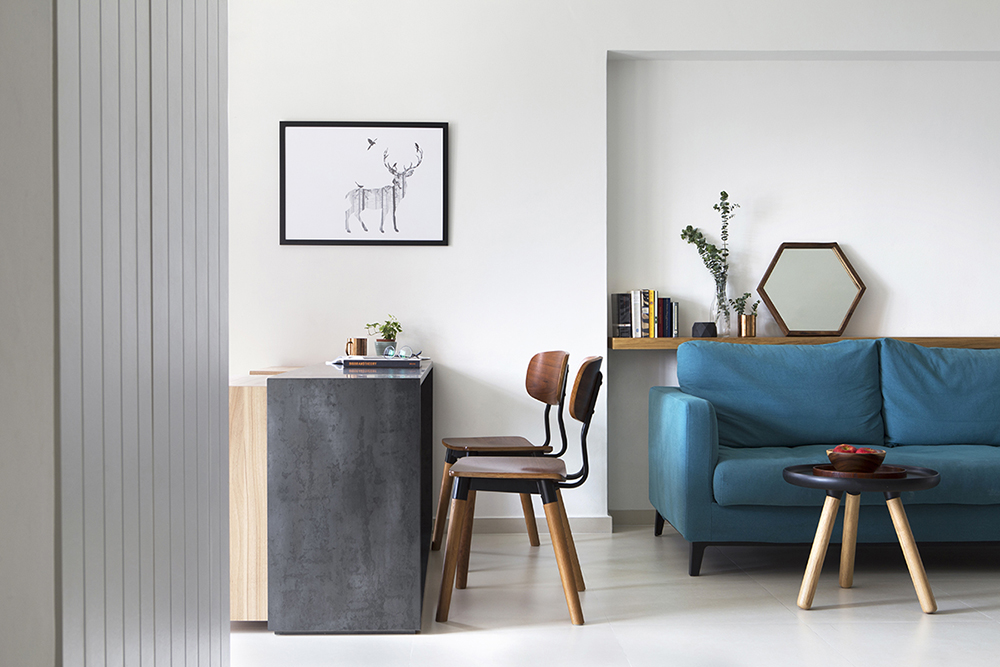
For the shared living and dining zones, the homeowners requested for the addition of a study area. The designer acceded by creating a custom-built table for two, as well as shelving. This combined fixture showcases a low-rise bookshelf of pastel-hued compartments to add to the functionality of the cosy reading nook located at the balcony.
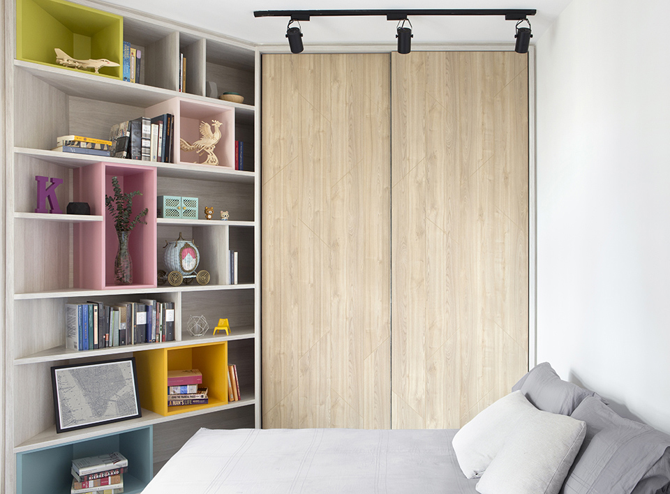
Irregularities in the floor plan were another challenge that the designers faced, being most prominent in the daughter’s bedroom. “There is a slanted corner in the tween’s room,” revealed the designers. “Since the daughter shares the room with her grandmother occasionally, we had to cater room for an extra bed and make full use of every inch of space for storage.”

To combat the limitations of space, custom-made carpentry was called in to save the day. The team designed a full height shelving unit to maximise the slanted wall area. To perk up the space, they worked in vibrantly-coloured compartments which mirror the bookshelf in the balcony.
Injecting personality through happy colours and with a savvy usage of space, the designers of Story of Us have completely turned this whole place around. They have pushed the envelope further by carving out a space for better liveability and timeless aesthetics – one where the homeowners can stay comfortably for years to come.
This was adapted from an article originally published in the February 2020 issue of SquareRooms.


