These homeowners’ love of vibrant colours inspired the rich shades in every corner of their flat.
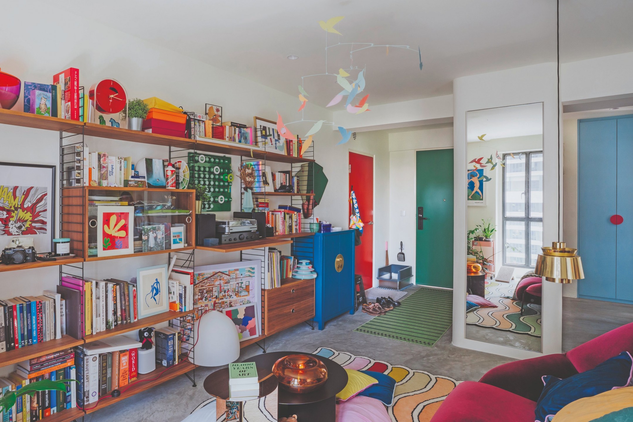
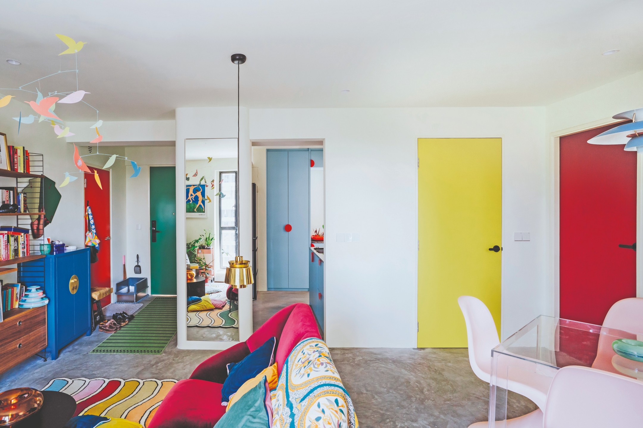
Every space in our home serves a different purpose. The owners of this resale flat in Dawson Road turned this concept into a fun element by demarcating the different spaces visually. So they painted each door a different colour, to ‘match’ the theme of each room the door opened into.
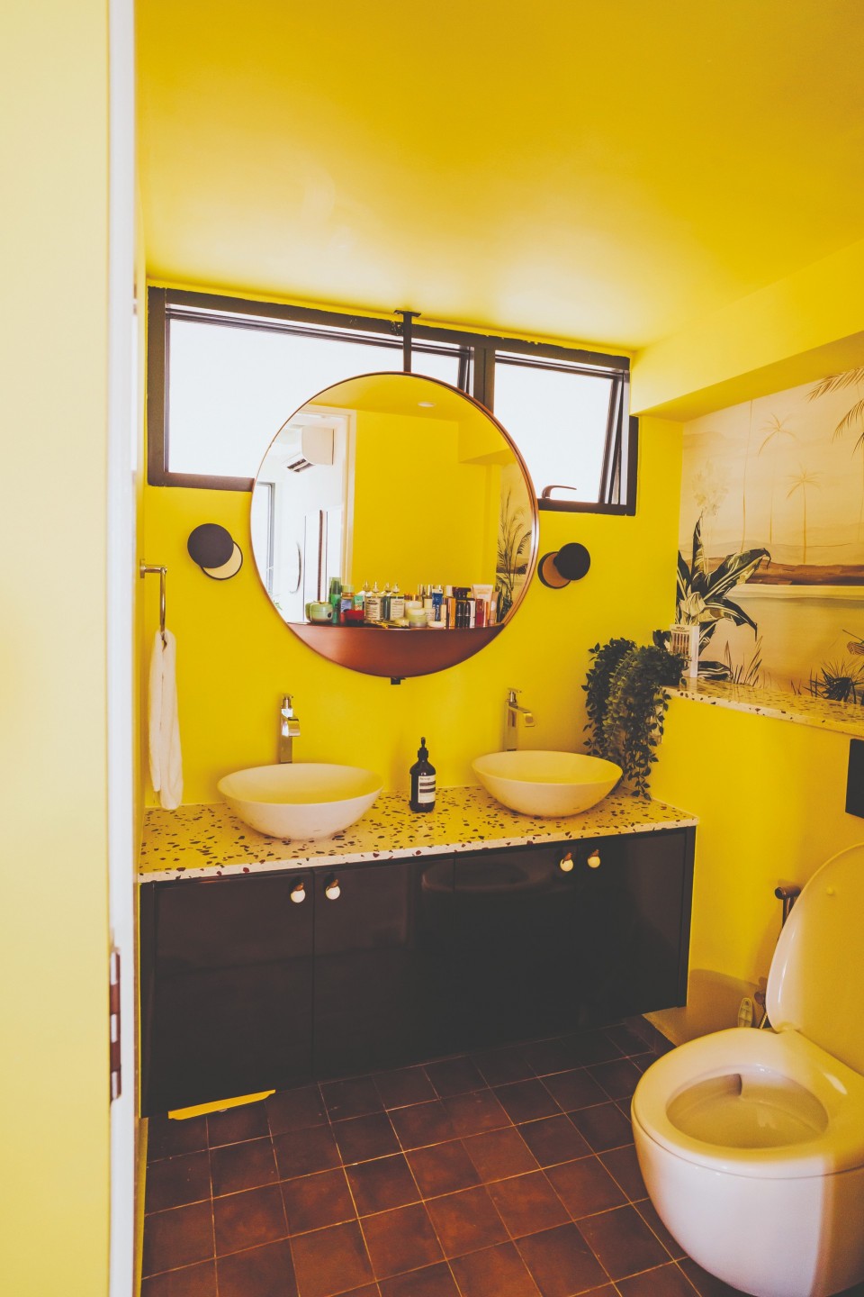
“Each door feels a little bit like a portal into a different space – the red door into the cosy womb-like bedroom or the yellow door for the beachy/tropical resort-inspired bathroom,” say the homeowners, Yankai and Rachael.
It was their love of bold, vibrant colours that inspired the design team at Insight.Out Studio to decide on the theme of the home’s new look. Interior designer Mandy Low then used elements of colours, textures, details and volumes integrated together to form a postmodern maximalist abode.
“The main challenge was pulling in the right colour combinations that went well together, along with the bold colours and textures of furniture we had planned for the space,” she elaborates. “We did multiple rounds of material selection over the course of the project, with certain changes made to the colours in specific areas along the way, to craft a balance between aesthetic and function that showcase a symbolic curation.”

The ultimate decision was reached by contemplating the desired ambiance for each space, resulting in a distinctive ‘concept’ for every area and, subsequently, guiding the selection of suitable colors.
Creating more space
The intention of the renovation was to create a fun, jovial and vibrant home for the couple to return to each day from their high-paced jobs. The layout of the typical three-room HDB flat – two bedrooms, one living area, two bathrooms – also didn’t appeal to the homeowners: “Space-wise, we found the living area too cramped to fit a decently-sized dining space, and we didn’t see the need for a second bedroom as we do not plan on having children. There was also a lot of built-in carpentry and a small corridor that made the space feel very cramped and dark.”

The second bedroom was knocked down, to open up the living space and fit a dining table. Blocky carpentry was kept to a minimum, with a focus on loose furniture that could be lifted off the ground, and they also played with different materials to keep things looking light, such as their transparent plastic dining table.
The homeowners’ love of designer furniture and quirky objects also guided the designers when deciding how they wanted the space to turn out. “We kept built-ins to their basic storage needs intentionally to let furniture and artwork shine, while having the element of colours, textures, details and volumes integrate and work harmoniously,” Mandy shares.
Letting the colours shine
The eight-year-old flat got new cement screed flooring in all areas except the bathrooms, where new tiles were laid. The walls were painted in an off-white shade as a neutral clean base so that the remaining colours could stand out. Also, rockwool was added to the false ceiling for sound insulation from the upstairs neighbours as well as to minimise sound transfer whenever the homeowners host large groups of guests.
In the kitchen, the cabinetry has a pastel light blue setting, with eye-catching orange half-circle handles, purchased from the kids’ section at IKEA. These give the cabinets a playful twist while providing an easy grip too. The granite counter surface is in ‘Indian black’, in a glossy natural grain to tie in with the black elements, while letting the other colours twinkle and provide visual richness.
“Balancing aesthetic with functionally, we opted for floating shelves and a custom hanging dish rack above the bottom cabinetry to open the kitchen space visually, as well as adding a section of full-height cabinetry with load- bearing shelves internally for appliances and other pantry storage purposes,” says Mandy.

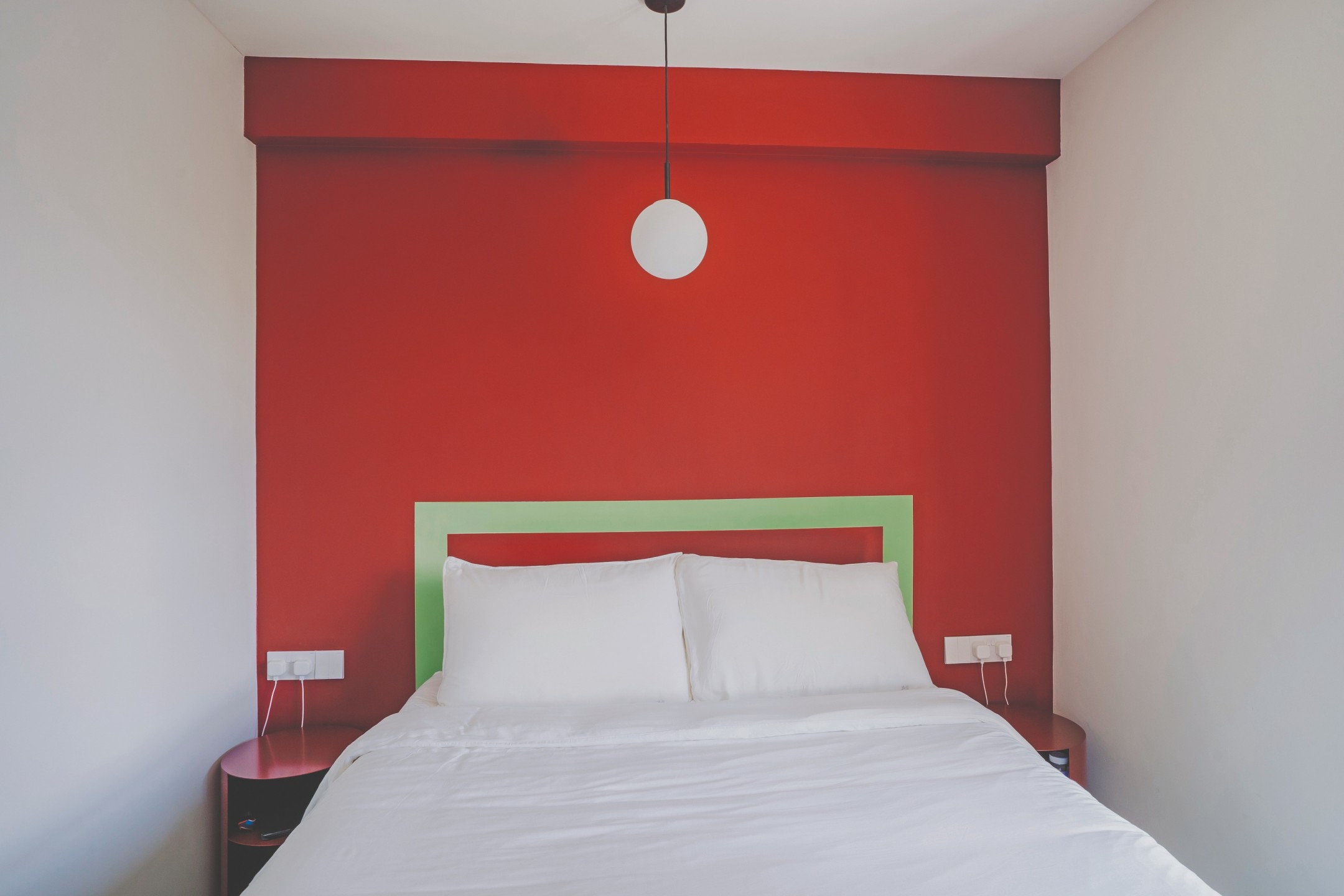
A study nook was added in the bedroom, tucked in a corner and divided from the bed quarters by a wardrobe. This is so the homeowners have a designated working area without being an eyesore to the overall design outcome, as well as privacy when on a video call. Also, to keep it simple in the bedroom – and to add colour – the designers created a border for the bed by painting a contrasting, contemporary colour (green), instead of having a physical headboard.
A touch of Europe
When it came to filling their renovated home with furniture, the homeowners were very inspired by the European modernist design from the 1950s, so they shopped at stores that carried Nordic and European designers. They found that Grafunkt had a well-curated catalogue of items that met their design needs so they bought their Ligne Roset sofa, Hay coffee table and Louis Poulsen lamp from them.
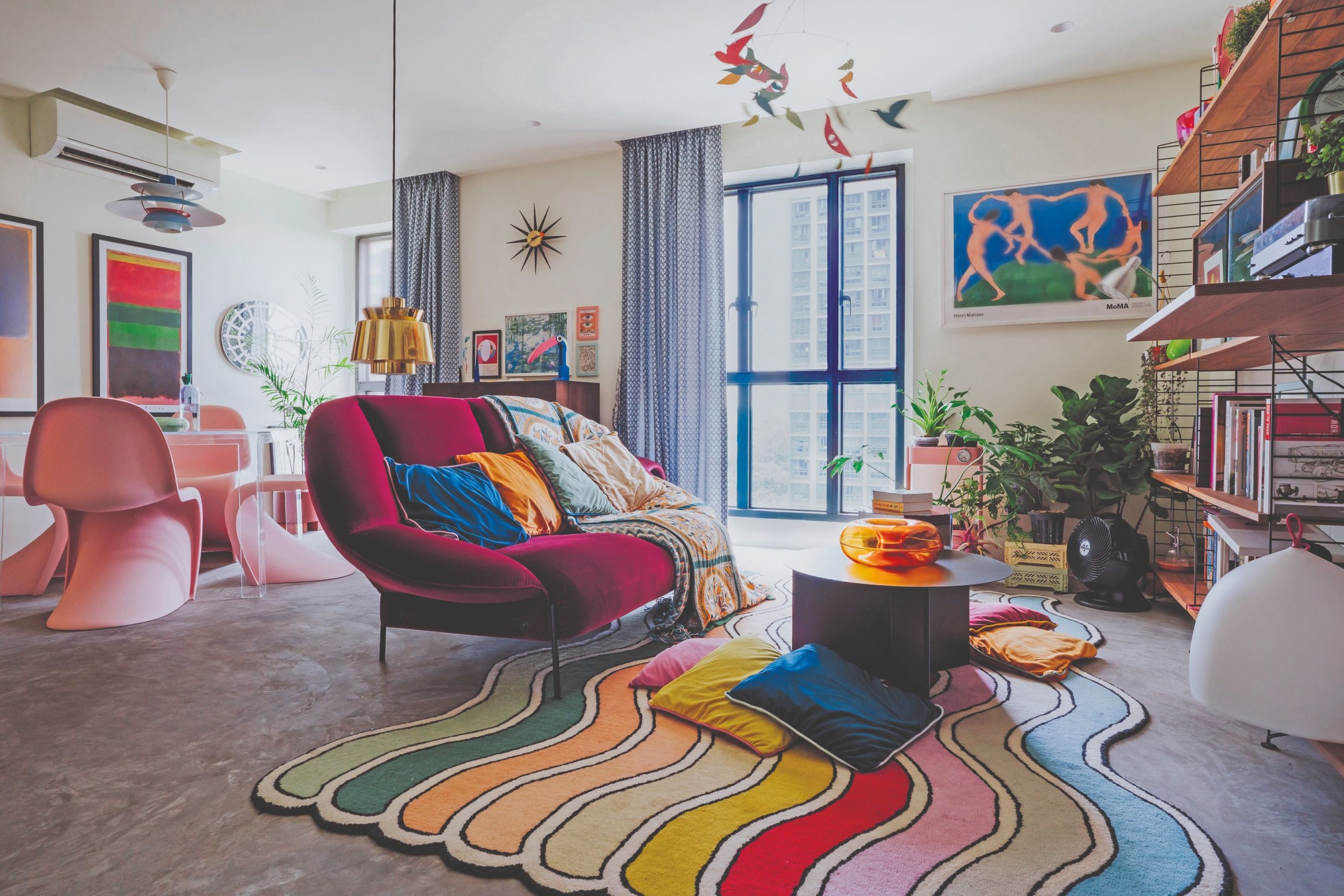
The string shelves in the living room came from Danish Design, their dining table was from Kartell, with Panton dining chairs from Vitra. They also bought lamps from Fritz Hansen and Finnish Design Shop. Additionally, they chose random colourful carpets from IKEA to soften the cement look.
The homeowners have two favourite transformations in their new home: “Doing away with the second bedroom to enlarge the living/ dining area has allowed a lot more light into the house as light from two of our big windows is able to fill the space and brighten the room. The other is our decision to convert one toilet to a powder room and the other to a shower-only bathroom – this helped to regain space in these tight places and allowed us to have less claustrophobic bathrooms.”


