With a blend of earthy tones and monochromatic flair, Simon worked his magic to introduce a dark colour without making the 4-room BTO flat feel cramped.
It isn’t often that an interior design project mirrors its environment, like this apartment in the idyllic BTO development of Tampines GreenVines.
The grand plan was to incorporate the homeowners’ favourite colour, green, throughout the apartment. Not just with a houseplant or two, but with entire walls and fixtures. You can see why deciding on the colour palette would be challenging; the variety of paints and laminates out there is astonishing. But, fortunately, their interior designer Simon Chin is no greenhorn at it.
Living room:
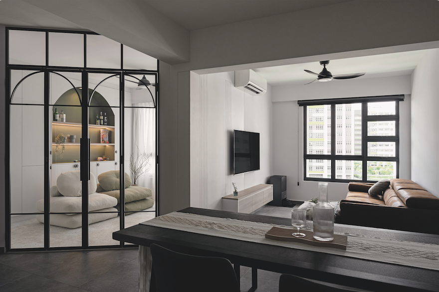
To create the illusion of space, the living room uses large floor tiles measuring 60 by 60cm each. Their dark hues, coupled with the grooves on the feature wall, add contrast to the space. Here, a neutral colour palette serves as a prelude to the rest of the apartment.
“There’s no sign of green here because we wanted to separate the living area from the other rooms, but the TV console uses the same laminate as the rest of the house for uniformity,” Simon explained.
Kitchen:
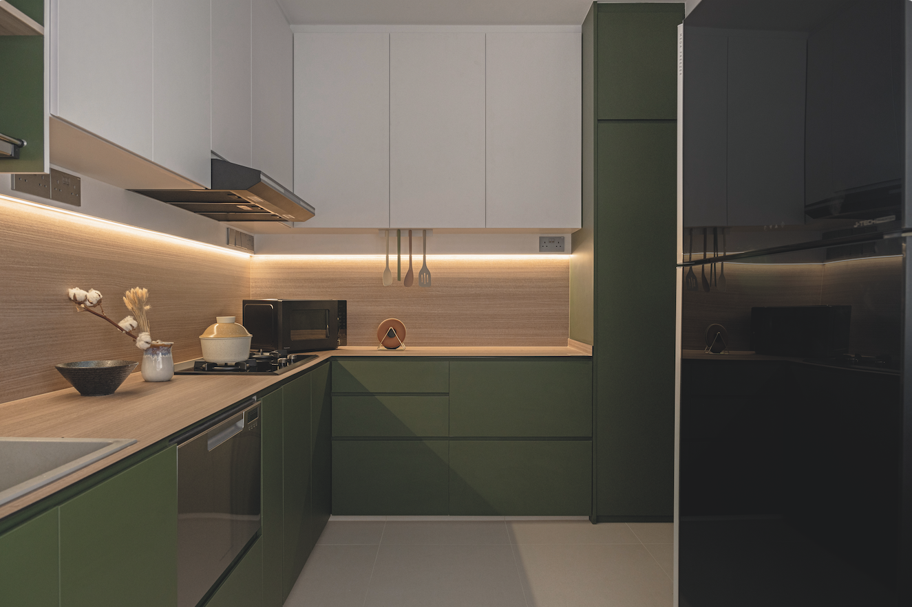
The homeowners requested for an enclosed kitchen, introducing the colour green for the first time. An olive hue adorns the half- height cabinets, complemented by wooden laminates on the worktop and backsplash. The crisp white finish in the living room extends to the top-hung cabinets, adding a dash of understated luxury to balance the “jungalow” look below.
Entertainment room:
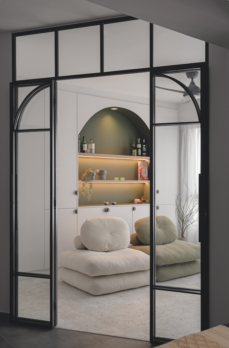
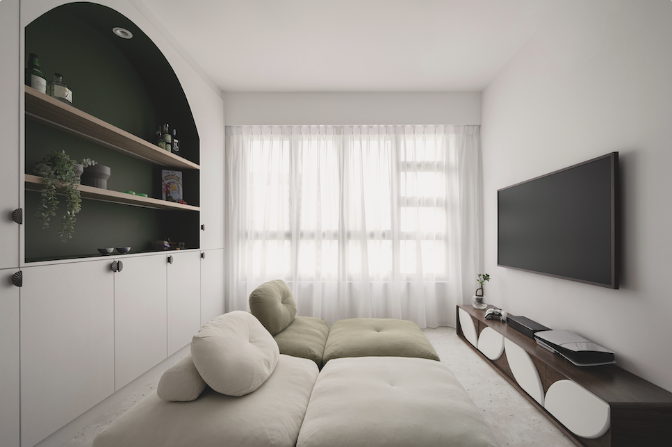
“The homeowners needed an entertainment room because they really enjoy gaming and watching TV during their downtime,” said Simon.
Its entrance had to be angled due to the layout, but this turned out to be a nice touch as the glass allowed more natural light into the dining area, making it feel more spacious.
Inside, an arched niche stands out amidst a wall of minimalist cabinets. It showcases some of the homeowners’ prized possessions, serving as a backdrop for their relaxation.
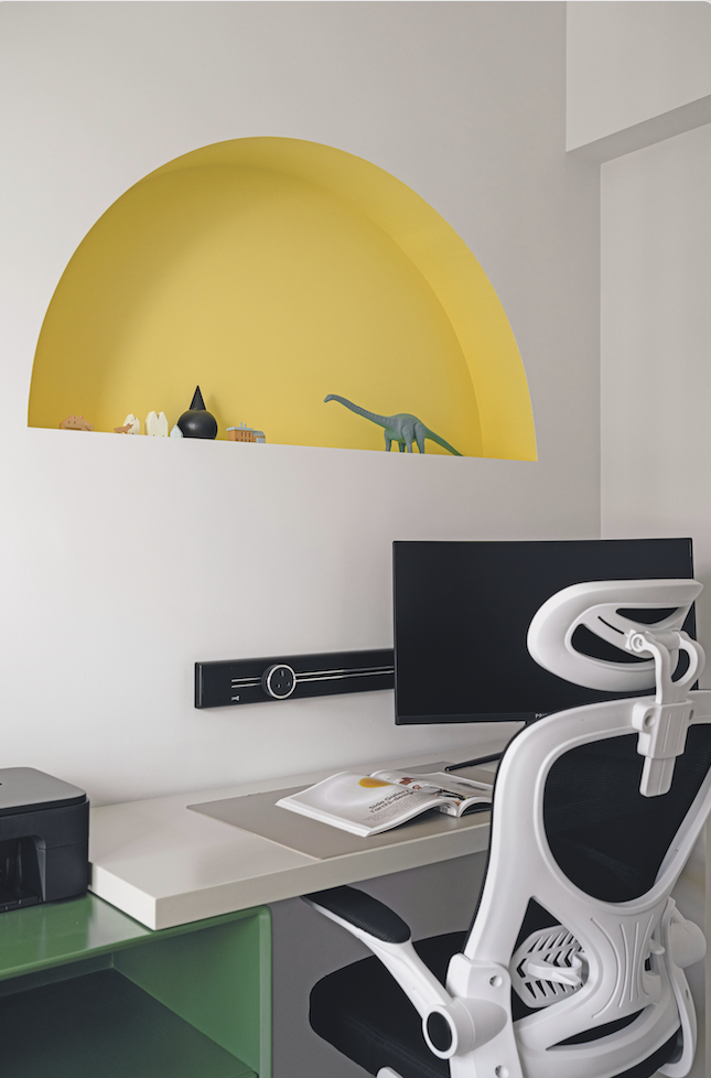
Study room:
The study features a desk from Taobao, boasting a similar shade of green as the other rooms. This is contrasted by a small arched niche above, evoking the image of a sunrise or sunset (depending on the hour of the workday) and adding a touch of playfulness to the otherwise sterile work-from-home setting.
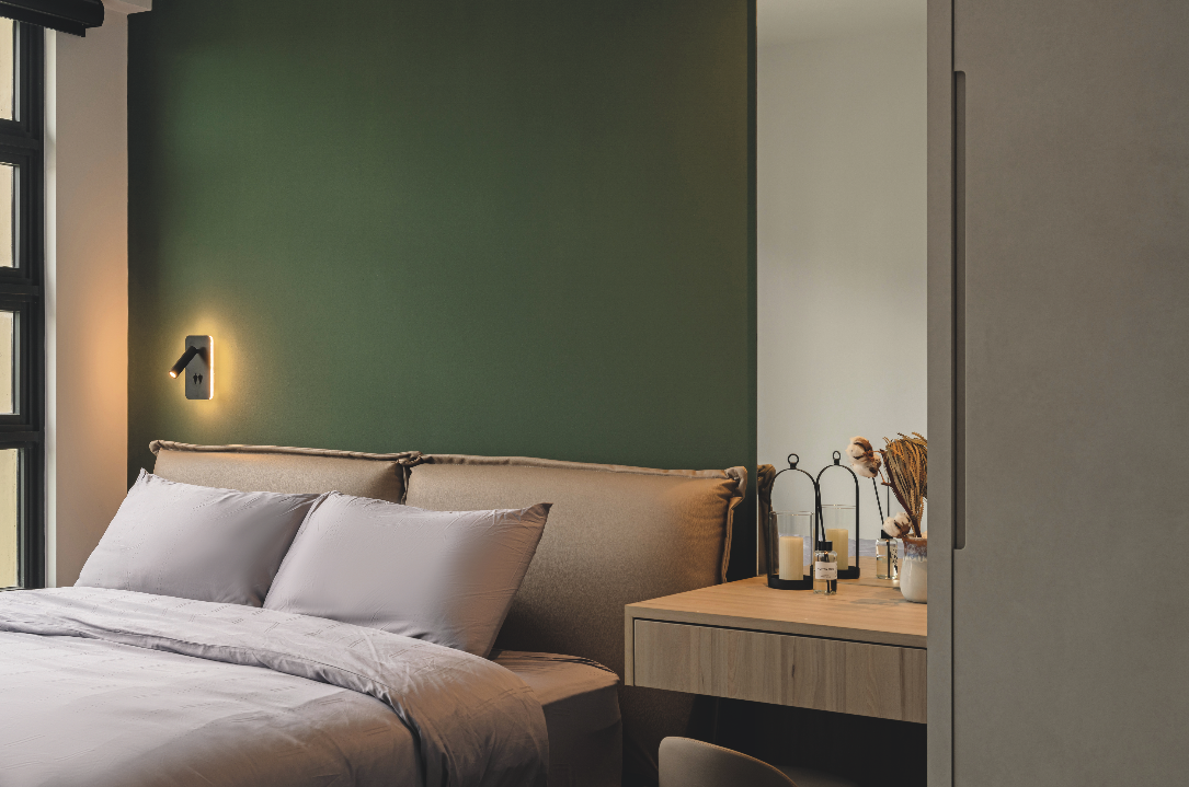
Master bedroom:
A dark-coloured wall and a floor-to-ceiling wardrobe could diminish the spaciousness of a master bedroom. But by choosing an L-shaped layout and applying a light-coloured textured paint, Simon countered their visual weight and with room to spare for a dresser.
Proportions are similarly well-maintained in the master bathroom, featuring green wall tiles for an earthy palette and a vanity with a curved corner to evoke an organic feel.
Ovon DesignShowroom 1: Showroom 2: tel: 65 85882388 |


