These homeowners knew what material they wanted from the start, then planned their renovations around it.
There was one main focus in this BTO flat’s renovations – travertine stone. The homeowners love this material and wanted the design of their abode to revolve around it. Therefore, everything was planned to match the look of travertine – a warmer tone and a raw and organic look, with every space still being functional. By why travertine, though?
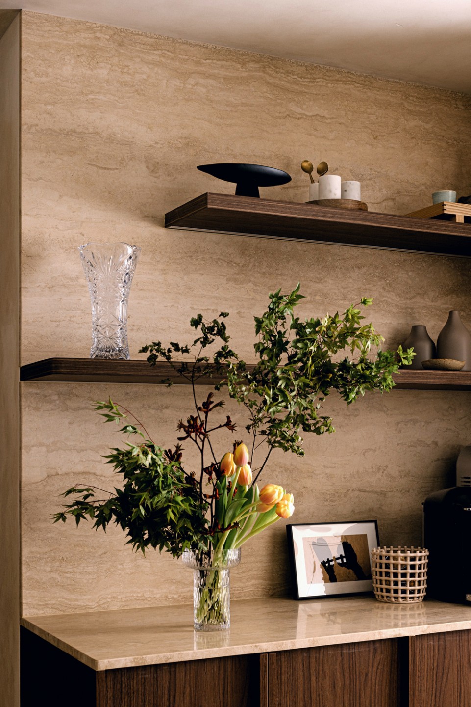
“Unlike marble, the beauty of travertine is that it wears with time and it grows with us. That was what attracted us the most – not the beauty of perfection but rather how the home will age together with us,” the homeowners, Jerlynn and Marcus (@ourtanhowse), reveal. “So we chose laminates to match it and we love how a contrasting darker walnut brings out the rawness of travertine perfectly.”
The couple also briefed their ID from Local INNterior that they wanted their home to look different from the regular cookie-cutter BTO flats. One advantage was that they didn’t opt for the HDB tiles so the flat was given to them completely in bare concrete, which means they were easily able to pick the materials they favoured. Travertine tiles are in the main areas, wood-like tiles for the bedrooms and rougher, raw concrete-looking tiles for the foyer area.
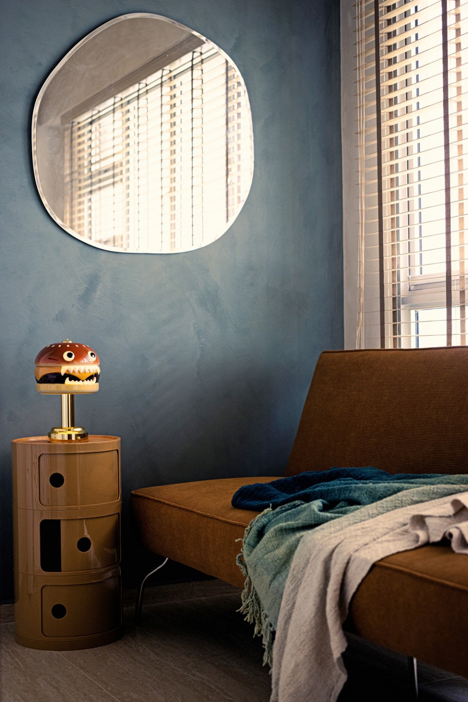
“Without a definite theme in mind, our home was able to come together in a way that suited us uniquely rather than being inspired by another theme and replicating it entirely,” they share.
The entire home is painted in limewash, including all ceilings and walls. The homeowners committed themselves to executing this job even though there was a huge delay as many layers and touch-ups were needed – and they have no regrets about going this extra mile.
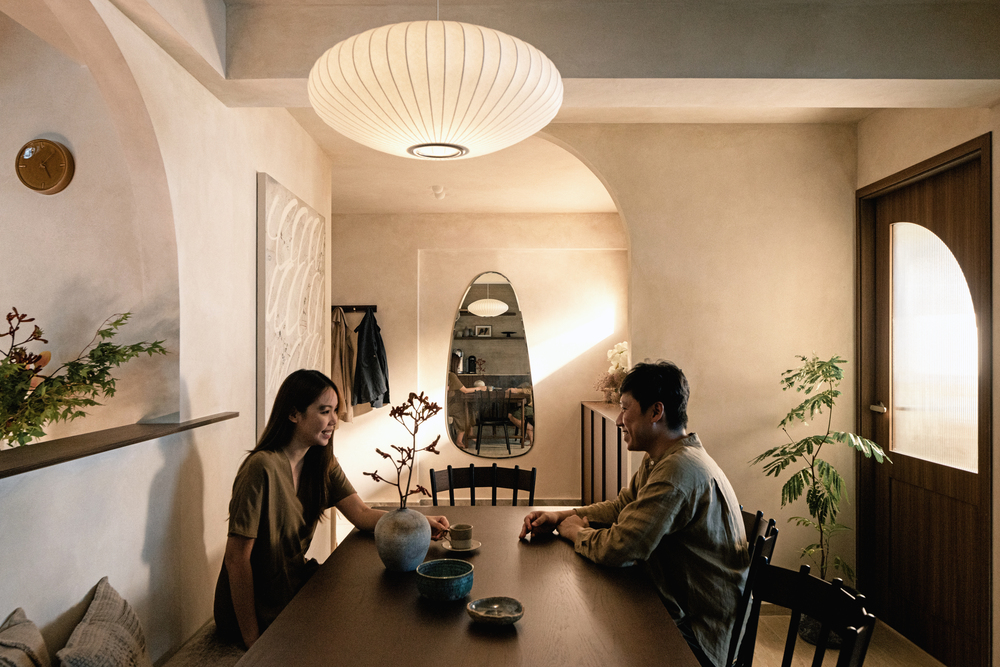
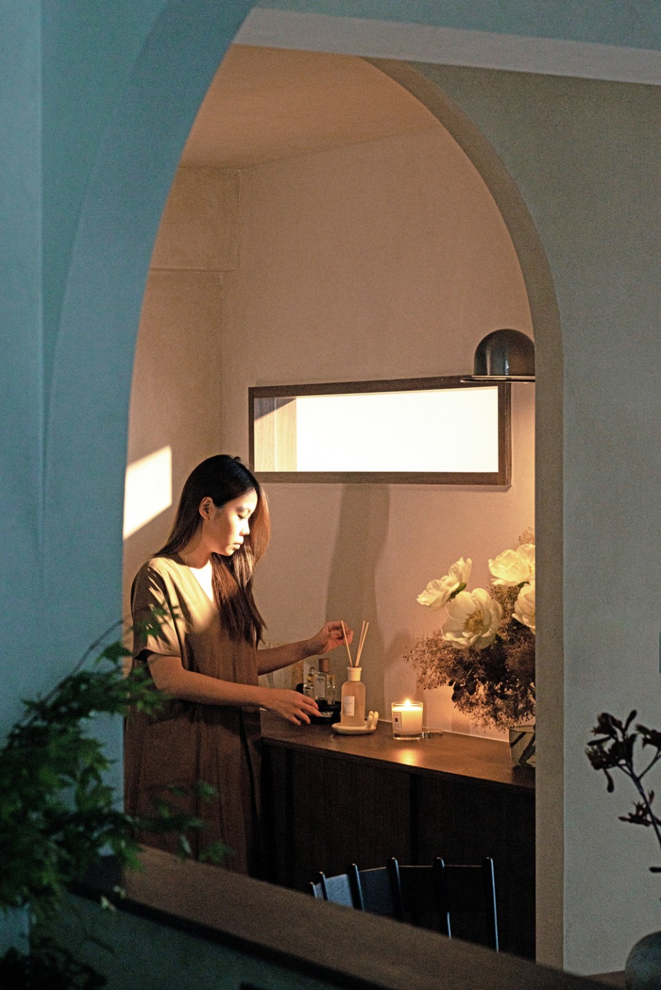
A foyer was created by the main door as they wanted to separate this space from the dining area, which is right next to it. This is where the homeowners store their shoes, keys and bags that they can easily pick up before leaving the flat. A hole in the wall was created for daylight to stream in as the home can get quite dark with all the doors closed.
“This area has given us the opportunity to decorate according to the seasons and place floral arrangements, something we both love,” the homeowners shared.
Altered layout
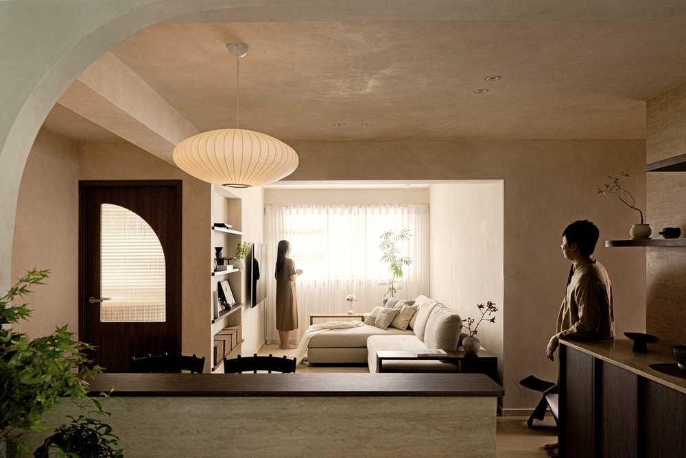
The biggest transformation in this flat was swapping the location of the living room and third bedroom. This was so the kitchen, dining and living areas could be more cohesive, with a better flow between the three spaces.
The kitchen’s countertops and backsplash are in pure travertine stone. Because of limited space due to the bomb shelter being in the kitchen, another countertop was erected, with a single bar stool and space for food prep. It’s also an ideal spot for cooking equipment as it has several power socket points.
A small pantry area sits at the kitchen’s entrance. According to the homeowners, it serves a practical reason and also flaunts the home’s design: “We really wanted to showcase our travertine stone and felt this was the perfect area to do so. It’s in the centre of the home plus it’s where our guests will be facing most of the time while dining and hanging out with us.”

The coffee lovers plan to expand it into a coffee area in the future. But right now, their water dispenser is placed here so guests can easily help themselves to water at any time, rather than walking into the kitchen. The couple opted for a larger dining table as they both have large families and love hosting friends.
The new location of the living room creates a more cohesive flow and flexible play of space. A hole in the wall that is standard in most BTO flats has been transformed into niche-shelving. The homeowners are glad they decided to turn this space into their living area: “After living here for a year now, we realise how much time we spend in the living room and we’re glad we invested in making it more cosy and inviting.”
Cosy cave vibes
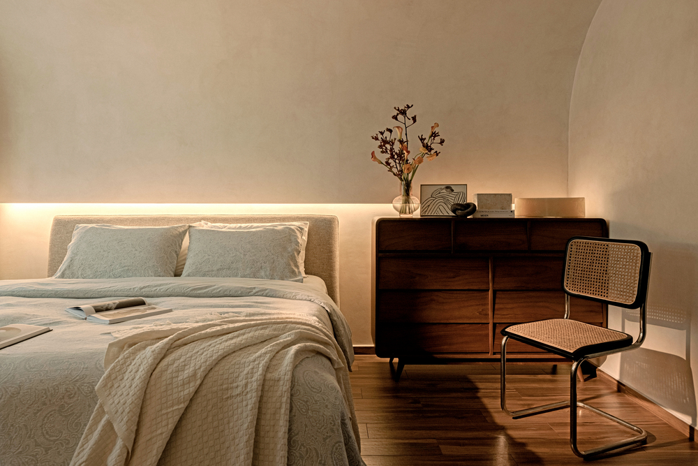
Their favourite transformation though, is the master bedroom, especially the huge, wall-to-ceiling curve over the bed.
“Our ID wanted to ‘go big or go home’, so we trusted him and went with the biggest curve he could do,” the homeowners recall. “Because of this one design element, our bedroom has been transformed from a regular four-walled room with a bed to a cosy cave which ties in with our limewash perfectly. This curve is also visible from standing in our foyer so it creates an impression when guests visit us for the first time.”
There is a concealed door in this room which leads to a walk-in wardrobe that doubles up as a study. The original door of the second bedroom was sealed up and an opening was created from the master bedroom. The couple decided not to leave this space open or combine it with the master bedroom so that they “still have privacy should we need to use this room as a room on its own”.
“We needed as much wardrobe space as possible, therefore the entire wall was built with a full-height wardrobe, in the same dark- walnut laminate and door design as all our carpentry in the house,” they add.
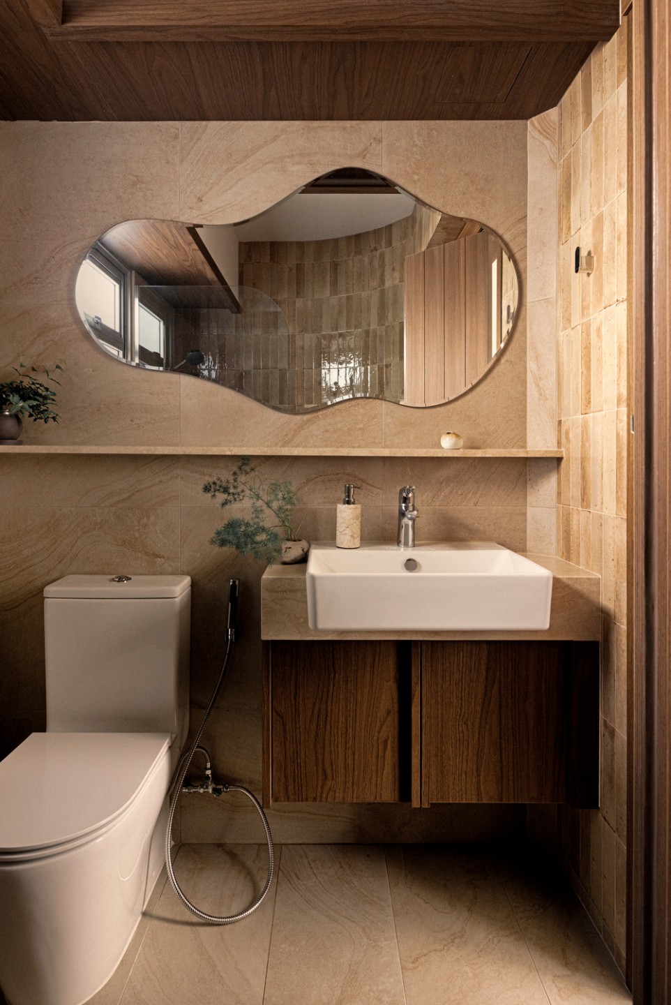
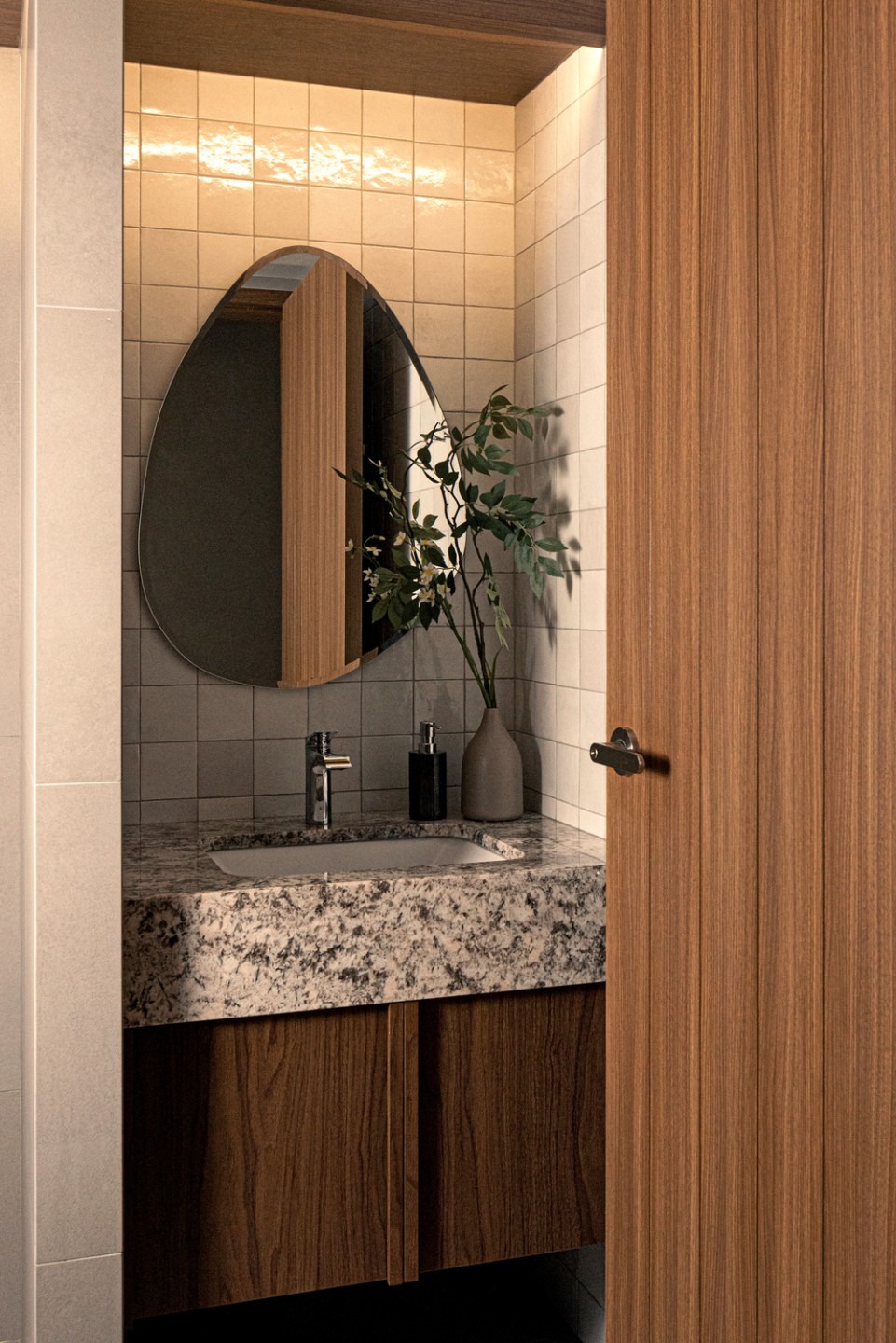
Both of the bathrooms were redone, with the common bathroom the only area in the home featuring cool-toned grey tiles, with matching starlight granite stone. The ensuite, however, is in pure travertine stone, to tie in with the warm-toned master bedroom.
“We loved the curved tiled walls that many European interior designs use and we showed that to our ID and he amazingly translated his version for our shower niche area,” the homeowners explain. “This is my favourite part of the bathrooms and it’s one-of-a-kind as hardly anyone in Singapore has ever done this since it’s labour intensive.”


