A carefully curated mix of textures and accents helps to make this family home shine.
We are all familiar with the phrase “God is in the details,” a term that’s very much applicable to interior design as it always comes down to the little things that transform the empty shell of a house into a home specifically curated for the occupants living within. This is perfectly demonstrated in this home’s makeover.
At the helm of the renovation project was local interior design firm Mesh Werk Studio, but as the property was new, there was minimal work required in terms of structural modifications. Additionally, the owners didn’t have a specific design theme in mind, so the team focused on maximising the functionality of the various spaces while creating an uncluttered yet cosy look.
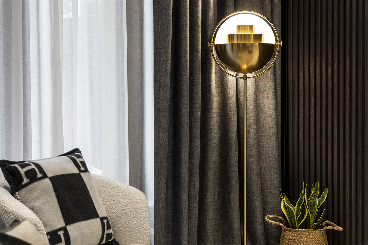
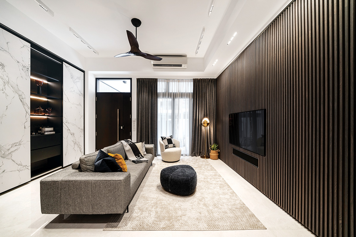
Right from the get-go, the chosen colour palette sets the home’s warm and restful ambience. In the living room, dark brown hues occupy the length of one wall, while white tones dress the other. Doing so ensures that no one colour is overpowering the other, effectively carving out a balanced and cohesive family room that feels welcoming and inviting.
Surrounding the television and Bang & Olufsen soundbar are dark wood vinyl panels arranged linearly in a 4m stretch. Besides functioning as a feature wall, this also hides storage units where the family’s precious collection of photo albums and other collectables reside. The design team shared that each vinyl strip was laid individually by hand, something that required a lot of time and hard work, but “the end result was definitely worth it.”
Behind the sofa, a display-cum-storage wall comes into view, where an abundance of shelving units and storage solutions help the home remain uncluttered. The most unique characteristic about this fixture, however, has got to be the sliding white marble-effect doors that boast beautiful marble veining and were constructed using Dekton slabs from award-winning surface manufacturer Cosentino.
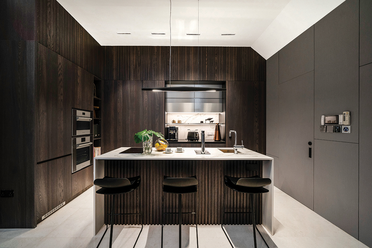
Once the owners shared their love for cooking and entertaining, the design team knew that they wanted the kitchen to be the heart of the home. In order to create a more comfortable and fluid working environment, the utilitarian zone had to be tweaked slightly. The original L-shaped layout was converted into a centralised island unit so that the dining area now connects to the dry kitchen from all sides, making for the ideal entertaining space.
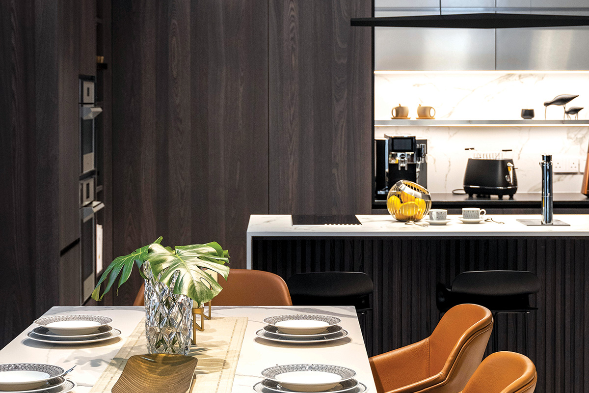
Since the living, dining and dry kitchen areas share the same visual axis, the designers purposefully utilised the same materials to ensure seamless flow and aesthetic consistency as one walks through the three zones. For instance, the existing marble flooring was retained as it matches the home’s overarching luxurious theme. Similarly, the dark wood strips on the television wall are echoed on the base of the island unit. The Dekton marble-effect slabs also make an appearance on the island unit’s countertop, as well as on the backsplash in both the wet and dry kitchen.
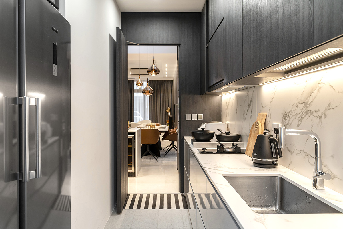
To further enhance the clean and seamless look in the home, all built-in cabinetry and appliances in the dry kitchen were kept flush with one another. Even the entrance to the wet kitchen—next to the functional niche holding the toaster and coffee machine—and the adjacent guest bedroom are concealed too.
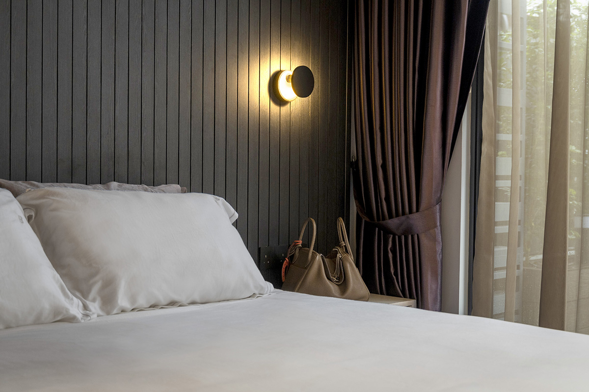
Looking back on the renovation process, it is clear that the design firm’s experience with balancing flair with practicality was key to crafting this personalised abode, resulting in a well-run living space for the family of three.
This post was adapted from an article originally published in the June 2021 issue of SquareRooms.


