This home’s creative redesign gave rise to multiple entertaining zones and luxurious private spaces for its owner.
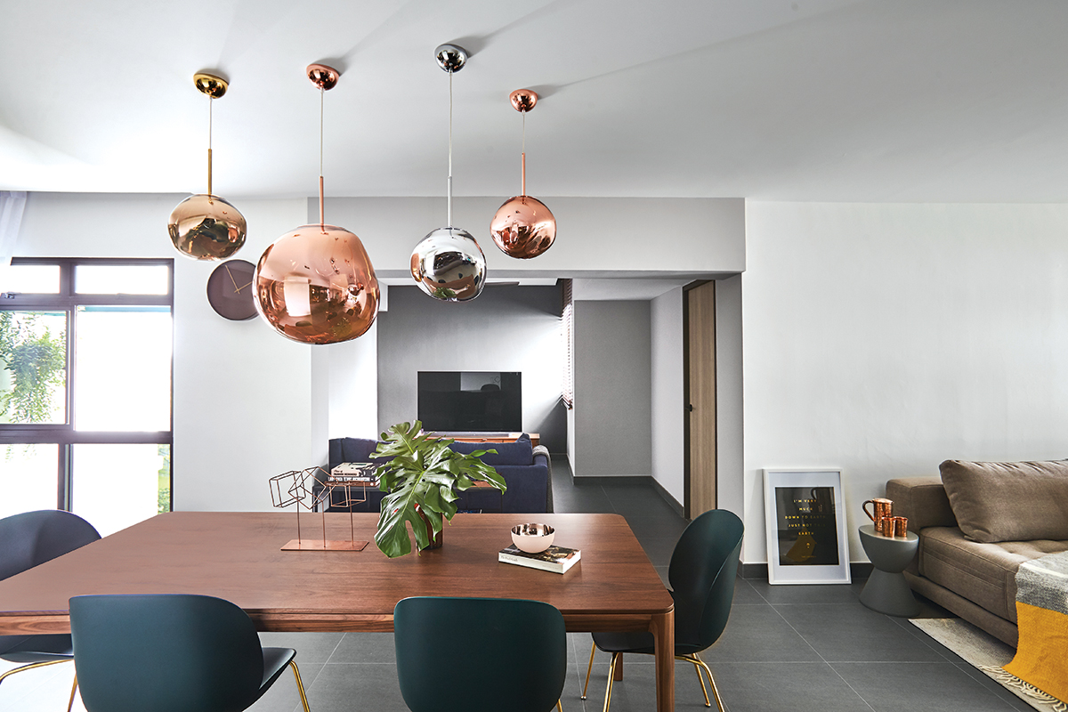
Home to a single occupant, this 1,184sq ft home presented its owner with a welcome opportunity many of us would like to have—namely, what to do with a spare room (hint: see p. 44 for ideas). The owner only needed two of the three bedrooms to function as his main bedroom and a guest or study room, so he felt the third could be used as a cosy corner as he enjoys cooking and having friends over.
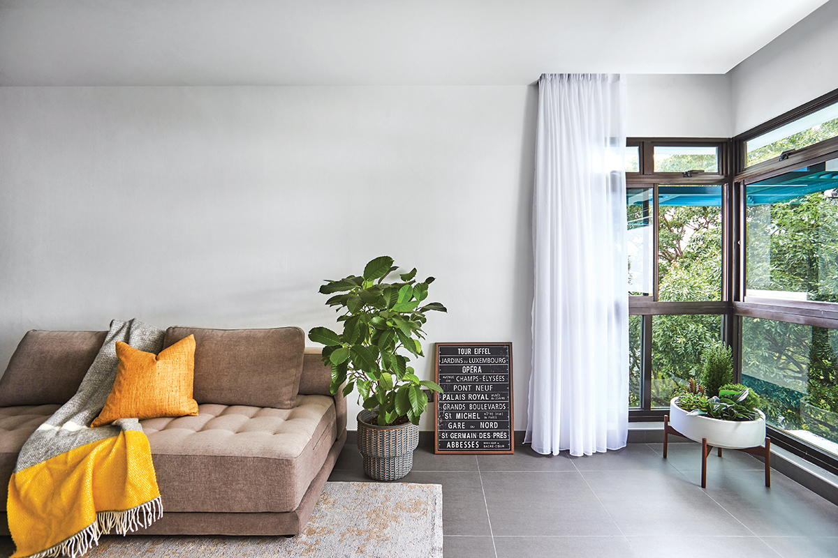
Working with Ian Lai of Bowerman Interior Planner, a firm known for contemporary and liveable designs, the owner sought help with determining which room would be best used for the flexible space. The home also had limited natural light, so the client wanted to brighten the flat and bring the greenery surrounding the space into the interiors too.
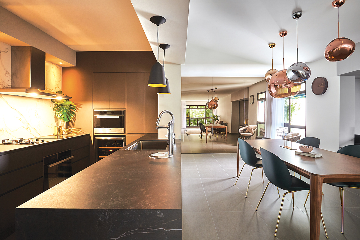
After observing the quality of light throughout the unit and studying the floorplan, the duo felt that a cross-shaped layout for the communal areas could create an interesting visual connection between the various open spaces. Taking down part of both walls flanking the linearly arranged living and dining sections would also fix the problem of this joint space looking “overly long,” shares the designer.
The removal of the old kitchen created an opportunity for installing sleek and sophisticated storage that integrates cooking and cooling appliances for a modern look. It also allowed the designer to put in a long countertop that would let the client interact with guests in the dining area while preparing food and drinks. The central space was then kept sparsely furnished for future flexibility.
At the far end of the dining area, Ian added a bronze mirror to a “boring white wall,” explaining that it makes the space brighter and more inviting while creating a new perspective that was never explored before.
Since his client would like to gather with guests in the living room and enjoy conversations without distractions, the TV was relegated to the newly created chill-out space. The TV also cleverly faces the dining table and kitchen, letting the homeowner watch shows while preparing and eating food.
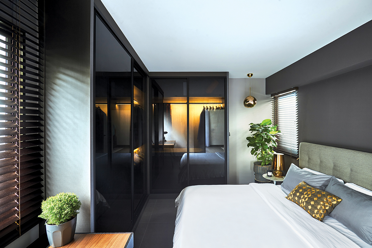
At day’s end, the owner can look forward to unwinding in a bedroom designed to be relaxing and luxurious at once. Located just off the living area, it embraces dark grey tones which set the room apart, creating a more private feel.
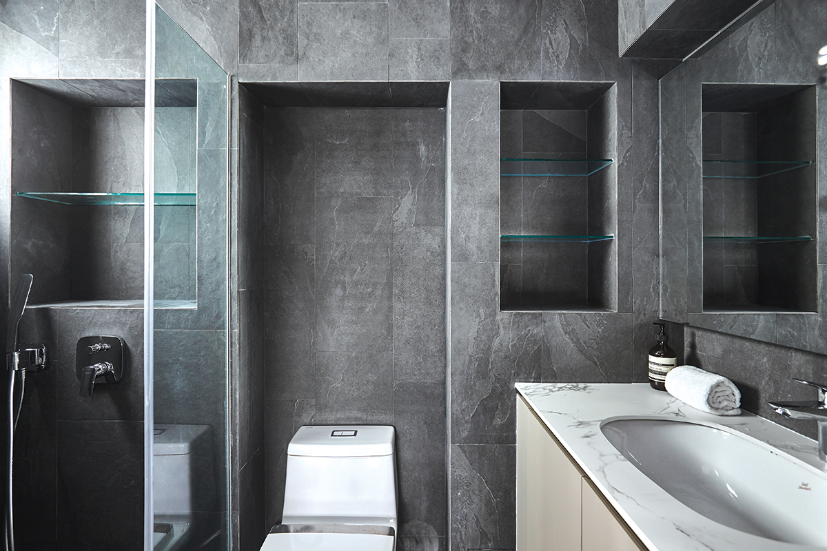
The same cocooning ambience is mimicked in the bathroom, which features stone-look surfaces that have enduring appeal. With chic gathering spaces and cosy private sanctuaries, this home feels like it has struck the right balance to deliver the best of both worlds.
This post was adapted from an article originally published in the May 2021 issue of SquareRooms.


