This four-storey home in Singapore’s Paya Lebar neighbourhood boasts a brick interior for warmth and cosiness and private spaces for quiet relaxation.
Located along Jalan Kelichap in Singapore, this intermediate terrace house is home to a young family of four, and features a series of inward-looking spaces of retreat. Designed by Hier Architects, a multi-disciplinary design firm helmed by husband-and-wife team Kelvin Lim and Lee Peishyun, the house offers privacy and cosiness while maintaining a sense of roominess, and includes areas for the owners and their two school- going children to relax in.
Kelichap, the name of the street that the house is on, is the Malay reference for a type of sunbird that is often sighted in the area. Lim drew inspiration from it when designing the property, saying that he “envisioned an intimate family home nestled among greenery and birdsong”.
Privacy matters
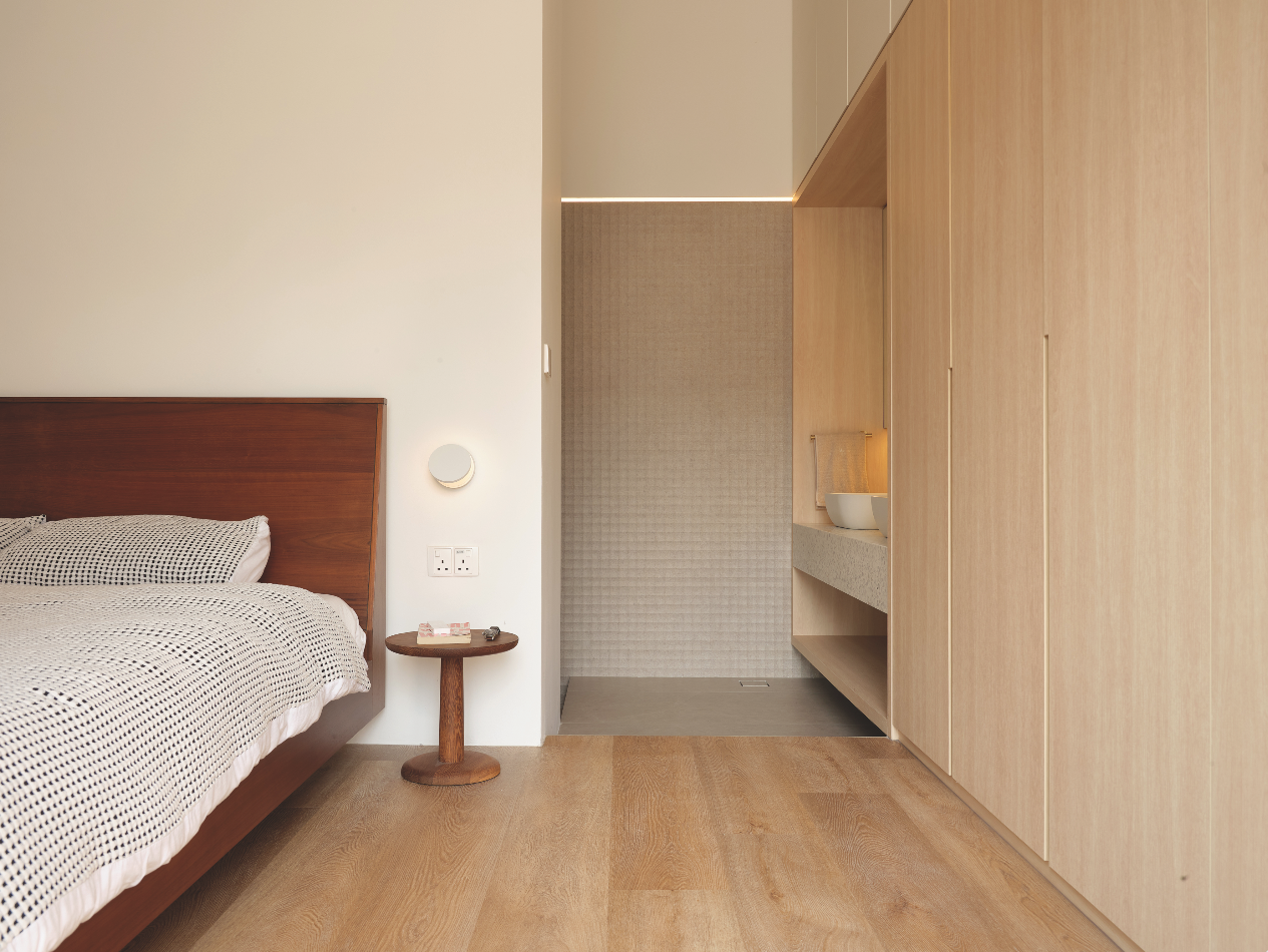
The brief from the owners was straightforward: they wanted three bedrooms and were keen on a brick interior.
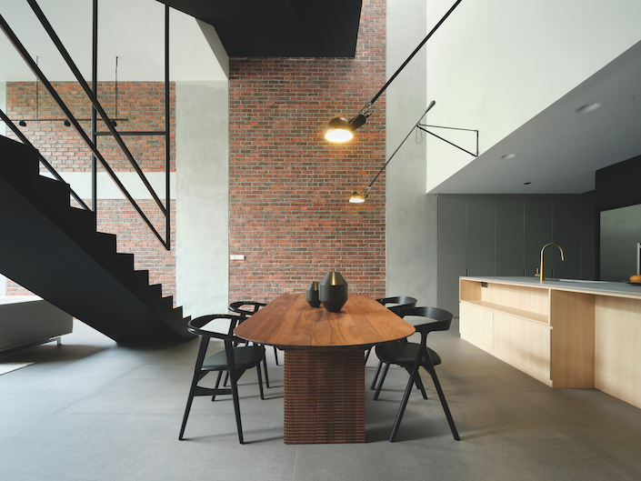
“The father of the family had lived in the United States for some time; he recalled the warmth and cosiness of places with a brick interior and wanted to create a similar effect in his home,” Lim notes.
Maintaining a sense of privacy was also important for the owner, so Lim designed a series of inward- looking spaces, one of which was the rear courtyard.
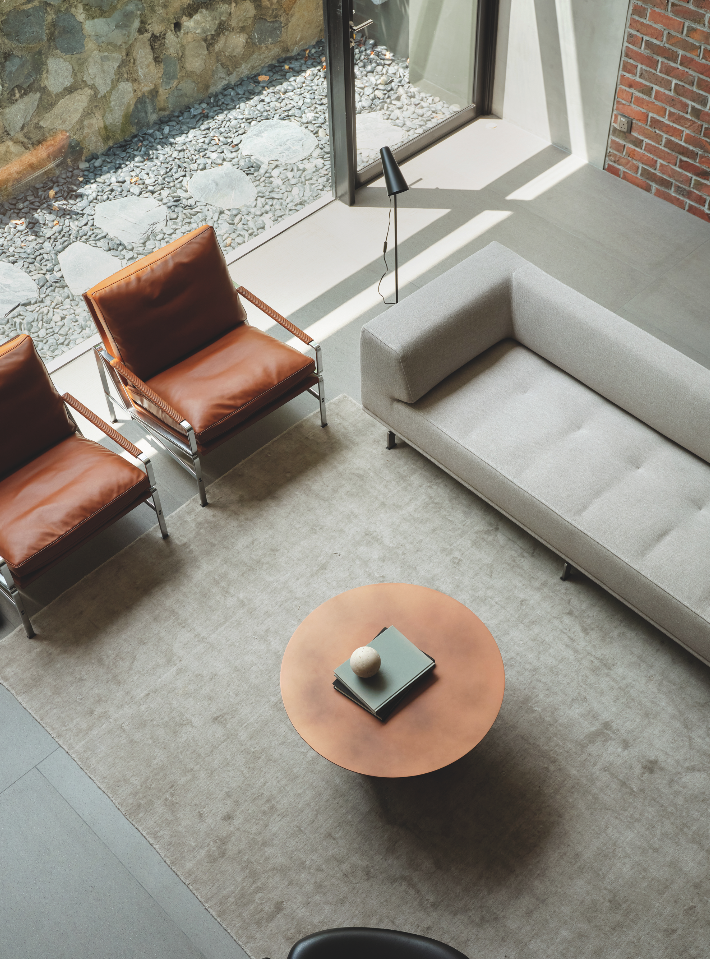
He explains: “The front lawn of the rear neighbour’s plot sits on elevated terrain one storey higher, giving rise to its very high walls (a mix of retaining walls and boundary walls) as well as a private rear setback area which we felt would be ideal for a courtyard.”
Lim therefore reorientated the design of the house to the rear, which also made sense, seeing as a busy eight-lane road (Upper Paya Lebar Road) runs a short distance away from the front of the property.
On the ground level, the main living room turns away from the main street entrance to face the back courtyard, where greenery greets the double-volume living space. Just behind the land is a small park with mature trees. The courtyard visually connects the owner’s plants to the mature foliage of the park beyond the boundary wall.
Another reason why the living room was reversed to the back area was that the front half of the existing two-storey house had been retained. According to Lim, this meant that the ceiling height for the ground floor spaces on the front half of the property was rather low, around 2,600mm. Lim chose to situate the wet and dry kitchens and powder room here.
“The rear section of the existing house was demolished, with a new four-storey extension built in its place – this allowed for a much higher double-volume living room at the rear,” Lim continues.
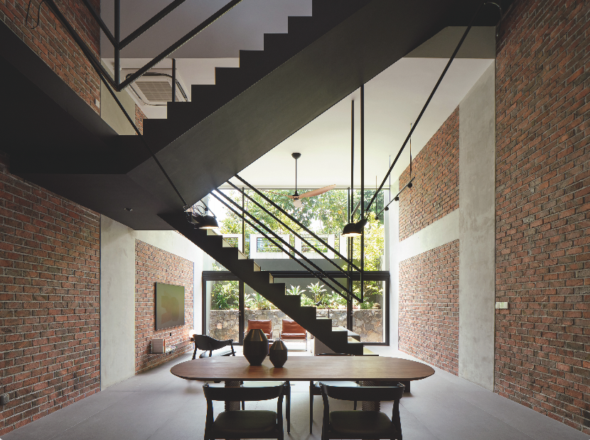
A three-storey-high atrium separates the retained section and the rear extension.
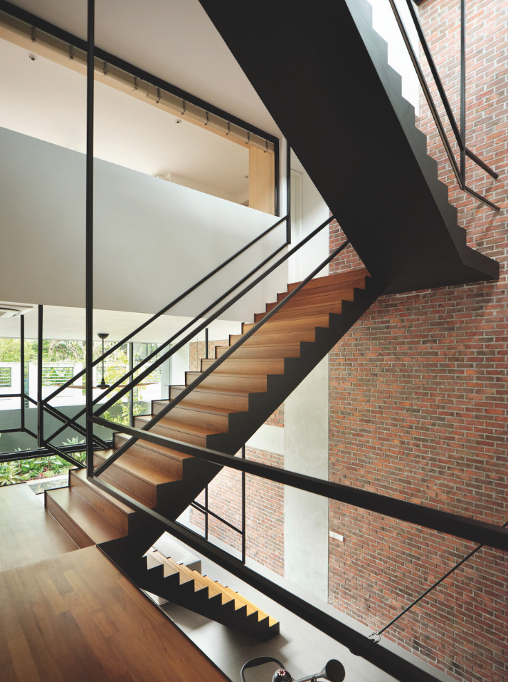
Within this atrium is a succession of staggered suspended staircases that “peel” away from one another (the suspended staircase folds out from each other as it ascends to the higher storeys), but connect one level of the house to the next. This “peeling”, Lim says, moves both in-section and in-plan to allow daylight to reach the deeper level spaces.
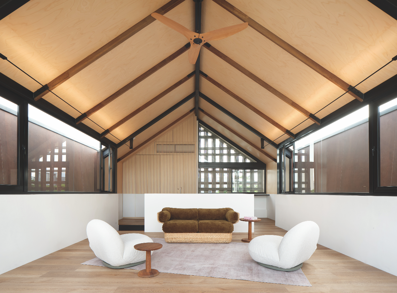
The attic-level family room cantilevers forward to allow for a roof terrace. This dramatic offset not only provides shade from the harsh tropical sun for the spaces directly under, but also allows for views of a community playground from the roof terrace. This offset perches the barn-shape form of the family room forward, almost resembling a dovecote that is adjoined to the main house.
Hardy materials
Besides the facing bricks, which Lim says his studio enjoys working with for its beautiful warm colour and smooth texture, the house features plenty of steel. To balance the sombreness of the brick interior, however, the steel staircase was designed to be “light”, says Lim.
“The staircase drapes and peels as it cascades down. We wanted an effect not unlike that of a suspended chandelier. To achieve that lightness, we constructed the staircase out of steel structure. Timber planks form the staircase treads,” Lim continues.
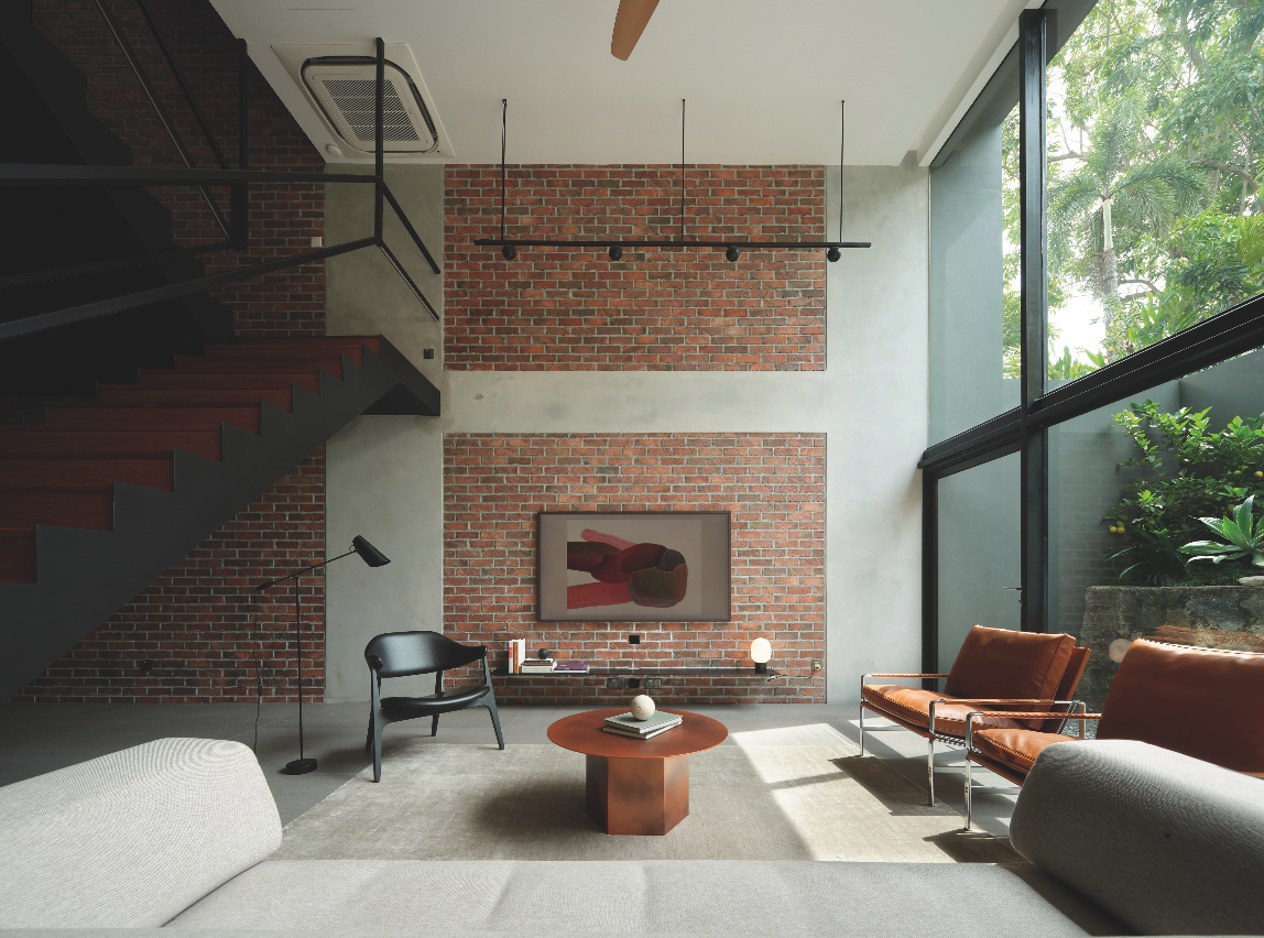
“The steel balustrades were suspended from the ceilings in very thin members. LED strips were incorporated and concealed into the slim channels to provide lighting to the steps.”
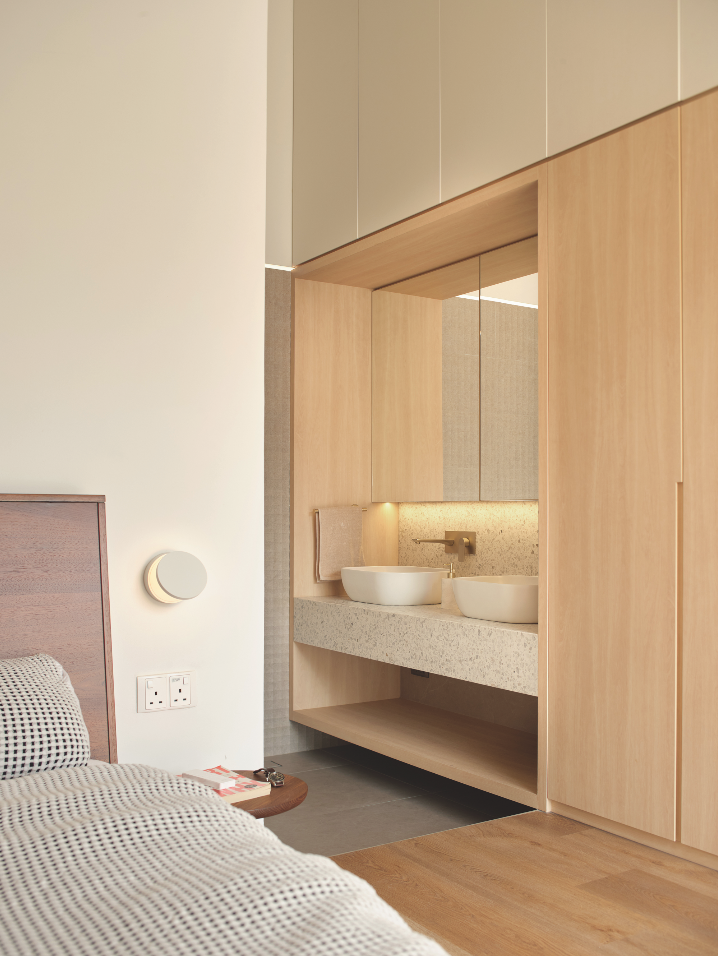
The family room features a plywood finish ceiling. Says Lim: “We created a cabin perched out on top. The roof structure was constructed using timber rafters, and the ceiling boards were made out of birch plywood, resulting in the timber interior.”
Meanwhile, the reinforced concrete columns and beams of the house structure were cast in-situ and left exposed.
Safety and comfort first
During the 15-month-long construction process, Lim says that he encountered one challenge which had to do with safety.
“The owners loved the suspended balustrade, but, as the staircase took shape, the large openings between the balustrade and the staircase soon became a point of discussion, because the owners were concerned about their youngest child’s safety. We came up with a few other options and mock-ups on-site to allay their safety concerns. Everyone agreed on the eventual design, which has two horizontal bars instead of one, which was the original intention,” explains Lim.
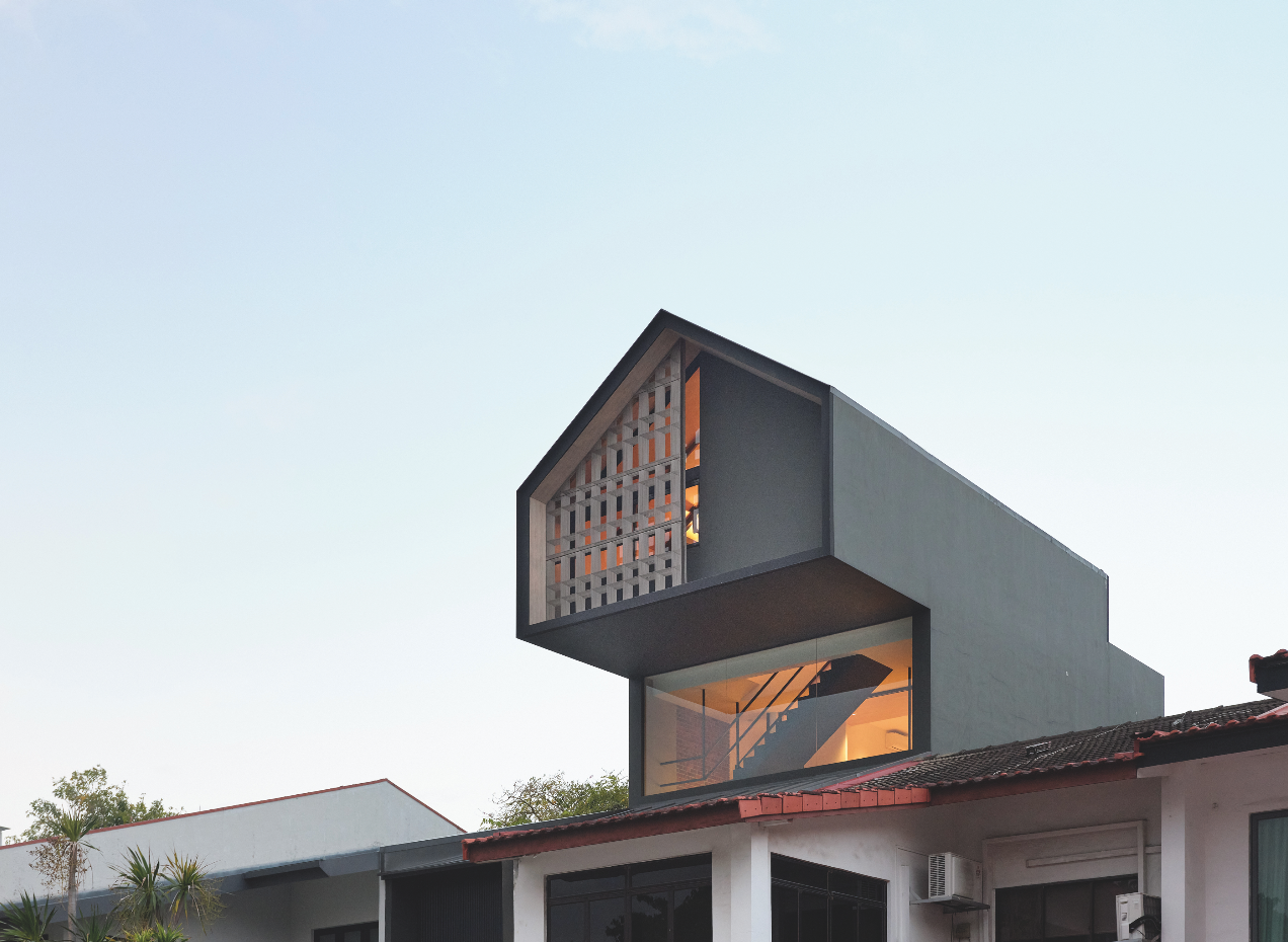
To ensure that the property stays cool during the hotter months, Lim designed a woven sunscreen on the exterior of the glass windows of the family room. And the perched barn itself cantilevers out to provide shade for the glass panel below (part of the staircase atrium), which admits daylight into the deeper levels of the house.
These thoughtful design interventions, together with the material palette and the overall layout, all help give the home a unique contemporary style that is perfect for the modern family.
This post was adapted from an article originally published in the July 2024 issue of SquareRooms.


