Tim and Nicole were so enamoured with their Tiong Bahru rental that they bought it, preserving its mid- century charm while personalising the pre-war unit.

For the last decade, Tim has shuffled from one rental apartment to another. But this SIT (Singapore Improvement Trust) flat in Tiong Bahru made him feel so at home, he jumped at the opportunity to buy it from his landlord.
“It was nice for him to call one permanent house a home after living a nomadic lifestyle for almost 10 years,” says Nicole. “Having lived in the home for 5 years, Tim had enough time to experience all the little details of the house and understand our shared preferences.”
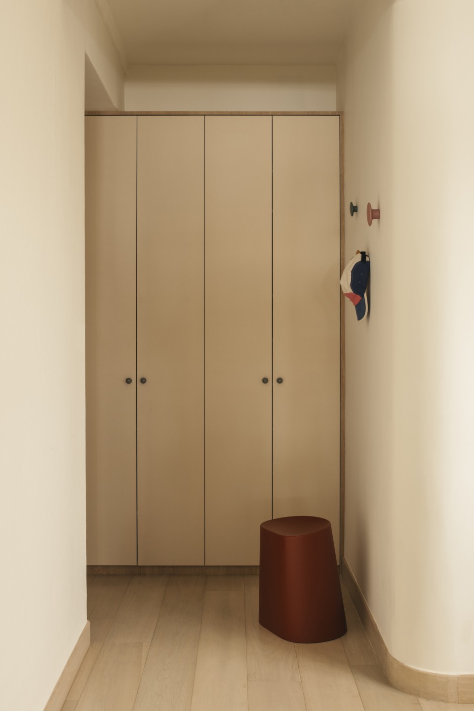
This wisdom culminated in a 35-page deck—an occupational hazard, given that they both work in advertising and communications. The brief contained information about the history of their home, a pre-war walk-up located along Yong Siak Street. When working with this typology, there’s an unspoken rule to retain as much of its heritage as possible. In fact, as an homage to the neighbourhood, the couple even commissioned a piece of art silk screened onto a coffee bean jute bag, featuring Mr Tan Yong Siak himself.
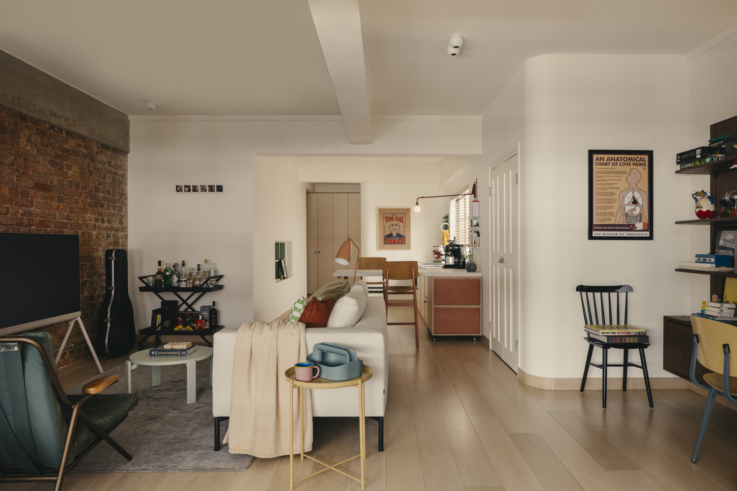
Striking a balance between the old and new, however, was no easy feat, noted Sheena, their interior designer from Shed Studio.
“The design should not only reflect their personalities and preferences, and accommodate their random collections over the years, but also retain certain elements of the old house to keep part of its history intact while being relevant to the neighbourhood,” Sheena said.
Aptly, the theme emerged as “a mix of eclectic, mid-century, with a little bit of old- school nostalgia.”
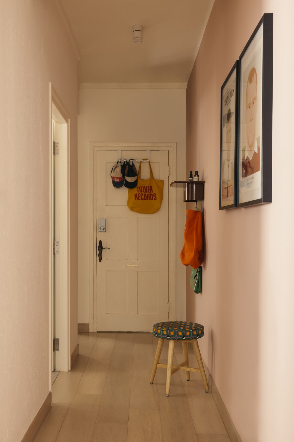
Entering the home, you’re greeted by one of the main colours used throughout the apartment—pink. While one wouldn’t normally associate this colour with a mid- century apartment, Sheena shared that it was intended to enliven an otherwise bland transition area and leave a lasting impression.
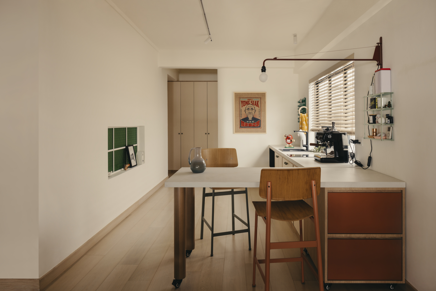
These pops of colour reappear in the dry kitchen and dining area, particularly through a green window.
“The green window was originally an old white/red fixed panel that was sealed off. We unveiled it and chose a green textured glass that was popular in the 60s and 70s, fitting the apartment’s period,” Sheena says.
Beyond aesthetics, the dry kitchen epitomises flexibility. It allows the homeowners to grab a drink without having to walk to the wet kitchen at the back of the house and features a movable island and dining area that can be stowed away when not in use. A Vitra Petite Potence lamp swivels to light up either the worktop or dining area.
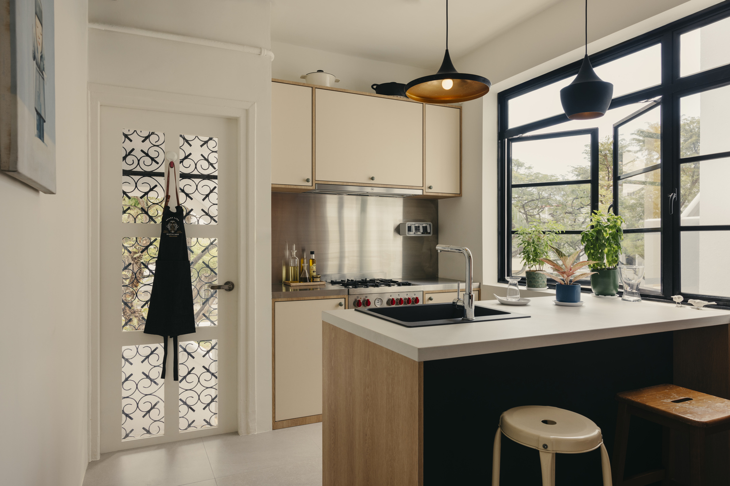
The wet kitchen, on the other hand, boasts a Bertazzoni free-standing cooker and oven, paired with a matching steel-cladded backsplash and countertop. The back door, once aluminium with mesh, was replaced with a timber one with glass to match the other doors in the apartment and let in more light.
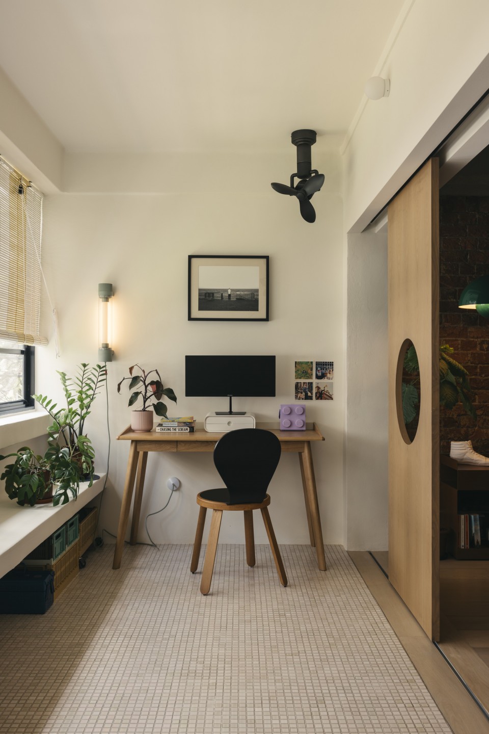
While at that, the trio also removed a storeroom once located by the balcony. This brightened the communal areas and made space for the homeowners to display their favourite items, including a small collection of lamps and lights.
“We love all our lamps and lights, but if we had to choose one favourite child, it would be our green &Tradition Flowerpot VP7 pendant in the living room. Tim also loves the United Strangers armchair he got from Journey East,” Nicole quips.
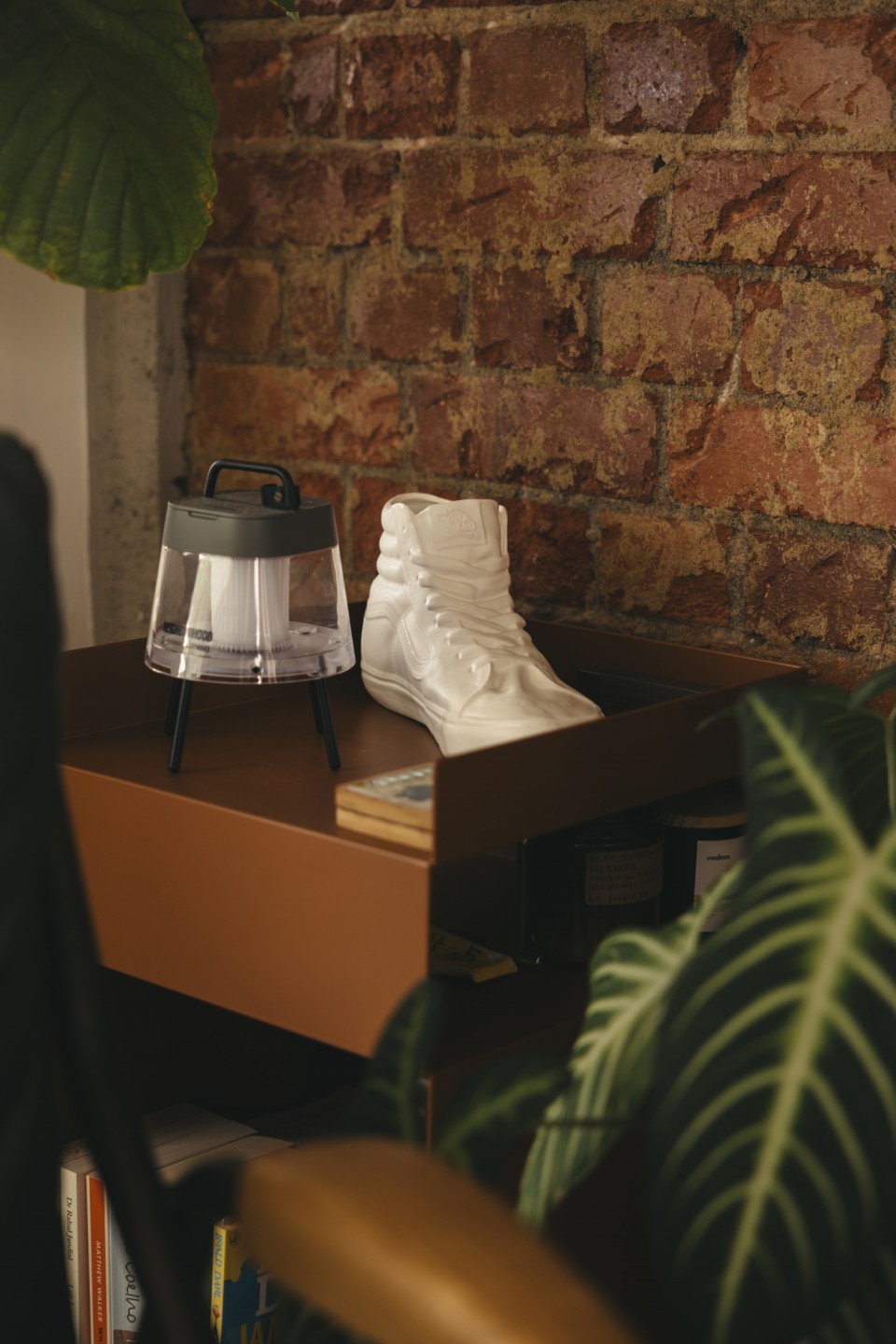
A brick wall backdrop adds to the cosy ambiance, another original feature Sheena was committed to preserving.
“We made extra effort to run new wiring and sockets along this wall using conduit pipes with metallic sockets to maintain its raw aesthetic,” she explains.
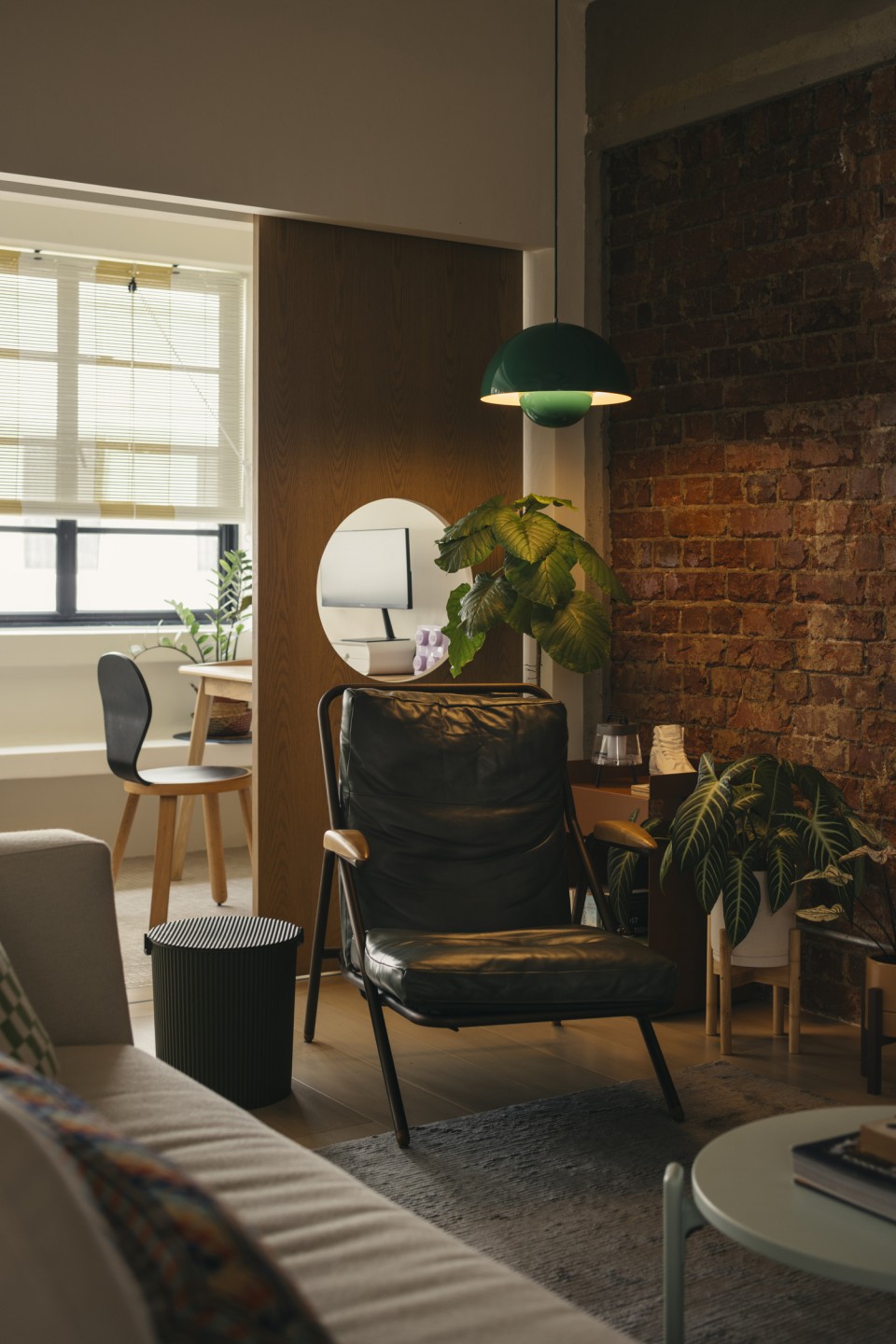
The sliding doors with circular cutouts, reminiscent of the iconic Tiong Bahru stairwells, separate the living room from the balcony, which has been transformed into a home gym and office.
“The floor tiles have a slight pink and green colour and shade variation, which aligns with the overall colour theme and nods to a time when mosaics were widely used in construction.” This colour combination continues into the master bathroom with subway tiles and a coloured ceiling. In the bedroom, a headboard inspired by Alvar Aalto’s Maison Louis Carré serves as a subtle feature wall, allowing the mid-century furniture and soft furnishings to take centre stage.
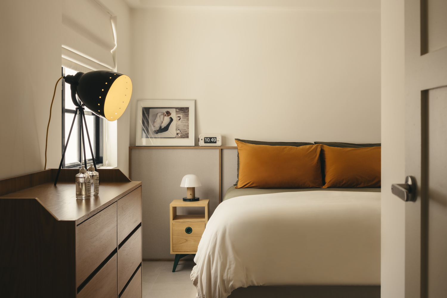
“Our bedroom has a really sleepy vibe, and we love it for that. Sheena also recommended a Louis Poulsen lamp that dims down beautifully, making things even cosier,” says Nicole, adding that coming home is always a relief for the homebodies they are.
“We’re both introverts and have limited social batteries, so coming home to our own space feels like the day is finally done, and we can be horizontal and spend time annoying each other instead.”


