Creating a home that’s breezy, open and filled with light is a common request many interior designers get. Another popular ask is for Scandinavian style decor. The couple living here wanted both those things, but what they didn’t want was something stale and uninspired. With designer Rashi of Home Philosophy, they found someone who understood their vision. Instead of opting for heavy cabinetry works, which is the tendency when one engages a designer, the couple wisely chose to let furnishings switch up their apartment.
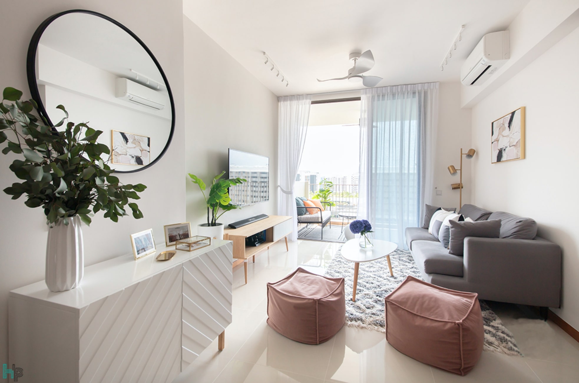
One of the first things to get addressed was how to make the home feel more roomy. With about 1,152 square-feet of space, the couple had a rather good amount of space to work with for local standards. However, since the homeowners like to entertain, Rashi had to figure out how to “meld the living and dining areas seamlessly so the homeowners could easily host without the two zones feeling disconnected. As “a bonus”, Rashi even managed to get the balcony to flow with the living room so the communal areas function like a “really large, open-concept home”.

Rashi achieved this with a careful selection of furniture, a service Home Philosophy provides as an end-to-end interior design firm. It’s what “transforms the blank canvas of a house into a home”, she explains. Since the clients leaned towards a “Scandinavian palette of white and wood”, she built on that aesthetic, adding touches of colour throughout with pink pouffes in the living area, grey furnishings, and gold-toned accessories sprinkled around to elevate the overall look. “Our clients were very trusting and let us completely have free reign when proposing all the furniture items,” Rashi shared. “We showed everything to them on moodboards and they loved it!” With the harmonious merging of the three communal spaces, Rashi tells us the homeowners now feel the home is “much bigger than they initially envisioned. They love that the spaces blend together well, yet have their own purpose.”

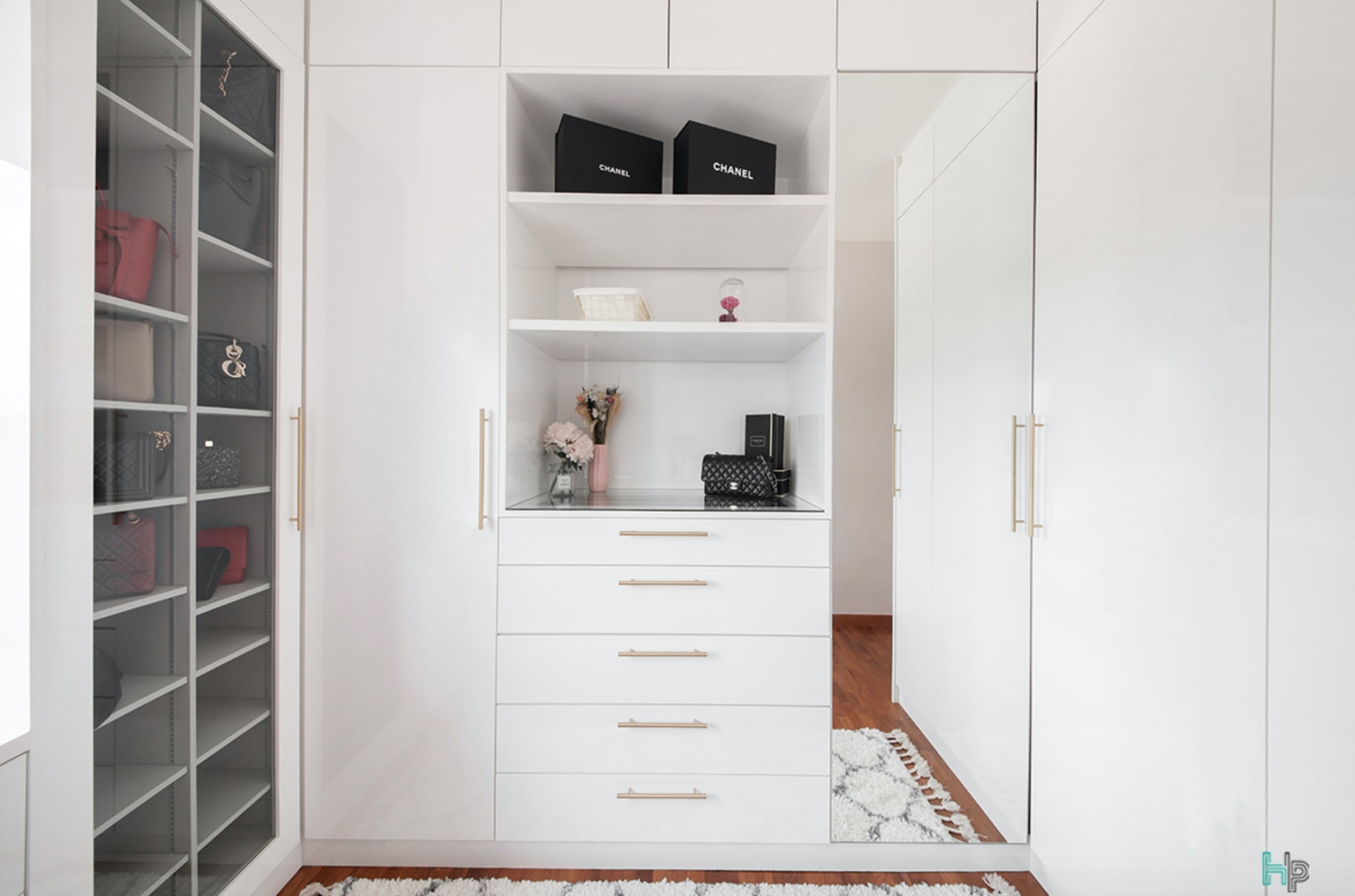
Moving further into the house, the room now used as a walk-in closet received a lot of personalised attention. Unlike the rest of the house, most of the pieces here were custom-built to maximise storage. Wrap-around cabinetry was designed with plenty of open sections as well as mirror and glass elements to prevent the built-ins from looking heavy. The glass doors also create a pretty display area for the female client’s favourite bags, letting her find the pieces she wants at a glance while protecting the purses from dust. Long, brass handles added to the doors impart a luxurious feel and echo the gilded lighting in the hall and dining area.

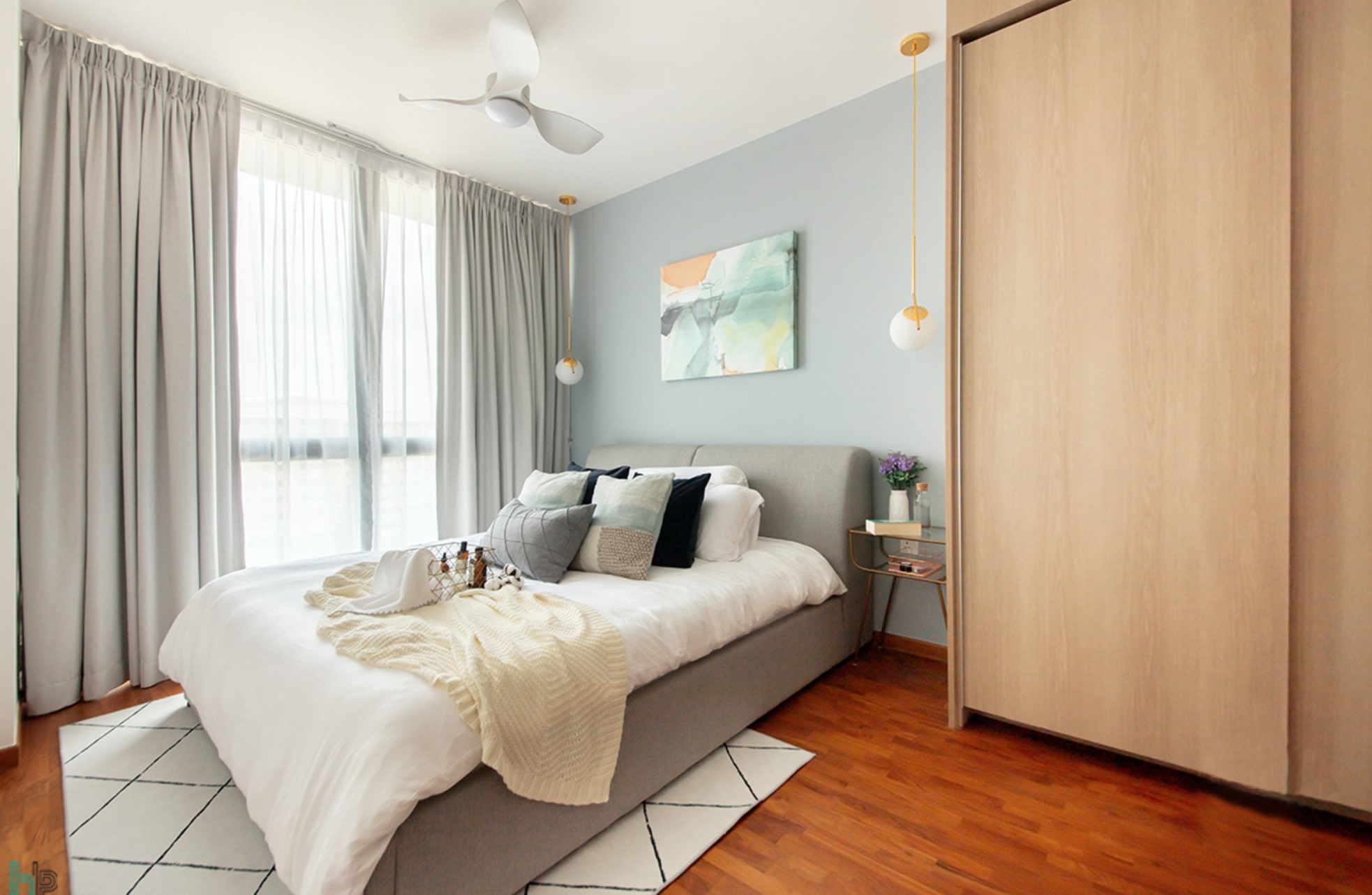
For the master bedroom, the homeowners wanted the same breezy look as the rest of the home, but preferred a slightly darker colour scheme for a cosier environment. This was accomplished with the selection of a “calming, grey-blue for the walls, and lots of texture via the rugs, pendant lights and cushions,” explains Rashi. The designer also added a storage bed here to eke out more space for stashing items without cramping the room or compromising the aesthetics.
By mostly relying on furnishings rather than custom fixtures and structural works to deliver personality, this apartment shows that it is possible to have a “Pinterest-worthy” home without extensive fiddling. As Rashi sumsit up, “even a living room can be brought to life with a good combination of furniture pieces and accent colours. It doesn’t necessarily have to have a TV feature wall.” At the end of the day, we are moving to a more sustainable and minimalist lifestyle after all.
This post was adapted from an article originally published in the October 2020 issue of SquareRooms.


