The power of aesthetics is well explored in this brand new HDB flat unit. Rather than rushing through the renovation process, which is more so often the case for many young couples, the homeowners, who are in their 20s, decided to take it slow. Making calculated decisions paid off tremendously for their home which is designed by Studio FortyFour. It was an integrative collaboration between the homeowners and designers as they sifted through different colour combinations and unique materials for the best fit.
“We wanted to explore and reflect our own individual personalities and creative backgrounds into our home, through the use of unconventional materials and quirky design elements,” explain the homeowners. “It’s not just about living well; we wanted to be inspired by our home which also doubles as a workspace for us.” To get their creative juices going, the designers merged softer colours and opulent metallic flourishes – which the homeowners desired respectively – into their living space.
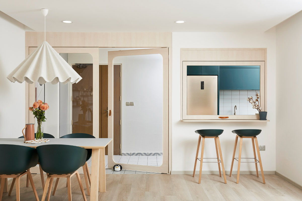
Forming an aesthetically pleasing design harmony with these two main design elements, the designers also established free-flowing spaces which encouraged work, rest and play. Case in point: The flexible use of space between the kitchen, front entrance and other communal zones. Double swinging doors now stand between the front entrance and combined living-dining zones.
“We specified for an ‘open and closed’ kitchen concept,” reveal the homeowners. The “open” aspect of things refers to its double doors and an awning window to bring more light into the confines of the kitchen. Besides the doors, the designers carved out a serving window that doubles as a casual breakfast nook. The highlight of this awning serving window is it stays at rest at varying angles. That way, the homeowners get to maintain a good level of interaction with each other or with their guests through this handy window. And with the doors and window closed, this prevents any heavy cooking smells from wafting across the other communal zones.
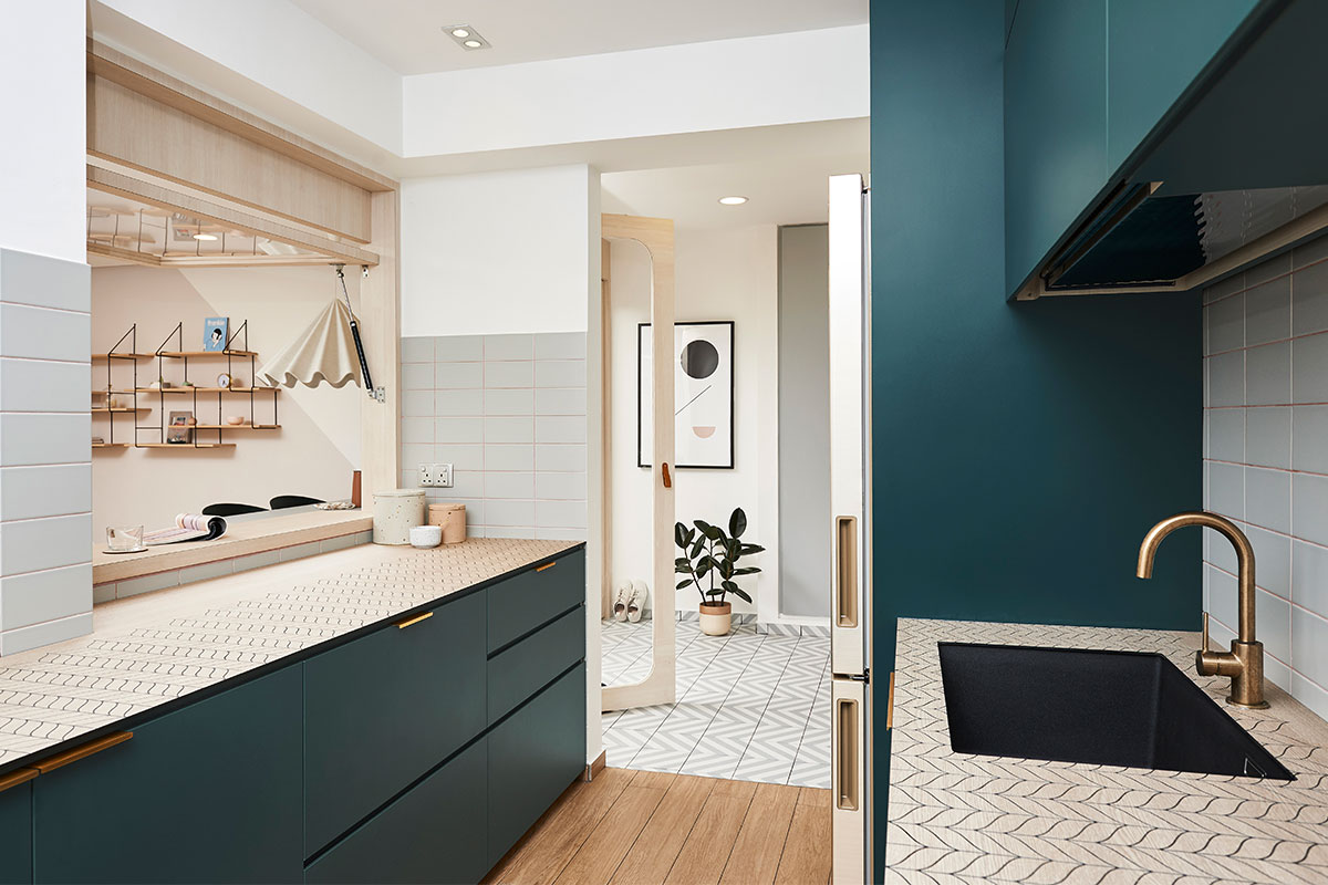
Moving into the kitchen, it’s hard not to notice the pretty botanical patterns on the countertops. Rather than go for the usual worktops in solid colours, the homeowners decided to go with some bold KompacPlus countertops with etched motifs. They remark, “We definitely wanted to try out something new with these patterns on the countertops.” While it might be easily perceived that these etched designs are cumbersome to clean, the maintenance of these worktops is much more fuss-free than expected. “The cut of the etching is not very deep and this makes these v-cut patterns easy to clean,” add the designers.
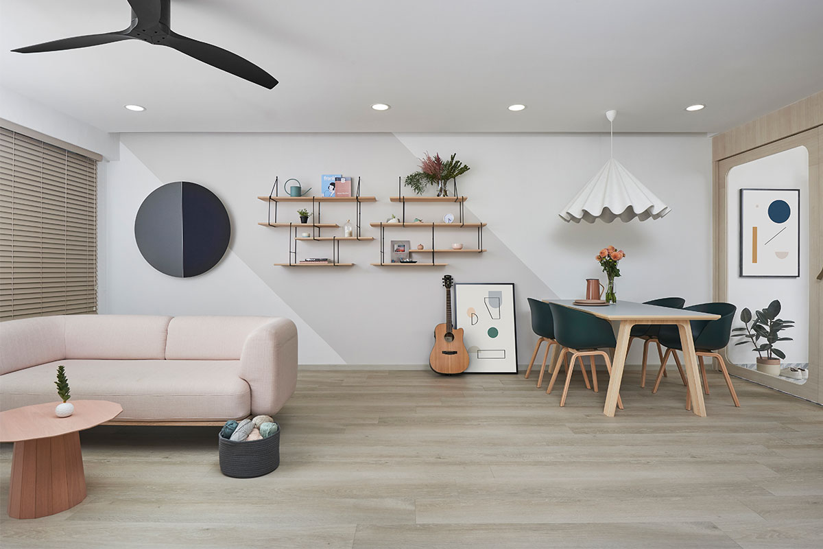
For the combined living and dining zones, it was all about nailing down the aesthetics of the feature wall. The homeowners say, “We like the colour-block effect and were presented with around eight design interpretations by the designers.” In the end, they went with the slanted two-tone wall treatment of soft greys. This works best with their double-duty wall speaker and streamlined Studio Hausen Link shelving system from online retailer Connox.
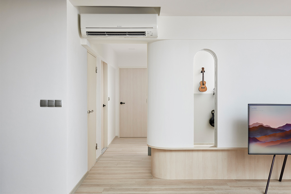
As one heads to the corridor which leads towards the bedrooms, a sleek application of LED lights has been installed along the curved ledge. It doesn’t just function as accent lighting, seeing this light implies that the common bedroom which has been converted into a music studio is currently occupied. This neat feature minimises any disruptions to the male homeowner while he is engaged in his music sessions. And it is precisely these thoughtful yet aesthetically pleasing design details that really make this home truly one-of-a-kind.
This was adapted from an article originally written by Disa Tan published in the December 2018 issue of SquareRooms. Photo credits: Studio FortyFour


