Careers and kids keep this family busy, but their tranquil abode gives them all a chance to take a moment and breathe.
As professionals in the maritime and tech industry, as well as parents to two boys aged four and seven, these homeowners have their hands full these days.
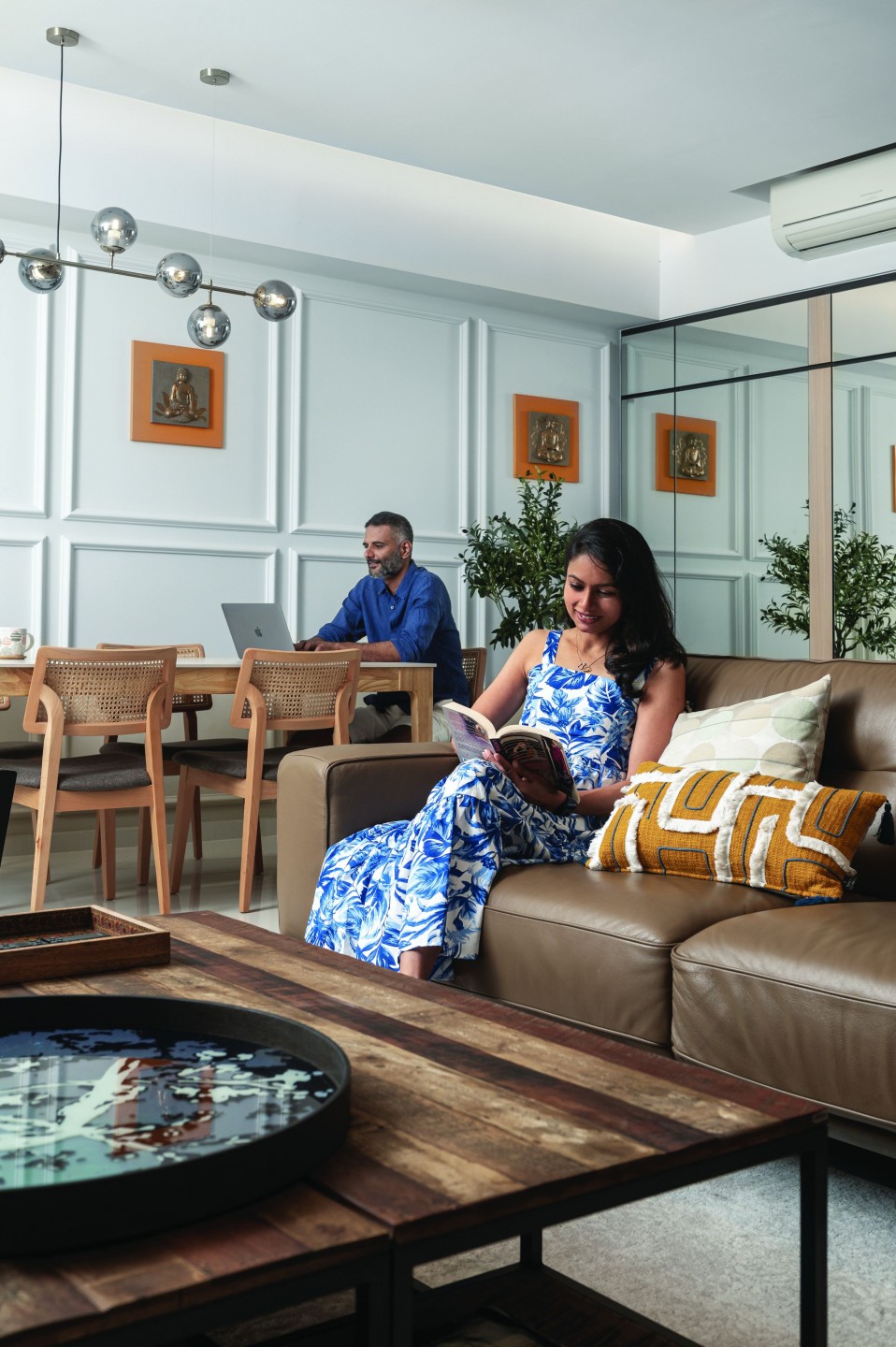
So rather than trying to cultivate hobbies with the limited free moments that they have, the couple tells us that they prefer to go with what brings them joy. This includes reading (often with the kids), having family time on the balcony, heading out to parks, and going for long weekend getaways at a beach resort.
Considering how much time they spend at home, what attracted the close-knit family to this house was its bright, airy ambience and positive vibe. Plus, the balcony view was also a big draw. To update the interiors, the homeowners engaged Richfield Integrated, a recommendation from a trusted colleague.
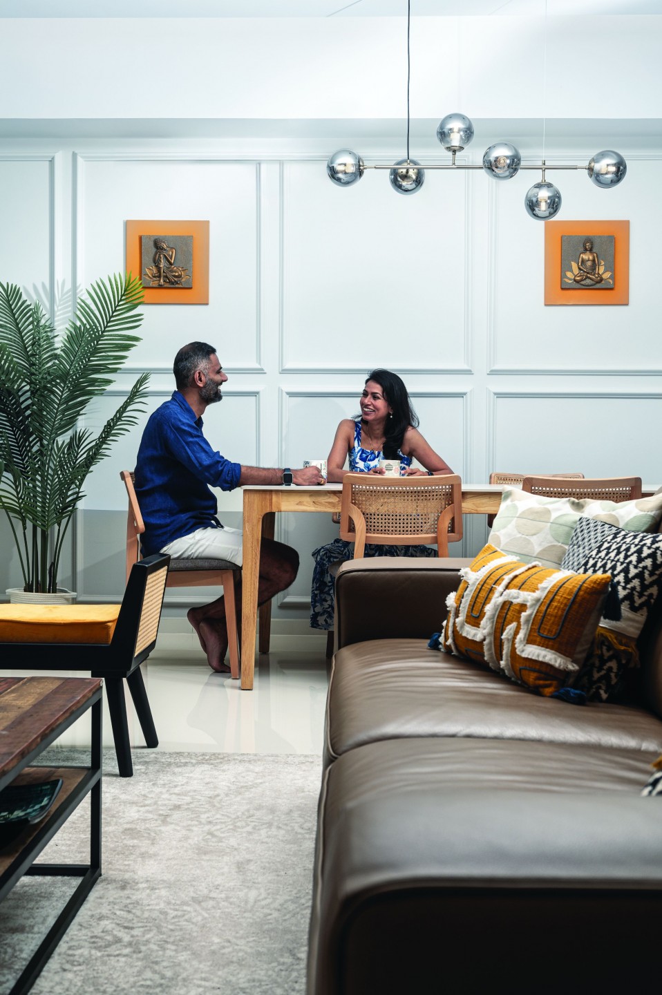
This pairing was an instant hit. “From the very first meeting, we felt assured of their professionalism and competency. More than anything else, we were looking for reliability and quality and Richfield delivered that.”
In their brief to designer Veronica Laborte and Senior Project Manager Sean Lee, the homeowners requested for a modern and practical home with good space utilisation and an understated luxury feel. Decor-wise, they wanted the space to reflect their Indian culture, their love of nature and their zen mindset, all while keeping the aesthetic rather muted and not overwhelming.
A transformation in the making
The original living room had been quite dark and tired, Veronica reveals. This was remedied with a lighter palette and new flooring from Hafary. The design team also went with less carpentry for an airier look, replacing a black, imposing media unit with discreet, closed storage compartments and a slim, full-height display cabinet to showcase treasured accessories.
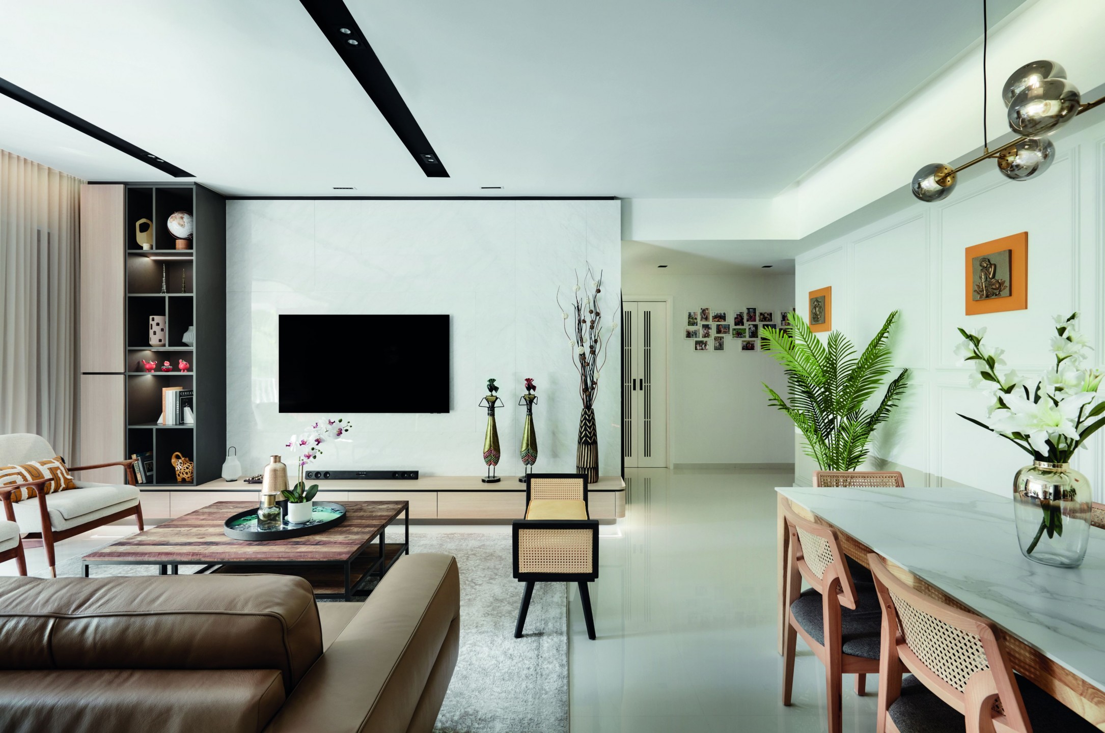
Look closely and you’ll spy a globe at the top. “We’ve always had a globe in our living space
over the years,” share the homeowners. “It keeps us down-to-earth and is a reminder of the larger scheme of things that we are just a minute part of.”
The clients wanted to keep the classic wall panelling that stretches across the common areas as it gave the open-plan space a “good classic touch,” shares Veronica. A swathe of greige was added to the lower section of the wall, further enlivening the interiors to balance the modern, streamlined updates.
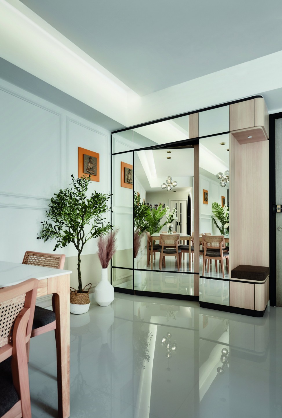
The existing walk-in storage by the entrance was given a makeover as well. The owners wanted to minimise its appearance so the door and surrounding surfaces were clad in mirror panels, which now serve to brighten and enlarge the hall. A small seat was also added by the main door, making it easy for the family and guests to slip on their footwear.
As for the spacious balcony, the homeowners don’t have to go far to feel like they’re on holiday. Located right outside the communal zones, the balcony was inspired by Moroccan design and features the iconic red clay hue often associated with the locale.
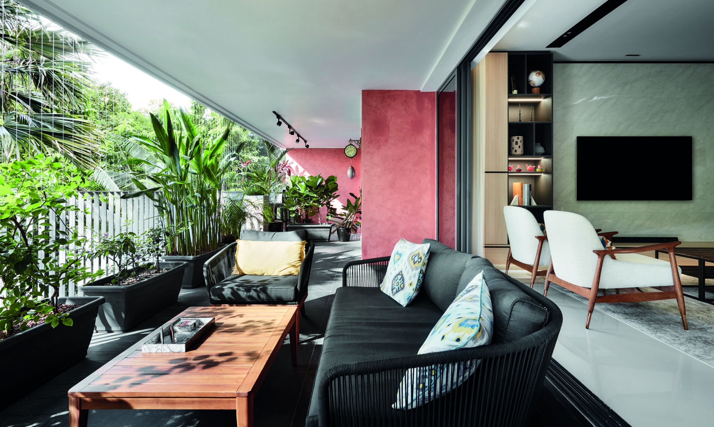
Complemented by dark slate outdoor furniture and lush greenery left by the previous owners, the balcony’s resort vibes make it hard to leave. Along with the adjacent living room, the owners tell us that this is one of their favourite spots in the house.
Functional spaces
According to the homeowners, to say that the family cooks often would be a grand understatement. “We cook every day, and predominantly Indian cooking,” they emphasise. Thus, they felt an open kitchen would not be ideal.
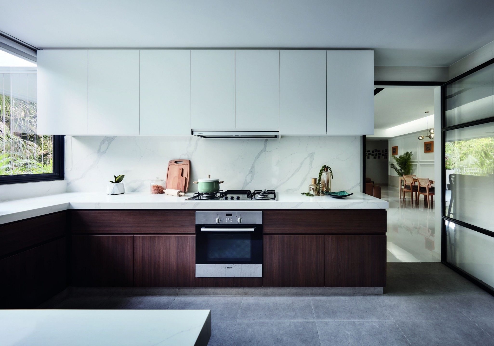
The existing cabinets in the formerly white and grey kitchen were kept to cut down costs, while the team refreshed the surfaces with new laminates for a more inviting ambience. The countertops and backsplash were replaced with quartz, and the kitchen also sports new porcelain tile flooring.
Another highly functional space in the home is the study room. Previously a walk-in wardrobe with a dark concept, it was completely redesigned to become a family lounge and study suited for working from home.
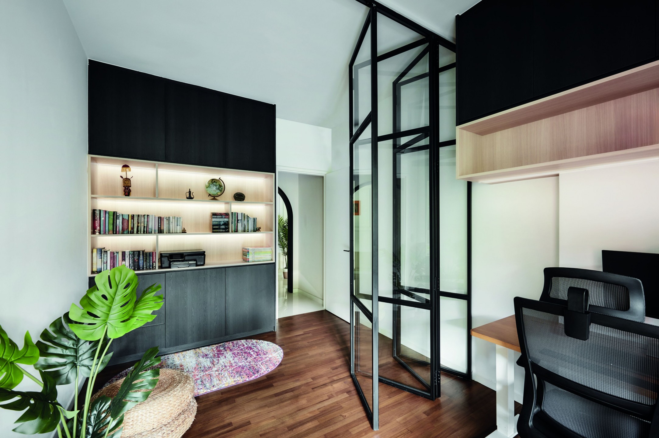
Sliding glass doors enhance separation, reducing noise while maintaining the flow of light and a sense of connection with the rest of the house. The dark timber flooring was also brightened, creating a cheerier environment for the occupants.
Designed for rest
A complete overhaul was needed to turn the once dark and gloomy bedroom into an uplifting haven. In addition to lightening the dark-stained wood flooring, a brighter colour scheme was chosen for the room, though Veronica tells us the team made sure to choose hues that would add warmth and not make the room appear too dull.
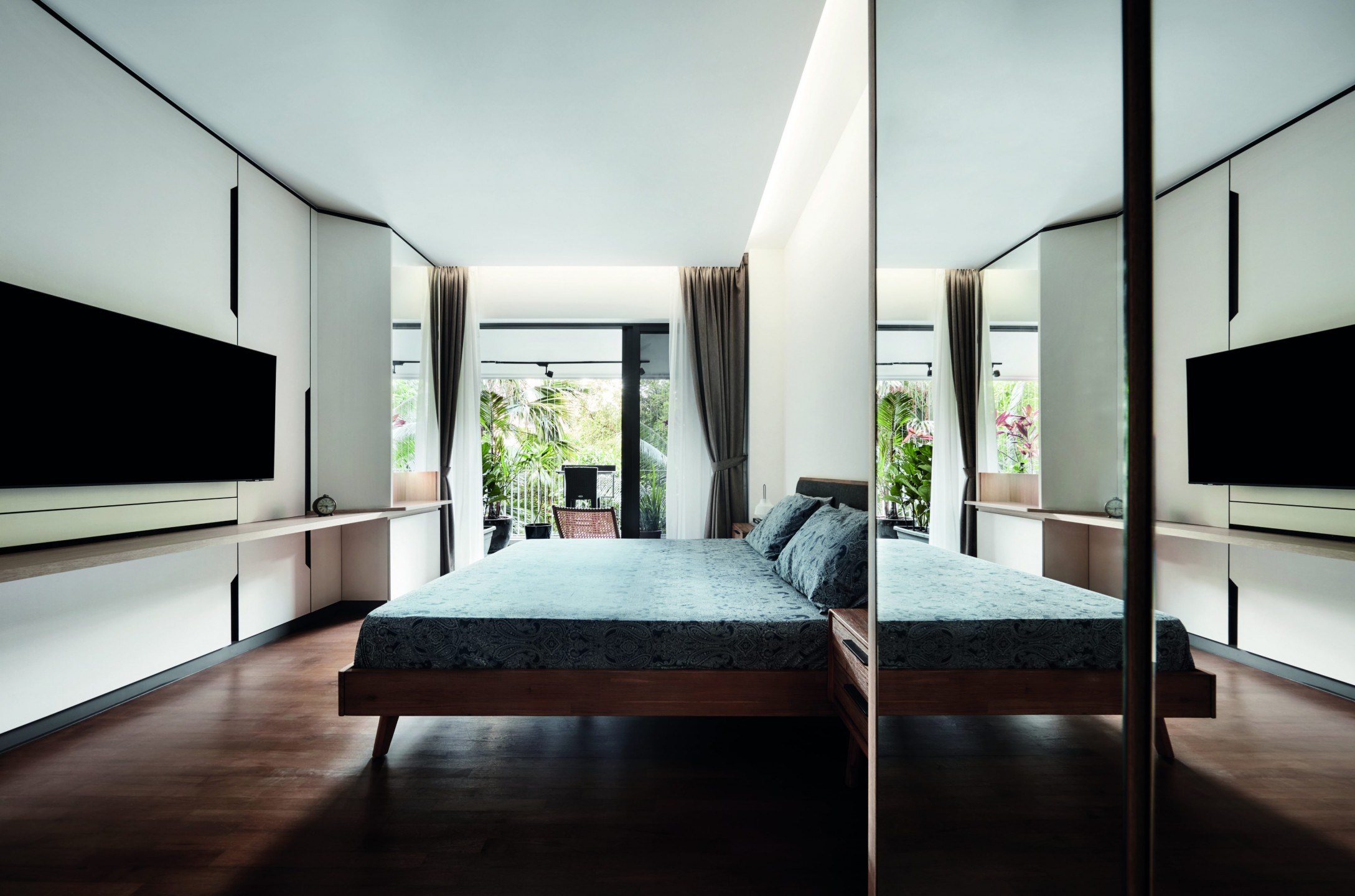
The room was fitted with simple and modern carpentry and furnishings, keeping the overall aesthetic breezy and clutter-free for improved relaxation.
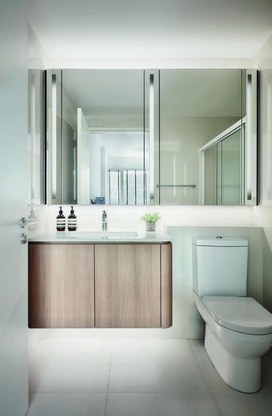
In the bathroom, a new vanity and mirror cabinet made the biggest difference. With ambient lighting worked into the design, it now delivers a flattering glow that puts everyone in a good mood.
Reflecting on the process
With the eight weeks of renovation now behind them, the homeowners have nothing but praise for the design team.
“Our experience with Richfield Integrated has been nothing short of spectacular,” the couple tells us. “Their professionalism and attention to detail are laudable. We really appreciate how they incorporated our requirements into the design while staying true to the design concept.”
Though the family’s demanding schedule hasn’t allowed them to have guests over as often as they’d like, the homeowners share that they are “hoping to host more in this lovely space we have now!”


