Walking into this five-room apartment located in Pasir Ris, one can’t help but notice its laidback and low-key ambience. “This is attributed to the family requesting for a nautical decor theme, which was inspired by the male homeowner who is from the maritime industry,” explains Max Lee, the design director of Icon Interior and designer-in-charge of this renovation project.
![]()
To achieve the desired look, the design team first overlaid the floor with vinyl, and utilised copious amounts of white and wood tones to create a calm and relaxing atmosphere. Then, navy blue hues were employed to further enhance the nautical concept. Colour scheme aside, structural changes were also made to improve the apartment’s flow and functionality.
One of the biggest modifications made was the removal of the balcony’s original entrance to create an expanded living area that would better accommodate whenever the family has guests over. Despite being a free-flowing space however, there is still a degree of separation between the two zones, in that the flooring styles are different. Although still the same vinyl material, the finishes are in different colours and the wood grains are also arranged in opposing directions. Then, both ends of the balcony were fitted with cushion-topped benches and backed by feature walls created out of tiles that look like wooden planks, which pays homage to the design styles of modern beach houses.
![]()
Continuing the home’s maritime theme, the wet kitchen is fitted with storage cabinets that have been clad over with a mixture of clean white and navy blue laminates. In addition to this, highly durable materials like a Silestone quartz countertop and wood-effect floor tiles enhance the functionality of the utilitarian zone – the former boasts higher resistance to stains and hard knocks, while the latter offers easier maintenance in case of spills. Hexagonal tiles on the backsplash then help tie the whole space together. “The owners initially wanted to use subway tiles here, but we felt it was too common a style. Instead, we proposed to use these hexagonal tiles that give the space a trendier and much more contemporary look,” Max elaborates.
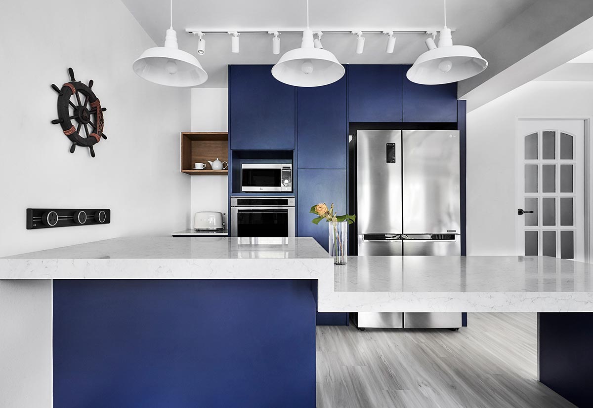
As the family frequently indulges in baking sessions, especially during the festive season, the design team wanted to carve out a dry kitchen for them that would also be heavy-duty enough to keep up with its regular usage. Located outside the wet kitchen, this new utilitarian space reduces the risk of cross-contamination of bacteria if everything was to be contained in one single space. For added durability, an expansive quartz countertop dominates the dry kitchen, which also impresses with its elegant aesthetic. Meanwhile, providing a landing spot for kitchen equipment and utensils is a series of full-height navy blue-laminated cabinets. However, instead of having the cabinets fill up the entire stretch of the wall, the last section was simply fitted with a half-height cabinet and a top-hung cubbyhole above. “This is to allow the space to serve different functions,” Max explained, “where the family can use that space to operate the necessary equipment while freeing up the countertop space on the island for prep work.”

At the furthest end of the home, the homeowners’ private chambers come into view. Clad in a combination of cosy off-whites and warm wood tones, the bedroom is imbued with a sense of cosiness and calm that makes it the perfect spot for their daily rest and repose. As a way to fully maximise all the available wall space in the room, the design team installed a L-shaped series of wardrobe units that offer plenty of storage units for clothes and accessories. Additionally, there were also dedicated spots carved out for a dresser table next to the en suite’s entrance, a television console in front of the bed, and a workstation next to the bed.
![]()
Over in the attached bathroom, despite its predominantly grey colour palette, there are plenty of interesting textures that adorn the space. This can be seen from the Spanish-patterned floor tiles and the tri-toned rectangular wall tiles inside the standing shower. But besides being decorative accents, these fixtures – especially the ones on the floor – are also there to provide a subtle visual demarcation between the wet and dry areas in the bathroom.
When all’s said and done, it’s clear that the eight-week renovation ended on a joyous note for Max and the rest of the Icon Interior design team. “After fully understanding how the family plans to use the home, we’re super glad we managed to create a home that is not only bright and cosy, but one that is also fully capable of catering to their lifestyle,” concludes Max.
This was adapted from an article originally published in the June 2019 issue of SquareRooms. Photo credits: Icon Interior


