First, there was Scandinavian, then Scandi-industrial and now this sought-after style has been reworked into diverse design interpretations in many local homes. While its versatility knows no bounds, there are certain instances where the heavily re-hashed style actually appears distasteful, cluttered-looking and missing that endearing charm. However, the designers from Versaform managed to steer clear of all these pitfalls with a clean-lined and monochromatic Scandi-industrial aesthetic for this brand new HDB flat unit.

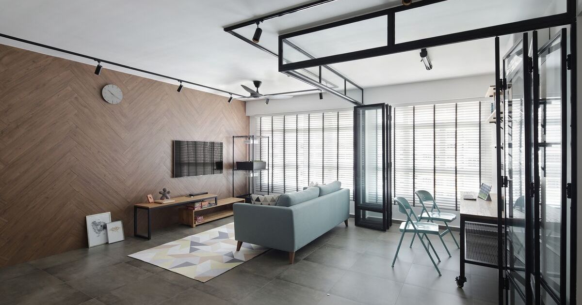
Their steeled focus in adhering to design uniformity is most prominent in the communal zones where the floor plan has been altered quite extensively. The boundary walls of the kitchen have been hacked away and they put up glass enclosures around it and the open-concept study. Having taken down several walls and with the applications of glass, it amplifies the flow of light and space into the public zones considerably.
With the communal spaces now visibly enlarged, the designers played up the textural appeal with unique tilework which appears in different areas. They used a herringbone formation of homogeneous tiles with warm wood-grained patterns that serve as a wall feature for the living area. For a neutral touch, they teamed the wall feature with grey floor tiles sporting a cement screed-like finish and in a wide format.

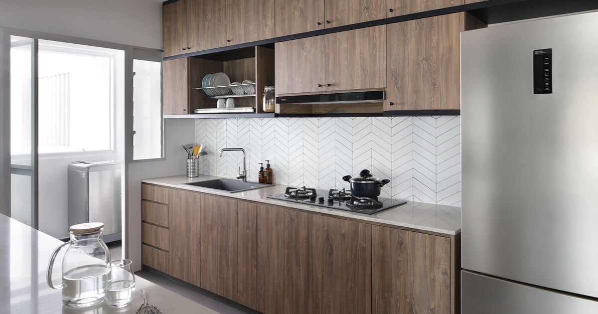
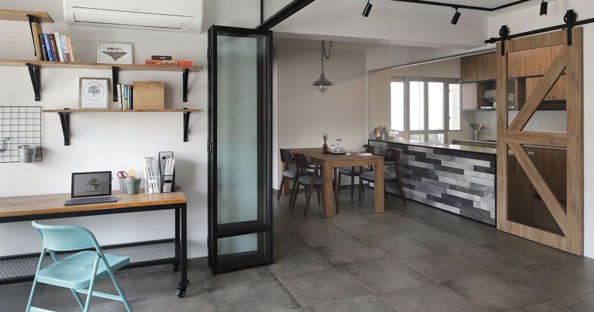
A similar staggered tile arrangement is executed in the kitchen where it appears as a striking backsplash. It creates a streamlined contrast against the warm woodgrain textures from the counter and the sliding barnyard-inspired door. To better define the semi open-concept kitchen, the designers tiled the base of the half-wall enclosure with subway tiles in varying shades of grey. It forms a striking colour gradient aesthetic and fulfils the ongoing black and grey colour palette well.

As one heads over to the next area which is the open-concept study, it has been segregated by bi-fold doors with a black powdered coated mild steel frame. When the doors are tucked back neatly, the communal zones present a spacious and airy ambience, especially with the seamless effect from the slab-like homogeneous tiles. The homeowners can also choose to keep their study private, by pulling the doors to encase the space and this helps to block out any noise or other distractions.
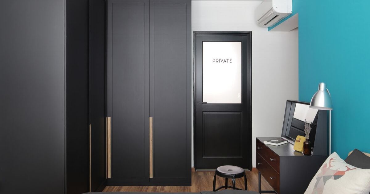
Pops of colour appear in the master bedroom where the main wall has been painted an inviting shade of teal. This striking tone pairs exceptionally well with the black undertones and the colour contrast draw out the crisp design lines of the monochromatic accents. A noteworthy feature is the custom-designed bathroom door which emits an edgy industrial aesthetic with its frosted glass window and customised decals. For a touch of warmth, the designers applied vinyl flooring with wood-effect textures.

A pared-back design language follows for both bathrooms where the designers utilised subtle touches of grey to convey a Scandi-industrial style. The clean-cut look is well-contrasted by the wall tiles in hexagonal forms which add a designer edge to the overall style. To add functionality, they worked in an extra storage ledge in a wood-effect finish and paired it with the sink countertop with a cement screed treatment.
As they say, less is more but in this home, the use of different style influences such as Scandinavian, industrial and even country creates a distinctive-looking space. With the Versaform designers making calculated decisions on each of the design elements; it makes the entire setup flow better and also reflects on the homeowners’ unique personalities.
This was adapted from an article originally written by Disa Tan published in the June 2019 issue of SquareRooms. Photo credits: Versaform


