Preparing a delicious meal is probably a relatively straightforward task for most experienced chefs. Pop open the fridge, prepare your ingredients and get cooking. But what if there’s the added challenge of space? Even the most seasoned chefs will find it hard to work in an overly-tight space, especially when they start knocking into pots, pans, or their equally hapless assistants.
Avoid bumping arms with your sous chef at home with these 4 practical layouts for small kitchen spaces.
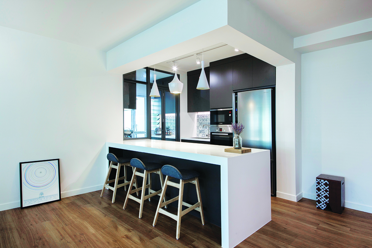
1. Conjoined counters

Image credit: Eightytwo
Aside from the unbeatable convenience of having breakfast at a counter that adjoins your kitchen, this layout also promises practicality by incorporating an eating space that takes up less space than a fully kitted dining area. Additionally, by bordering wet and dry zones, the counter is capable of serving as a physical barrier that prevents any messes from spilling over into adjacent spaces.
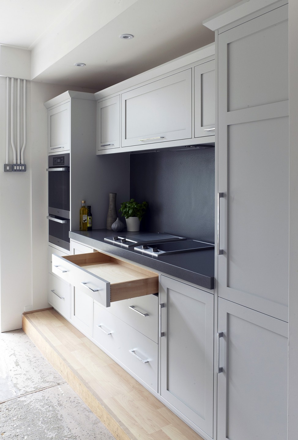
2. Pullman-style

Despite its fancy name, the Pullman-style offers a practical way to create a small, but efficient kitchen within a long and narrow space. Storage compartments, worktops, and sinks are all arranged along the same plane in a Pullman kitchen, and this helps to maximise every inch of horizontal and vertical space that a single stretch of wall has to offer.
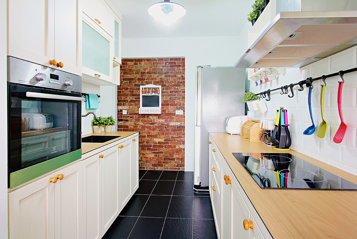
3. Galley

Image credit: KompacPlus
When it comes to small kitchens, one distinct advantage that a galley-style layout offers is its efficient use of space, with preparation counters on one side and the washup area on the other. This comes as no surprise as this arrangement method takes its name from the small kitchen areas that can be found on ships and planes. Regardless, if you don’t intend to entertain guests in the kitchen, this is the arrangement for you.
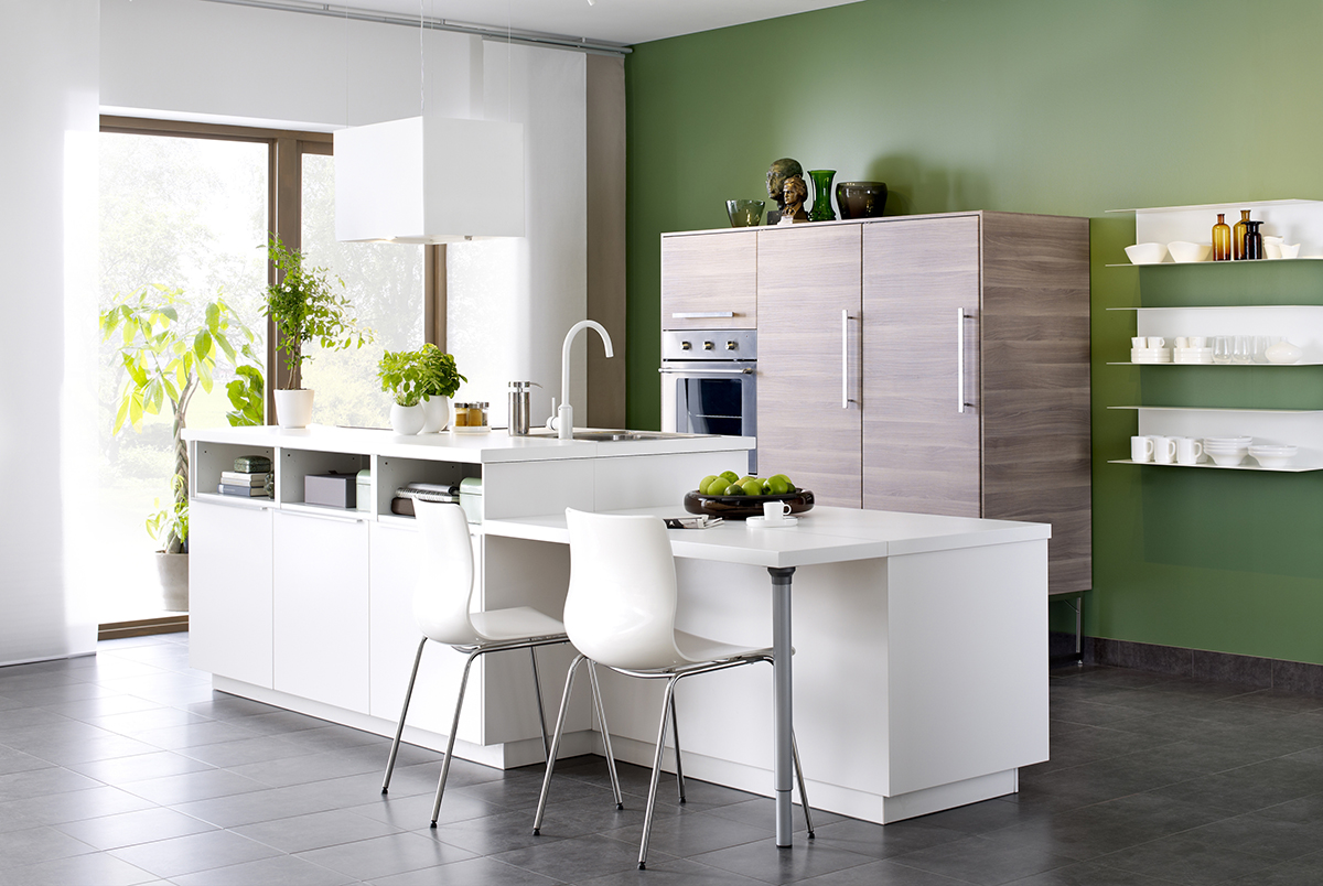
4. Open concept

Image credit: IKEA
In the case of small kitchens, tearing down the walls can do much good in preventing them from being cramped. This method works by removing any unessential barriers to create a seamless look between a kitchen and any room that is close by. For a streamlined look, pick overlapping or complementary colours, such as green and white, between spaces as they can enhance visual consistency.


