From mid-century modern styles to vibrant Pop Art, vintage-inspired interiors are popular with homeowners for their nostalgic vibes. Want to incorporate some of these classic looks into your space? Read on for our tips.
- Don’t shy away from colour
One way to make a grand entrance is with colour, and the vintage style will never disappoint in this area. Loud, psychedelic hues are its middle name and you can play up the look with matching colour accents or tone things down with dashing Mad Men-inspired furnishings.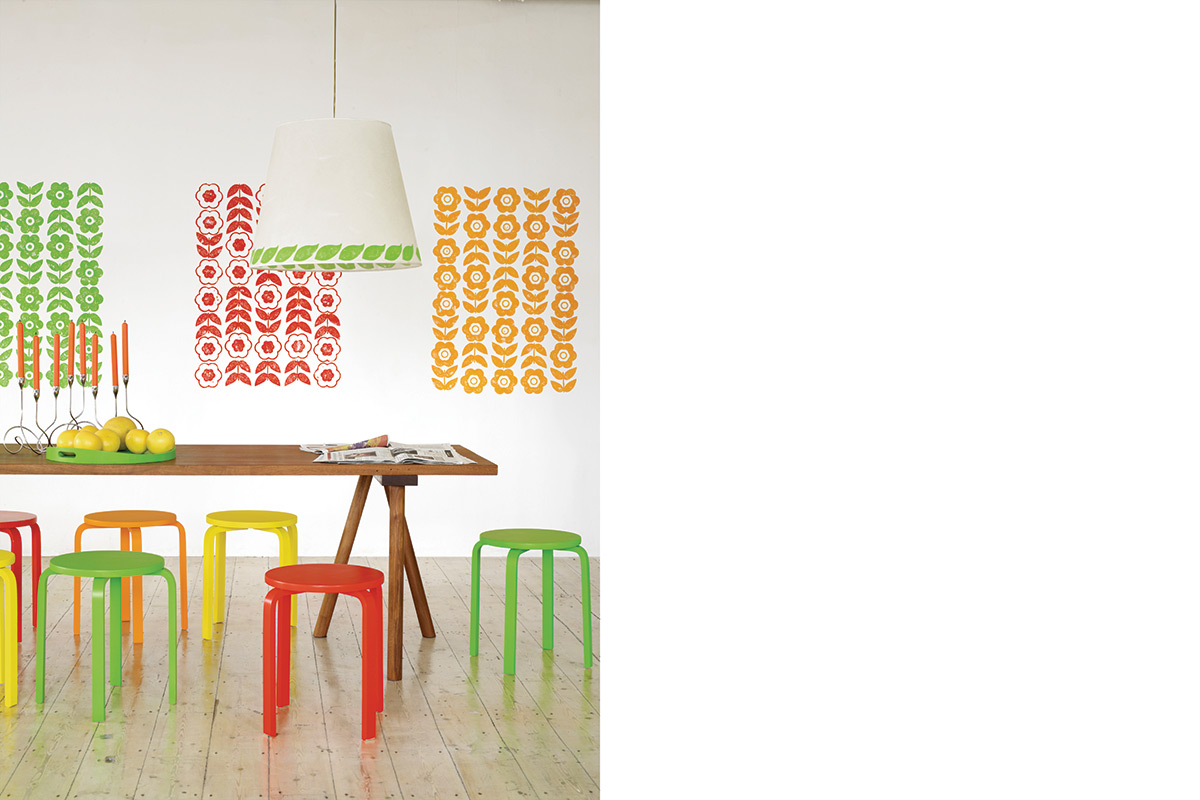
Image credit: Dulux
- Go back to your roots
It’s definitely challenging to go full-fledged with the vintage style in this modern era where most of the materials are probably defunct. Try diversifying the look with a modern-vintage take instead. This bungalow does this old-meets-new style well with a contemporary backdrop accented by Peranakan tiles, window frames and doors, ventilation blocks and brick walls.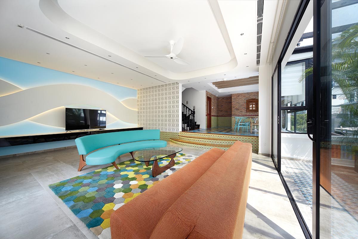
Image credit: Free Space Intent
- Modern classics are always a good bet
A cosy corner like this beckons some lazy lounging and contemplation as well; about the good old days! It’s not just the vintage armchair with its typical curved wooden armrests and floral cushion covers that makes good on the nostalgic theme but the overall setting. The dual-toned wall treatment of teal-coloured paint and woodgrain laminate covering add to the vintage style as well.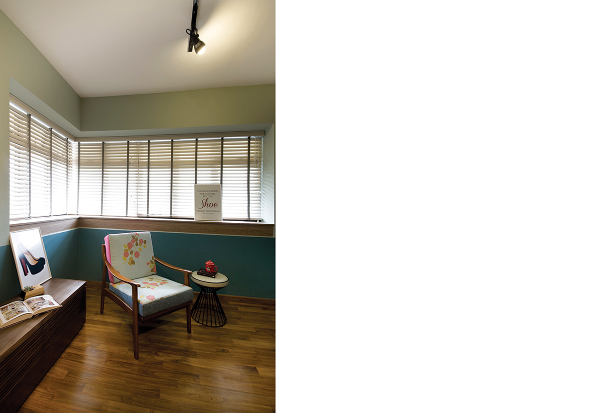
Image credit: Project File
- Classic palettes
Nailing the vintage style is this living room with a fetching palette of olive greens and mustard yellows. Not only do the colours conjure a cosy, nostalgic feel, the exposed brick wall serves as a neutral yet fitting backdrop to take us back to the past.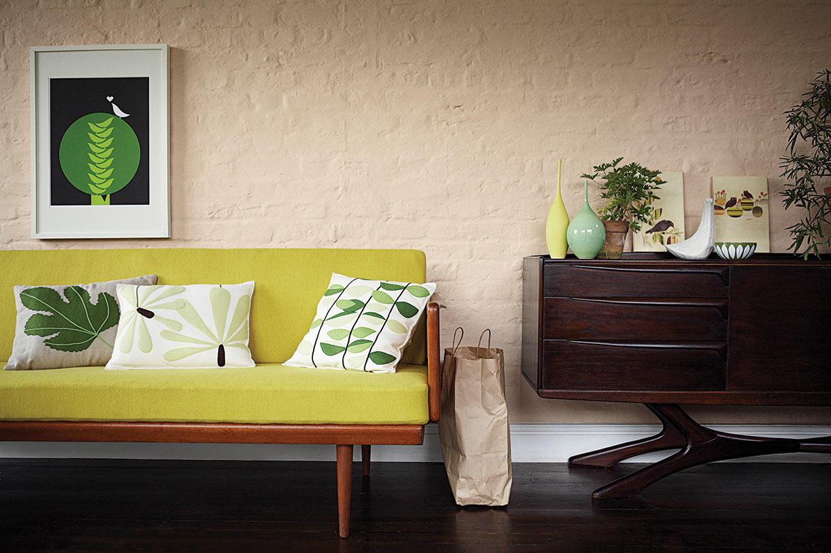
Image credit: Dulux
- Mix with modern pieces
Mixing old and new furnishings is a good way to create a varied, eclectic style. For this French-style boudoir, the rattan bed with intricately-carved embellishments pairs well with the modern see-through plastic bedside table.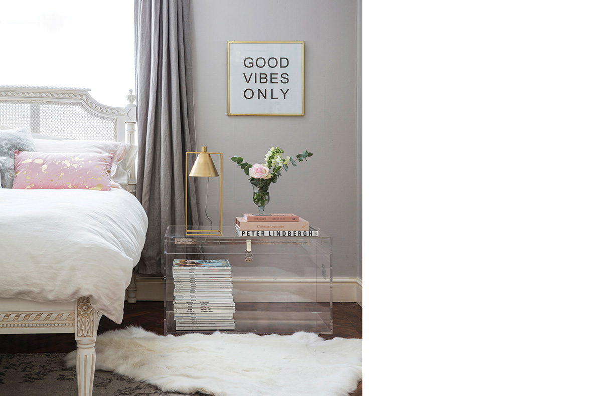
Image credit: The French Bedroom Company
- Americana inspiration
How can we talk about the vintage look without covering the bustling diner style? The chequered black-and-white patterns and touches of red make for an interesting contrast with the clean-cut furnishings. Since the chequered patterns are bold enough, it’s best to keep the rest of the setting pared-back.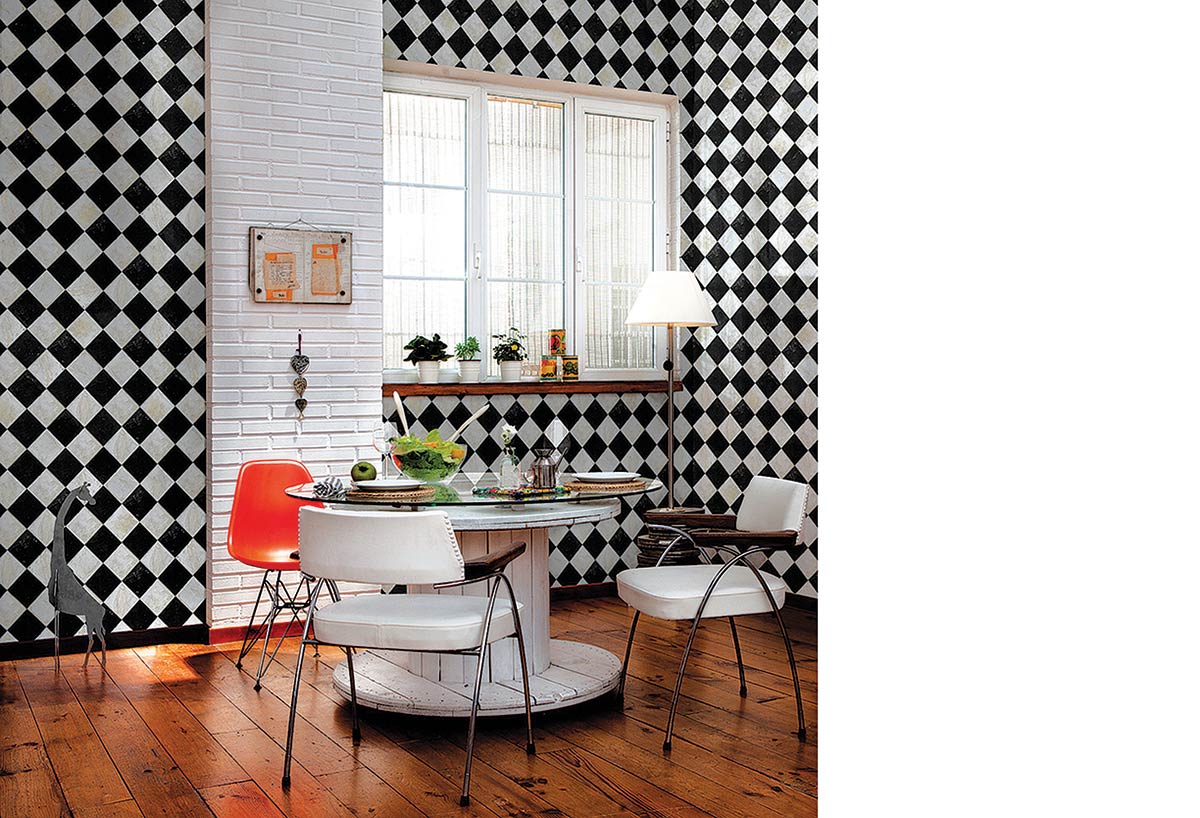
Image credit: Tapeten and Uhren
This was adapted from an article originally written by Disa Tan published in IdealHomes vol.9


