Ever since I chanced upon @oldbishanflat on Instagram, I’ve become obsessed with their collection of iconic furniture pieces and the artful way they’ve been photographed in their home. @oldbishanflat shares the journey of a young pair of full-time professionals as they transform their first home—a quintessential ‘90s resale HDB flat located in the vibrant neighbourhood of Bishan.
Tell us about yourself and what inspired you to start featuring your home on Instagram?
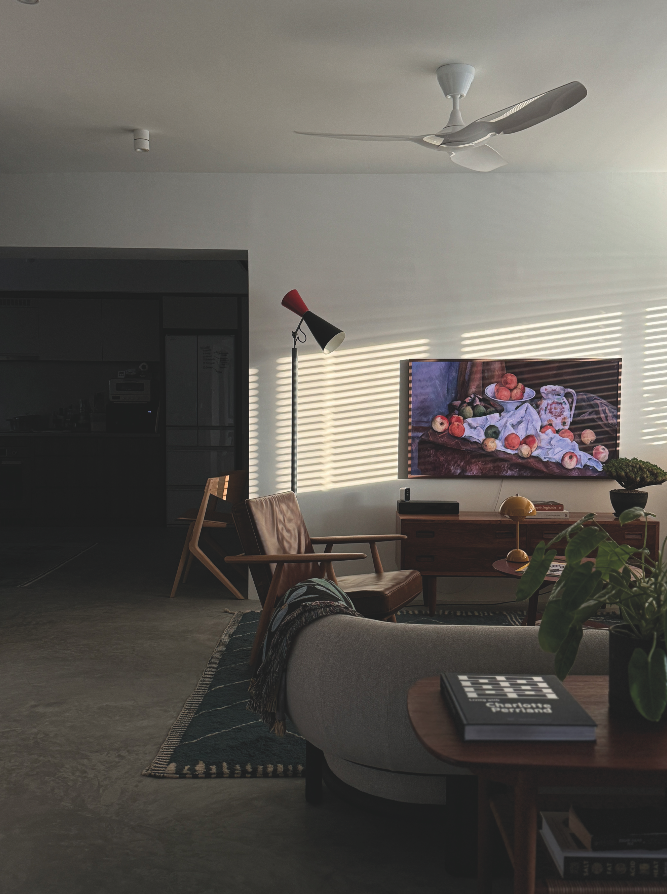
We’re a young pair of full-time professionals and have been living here for almost a year. Old Bishan Flat (OBF) began as my way to document the process of building and renovating our first home—a tremendous milestone in anyone’s life. It started with the complete demolition of our dark, dated, original-condition ‘90s resale HDB flat, moving through careful and deliberate design reconfigurations, and the remarkable people who made it all happen, turning OBF into what it is today. Contrary to my expectations that OBF would lose momentum after our renovations concluded last June, it has evolved into my little obsession with the interiors of our old but refreshed flat, where I aim to share the beauty of what we see every day.
Through our social media, we occasionally connect with like-minded individuals on topics ranging from renovation challenges to timeless design classics, and we’re always pleasantly surprised at how wholesome and friendly this home community can be.
In fact, we once gushed over another homeowner’s super rare Finn Juhl “Japan” sofa via their DMs, and what started as an exchange of our mutual appreciation for vintage Danish furniture eventually led to an invitation to their beautiful home in Joo Chiat. We’ve also returned the favour, hosting them for dinner and wine at OBF a couple of times, and we have remained friends ever since!
What’s the story behind your home? How did you come to select the flat and choose to live in this area (Bishan)?
We stumbled upon this flat by chance—we were growing weary after weeks of sporadic viewings and were considering taking a break, but decided to give it one last try when its listing appeared on a Saturday.
We arranged a viewing for the very next day, Sunday, and I vividly remember it because we weren’t the only ones interested; five other groups were there and they all seemed keen, so we knew we had to act quickly.
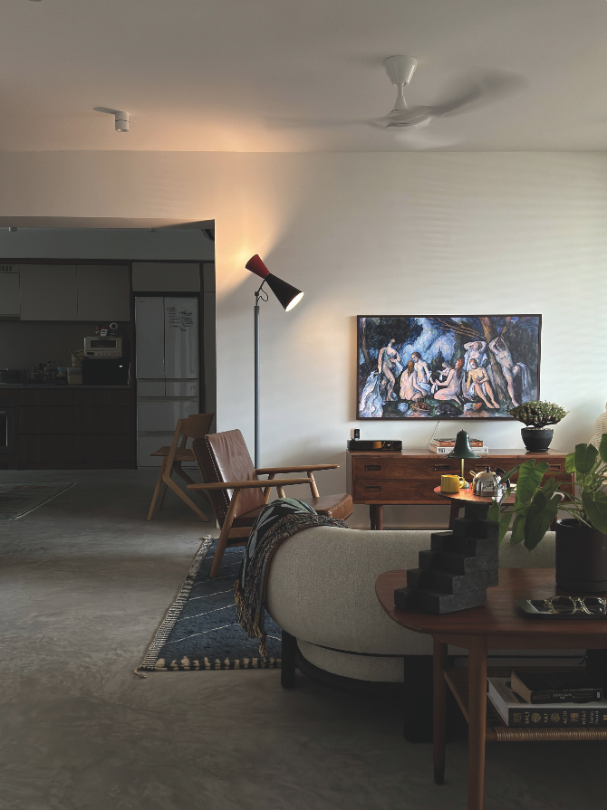
Although we had some reservations about it being a corridor unit, it met most of our other criteria (budget, location, amenities, proximity to public transportation, and the absence of a bomb shelter) and, most importantly, we saw its potential. We made our offer that same evening, and the rest is history.
How would you describe your home’s design aesthetic?
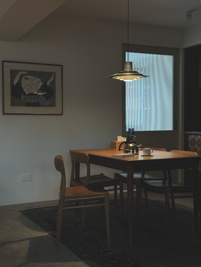
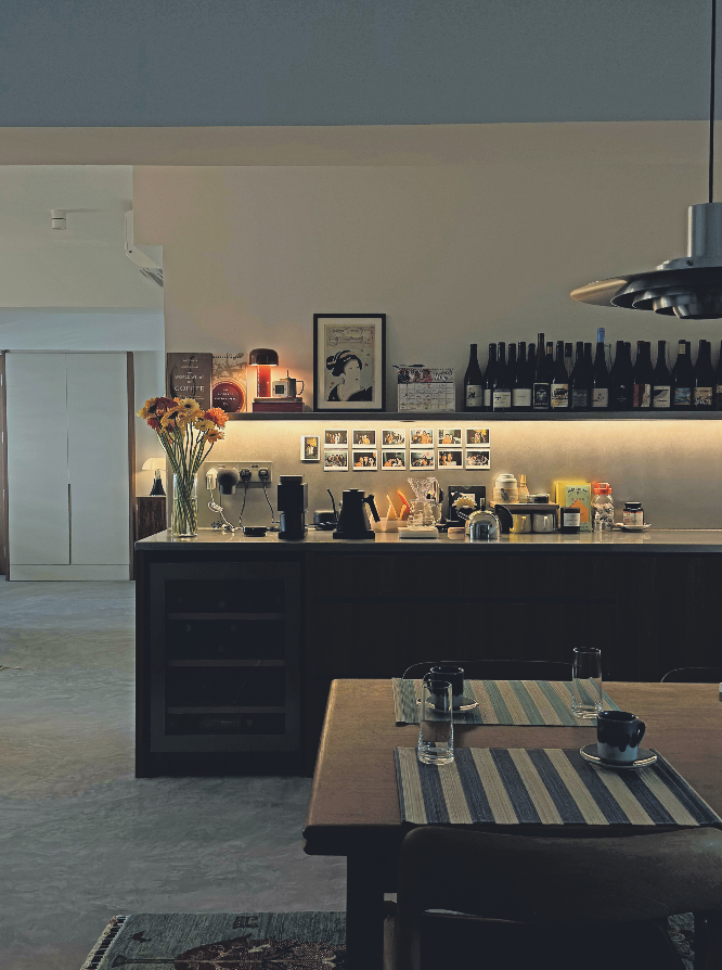
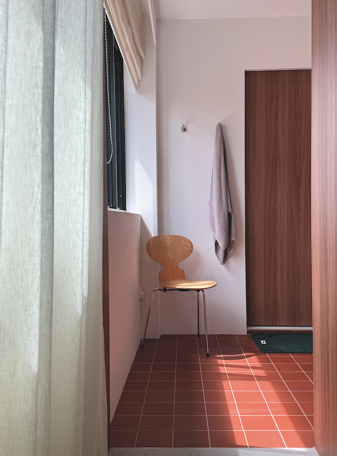
We have deliberately avoided “themes” because we felt that applying them would restrict our choices and style. Instead, we focused on curating an interior that would stand the test of time. By using a neutral colour palette and intentionally keeping our material selection consistent and limited (cement, terracotta, stainless steel, and wood), our furniture and interior decorations naturally became the focal points of our home. If I really had to describe our home’s design aesthetic, it would probably be a mix of modern contemporary with mid- century elements, but even that description is a bit of a stretch.
Are there any particular styles, eras, or designers that influence your interior design choices?
At the beginning, we only had a vague idea of what we wanted our home to look like. It was through spending time looking at homes that inspired us that we discovered our preferences (and aversions), making it quite an iterative process.
I think we were somewhat influenced by the Modernist and Danish Functionalist movements. In decorating our flat, we drew inspiration from a wide range of designers from that era, including Alvar Aalto, Eero Saarinen, Le Corbusier, Charlotte Perriand, Charles and Ray Eames, Hans Wegner, Arne Jacobson, Isamu Noguchi, and Finn Juhl.
We’re quite partial to Wegner’s furniture because of its simple, elegant, and timeless forms. We currently have three pieces in our home from the renowned “Master of the Chair”: the GE 240 “Cigar” easy chair, the GE 290A high back easy chair, and the iconic GE 6 daybed, reupholstered in a two-tone fabric with colours loosely inspired by Finn Juhl.
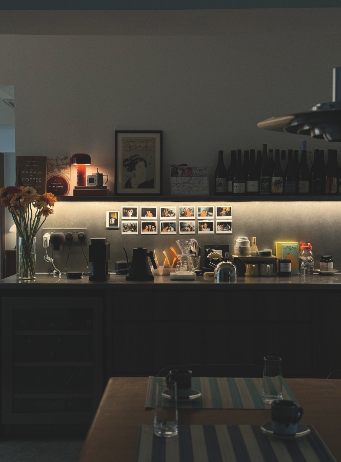
Can you walk us through your renovation process? Were there any significant challenges you faced during the renovation?
I have heard of some people who meet with 20 to 30 interior design firms before they appoint “the one.” Fortunately, we didn’t have to go through that extensive process and decided quite firmly on Monocot after meeting with just three design firms. Monocot is a design-focused consulting firm, so while they concentrated on the spatial design of our flat, the actual build was handled by a separate firm, LCN Interior.
The actual renovation of our flat took precisely four months, but the iterative design process with Monocot that led up to the renovation took about five months—so, a total of roughly nine months from start to finish.
We were extremely fortunate to have worked with a great team and honestly did not encounter any major budget-breaking hiccups along the way. There was an unanticipated leak from the ceiling of our master ensuite toilet, which required HDB’s rectification, but our fantastic builders managed to work around that issue in the interim, ensuring that there were no significant delays to the completion of our renovation.
What are your favourite features or spaces in your home, and why?
My favourite place in OBF is probably the living room because that’s where we spend most of our time together—lazily lounging on our sofa or easy chairs. The piece that really completed that space has to be our custom- made Prussian blue Moroccan rug from Salam Hello, which helped tie everything together.
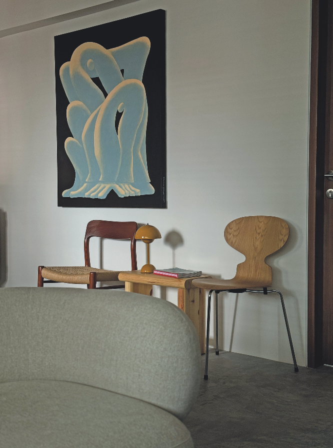
The artwork in our entryway titled “Push, Pull, Prosper No. 1” also holds special meaning for us, painted by Thai graphic designer and illustrator Nuttapong Daovichitr (Nutdao).
We discovered the piece at the Bangkok Art and Cultural Center (BACC) during a short trip to Thailand for a friend’s wedding. While we were exploring the exhibition separately at our own pace—a habit of ours at museums—we somehow converged on this piece at the same time, almost as if it was meant to be. We inquired and found it was available, so we purchased it the next day and arranged for its transportation to Singapore, where it now resides permanently in OBF.
What practical advice would you give someone who is about to start their renovation journey?
Firstly, and most importantly, determine your renovation budget and then set aside an additional 10-20% for potential unforeseen problems that may crop up partway through your renovations.
Secondly, renovation costs—the substantial quotation you receive—really only cover what you pay your builder for the demolition and rebuilding of your space. Appliances, furniture, fixtures, fittings, tiles, window treatments, and more represent separate costs and are not included in the renovation quotation, so these must also be considered during your budgeting process.
In general, I’d recommend investing more in high-quality fixtures and fittings (and trying to save elsewhere) because these are items that are meant to last the duration of your stay. Having to replace them a year or two after moving in can be not only cumbersome but also very costly.
How do you maintain the look and feel of your home on a day-to-day basis?
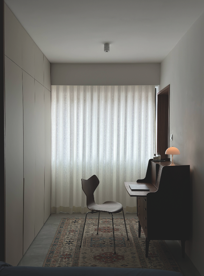
We hire a part-time cleaner who comes by every two weeks to do the heavy duty cleaning, while we rely on our robot cleaner to do the day-to-day maintenance. We generally put our things aside into our built-in cabinets to avoid unnecessary visual clutter.
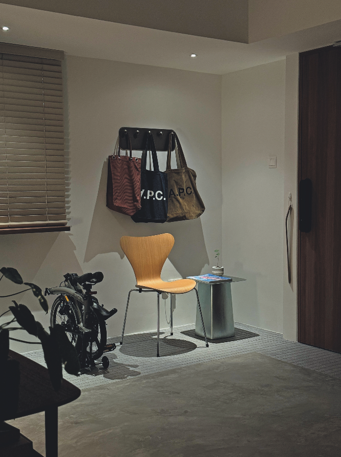
What’s your interior obsession?
Probably chairs. Friends have commented that we have way too many chairs for just two people, but I think chairs are really special pieces of furniture with countless different forms, and I can’t wait to add more. My dream chair is the Finn Juhl Chieftain Chair, but that will be for another time in another (hopefully bigger) home in the future.
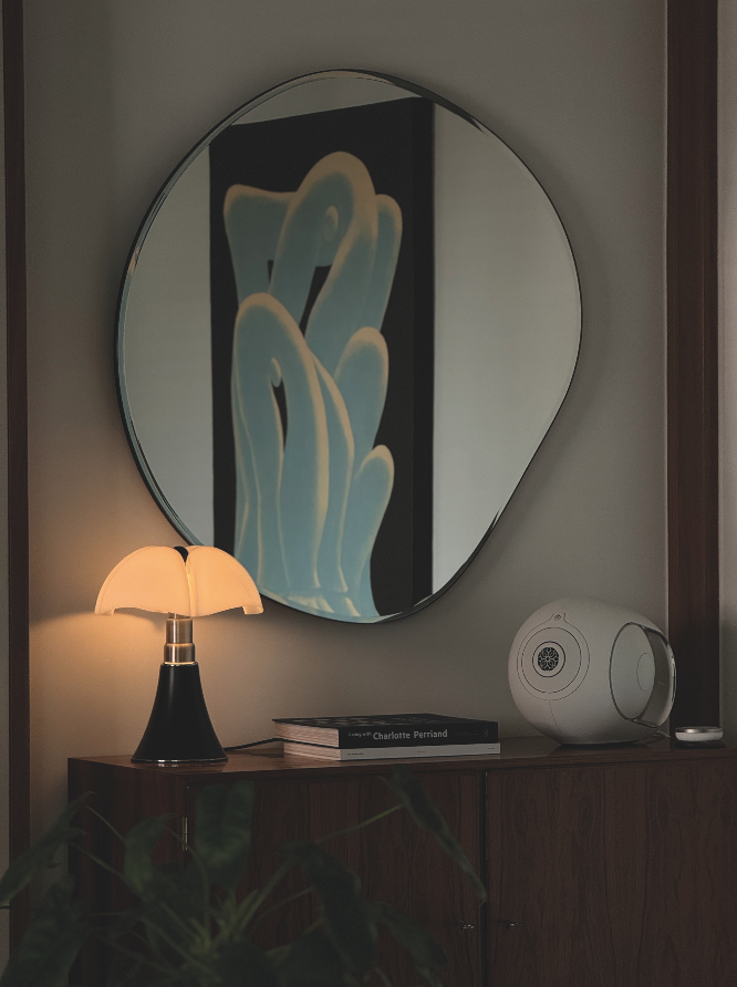
What advice would you give to new homeowners who want to personalise their space but don’t know where to start?
It can be quite challenging to figure out what you like and dislike, especially when your tastes may differ significantly from your partner’s. I think having a broad and common idea of what you want your space to be like can help narrow down and refine these choices.
In our case, our common goal was to curate an interior that would be timeless and that we’d look forward to interacting with every day for years to come, as opposed to one that we would have to replace and refresh regularly.
Looking at homes that inspire you (either through books, magazines, or social media) and analysing what you agree with takes time, but it’s a process that should not be rushed. Take your time to find what resonates with you, so you can create a space that is an expression of your personality and lifestyle—a home that grounds you.
Follow their journey on Instagram @oldbishanflat
This post was adapted from an article originally published in the June 2024 issue of SquareRooms.


