Whether it’s a freshly completed BTO flat or an old resale unit, a 4-room HDB flat isn’t exactly the largest of spaces—which is precisely why it’s so important to find a great layout that works for your lifestyle, so you can fully maximise the space.
Read on for some spacious layout options and space planning ideas to make the most of your 4-room HDB flat!
4-room resale HDB layout with no shelter
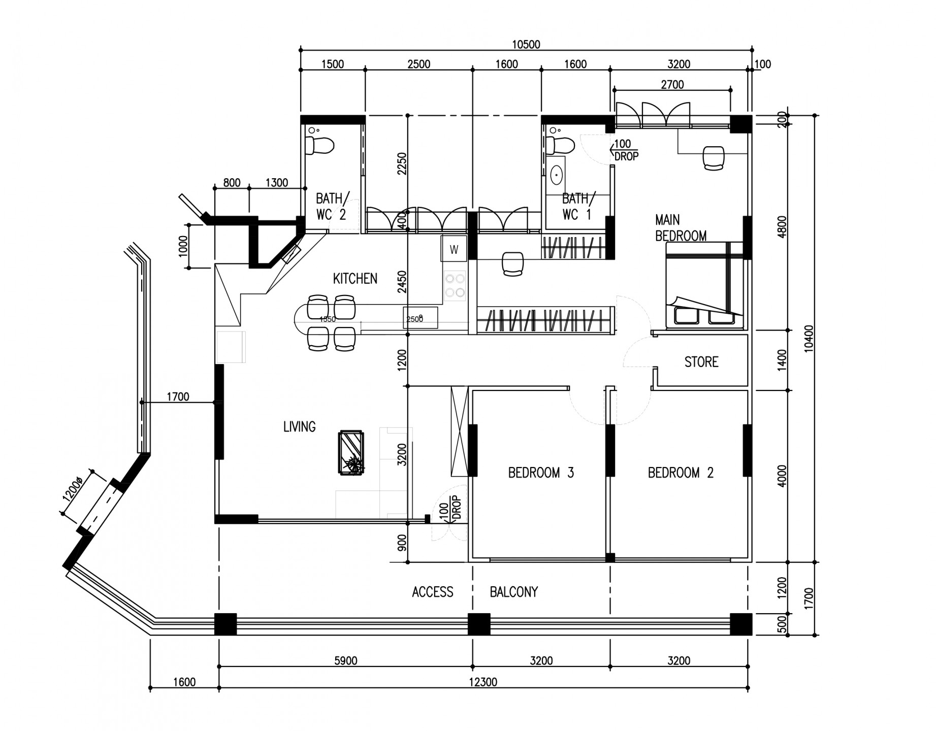
This old HDB unit was fully revamped by the OVON Design team. Like many older HDB flats, it doesn’t come with a household shelter, which gives the flat a more spacious feel and also makes hacking and changing up the layout more straightforward.
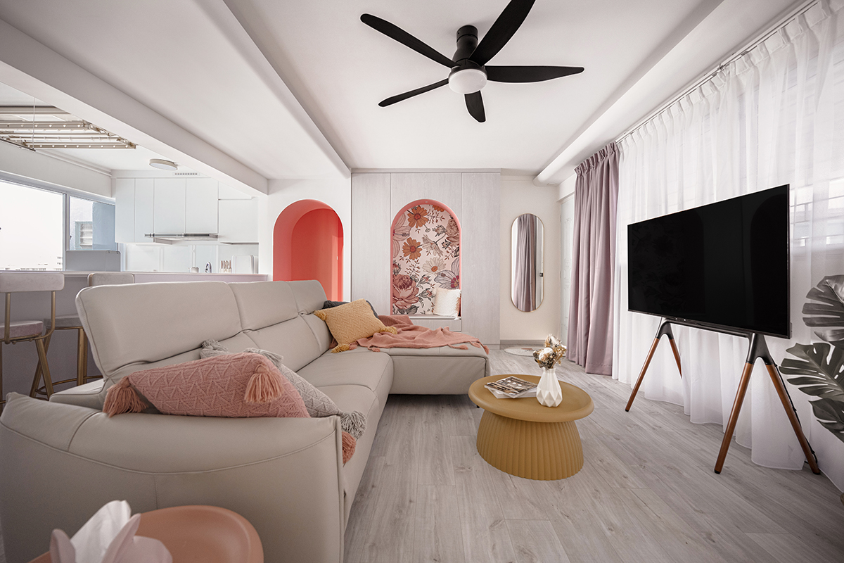
Having no household shelter to disrupt a potential open-concept design, the living area, dining and kitchen were combined into one generous common area that feels grand yet cosy.
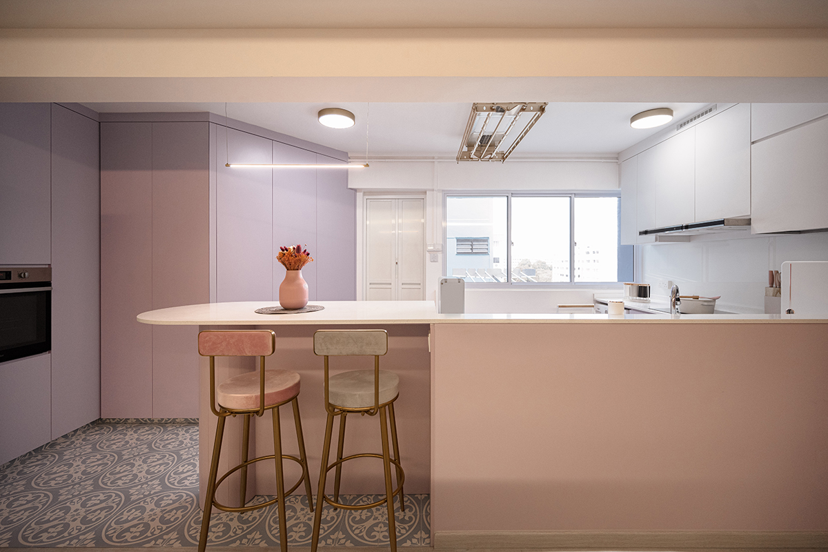
In the kitchen, an awkward diagonal wall was maximised by letting the carpentry follow the natural line of the room. The curved edges of the island balance out the sharper corners of the carpentry, softening the overall look.
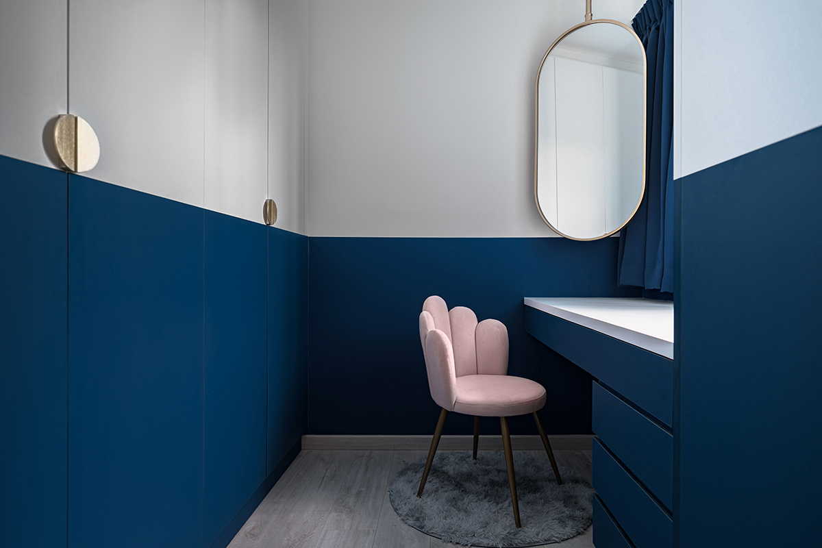
If you take a closer look at the floor plan, you’ll notice that one of the rooms was turned into a walk-in wardrobe with an extra vanity area.
While walk-in wardrobes are common enough, it was a clever idea to make use of the room’s only window and incorporate the vanity table where the homeowners can get lots of natural light.
4-room BTO layout with just one bedroom
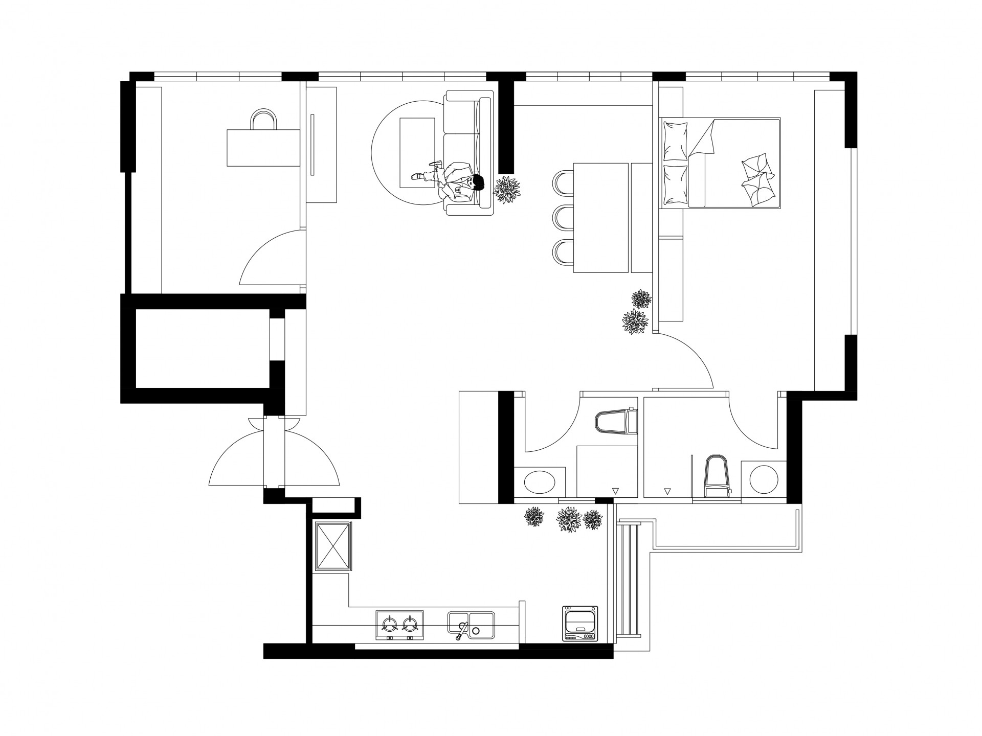
Interior designer Alex Chang’s own BTO flat was transformed by his team at Ju Design Studio, giving him and his family a loft-inspired abode with industrial charm.
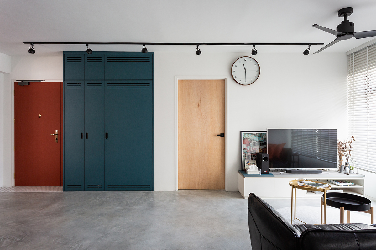
First and foremost, the household shelter was hidden not using seamless built-ins but with a full-height shoe cabinet in a bold blue shade.
While most homeowners try to conceal this area as much as possible, Chang’s statement shoe cabinet draws the eye so much it distracts from the fact there is something hidden behind it in the first place.
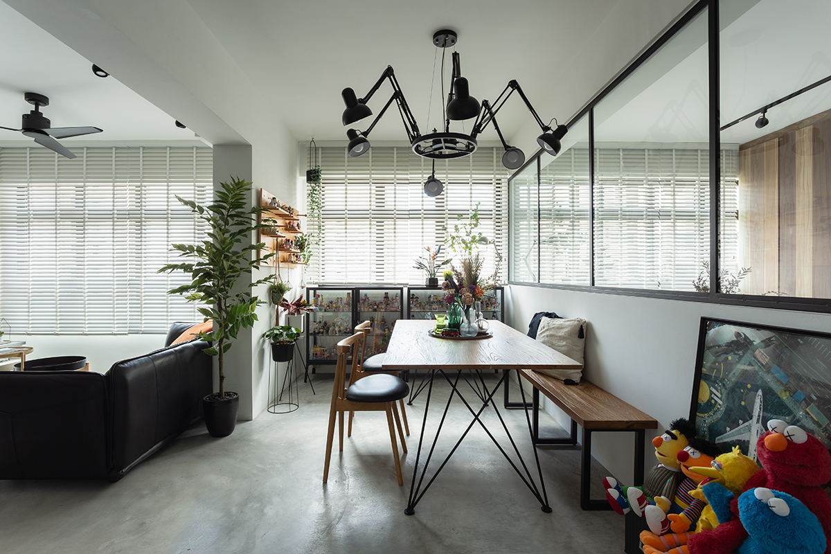
One of the the original bedrooms at the back of the house was turned into a study room. The room above, on the other hand, was hacked to become an open-concept dining area, extending from the living room.
The back of the sofa acts as a makeshift room divider to lend the dining area a subtle sense of separation.
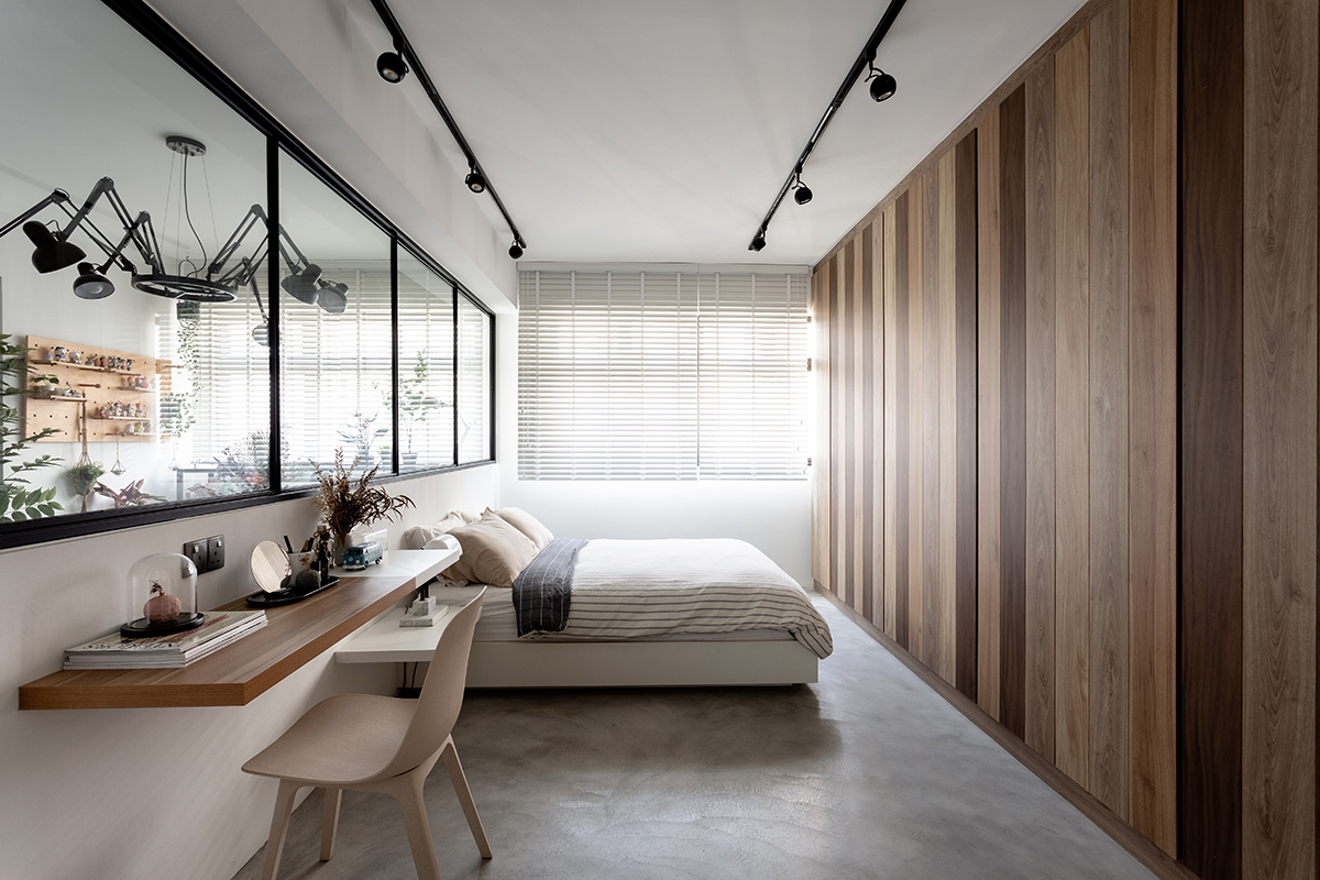
Instead of separating the bedroom from the common areas as much as possible, the designer decided to invite natural light into the main suite with a set of internal windows.
At the same time, the bedroom is nicely located at the corner of the home, keeping noise from the common areas to a minimum.
4-room BTO layout with an open-concept kitchen
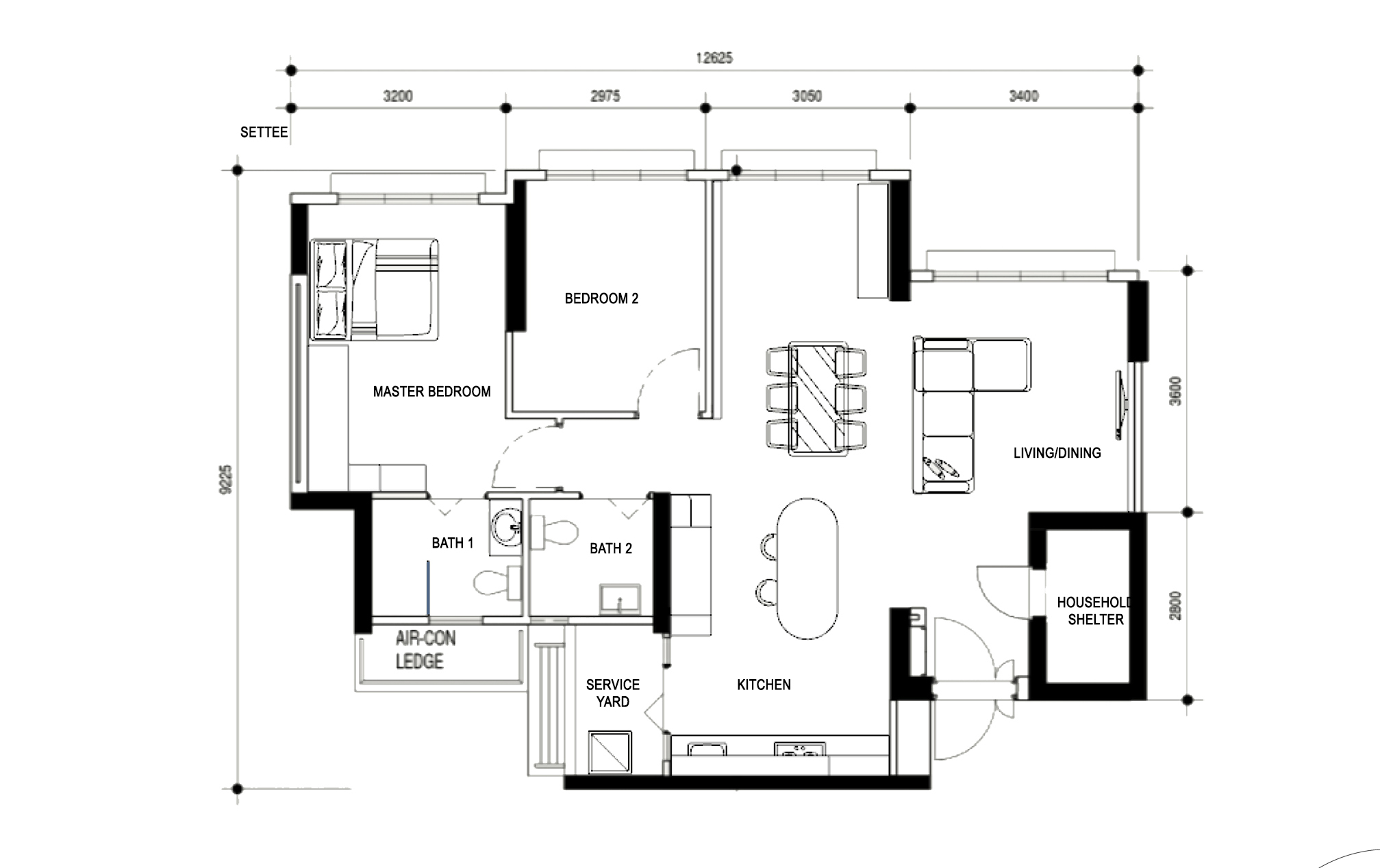
Designed by Cozyspace, this 4-room BTO flat is home to a married couple in Bedok South.
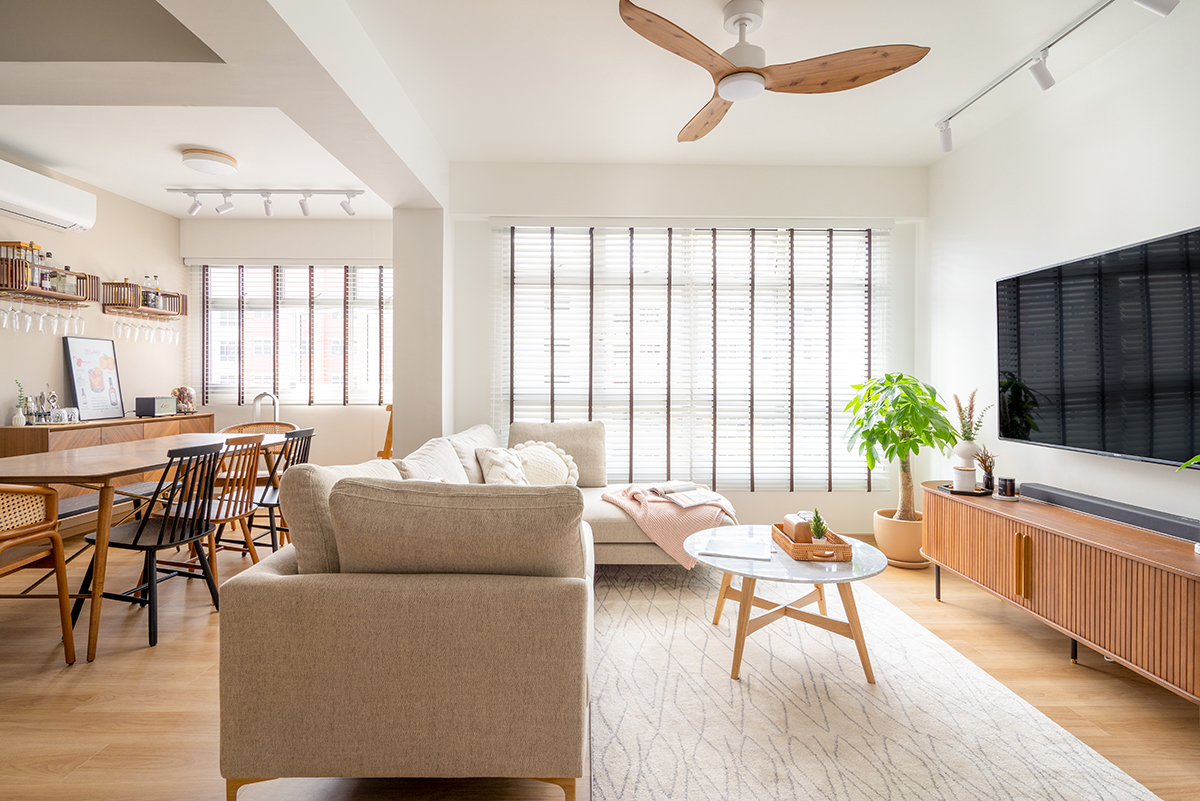
Since the home only needs to accommodate a couple, one of the bedrooms was hacked to extend the living area into an open-concept dining space, making the common areas feel so much more inviting.
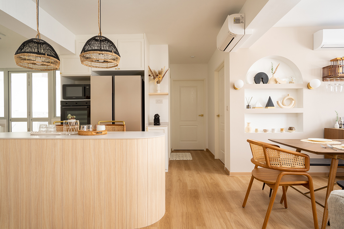
The kitchen was opened up as well, separated from the dining and living spaces only by a rounded island that doubles up as a bar and serving counter.
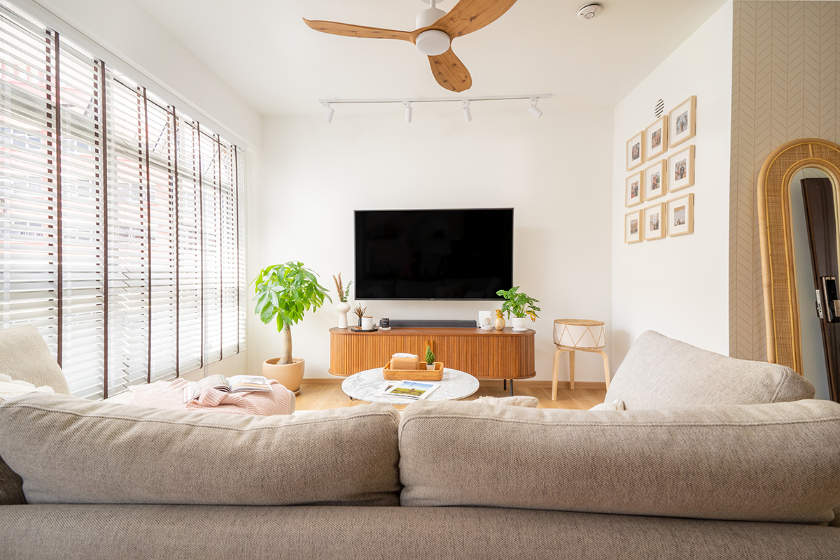
And for those of you who are wondering what was done to conceal the household shelter—it was adorned with a neat chevron pattern and the entrance was hidden behind a standing mirror, which is extra handy to have near the front door.
4-room BTO layout with a walk-in wardrobe
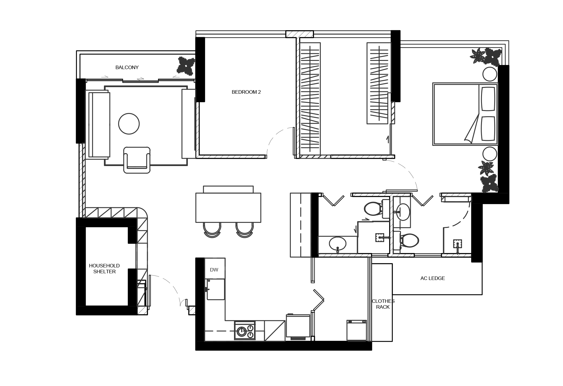
This BTO flat in Singapore’s central area was overhauled by the talented designers at Ascend Design, lending it a Japanese tea house-inspired aesthetic.
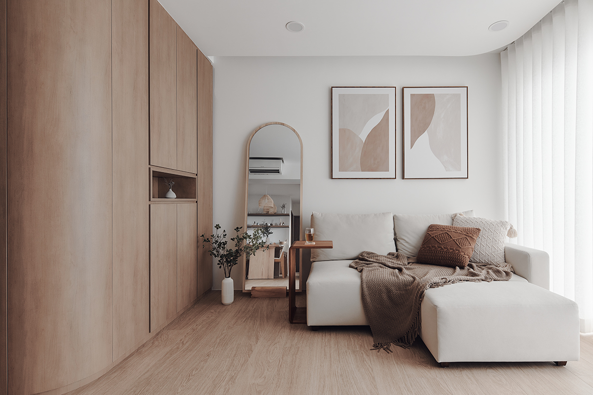
Curved panels were applied around the household shelter, serving a dual function: they conceal the shelter and also set a soft and gentle ambience while leading visitors into the living area thanks to the lack of sharp corners. Plus, they provide storage space along the walls!
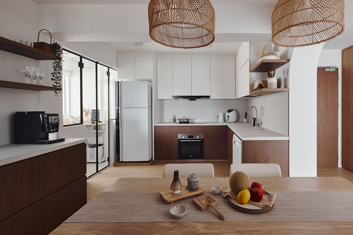
The kitchen was fitted out with a spacious, in-kitchen dining area. At the back, it opens up into a rather large, glass-enclosed service yard, which helps bring more natural light into the kitchen.
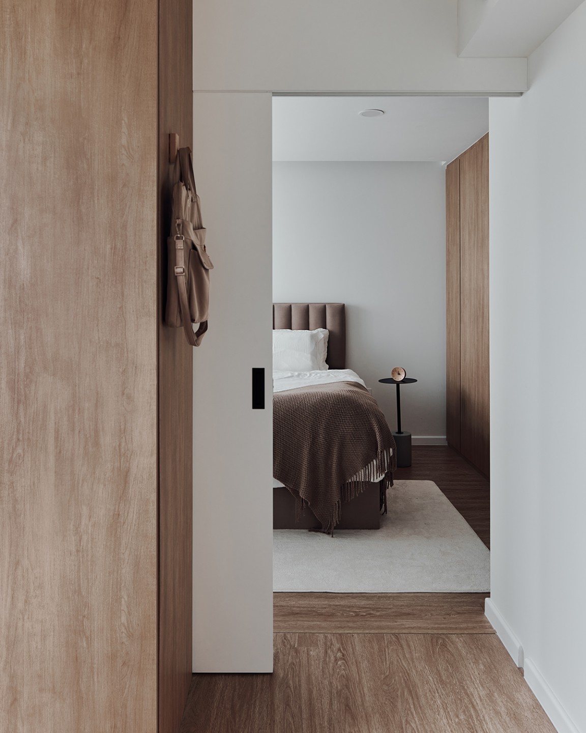
One of the bedrooms was turned into a walk-in wardrobe, separated from the main suite by a pocket door. The designers made sure to paint the door in the same shade of white as the walls for a seamless transition, which makes both rooms appear larger.
Looking for more inspiration for your HDB renovation? Check out our selection of house tours!


