Go beyond walls and make a clear-cut definition between the two areas of the communal zone with these solutions.
Place the sofa in the centre
Don’t give up your dreams of owning a dining area even in a common space with a minimal footprint. Apartments with a narrow but longer layout would benefit from a configuration where the parts of the home designated for seating and eating are back to back of each other. No square footage left for additional furniture? No problem. Position the largest piece of furniture – usually the couch – roughly across the centre of the room. It acts as a dividing line to give the impression of dual zones.
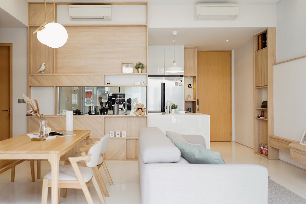
Image credit: Authors Interiors & Styling
Use tiles to define
If you prefer to leave your interior free-flowing and devoid of obstructions, shift your attention underfoot. When laid across floors, tiles can aid to visually set apart a floating sitting room from the eating place. In this way, they act as a pseudo rug – only they are easier to clean in case spills happen. Aside from that, attention-grabbing tiles like these are great at injecting colour and personality into an abode. For those whose taste veers towards the understated, a gradual transition of design instead of the juxtaposition of contrasting patterns would work better for you.
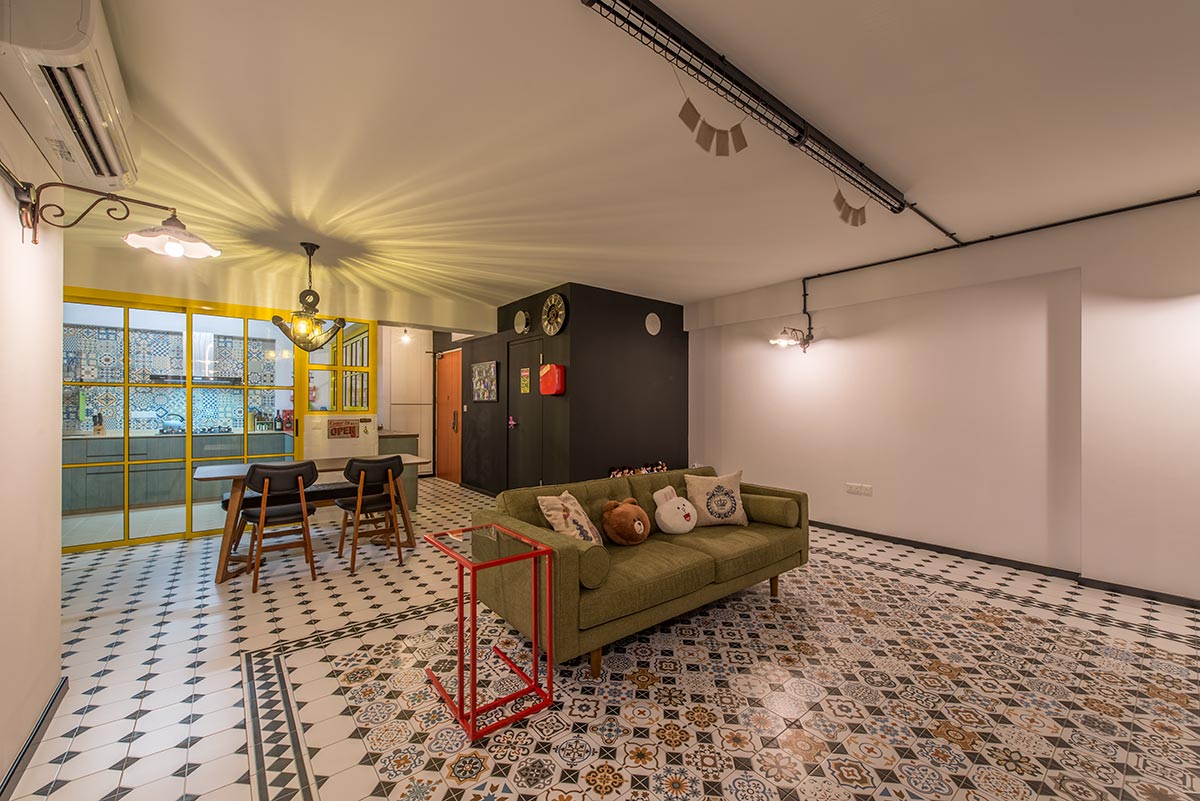
Image credit: The 80s Studio
Bring the indoors in
What better way to relish a meal than in an alfresco setting with a view? This indoor-outdoor space is further accentuated by wooden floors and furniture which additionally play a part in individualising it from the adjoining lounging zone. Low-lying furniture ensures a flow is maintained between these two separate areas – enabling and encouraging easy conversations no matter where one is seated.
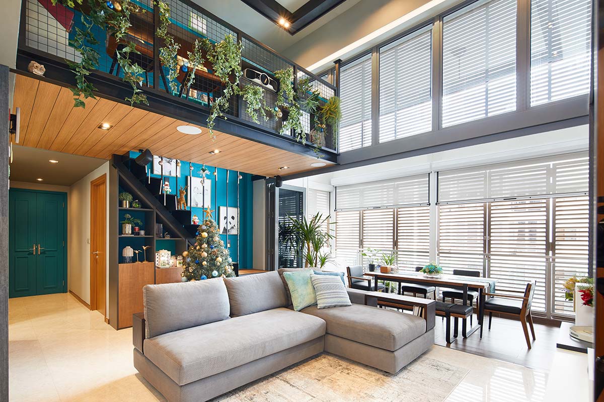
Image credit: Black N White Haus
Use area rugs to define spaces
One of the simplest ways to visually compartmentalise a room without partitions is using area rugs. They add patterns to the interior and provide a soft surface whether you’re having a munch or simply lazing on the sofa. The edges of the rugs make you feel as if you’re entering one zone from the other, and this thus keeps the furniture within proximity from feeling like a jumble.
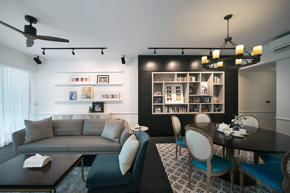
Image credit: Fuse Concept
Take advantage of custom furniture
A foolproof combo to beating tight spaces is built-in furniture. This custom-designed dining table and banquette style bench not only maximises the dwelling’s square footage, it helps to enhance the room’s aesthetics as well. Features such as an extra-high backrest that doubles as a privacy partition prove that simple can be clever. On the opposite, stools in place of conventional chairs keep the constrained pad feel incredibly airy.
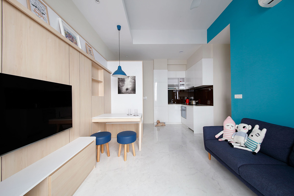
Image credit: Free Space Intent
Divide and conquer
Sitting in the midpoint between the two parts of the home where one lounge and dines, a home entertainment plays a role as a divider to keep these areas distinct. As it is low-lying and barely bites into much real estate space, it serves its duty without impeding into the sense of spaciousness here. The best part is the television swivels – so you won’t miss a second of your favourite show even when it’s chow time.
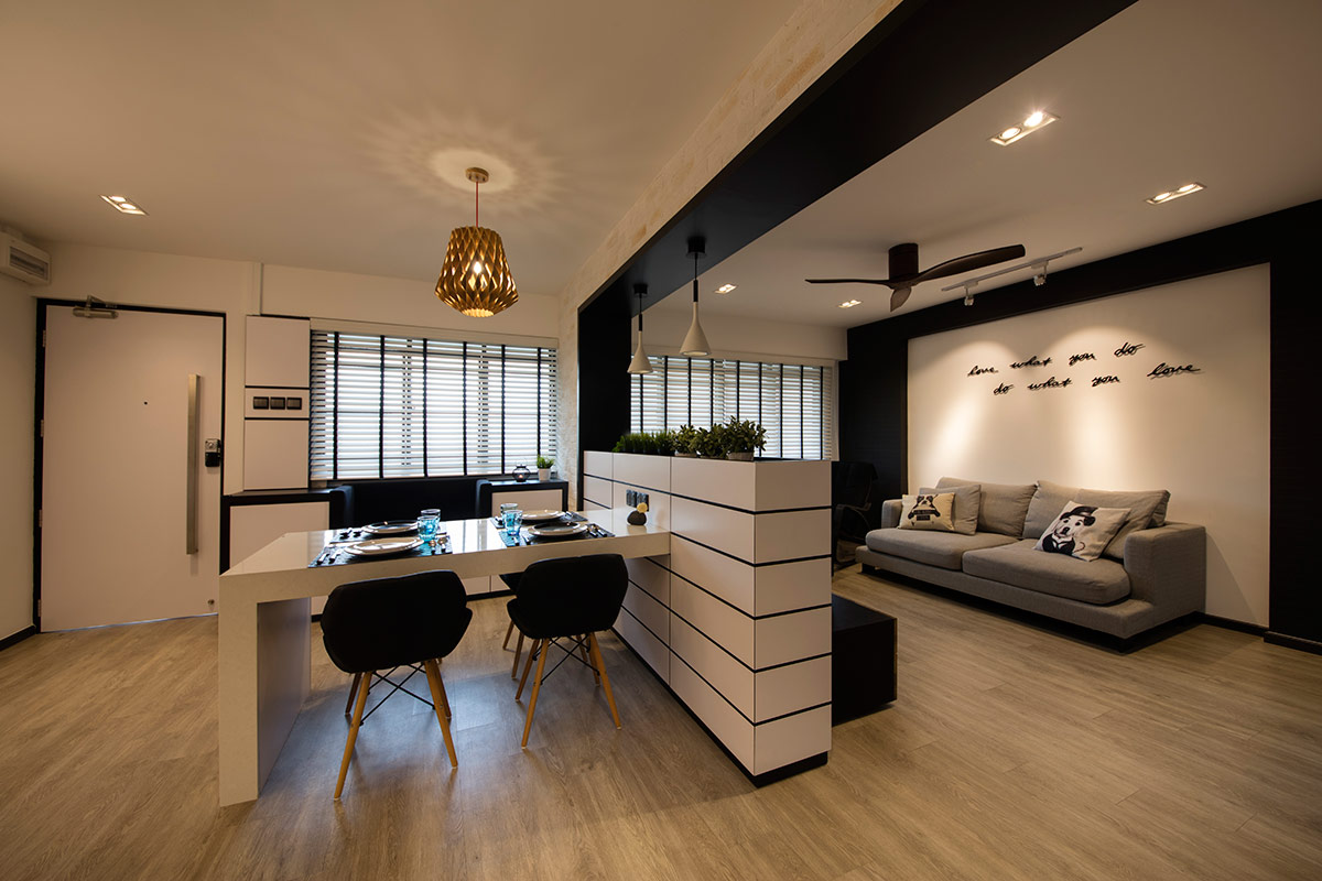
Image credit: KDOT Associates
Separate with a shelf
Bookshelves make effective partitions because not only do they help to demarcate zones, they do so without blocking light out entirely. What’s more, the shelving space can be used to stack books or show off your favourite collectables. They’re not one-size-fits-all though. Full-height units that boast a grand stature are better suited for homes with a more voluminous footprint, while low-lying ones complement petite pads.
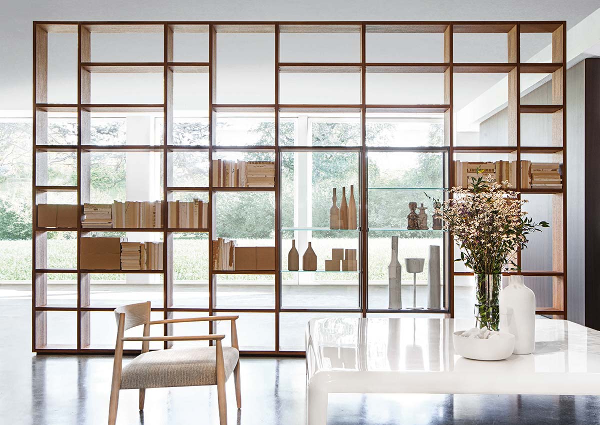
Image credit: Porro
Use accents to anchor a space
Despite being designated to an awkward corner between the living room and kitchen, this compact-sized spot for dining shows how space and size constraints can be conquered with nifty solutions. A gorgeous metallic copper pendant lamp is an excellent method to mark out the nook, while the mirrored backdrop aids in balancing the scale by optically opening up the area.
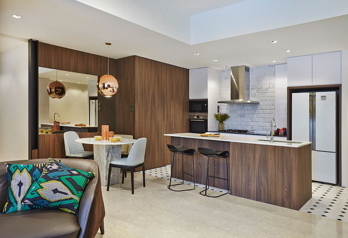
Image credit: Minimo & Minimology
This was adapted from an article originally written by Fidz Azmin published in the July 2019 issue of SquareRooms


