While the colours you choose for your home should reflect your own taste and personality, there are certain colours that complement specific rooms and purposes. A bathroom, for instance, should be restful and not too bright and is thus complemented by warm neutrals and pastels. The kitchen, on the other hand, should first and foremost be appetising and ultimately inspire you to cook up a feast.
To find out more about how colours can enhance cooking and appetite, we spoke to Ms. Evelyn Ler, the General Manager of KitchenAid Asia. Read on for her guide to choosing colours for the kitchen and her top tips for working bold, colourful appliances into your kitchen aesthetic.
Why is it so important to choose a good colour combo for the kitchen?

Colour has a very strong impact on the human mind beyond simple visual aesthetics. Colour addresses one of our basic neurological needs for stimulation, and the kitchen and its culinary adventures are a sensory feast—sight, smell and taste are all engaged simultaneously.
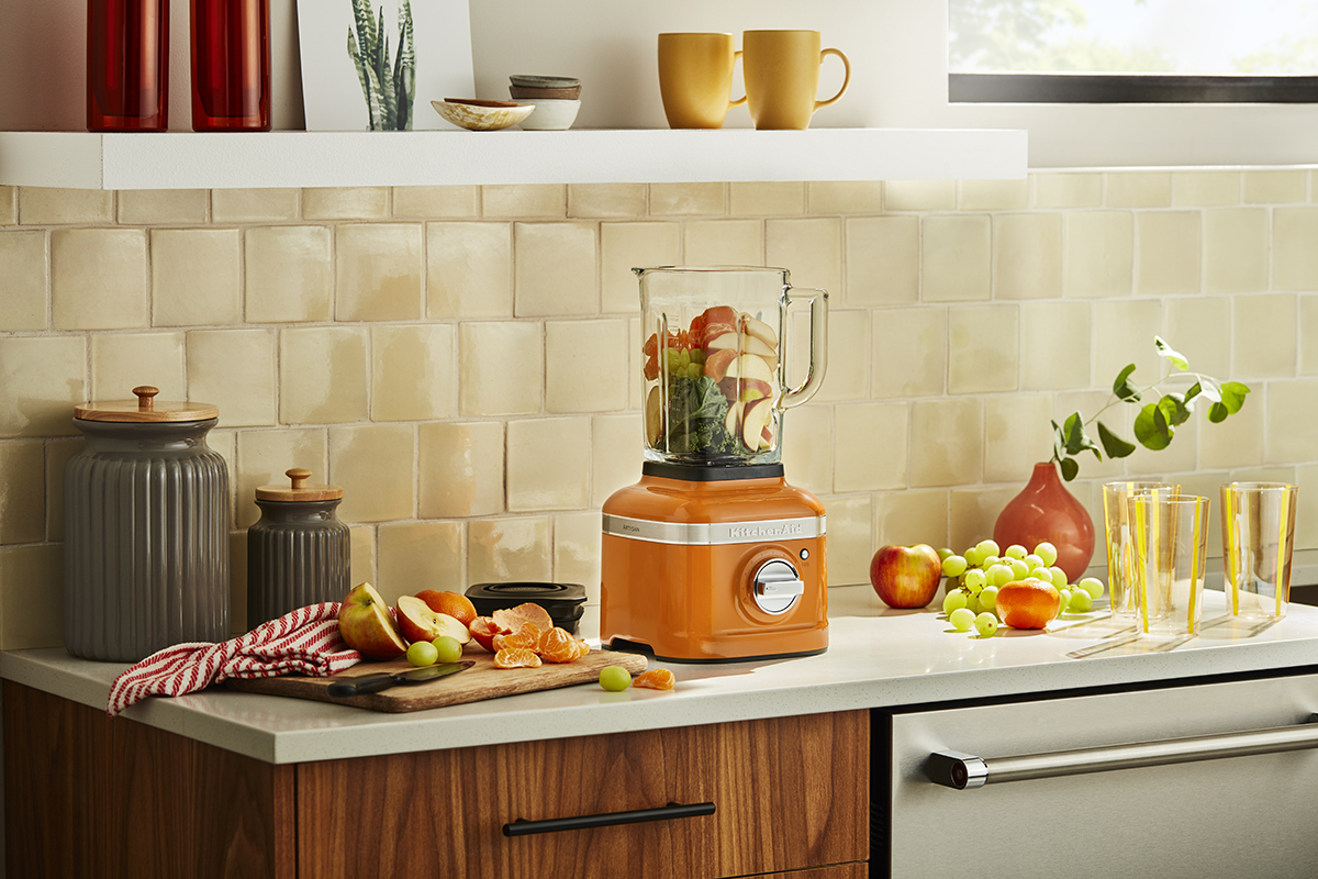
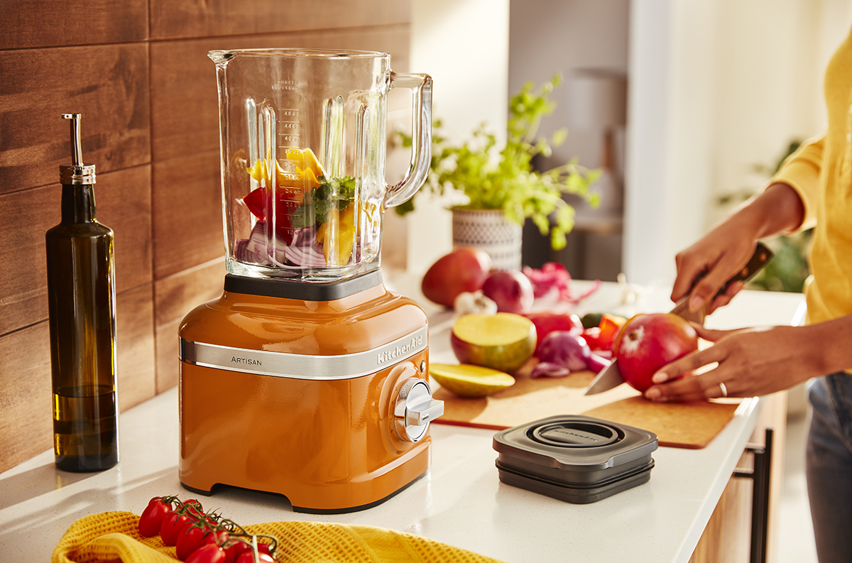
Using colours we associate with positive feelings can enhance our overall experience. For example, colours such as red and yellow can build an appetite while orange is a colour we associate with warmth and comfort. A good colour combo can inspire creativity and give comfort.
One more consideration: try to keep your colour palette simple. We advise no more than three focal colours.
What’s your top tip for working bold, colourful appliances into a modern kitchen?
My top tip would be to embrace the bright and bold energy that comes with colours like that. We are very used to appliances that can come across as sterile with their tamer colours. Those looking to add a pop of colour can start small with a few statement pieces in the kitchen, which can easily be relocated and rearranged if need be.
One alternative is to gradually introduce colour through brightly coloured or patterned tea towels, aprons or rugs—all small touches that can be built on. I’ve also seen beautiful kitchens with a bright feature wall or painted furnishings. Kitchens are vibrant, fun places where we create happy memories and feed our families—don’t be shy about letting your personality shine!
You recently announced Honey as the colour of the year. How did you determine this shade?
Determining the colour of the year involves systematic evaluation and synchronisation of past seasonal colour influences, socio-cultural and economic factors and fashion trends, as well as the forecasters’ intuition, to create several colour palettes applicable to a variety of market sectors each season.
In Singapore, more people are seeing the home as a centrepiece for interaction and spending time with loved ones. Maintaining connections with loved ones has become a high priority. Honey is a reminder of the sweetness of coming together in the kitchen and experiencing that irresistible positivity, warmth and cosiness. We hope that this added splash of warmth in the kitchen will inspire more creativity and bring about more shared moments of togetherness at home.
Which colours would you recommend pairing the new Honey shade with? Any favourite combinations?

Use a light, neutral shade on the walls to keep the room light and open, such as white or a cool grey. You can use tea towels in navy blue and add a fabric accent in grey on your countertop. Add wall hangings in bright warm shades like orange or red for contrast that complements! We find that warm shades work particularly well against wood as well, be it light or dark wood.
A statement piece in such a deep, warm shade will add a sense of richness to your kitchen, no matter how and where you place it.


