Designing your home is not just about buying the right furniture and picking out the most suitable colours—how you plan your space is equally important. In fact, designing your surroundings without considering the flow of movement in your home can end up doing your carefully picked furnishings and features a disservice, making them appear inadequate. Whether you’re devising your home for the first time or want to give your current space a makeover, here’s how you should plan your space for better flow of movement.
Create a focal zone
The easiest starting point for effective space planning is to strip down each room to its main function. You will need to figure out what the purpose of the room is, pick out the one item that fulfils this purpose, and build around it. In a dining room, for instance, the dining table should be the feature that everything else points to. Position your chairs around the table and hang your main lighting source above or around it in order to highlight the whole set-up. To enhance this visual focus even further, place the table and chairs on an area rug, facilitating the flow of movement around the dining zone by demarcating it as its own little island.
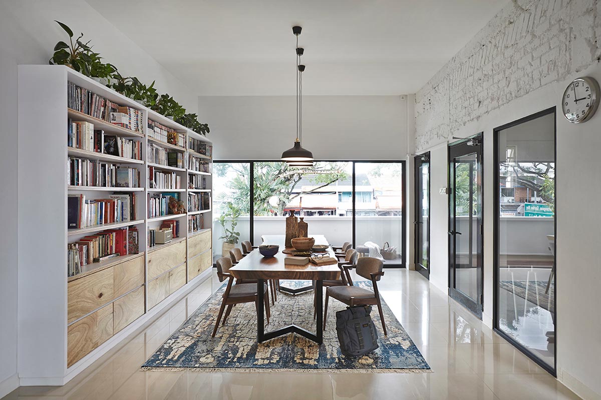
Image courtesy of Three-D Conceptwerke
Keep some distance
One of your top priorities when planning the layout of your home should be the space you leave around your furniture. After all, creating a good flow of movement means carving out the space to move around comfortably. It’s crucial, for instance, that you keep some distance between the coffee table in the living room and the soft furnishings that surround it, as well as between the soft furnishings and things such as bookshelves and doorways. If the paths between the different items and areas of your home are obstructed, it will interrupt the flow of movement you are so carefully crafting.
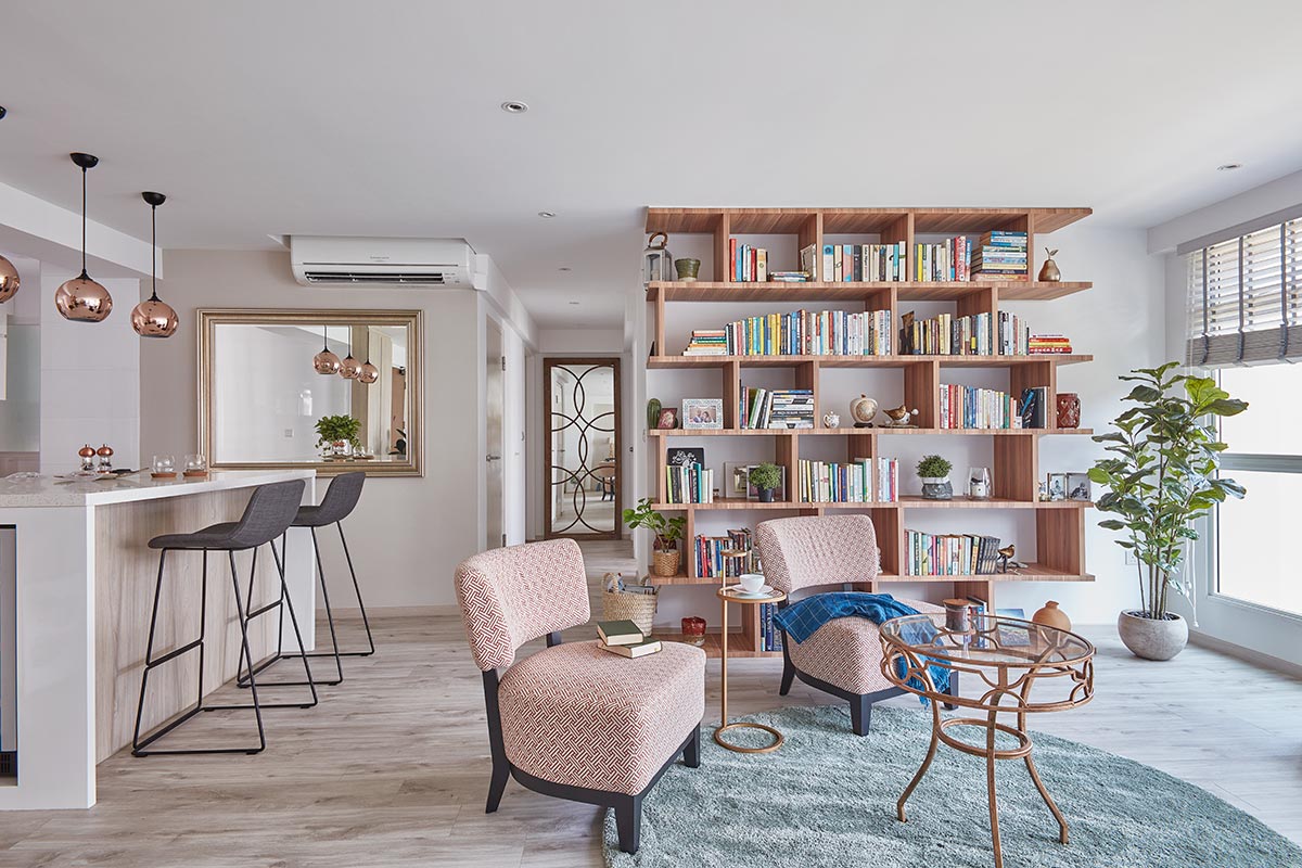
Image courtesy of Free Space Intent
Hide your storage
One of the most disruptive features in otherwise well-planned homes is bulky storage. While bookshelves and display racks can lend a touch of personality to the home, most types of storage are not nearly as pleasant. To maximise your space and improve the flow of movement in your home, incorporate storage into your walls and into the hidden nooks and crannies of each room, avoiding cupboards and cabinets that stick out awkwardly. Full-height wardrobes are a particularly good option in the bedroom.
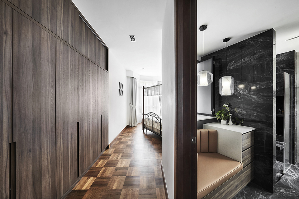
Image courtesy of Richfield Integrated
Balance out the design
Be it size, shape, colour or style, balance is key when planning your space and particularly when arranging your furniture. A chunky armchair can be balanced out by a dainty sideboard, a square table by a round rug, a dark finish by a light one and a patterned design by a solid shade. If one side of the room boasts a bright feature wall and heavy furniture, the other side should complement this look with what’s missing, thus creating a sense of balance that makes the space easy on the eyes. When you apply this technique to your entire home, the space as a whole will come together with a steady aesthetic flow.
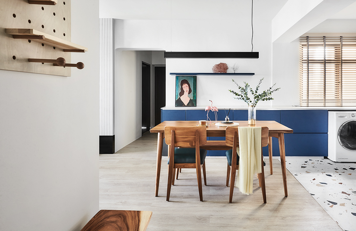
Image courtesy of Dan’s Workshop
Curve it out
Corners can come in handy when you want to visually separate different areas, such as dining zones, but they can also make for abrupt transitions that interrupt the flow of movement. For a softer change of scenery, consider incorporating curves into your layout. These can be curved walls, which facilitate movement through the house by guiding you from room to room, or curved furniture items, like coffee tables and sofas.
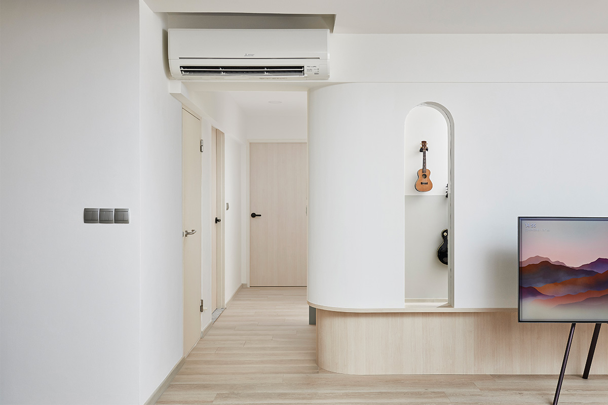 Image courtesy of Studio FortyFour


