Ermita S. and her family are no ordinary HDB dwellers. She and her husband balloted for their 3-room BTO unit at Bendemeer Light in 2012 before they found out that they were going to have three new additions to their family two years later. She recalls, “My husband and I had planned to have a second child after our first daughter, Livia, but never in our wildest dreams did we expect the addition of three new members to our family at once. To say the least, it was a great shock for us both.”
When they moved into their new home, they brought their four daughters – Livia and triplets Lysbeth, Lucia and Liora – with them. Hoping to maximise every square inch of their 731-square foot space, the homeowners sought the help of interior designer Ryan Lin from Dyel Design to make the most of every square inch of their home.
Here are some clever space-planning tips we learnt from this cosy and space-efficient family home:
1. Create a carefully-planned layout with sufficient storage solutions
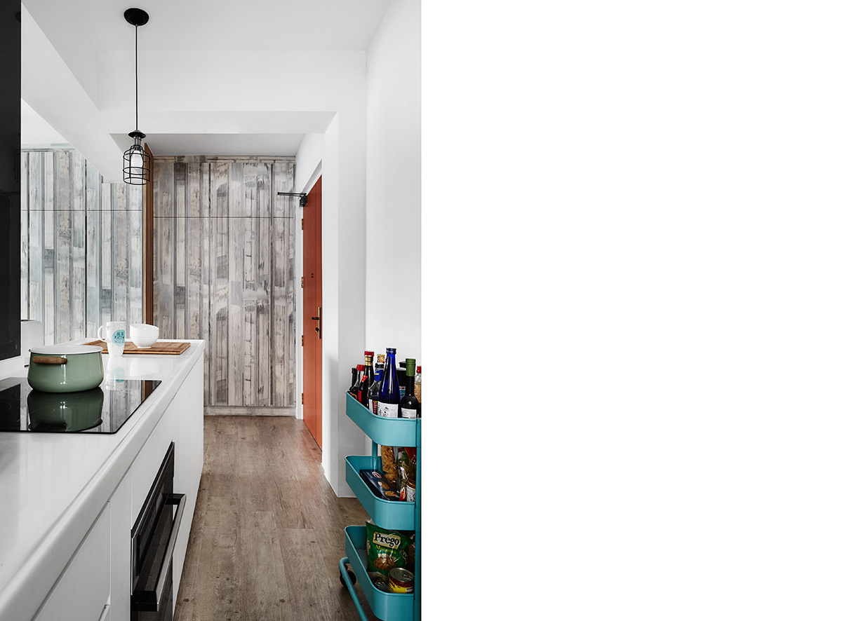
Determined to make the most of her family’s modest 731-square foot Bendemeer apartment, Ermita commissioned its transformation into a modern two-bedroom abode with an open-concept design. The home’s defining characteristic is none other than its carefully-curated combination of custom built-ins and compact store-bought furniture that greatly helps in improving space efficiency.
2. Make the most of multipurpose spaces and furniture
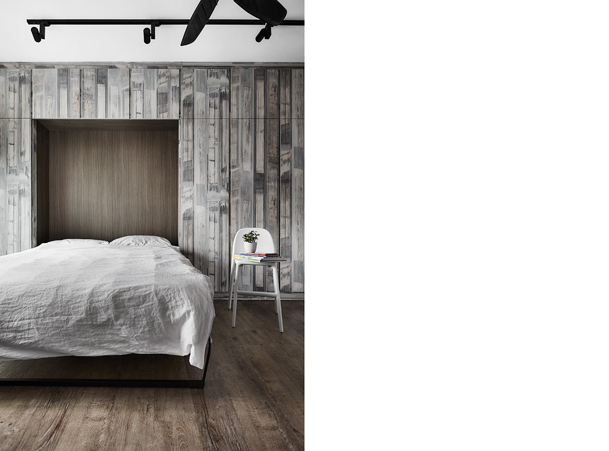
Primarily clad in washed-out wood tones, the living room is a tranquil space that doubles up as the apartment’s master bedroom. This is made possible by a foldable bed, which can be neatly and easily stowed away into a multipurpose storage-cum-feature-wall. Meanwhile, colourful Ambient Lounge designer bean bags serve as the perfect alternative seating options to a bulky conventional sofa.
3. Demarcate spaces with collapsible see-through walls
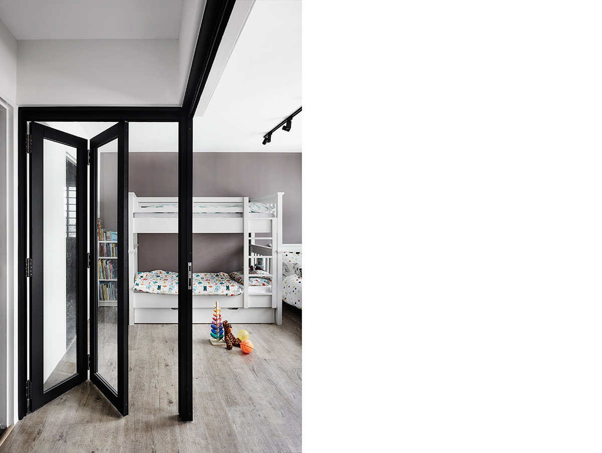
Following the removal of the walls that separate the apartment’s original bedrooms and central walkway, collapsible privacy barriers in the form of glass bifold doors were installed in the zone to serve as see-through replacements.
4. Keep furnishings clean and functional for an uncluttered look
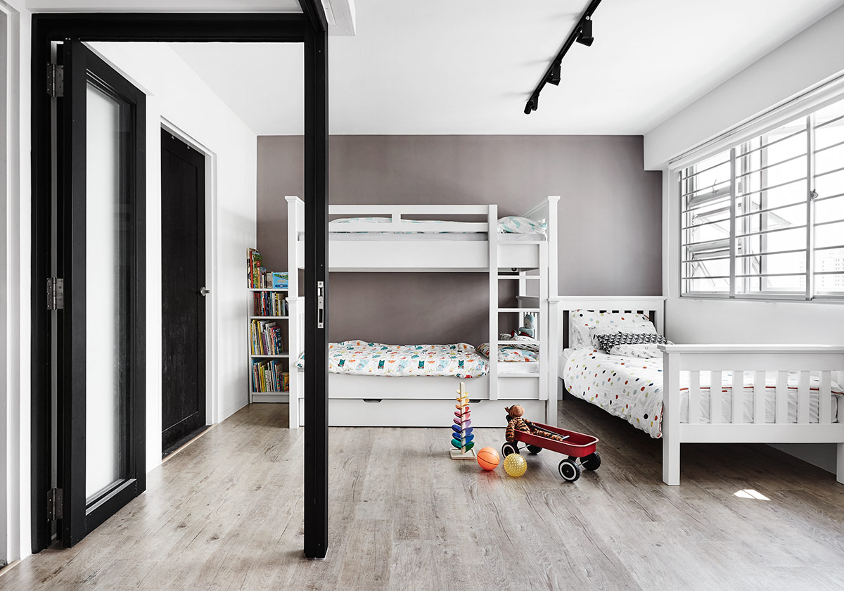
Converted into the children’s bedroom, the former master boudoir now features a pair of matching beds, one a bunk with a bottom pull-out berth and the other a standalone unit. For colour consistency, Ermita stuck to mostly white fittings that would complement, but stand out a minimalist backdrop of solid ultra-grey.
5. Get smart about keeping your rooms organised
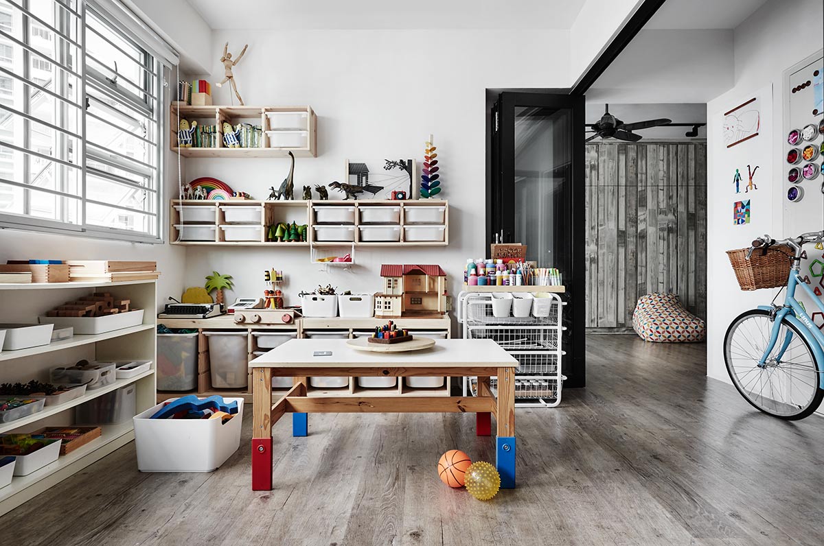
Inspired by Montessori learning concepts, Ermita had a special activity area constructed within the children’s bedroom as a way of honing their senses and critical-thinking skills. Apart from being filled with interactive learning aids that enable this hands-on approach to education, the play area also comes outfitted with practical storage accessories, including child-height shelves, storage trays and a play table.
This was adapted from an article originally published in the August 2017 issue of SquareRooms.


