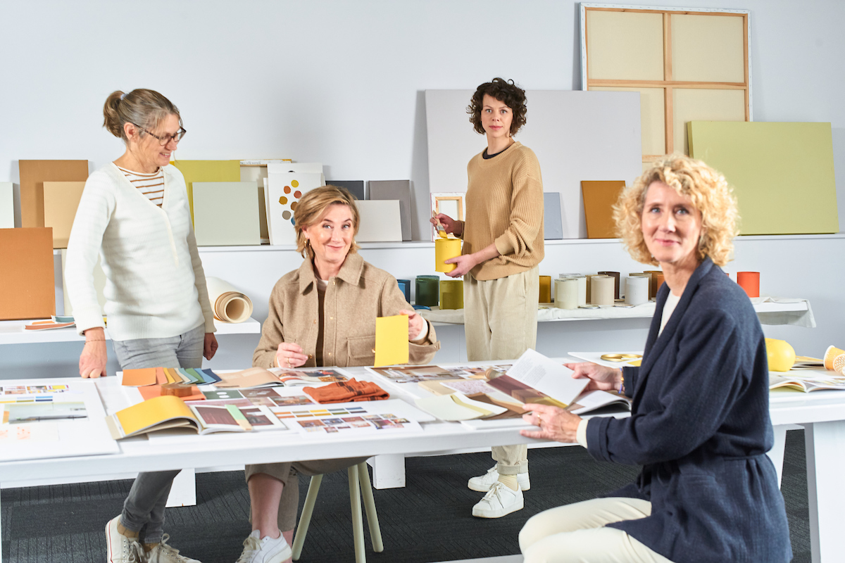
Leading the team at the AkzoNobel Global Aesthetic Center is quite the responsibility, but in Heleen van Gent’s eyes, it’s also a dream come true. “People often say I have the best job in the world, and I believe that’s true,” she shares. At the heart of her work is one key event: the announcement of AkzoNobel’s ColourFutures trend forecast and the carefully selected Colour of the Year, this time set to be revealed on September 9.
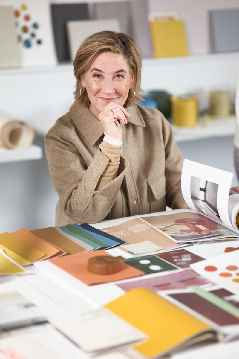
Heleen van Gent, Creative Director Global Aesthetic Center
This annual highlight is the culmination of expert research into global trends and insights, which then defines the curation and advice that the team has been offering for more than 30 years, with van Gent at the forefront since 2009. An unequivocal expert on trends, colour, design, and architecture, she takes pride in her mission to help people beautify and personalise their spaces through the power of colour and paint.
Can you share a bit about yourself and your work?
My creativity stems from my early childhood, when I used to play with my architect father’s design board. I launched my design career after graduating from the Royal Academy of Arts in The Hague, and spent 20 years as an interior stylist and design editor before moving on to publishing roles, having edited more than ten books on interior and colour design.
Being able to inspire people all over the world to make their living environment more beautiful with colour is a joy. My team and I make sure we understand the colour needs of the people we work with. We ensure that picking colours is easy and hassle-free, and something to enjoy rather than to avoid.
How did your experience working in publishing further shape your thoughts on colour and design?
I was trained to understand the publisher’s audience, the readers. I truly believe that it’s our duty to make their everyday life more beautiful. Nothing changed going from a magazine to the paint business; it’s still all about understanding and catering to those needs. There is so much to choose from when it comes to colour, and we develop easy-to-use guidelines and tools to make choosing colours simple. Paint is an essential part of interior design and architecture, and we want to make the world of colour easily accessible and fun.
Please tell us a bit about Dulux Colour Futures and the selection process that goes into the Colour of the Year.
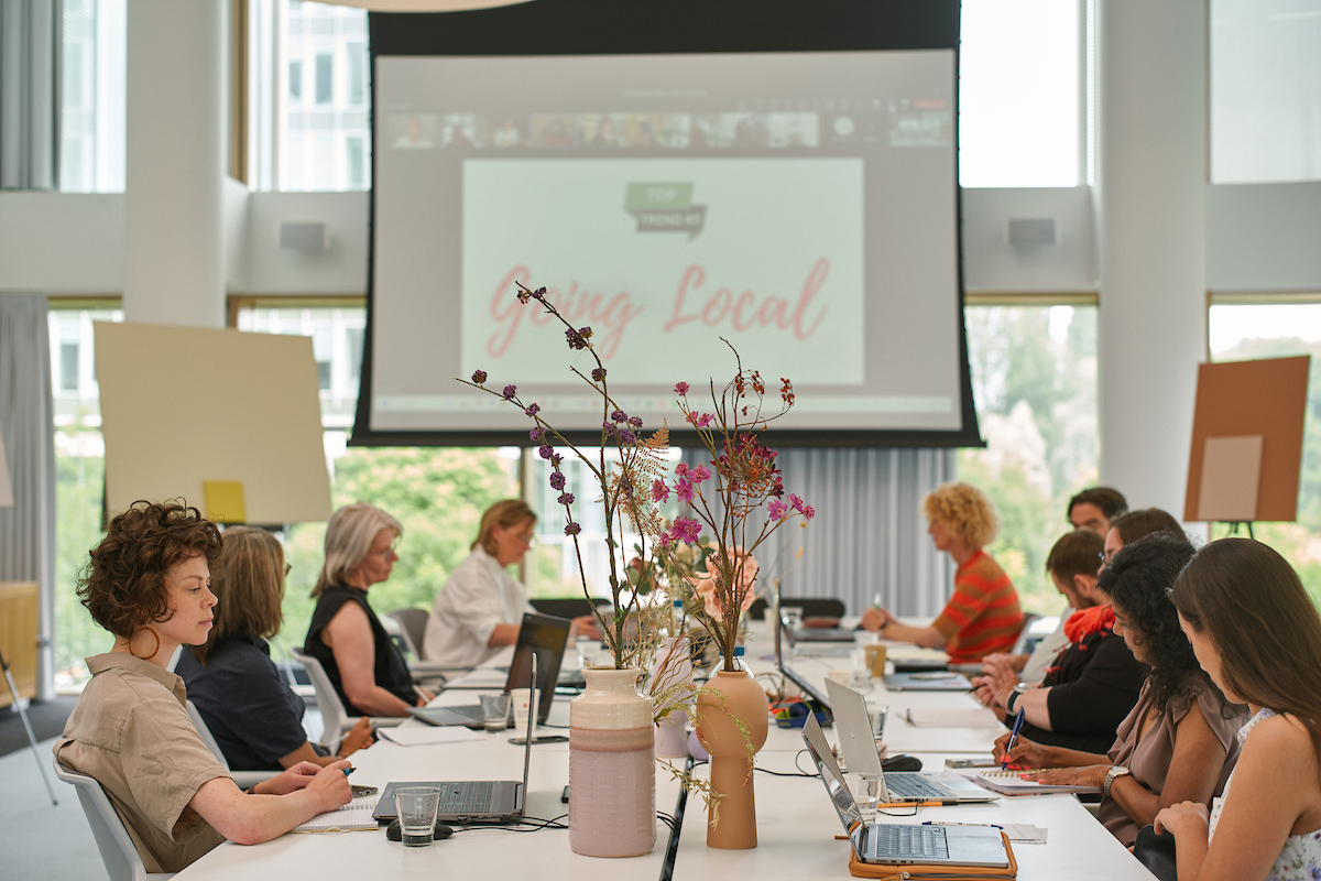
We select a panel from all over the globe for our annual Trend Forecast brainstorm. Whether they come from Ahmedabad or Amsterdam, the tales our experts tell are striking in their similarity. These shared sentiments highlight that people all over the world feel very much the same.
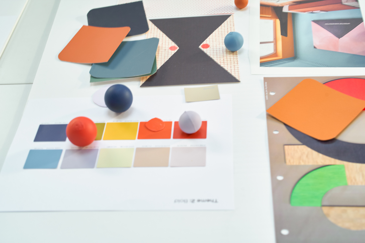
We select an overarching theme and the three most important trend stories. When my team and I start translating the stories into colour, it’s all about helping our customers create a space that feels just right for them, in the context of the times we are living in. What colours work in their homes and on their walls to make them fit for the future?
Behind the scenes with AkzoNobel’s Global Aesthetic Center, where Heleen van Gent and her team translate global trends and human emotions into the Colour of the Year 2026, a hue crafted to shape the way we live, feel, and design.
How can homeowners take inspiration from the Dulux Colour Futures and Colour of the Year while still personalising their space as opposed to blindly following trends?
This is exactly what we will be tackling this year: colour personalisation. We know colour is personal, it evokes emotion, and we should cater to the needs of the individual. I can’t say much yet, but watch this space!
What are some of the most common mistakes people make when choosing paint?
People are too careful and aren’t aware of which colours combine best. This is why we have our Colour Combination Principles, an easy way of putting together the best colour palettes. As an additional tip, the best colour combinations are finished with the best white.
Looking back on years of trend forecasts, how do you feel that the paint and colour landscape has changed over time?
Colours have become more subtle and refined. What really changed are the colour combinations, more tone-on-tone. Furthermore, the unexpected use of neutrals in combination with brighter colours. It’s all very exciting.
Can you share one key lesson you learned over the years working with colour and design?
Trust your instinct, your gut. Don’t be afraid to make mistakes. Take a light-hearted approach to colour. Be open to inspiration in places where you don’t expect it and experiment. Colour is personal—it’s your house, your home, your walls.
Stay inspired by following AkzoNobel’s Colour Futures for the latest insights and design forecasts.
Words by Yaiza Canopoli.