From ceramists to woodworkers and homeowners taking on DIY renovations, we catch up with Singapore’s talented crafters and makers.
Ummuramics
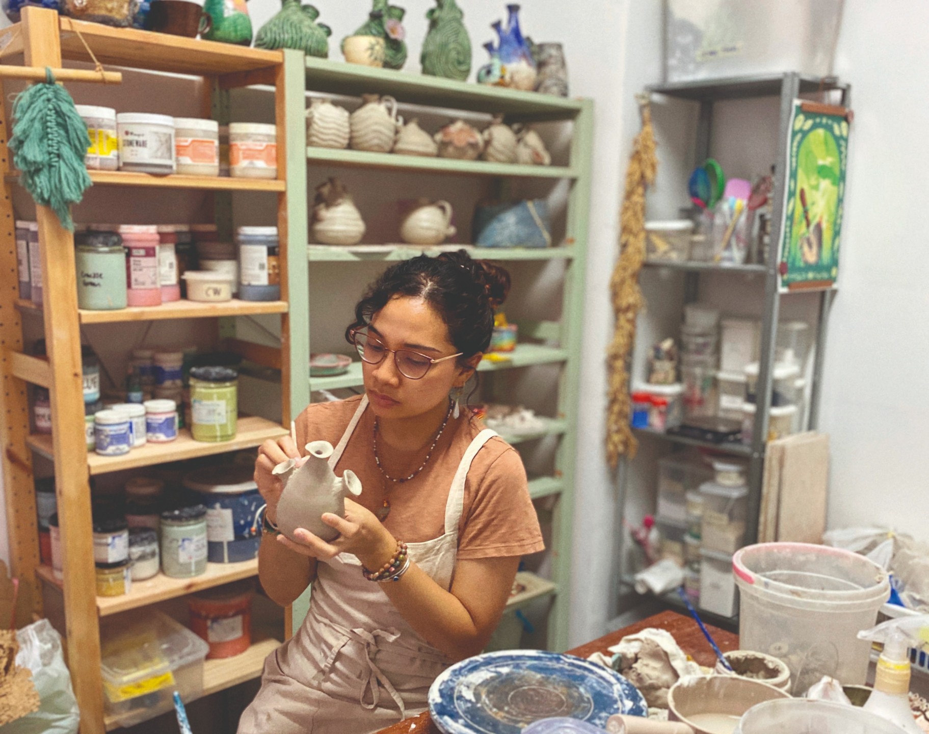
Tell us a bit about yourself. Hello! My name is Ummu and I am a full-time “clay person” or, in a more professional term, ceramist. I enjoy both a good kopi peng and flat whites, and I have two cow cats.
I have enjoyed crafting since I was young. I remember drawing and entering art competitions in primary school and I was always excited about projects and homework that involved making posters.
Tell us about your first encounter with ceramics. What made you fall in love with it?
I was introduced to ceramics back in secondary school. Fortunately, I went to a school that was largely art-based and ceramics was one of the main areas of focus. I actually hated ceramics then, maybe because the instructor was so mean and I only wanted to paint.
I love painting. Long story short, my art results brought me to Nanyang Academy of Fine Arts (NAFA), where I thought I would be dead set on choosing painting as my major. But during my last day of an introduction to ceramics elective, my lecturer did a wheel-throwing demo and I just freaked out in awe. And that was it. I did not manage to make anything at all that day, but somehow I was determined to pick up this skill. So, with no regard for my future, I took ceramics as my major.

Seahearts at the beach
How did Ummuramics eventually get started then?
Ummuramics actually started on Instagram with the intention of sharing my work online, as a lot of artists in the West did back then. I wasn’t even intending to make a living out of it. Then I casually joined an art market one day, where my first mug was sold for $9. I was so elated. It was such a bad mug but I was a student who genuinely wanted to share my love for this craft even before the ceramics craze hit.
Initially, my work looked like every other ceramics beginner’s. I was so invested in making only functional wares. Not sculptures. Not art. I just wanted to make bowls, cups and mugs. My work looked plainer back then. I explored a lot with different clays and tried to make my work look “proper” in a more traditional way, the “right” way.
Your work seems to be more “maximalist” than minimalist now. What’s the thought process behind that?
The thought at first was: Why the heck not? I tried minimal ceramics before and although there is beauty in the craft of it, it wasn’t the path I wanted to explore. I hated the idea of empty spaces or blankness. I always asked myself: Why am I making this? Am I just making another mug to hold water? That’s it? I couldn’t fathom the idea of such simplicity.
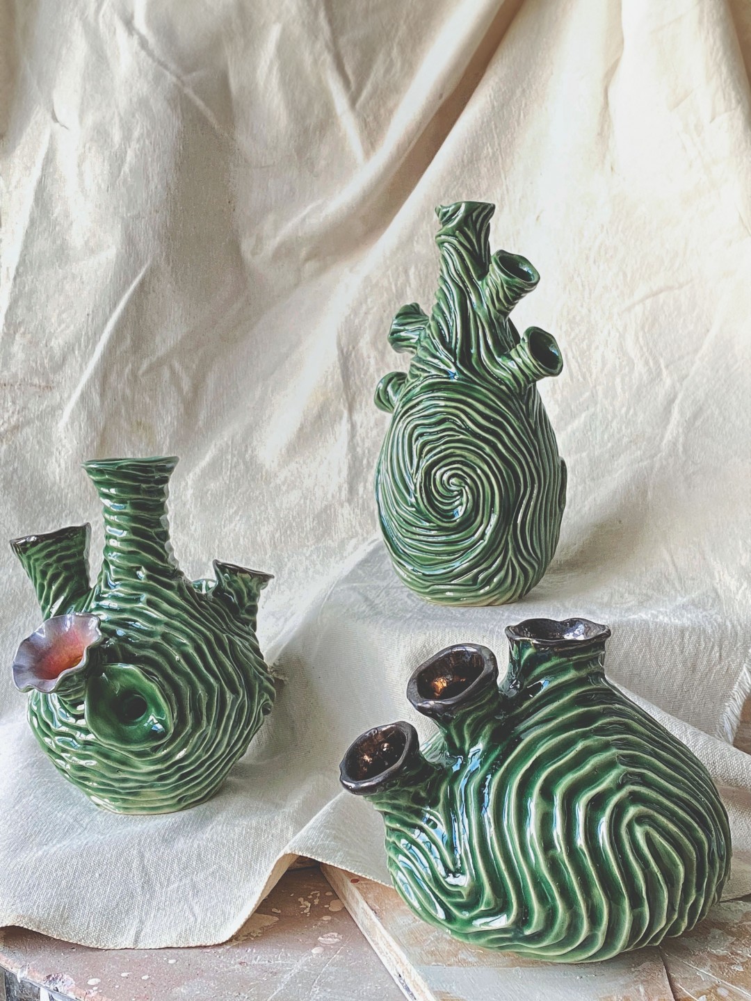
Jaded Seaheart
I wanted to make something with more life to it. I wanted to make elaborate things, like the beautiful, old architecture people used to build. I wanted to make things as bright and enchanting as nature itself–flowers on the roadside, curly vines, rainbows and seashells.
What are your bestsellers and personal favourites?
The Sea Heart and Seabed Mugs are personal favourites and also the ones my customers love the most. They seem to understand the deep and personal concept behind these products and enjoy them as much as I enjoyed making them.
What are some of your most memorable pieces?
The most memorable ones are actually pieces I made for my own collection. These were made during the harder times in my life so they’re like milestone pieces. Like my collection of “jaded” Sea Hearts in 2021. It’s like a “journal” made from clay.

Seabed Coffee Mugs
You’ve also been teaching courses in schools. How’s that going?
I love teaching! I enjoy it a lot, but I won’t deny that it is tiring. Shoutout to all the full-time teachers! It’s very different from working in my own studio. Explaining how to carve clay to
40 kids is a lot of work and not all of them can grasp it easily. Making sure that everyone is on the right track is less calming than carving my own work.
Ummaramics has been around for eight years now. What challenges have you encountered during this time?
There are too many to list, but finding a workspace was one of them. Believing that my work is good enough is also a constant challenge that I face every now and then, and I try to resolve this by taking a step back and remembering the progress I’ve made.
Blafink

“The end result not only has to look good, but it also needs to fit very well.” — Ashley, Blafink
Tell us a little about yourself and how Blafink got started.
Hi! My name is Ashley Choo and I’m one of the three co-founders of Blafink. Blafink was started in early 2015 as a furniture shop offering very typical choices. Over the years, things got more interesting as we expanded our search for more materials and solutions to add to our collection.
What sets Blafink apart from other stores?
Many furniture shops claim that they can customise furniture, but they will likely only do it up to the point of, for example, changing the total width of a sofa. Blafink is able to entertain specific details, from sofa arm dimensions to the edge profile finishing on your back cushion.
We are also willing to work on projects that are not included in our product catalogue. For instance, many interior designers bring us their own product designs for us to work on.
We offer a wide variety of upholstery materials in various colours and textures. This is very helpful for both homeowners and interior designers who want a certain look for their space.
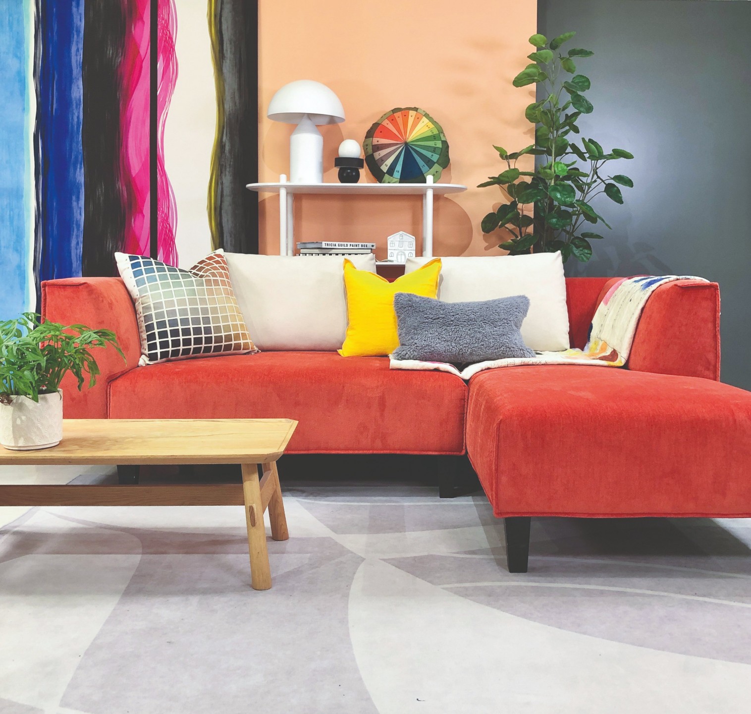
What are some misconceptions people have about custom furniture?
You know, haters gonna hate, right? People complain that customised furniture is too expensive, has long production times, and that ordering is a complicated and time-consuming process.
In this Taobao era, people aren’t wrong. Our prices are one decimal point on the “wrong” side of a value-seeker’s budget because we do not have economies of scale to our advantage. Our lead time is six to ten weeks, and we ask a lot of questions when you visit our guideshop.
Blafink has been around for eight years now. How have customer preferences evolved during this time?
When we first started, everybody wanted the Scandinavian and industrial look, and this had a huge impact on the designs people were looking for.
From 2015 to 2017, most of our clients wanted anything and everything upholstered in grey—light grey, dark grey, cool grey, grey with a lavender undertone, etc. Sofas with skinny arms and tall, skinny legs did exceptionally well too.
Later, in 2017, more and more clients started asking for millennial pink, and I was glad to be among the first businesses to offer that particular shade at affordable prices.
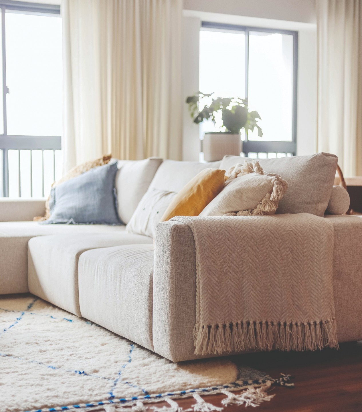
Now, everybody wants cream-based upholstery. Grey is outdated and very, very few homeowners and interior designers are using this colour for their projects. Wide-armed, heavy-looking sofas are also trendy now. We also have a lot more requests for curved sofas these days.
Tell us about a project you’re particularly proud of.
Banquette projects are challenging in nature. The end result not only has to look good, but it also needs to fit very well.
One particular project we completed recently did just that. We not only had to make sure that it looked somewhat similar to the Pinterest reference image but there were also nooks and crannies (such as skirting details) that we had to carve out notches from to fit the banquette against the wall snugly.
Another banquette project we did with YWA Interiors involved a lot of back-and-forth. We made seat prototypes for Tyler Wisler, the design director for YWA interiors, and three- dimensional templates for the curved corners. We’re delivering the corners this Friday and fingers crossed—they’d better fit!
What would you say is the most interesting brief you’ve received?
Recently, Oblivion Lab, a local interior design firm, asked us to attempt an almost two-metre-tall sofa. We have so many questions! How are we going to deliver it? How is anybody going to climb up and sit on it? How do we even quote for this? We have not started to work on it yet, but I suppose this might be the most interesting project we will work on this year.

And what might be the most popular customisation request among Singaporeans? I imagine small L-shaped sofas are a big hit.
We get a fair number of requests for bed frames built to suit European-sized mattresses. For sofas, we are asked to look into 1.4 to 1.5-metre-wide sofas. Small L-shaped sofas too, like you’ve pointed out.
Singaporeans also tend to feature-pack their furniture with as much practicality as possible. Many ask for hidden storage, low-maintenance upholstery and bespoke ergonomic details such as higher backrests.
Let’s say I’d like to customise a sofa today. What should I consider?
A lot of homeowners like to visit furniture shops, sit on a sofa and determine how comfortable that sofa feels in one position. But no, you ought to be thinking about movement. Can the seat depth accommodate you if you prefer to sit cross-legged? Is it so soft that you would have to struggle every time you get up?
We often ask clients to think about these issues in our guideshop before committing to anything, because customisation can resolve many of these regrets. I, for one, observe how my clients’ knee pits rest on the edge of the sofa or where their shoulders are placed against the back cushion before I make suggestions.
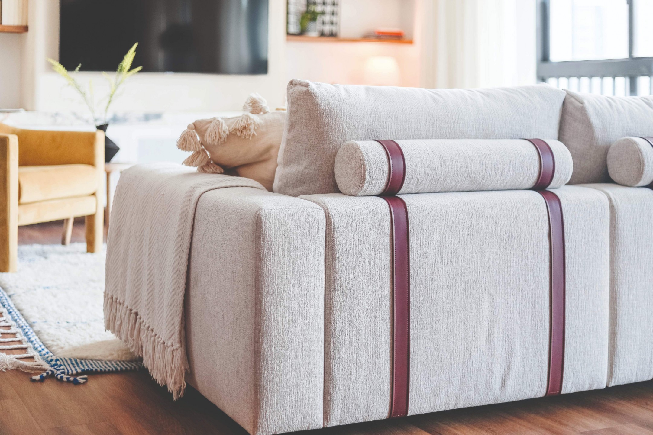
I also find that a lot of our clients don’t consider how a sofa can be used to anchor their entire living room. Many use one of the walls in their living room as a benchmark, and it often results in furniture that is disproportionate to the space. This is where a good interior designer can come in to help evaluate the space and advise accordingly.
Upholstery is a big part of your business. Any advice to shoppers who can’t discern between high and low-quality materials?
I usually start by looking at the back of the material. The back of the material is indicative, albeit inconclusive, of how the surface material will perform. Entry-level upholstery typically uses less material on the surface but is made to look robust with a thicker and cheaper material at the back.
But over time, the surface material and the backing separate. You know how the polyurethane peels away from the thin polyester mesh in the PU leather of cheap sofas and beds? Again, this is not conclusive, but it’s one of the tricks I use when sourcing for new upholstery collections.
jmeeandjo
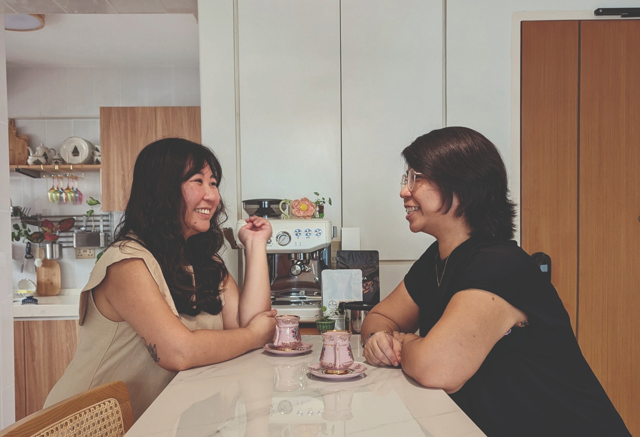
“Inspiration is everywhere if you look closely enough.” — Jolene, jmeeandjo
Tell us a bit about yourselves. We’d love to get to know the people behind @jmeeandjo.
Hi, I’m Jolene! My sister Jaime and I have been DIY-ing our way through my 3-room HDB flat for the past 11 months or so. I would say that I am a minimalist maximalist, but my sister would say that this term doesn’t exist.
There wasn’t a specific moment where we said that we were going to DIY the whole unit. It just happened naturally. I would point out something that I’d like, and my sister, who’s an eternal optimist with a can-do attitude, would go, “We can totally do that ourselves.”
First things first, what was your journey to homeownership like?
As a single homeowner, it made sense to just look for a 3-room HDB flat. I started looking at the beginning of last year and it was intense. Prices were rising rapidly. Almost all the units that I viewed were snapped up very quickly.
It came to a point when I realised that you don’t really get a lot of time to consider and think things through. I remember viewing this unit at around
8 pm, making the offer at 9 pm and paying the option fee by midnight.
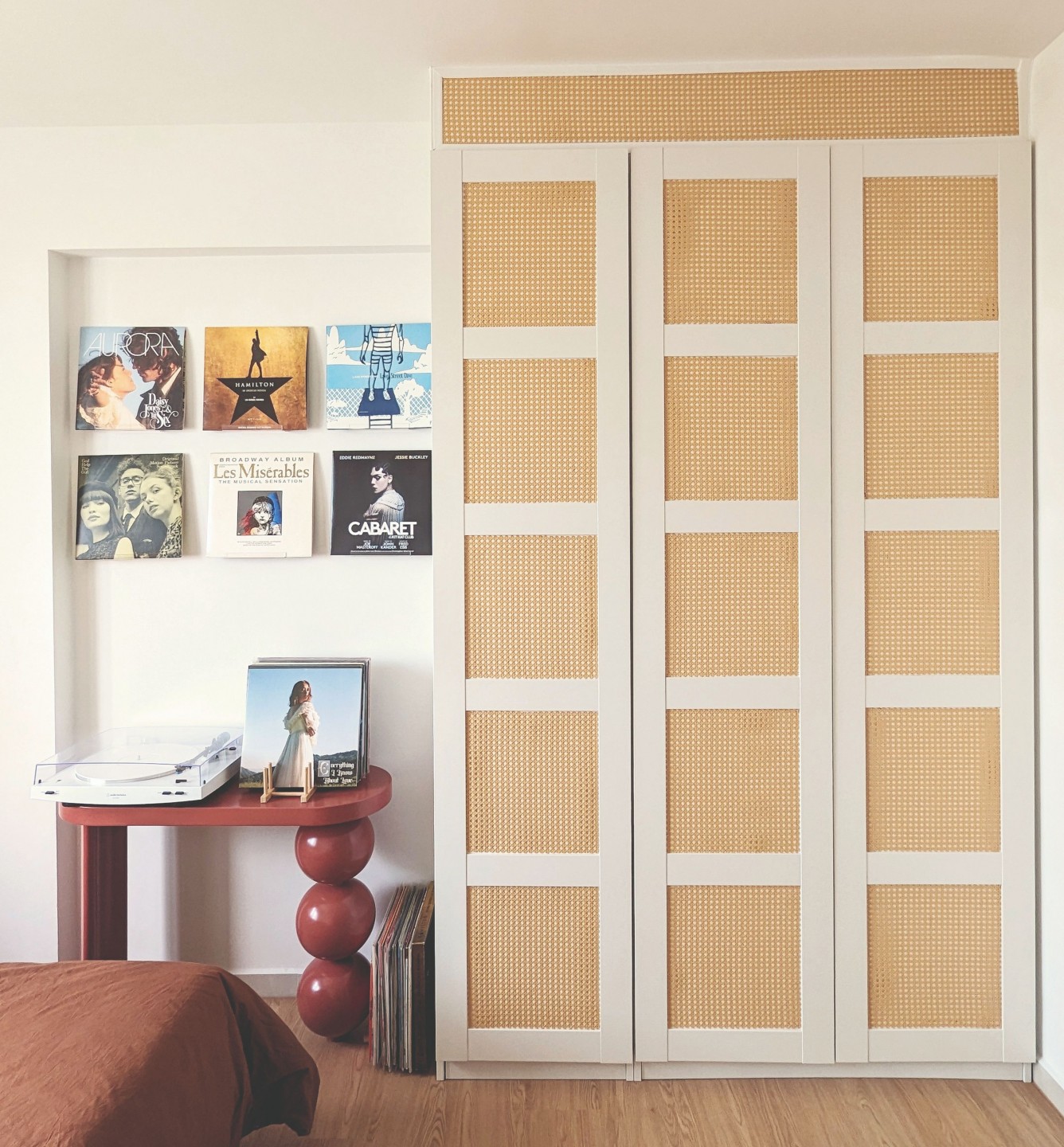
What I like about this unit, other than the fact that it’s 10 minutes away from my sister’s, is that it wasn’t heavily renovated. Most of it was still in its original BTO state. So to me, it was like a blank canvas. I didn’t really need to tear down any built-ins.
It seems the enthusiasm for DIY runs in the family. Did it start from a young age?
We dabbled here and there when we were younger. I painted my bedroom walls in pink and white stripes, trying to mimic a wallpaper. My sister definitely had more DIY projects—she repainted the piano using chalk paint and added mouldings to make it look like a 20th-century piano. But we had never done anything at this scale.
What we love about DIY is that we can recreate a design or repurpose certain things into what we like without breaking the bank. You have the freedom to customise projects to your own needs and preferences. Also, there’s the sense of accomplishment and satisfaction that comes from completing a project with your own hands.
What are some of your proudest projects in the flat?
Everything that we’ve done here! The wall arch, the flooring, the kitchen countertop, transforming the IKEA PAX wardrobe to look built-in… and wrapping the door frame. It took us so long to figure out how to do that.

You’ve even DIY-ed the vinyl flooring and balcony “tiles.” Can you walk us through your process?
The first step to starting any DIY project is research. Scour the internet for all the necessary information. This includes watching tutorial videos, reading articles and basically understanding the tools, materials and techniques involved.
Once you are sufficiently prepped, the next step is sourcing materials and tools. We got most of our materials from Taobao and our tools from Amazon or local sources.
The step after is prepping the space. In applying the vinyl, we laid a thin layer of foam to protect the floors. We also used spacers to create a gap between the planks and walls to allow for expansion and contraction. After that, it was just about clicking the planks together, laying the baker rods, applying a sealant to fill in the gaps and adding trimmings where necessary. I would say that it’s more tedious than complicated. It took us three full days to get everything done.
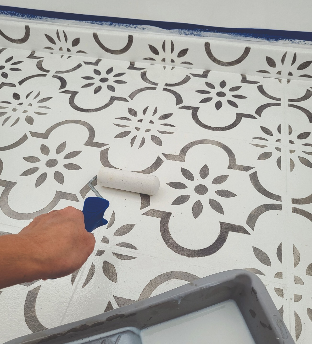
Stencilling the tiles in the service yard was much easier in comparison. We first painted the floor in epoxy paint and once it was dry, we stencilled over it, applied a top coat and we were done!
What about the wall arch? It seems to be the “centrepiece” of your DIY projects.
We got a made-to-measure arch from Taobao, attached it to the wall using PU foam, and covered the gaps between the arch and wall with self- adhesive mesh tape.
After that, we covered the whole surface with a joint compound. You’ll need to apply layers to get the best result; wait for it to dry, sand it down and repeatedly layer the joint compound. Once you’re satisfied with the arch, you can then paint over it using regular wall paint.
How much do you reckon you saved on this project by DIY-ing?
It’s hard to say as I didn’t really ask around for quotations, but I think that I managed to save at least two-thirds of the market price.
The easel-turned-television stand and hamburger coasters are quite unique too. What inspires you to come up with these kinds of ideas?
I paint so I already have a couple of easels lying around. I wanted to display my paintings and thought, instead of mounting the TV on the wall, why not use an easel to make it look like another painting? We also built a frame for the TV so that it looks more like a framed painting.
Making the hamburger coasters was so much fun! My sister got the idea from TikTok. It’s a great way to de-stress by doing something simple amidst all the large-scale DIY projects. As cheesy as it sounds, inspiration is everywhere if you look closely enough. Social media is a great way to look for DIY inspiration. There are huge DIY communities that are very friendly and share great ideas online.
What tips do you have for aspiring DIY enthusiasts?
Don’t be afraid. Just give it a go! It’s a learning process and a lot of patience is required, but the end product makes it so worthwhile. Also, nothing is permanent. If you know how to build it, you’ll know how to undo it.
The Table Guy
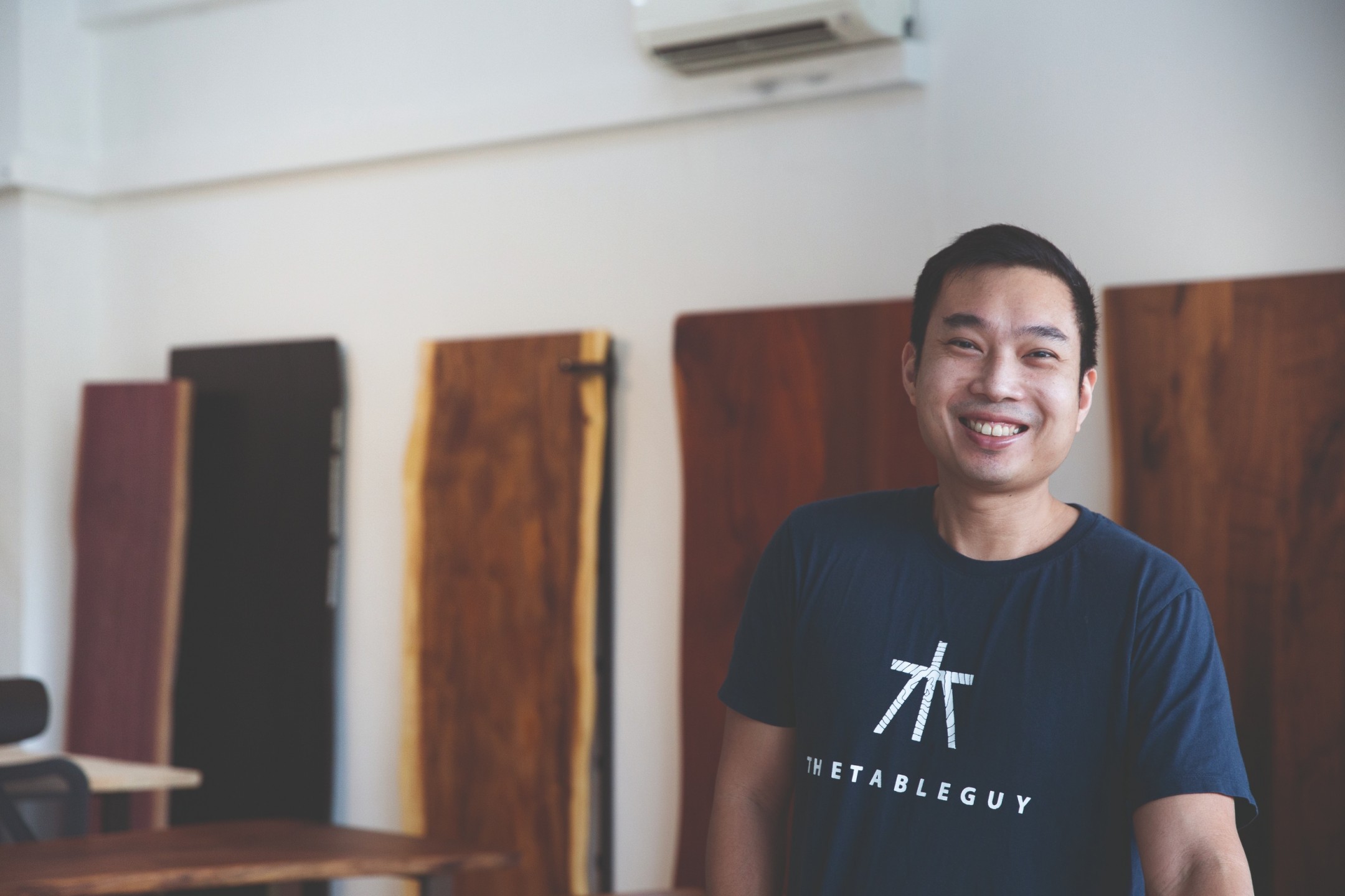
“With wood, it’s difficult to get a true understanding without getting hands-on.”— Darryl, The Table Guy
Can you tell us a bit about yourself?
I am 42 years old and I am passionate about creating unique spaces and products.
What’s the founding story of The Table Guy?
It actually just started with me wanting to get a wood slab table for my own house. I got a better deal with a bulk purchase, so I sold off the balance pieces via Carousell. Coincidentally, I had just started a chair-making course at Tombalek. That was when I got really curious about the finer points of solid wood finishing and started experimenting with the extra pieces of wood I had on hand.
The Table Guy wasn’t something that I had set out to create. Rather, it grew organically out of the increasing demand we saw along the way. It was all via word of mouth. A few months in, there was enough volume and we decided to just give it a go and see what would happen!
What made you give up a career in real estate for one in woodworking?
I wouldn’t say that I gave up real estate for woodworking. It was more of a natural evolution. As The Table Guy grew, it naturally took up more of my time. I had never built a business before, so it seemed like a good opportunity to challenge myself and grow as an entrepreneur.
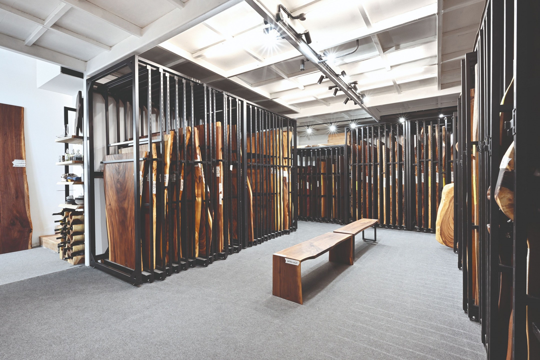
Having been through the purchasing process, I realised that there was a large disparity between high-end and low-priced wood slabs six years ago. There wasn’t a lot of information and education on wood and aftercare either.
My goal then was to create a product that was luxurious but accessible at the same time. We were also at the forefront of educating the public about solid wood via social media and our website.
It’s impressive that you built this business without formal training in design. What challenges did you face and how did you overcome them?
The main challenge was learning about the materials and how to work with them. Different types of wood have different properties, and what works for a particular set of furniture may not work for another.
We read and watched videos, but with wood, it’s difficult to get a true understanding without getting hands-on. A lot of it was really quite experimental, and we definitely made our fair share of mistakes to get the knowledge. I would give the lion’s share of credit to friends in the industry who were so generous with their guidance, time and energy.
In terms of design, you might have noticed that we lean a lot towards utilitarian forms rather than “design” design. That is a natural result of our approach to product development, which is problem- solving for users.
We rely on observation and feedback from
our community when creating new products and testing new ideas. We’ve been super lucky to get to work with young product designers in Singapore who can communicate our ideas in a way we can’t without a formal education in design.
Can you share the painstaking journey of each wood slab?
At The Table Guy, we have a specific set of parameters for the wood slabs we curate, from the drying standards to size, grain features and shape. This process is ongoing throughout the year. We keep a constant lookout for pieces that our clients would love and super cool ones we would love to introduce to the community.

Once selected, these pieces are sanded thoroughly to remove processing marks including burn marks, cuts and splinters, so the natural beauty of each slab is revealed. From there, every piece is finished with a hard wax oil seal that not only allows the features of the wood to shine but also enables easy maintenance and daily usage without worries.
In the early days, we insisted on doing everything in-house
to ensure our quality standards were met. Over time, we’ve developed great relationships with our suppliers, so we are able to teach them how to execute according to our standards before shipping.
The client’s journey often starts in the showroom. As much as possible, our team members do their best to provide personalised guidance to every visitor. From understanding the differences between wood types to identifying the grain features that make each piece unique and advising what may or may not suit a particular space, we draw from our experience so our clients can make an informed choice.
My favourite part of the process is coming up with creative solutions for clients to use a wood slab they love for its aesthetic qualities, but which may not fit their limitations (where size is concerned). In these situations, we often tailor the slab to fit the main piece. Excess material is then repurposed to make other furniture, such as coffee tables or side tables.
Apart from selling furniture, what other services do you offer?
Apart from selling furniture, we mainly offer maintenance and carpentry services that allow our clients to enjoy their items for a long time. This includes maintenance oiling, restorative refinishing and carpentry work to transform tables that might be too big or small for other uses.
It’s our aim to keep these resources out of the landfill for as long as we can. We also offer small- batch manufacturing services to designers who are looking to make a prototype with solid wood or create a limited run of their designs.
What are some of the most memorable projects you’ve worked on?
Wow. Now that I look back on it, it seems they all have to do with food!
The Kizuna Table was one of our most creative projects, made in collaboration with Kizuna, a local cafe in Potong Pasir. It was so satisfying to figure out a way to piece small offcuts into usable tables that would not only be functional but also match the decor.
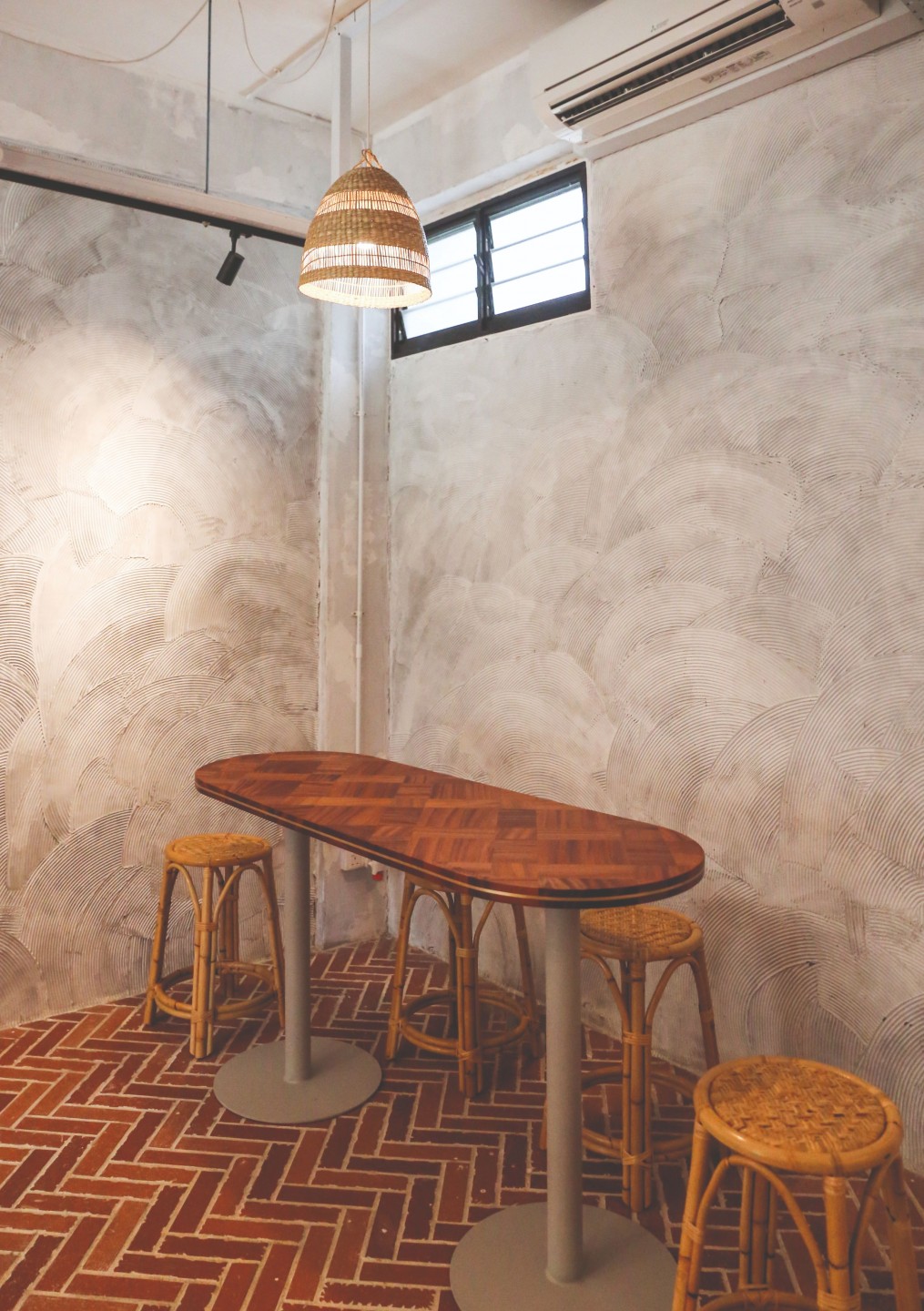
There was also the custom display we designed and built for the Singapore team for the International Catering Cup. It was a creative exercise that began with the aesthetic objective of incorporating icons like Marina Bay Sands and the ArtScience Museum, but there were functional challenges too. It had to be light enough for travel to France, easy to assemble on-site and sturdy enough to support the weight of plates and food.
You seem to place great importance on user- centric creations. How have you designed your products to suit the local market?
Whenever we’re creating something, we think not only of its immediate use but also of the maintenance requirements in terms of energy and time. In Singapore, our social activities revolve around food gatherings, yet most clients are working professionals with little time and energy to waste on additional household chores.
It’s the tiny things that add up. Wondering how to politely nag at your guests to keep the cups on their coasters, remembering to shield the table from a hot soup bowl with trivets and stressing that every wine spill might leave a forever stain.
We put a lot of effort into finding the right finish that would eliminate these daily irritants and allow clients to fully enjoy connecting with their friends and family over a warm meal.
Studio Kallang
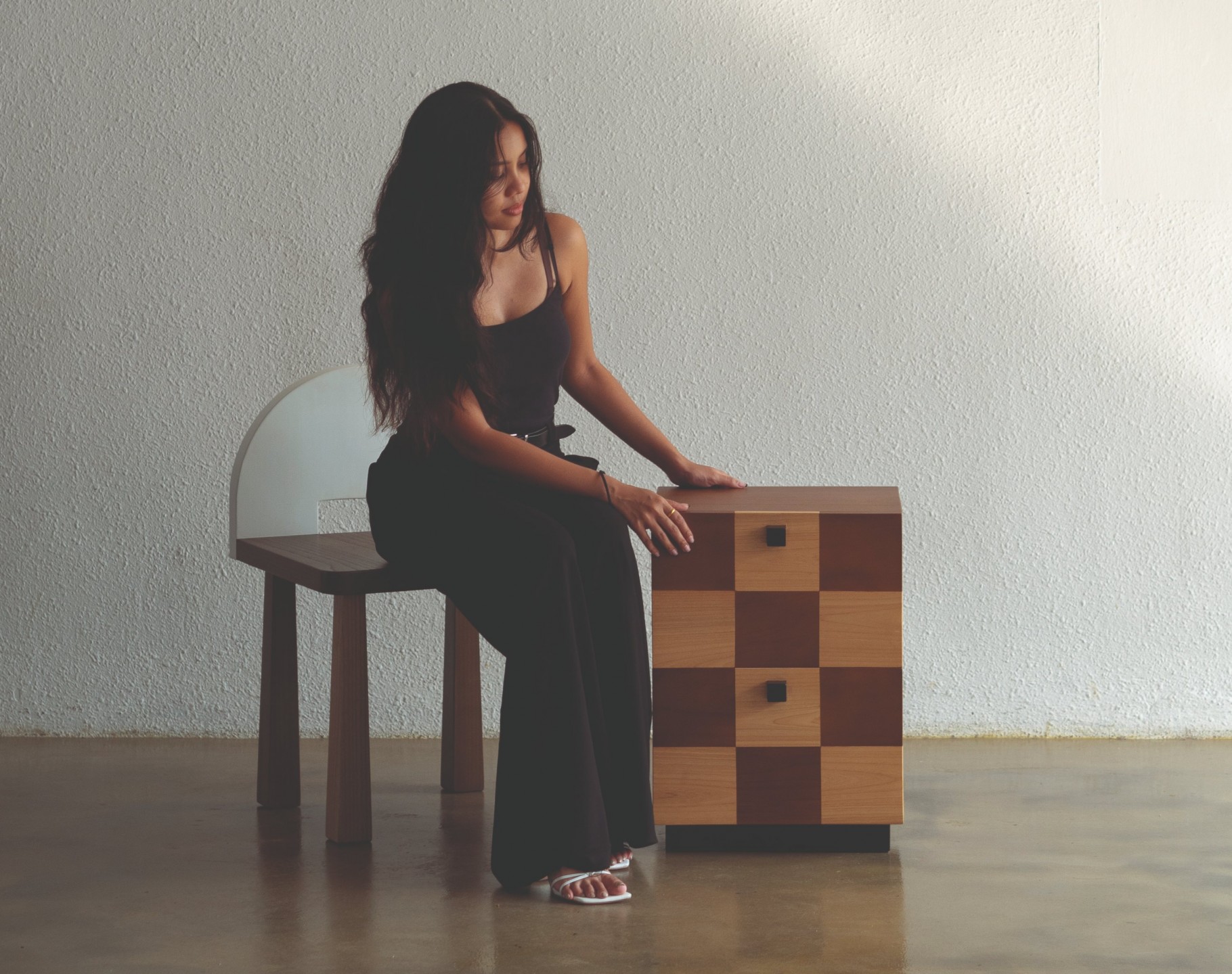
“I realised that the best work happens when I’m not too cerebral about it.”— Faezah, Studio Kallang
Your mum owns the cherished furniture store Second Charm—what are some of your fondest memories of growing up in the furniture industry?
It’s hard, I have so many. I used to spend a lot of time in my mum’s store after school and on the weekends. She had these storage spaces packed with furniture pieces— they were literally stacked on top of each other—and they sort of turned into my playground.
It was honestly the perfect setting for a kid’s imagination to run wild, although maybe not the safest! I had a lot of fun. Sometimes I would have a friend over and we would pretend that we were having an adventure far away when really, we were just crawling under tables.
How did your time in design school shape your work?
I think it exposed me to the more conceptual side of things. Design thinking, or whatever you want to call it. It also taught me how to organise my ideas. It was definitely a valuable experience that I’m grateful for, but the funny thing is that I’ve had to unlearn some of it.

Recently, I realised that the best work happens when I’m not too cerebral about it. I’ve also been thinking about how ideas don’t need to come before making something, they can happen simultaneously. Or, the act of making can even come first and you just have to trust that at some point, the epiphany will come.
Furniture is often pigeonholed into trending themes, like mid-century modern or Japandi. How would you describe your designs to a layperson?
I like to believe my designs aren’t trendy, especially since they’re born out of my personal memories and experiences. If I had to explain my style in just one word, I guess I would call it eclectic or playful.
Your Hilu stool, Coklat side table and Onde mirrors seem to evoke a sense of nostalgia. How have your childhood experiences influenced your designs?
I think drawing from my childhood experiences gives the work a sense of humour and stops me from falling into the trap of “self- seriousness,” especially with business-related pressures like costs, stockists, PR and profit margins.
We’ve noticed from your Instagram feed that films play a significant role in inspiring your work. Can you share some examples?
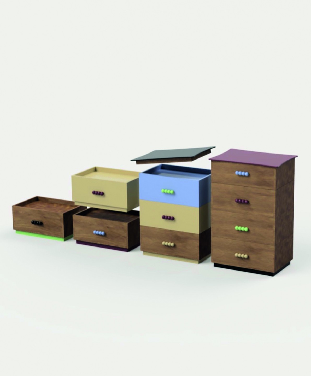
The colour palette of Sofia Coppola’s Marie Antoinette had me thinking about it for days after. This eventually translated into the colours I used for my Mamun modular drawers. Cinema Paradiso also has a beautiful palette. Lots of deep browns, greens and reds. They’re colours I return to a lot because they work well with the natural tones of wood.
Children of Heaven and The Color of Pomegranates had me thinking a lot about textures. They’re set in Iran and Armenia respectively and I loved the unexpected ways materials would interact, like metal on silk. The opening scenes I remember especially. Children of Heaven opens with the protagonist buying fruit at the market, with lots of colours, patterns, burlap sacks, wood crates, etc. The Color of Pomegranates has this vivid opening scene where the pomegranate juice stains a white fabric deep red. They’re emotional scenes for me and I try my best to have the colours in my work create the same effect.
What are some of the most memorable made-to- order pieces you’ve crafted for clients?
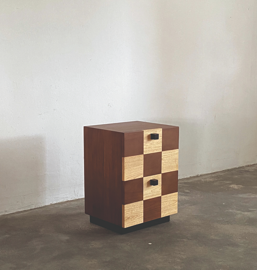
I did this little Onde soban table a while back. My client, Kenn, came to me with a sketch of what he had in mind, and we made it happen. I think it’s cool when people come to me with their own ideas based on my existing work. Because something new is created and it feels like an exchange of ideas that just naturally happens.
I also did some custom shelves (Angel Shelves on my site) for another client, Germaine. I wasn’t planning on designing shelves, but that’s what I love about commissions. They push you to try new things.
Also, I’ve been very blessed with kind and open clients so far. That experience makes the pieces memorable too.
Tell us about your creative process, from the initial blueprint to the final product, for one of your signature pieces.
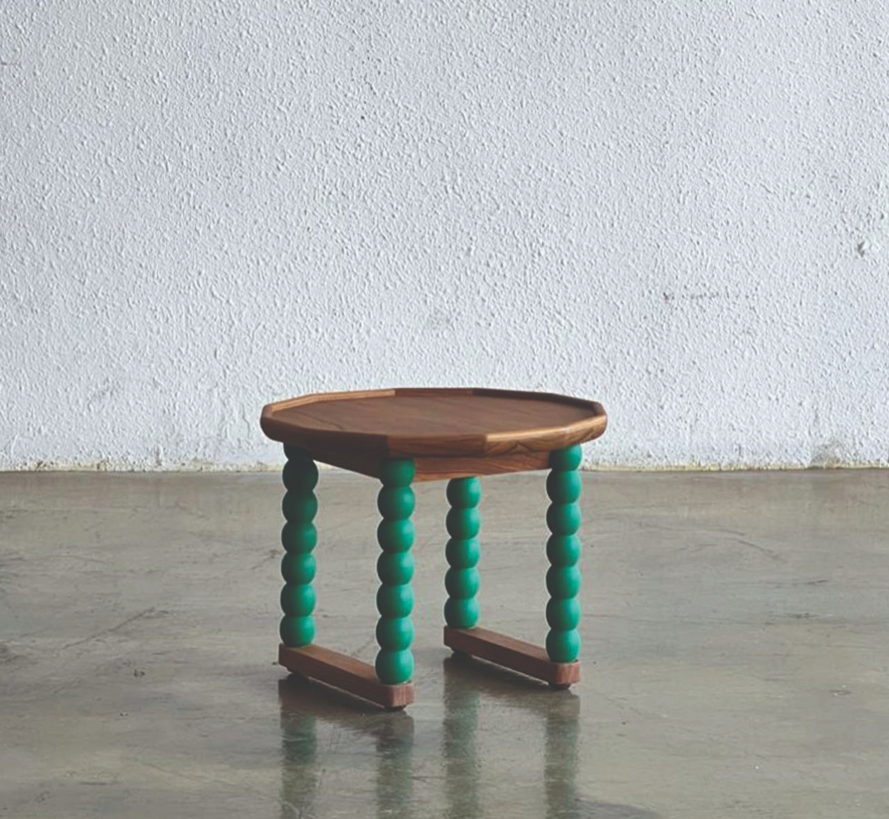
I usually start with sketching and moodboarding. I try not to be too focused on the technical aspects at this point, because I don’t want my conscious mind to limit any potential ideas.
Then comes the edit, where I pick out the best ones and continue the process on a computer-aided design (CAD) program. This is where I work out the actual dimensions, colours and more. It’s also where I do renders for the client or for socials.
Once everything is finalised, I make technical drawings for production and select the finishes. This can sometimes be the most stressful part because there’s a financial risk when actual materials and labour are involved.

How do customer preferences between Singapore and the US differ? How do these variations influence your work?
I don’t really tailor my designs and marketing to the different markets, because I feel like people who resonate with my work will naturally gravitate towards it regardless of where they are.
I think it’s an approach that has been working. I have clients from all over now, but it feels like everyone is on the same page or wavelength somehow. Marketing is also exhausting, so I mostly just try to be myself as much as possible.
However, there are some differences; I feel like I can get away with more experimental designs in the US, but the Singapore market understands more of where my influences come from.


