The managing partner of multidisciplinary studio Noto talks to us about how his team comes up with new designs that push the boundaries.
Are you someone who has always liked to create things?
Yes. As a child, I was already interested in making things. I loved playing with toy bricks and it was always fascinating to come up with new designs. After school, my first idea was to become an architect. As such, I studied model making to understand more about architecture. During that period, I met a lot of designers and I found their work more interesting. I like the multidisciplinary aspect of design – so I made the switch.

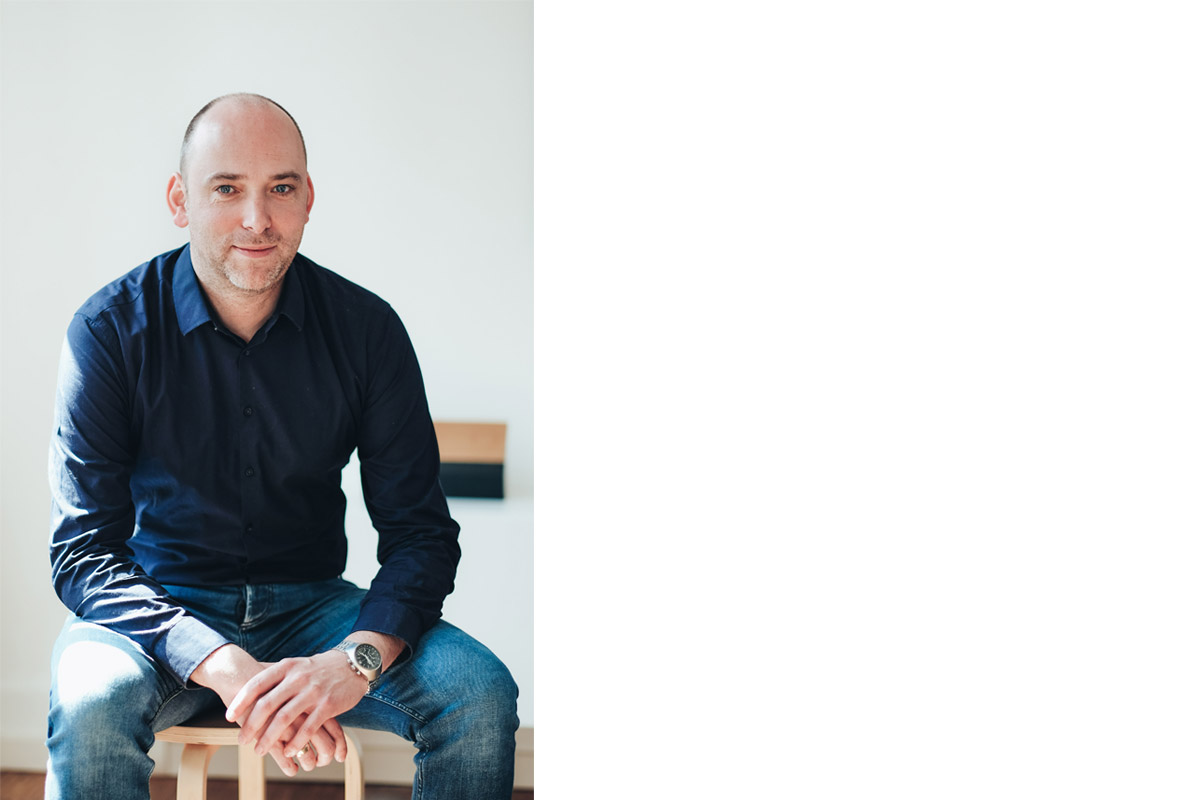
André believes that good design should enrich the lives of users.
Your studio, Noto, has created products that range from an inflatable tent to speakers. Do you consciously try to work across different disciplines?
We strive for that wide range. That is something we really want to keep for our studio because we think that it’s so good to be open-minded. At some points, we can transfer ideas and skills from one industry to the other and sometimes with that you can be innovative just by sharing.
What is your favourite product that Noto has created so far?
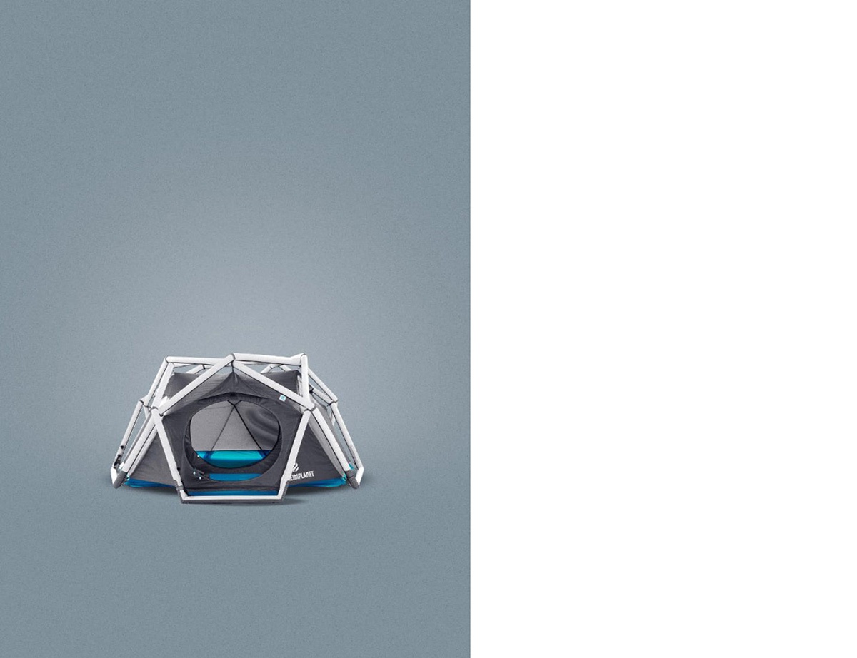
The Cave, an inflatable tent we created for Heimplanet, is something special for us in two ways. One is that it’s a new archetype for an industry that is quite slow and old-fashioned. And we were allowed to change the paradigm for it. Secondly, it’s interesting because this product is the foundation of a business – this start-up that asked us to cooperate with them. They based their whole business on that one tent. They now have more products following that same principle so they could grow a business based on that product.

The Cave, an inflatable tent Noto designed for Portuguese start-up Heimplanet, features an inflatable exoskeleton that provides maximum stability.
Tell us more about how you came to design the sculptural-like BeoLab 90.
The speaker was an ongoing project at Bang & Olufsen for a couple of years before it came to us. Their vision was to allow sound to move in a room. The classic listening mode when it comes to high-end speakers is that sweet spot which is made for one single person with no friends. But that is not the Bang & Olufsen attitude. They wanted to make a speaker for real living conditions. The idea is that you can have the same sound quality in front of the TV as well as from dining table. That was what they developed before they talked to us. We knew that we had to achieve high to make it an icon that everybody who looks at it can feel and experience there is something different going on. It had to be a speaker that looked totally unexpected.
What was your inspiration behind the design of the BeoLab 90?
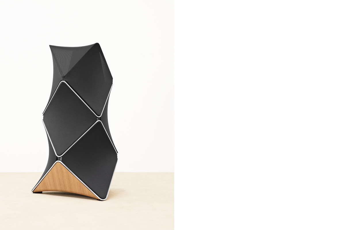
We had two main inspirations. The first one was a chandelier. When we did some user research, there was a lady who said that her chandelier in her entrance hall was the most fascinating thing she’s seen because it’s always different when she looks at it. And that was due to the change of perspective and the lighting conditions. As such, we worked with the concept of facets. And working with that architectural approach, we used fabric that gives off a certain reflection. When you move around the speaker you will see the reflection of light moving, which fits right into the concept of the sound moving.
The second thing is a principle by a German structural architect Frei Otto, in which when you place a plane on two lower points and two upper points you get a tension and a definition in the fabric. The curves support the reflection and it’s the perfect minimal structure that gives maximum tension and definition.

The BeoLab 90 was designed to allow sound to move in a room and its 360° design facilitates that.
What, in your opinion, is good design?
We have a claim in our studio, which is that every designable aspect should enrich life. So everything that we can design, we design it in a way that delivers something life-enriching.


