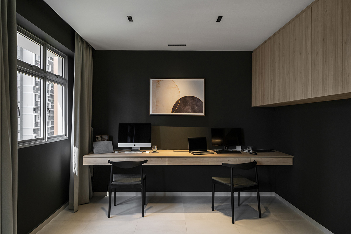
The past couple of months have seen a dramatic shift in homeowners’ priorities. With working from home being so commonplace now, many Singaporeans are looking at ways to incorporate an airy, comfortable home office into their abodes. The young couple residing in this 4-room HDB flat is no different, stating a spacious study as their top requirement for their brand new BTO.
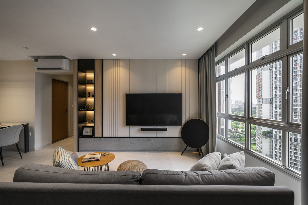
To kick off the renovation, the design team at Mesh Werk Studio began by establishing the overall look of this particular home. The theme and colour palette were thankfully settled rather quickly, with the residents asking for a modern, minimalist style with some earthy accents. The designers thus came up with the toned-down colour scheme we can now observe in the unit, interspersing the white and grey hues with wooden textures to lend the home a warmer feel.

The next step? Providing the couple with plenty of storage space. “The tight space was the biggest challenge with this project,” the team shares. “We wanted to have more storage in the living area without making the space look cluttered and small.” That’s how some of their more ingenious solutions came about, such as the hidden storage space inside the TV feature wall. Despite its bulky form, the household shelter ended up coming in handy as well, with the designers concealing the shelter’s unsightly door with a secret shoe rack. “The limited space didn’t allow for the homeowners to have a stand-alone shoe cabinet. That’s why we incorporated concealed storage along the household shelter.”
Of course, the biggest game-changer in this renovation was the removal of the wall separating the living room and what is now the open study. What used to be a superfluous bedroom was combined with the original living area, resulting in a much larger overall space that feels much less crammed. The extra square footage allowed the designers to equip the homeowners with a dedicated work zone that yet feels connected to the rest of the home. A dark curtain can be pulled close between the two spaces, finishing off the new layout with a necessary touch of privacy.

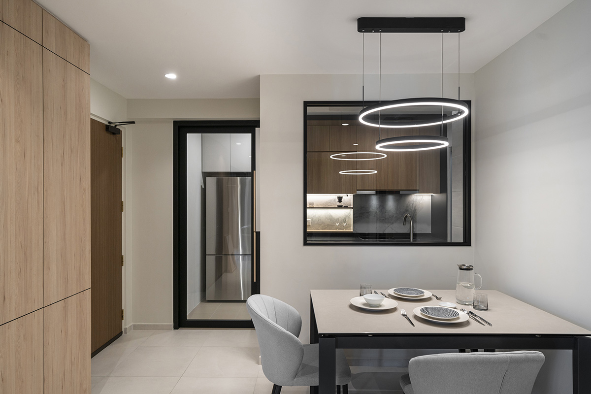
But the designers didn’t stop the hacking at the study. A portion of the wall separating the kitchen from the dining room was similarly removed. This time, however, it was replaced with a clear window. This gives the homeowners a handy overview of the living area—a particularly handy option should they have to supervise any kids in the future.

Beyond this use, the glass partition helps to introduce more light into the kitchen and to once more establish visual flow and connectivity throughout the home, making the separate areas of the house feel less cut off from one another. The simple furniture, subtle colours and consistent use of lighting and materials round off this sense of connection, tightening the home’s vibe as a cosy, welcoming abode.
This post was adapted from an article originally published in the September 2020 issue of SquareRooms.


