Smart tweaks and multi-functional fixtures maximise this apartment’s footprint so that this family is comfortably set up for many years ahead.

Home to a single mother and her four-year-old son, this 1,200 sq ft apartment is more than spacious enough for the small family of two. But while there is no denying its generous proportions, the homeowner quickly realised that the apartment would better serve her family with more functional storage in anticipation of her child’s growing needs. She ultimately engaged the help of interior designer Cadine Lim from Prozfile to maximise her home’s functionality.
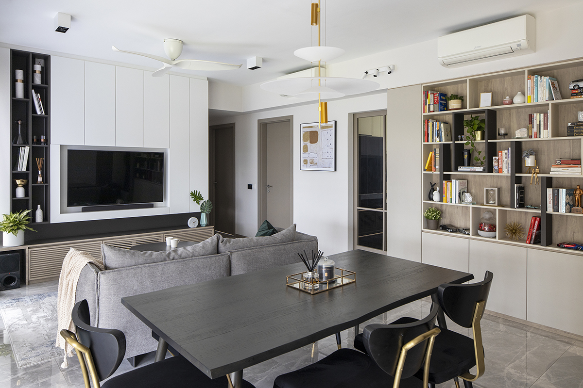
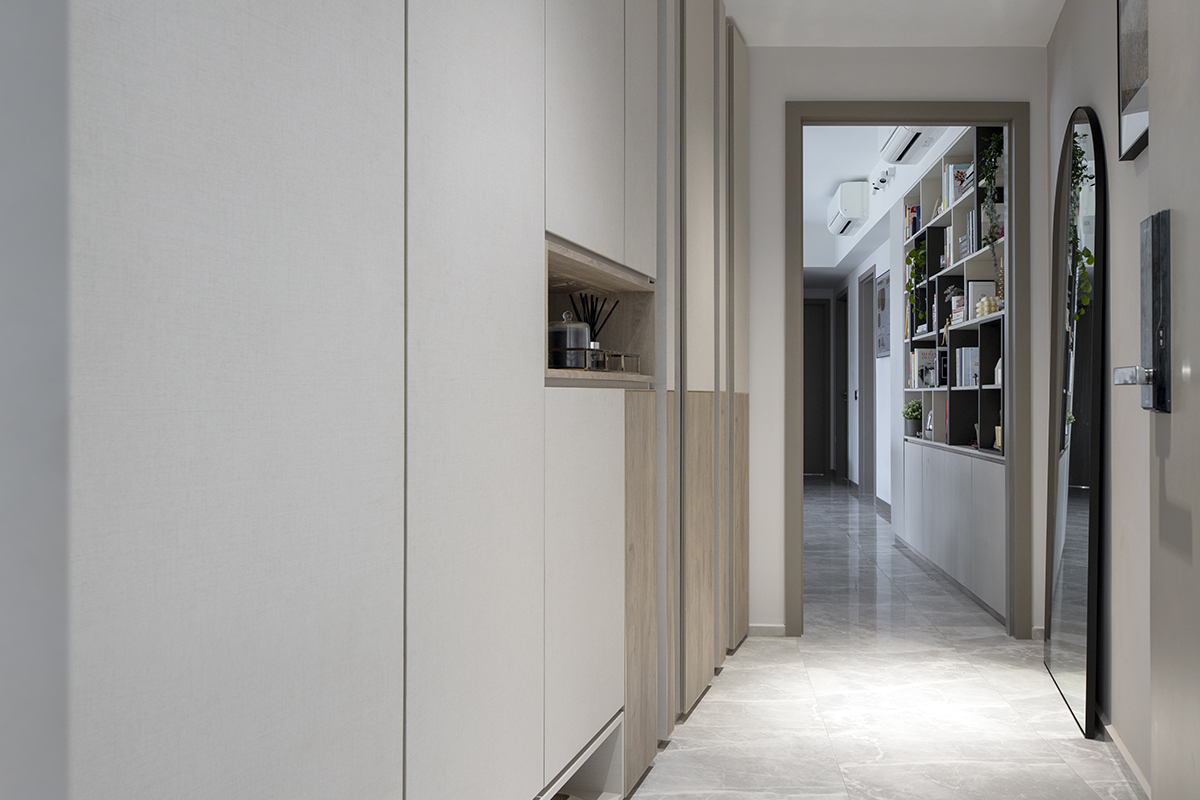
Noting the mother’s preference for soft colours, Lim put together a palette of white, cream, soft greys and beige that comes to life through the various carpentry finishes. Of all the spaces in the home, the entrance foyer saw the most dramatic transformation. Previously, the short entryway forked into two walkways, leading to the dining area and a sprawling balcony respectively. Since the balcony could be easily accessed from the living room, the designer suggested closing off the second walkway with a wall, making space for extra cabinets instead.

This idea is now fleshed out in the finished cabinetry that spans the full length and height of the foyer on the left-hand side. While the accessway to the balcony may have been superfluous, the natural light that came through provided a nice touch of illumination that Lim felt was a shame to lose. She finally settled on a hybrid cabinet design as the workaround; half of the unit consists of closed cabinets while the other half features display niches with a translucent back, allowing sunlight from the balcony to subtly seep into the foyer.
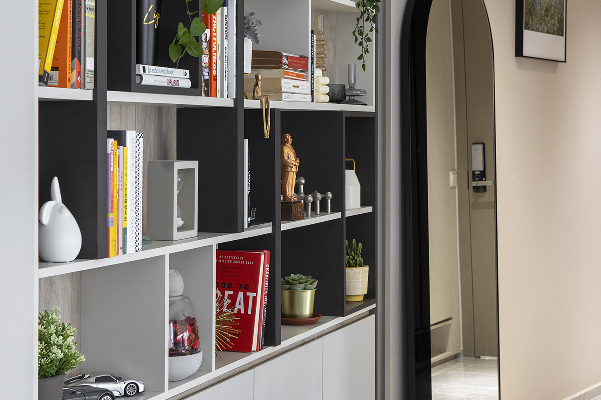
Finding the perfect spot for a bookshelf, another one of the homeowner’s requests, initially proved to be a challenge, but Lim soon discovered the perfect place for it near the dining area. As the bookshelf was to be located right by the hallway, it was essential to streamline the unit’s bulk to avoid hindering the family’s movements. The final design is shallow yet spacious—what is lost in depth is made up for in width. Finished with light wood-look and cream laminates, it’s also fitted out with mismatched dividers, giving the bookshelf a slightly offbeat twist.

The designer then identified yet another prime spot in the living room to incorporate storage: the TV console. Comprising several parts, the bottom section was designed with louvred doors, allowing the AV equipment to sense remote signals despite the enclosure. A narrow display shelf is parked to the left of the TV, which sits in a shallow niche inside a feature wall. The rest of the wall is dedicated to extra storage space, concealed behind white panels.
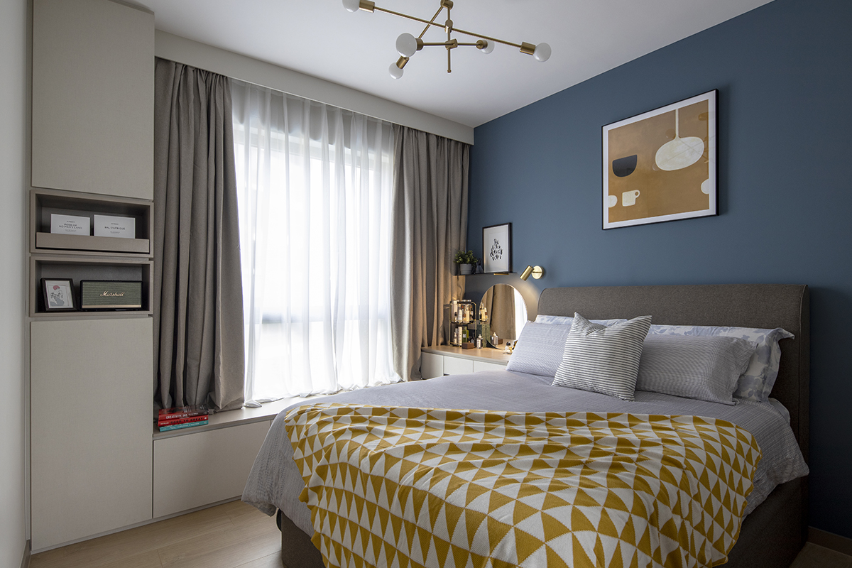
To set a restful mood, darker tones were experimented with in the bedrooms. One of the walls in the son’s room was painted dove grey and complemented by a playful, patterned wallpaper on the adjacent side. In the mother’s private sanctuary, vinyl flooring and furnishings evoke gold-brown tones, a cerulean blue wall behind the headboard forming a lively contrast. As her room was missing a dressing table, the designer took the opportunity to not just fashion one for her but make it multi-functional as well. The result is a compact dressing table, integrated with a brand-new window seat with compartments underneath and a tall cabinet at the other end.

Now that their home is perfectly catered to accommodate their present and future needs, this small family can sit back and focus on living their best life ahead.
This post was adapted from an article originally published in the January 2021 issue of SquareRooms.


