Hues may not be for everyone, but for this close-knit household, the myriad tones celebrate and reflect the personality of every family member.

Colours can transform a space and make your home feel more like “you”, but finding the right shades can be a daunting prospect. You’ll have to consider if the hues go together and complement your existing furnishings, and you’ll have to think about whether you’ll still like the combination after a few years. Yet the payoff for stepping away from the safety of neutral and white spaces can be hugely rewarding. For this family, their collaborative effort with Wilson Teng and his team at Studio Fortyfour resulted in a cheery and serene home filled with soft pops of colour and special custom pieces.
“We had fun working on the project together with the owners and their daughters,” muses the designer whose company the family discovered through Instagram. Telling us about the brief, he shares that the “close-knit family” wanted a home that would “blend the different likes of each member,” yet have the ideas sync together. The colours and finishes throughout the 1,550sq ft condo were thus the result of “going with the flow of what they like” and then putting the ideas together with the team.

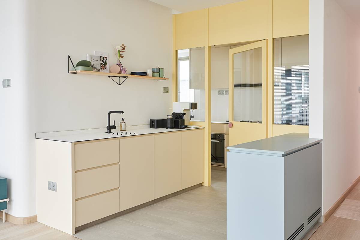
The kitchen, which both homeowners use a lot, underwent the most significant transformation. It was previously “very dark and space was very tight,” Wilson tells us. “We wanted to change all of that.” Taking down a kitchen wall brought more light into the meal prepping space and also made the area feel less “squeezy,” a boon for the couple who enjoys cooking together. Now beaming with tones you’d find on a sunny day, the kitchen is one of the clients’ favourite spots in the house. It also makes for a warm welcome home for the family and their guests as it’s located right by the entrance.
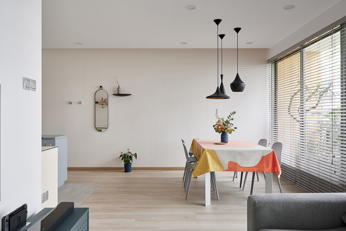
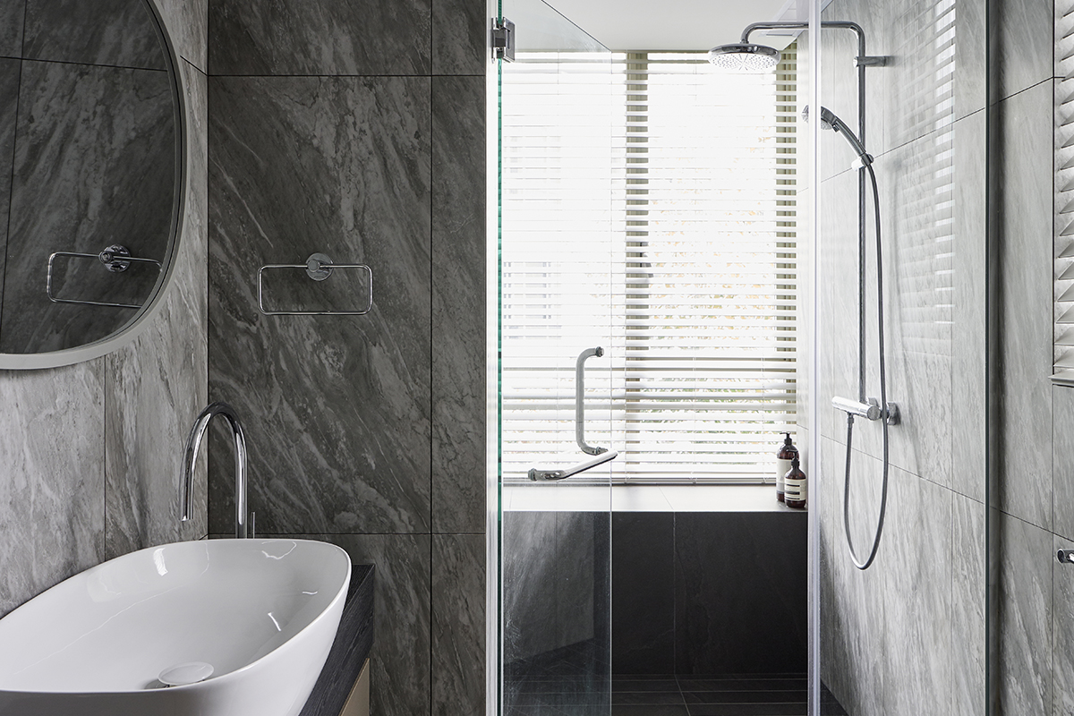
Since colours can get tiresome fast, the team chose softer, muted tones to prevent the interiors from looking dated after a while—you’ll see just the barest whisper of pink adorning the wall by the dining area and a misty haze of blue in the main bedroom. The teenage daughters’ bedrooms are only a touch brighter. To switch up the decor, deeper grey stone-look tiles were used for the bathrooms, giving these spaces an organic and relaxing feel. Coloured cabinet fronts then help to tie the bathrooms back to the rest of the house.

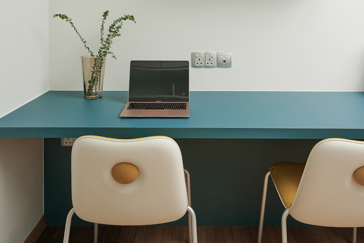
Besides working out the hue choices, Wilson and his team also came up with several custom designs to further strengthen the home’s unique character. These include the stylish built-ins seen in different rooms, as well as standalone pieces such as an accessories cabinet in the master bedroom and a media unit in the living area. Designing these were a challenge, the designer admits, “but we love the challenge.” Though renovations ultimately took six months as it coincided with the circuit breaker period, the family now has a highly personalised home that’s worth the wait.

This post was adapted from an article originally published in the March 2021 issue of SquareRooms.


