A sea of black, white and grey textures transform this five-room flat into a sleek yet restful abode for two.
Not wanting to be conventional in terms of their home’s design, the new owners of this five-room flat had one request for the Blend by ImC design team: absolutely no wood tones were to be used in the home. Instead, they opted for a monochrome look which the team acceded to by employing a palette of blacks, whites and greys.
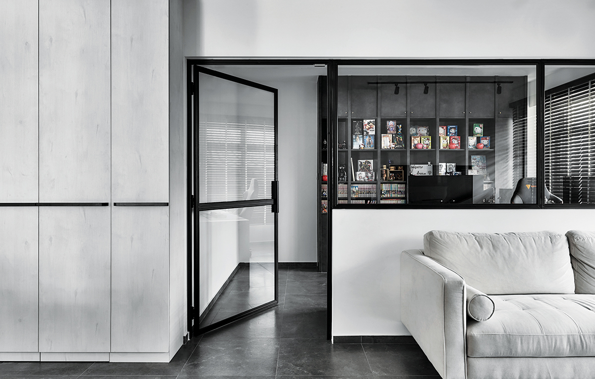
However, instead of just using solid shades, the team zoned in on a material palette that also had lots of interesting textures to ramp up the visual appeal of the home. For instance, the newly overlaid floor tiles from local tile supplier Soon Bee Huat feature a grey concrete effect, while custom built-in carpentry near the main entrance and in the walk-in wardrobe were made using white laminates that have subtle wood veining.
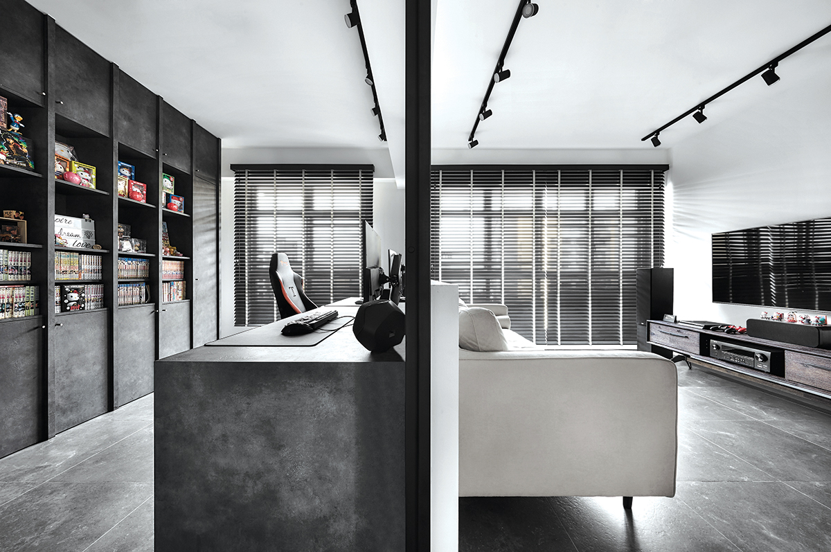
Theme aside, the owners had one other requirement for their abode: a series of bookshelves to display the male owner’s impressive Japanese manga collection. Situated in the home office, the structure was outfitted with open cubbies and closed cabinets in textured slate-effect laminates to house comics and office supplies respectively. Additionally, the office’s original partition wall was hacked away and replaced with a half wall topped with glass panels to allow plenty of natural light to flow through easily.
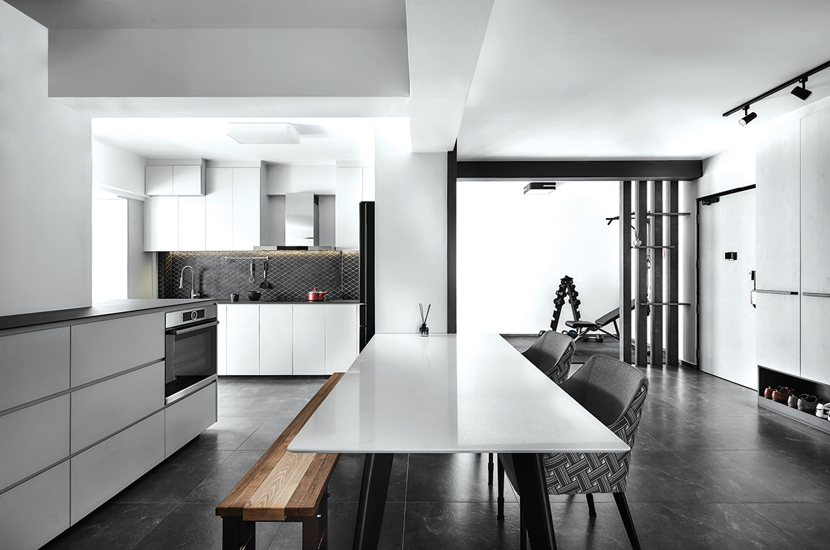
Over in the kitchen, functionality reigns supreme, though aesthetics isn’t far behind. Given that the owners love baking, renovation works entailed the installation of new stone-effect KompacPlus countertops and base cabinets featuring solid white laminates. By doing so, the owners are given ample tabletop space for meal prep and plenty of storage solutions to keep the utilitarian zone tidy. As the owners are quite tall, the design team also went a step further to make the cabinet for the oven, the couple’s most-used appliance, higher for ease of use without having to bend too far down.
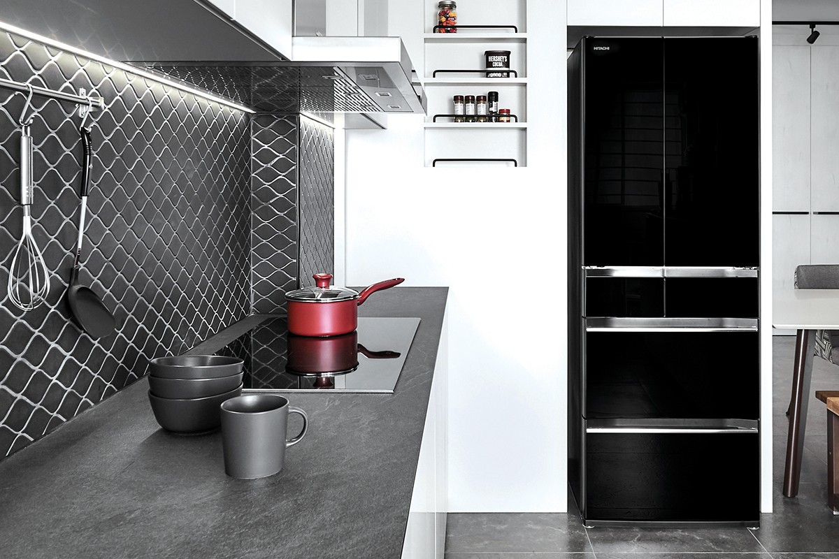
Although the kitchen is primarily grounded by clean and sharp forms, there is one distinctive feature here: the backsplash that features diamond-shaped tiles in a diagonal layout. While not a backsplash design one would typically find in a kitchen setting, this unique profile injects its clean and pared-back surroundings with a visually arresting showpiece.
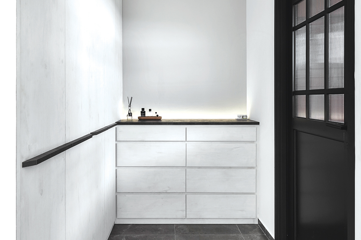
For the home’s private spaces, visual consistency with the outer communal zones is ensured by using the same materials throughout. In the sleeping zone, a platform bed provides a hiding spot for bed linen, and embedded cove lighting in the headboard enhances the cosy factor of the bedroom. Meanwhile, the walk-in wardrobe has a variety of built-in fixtures to accommodate different purposes—full-length ones for clothing that needs to be hung, and a chest of drawers for folded garments and accessories like watches and ties.
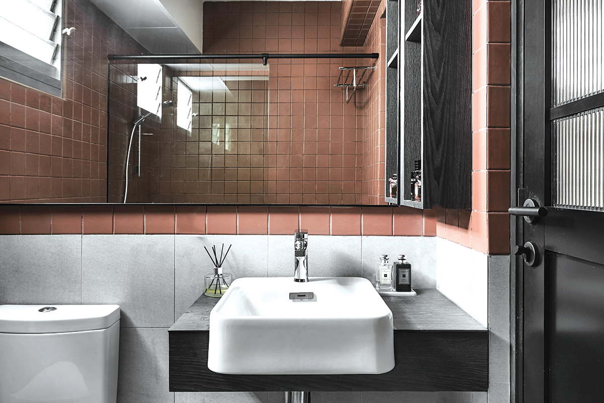
Good design emerges in many forms, and with this home, it’s all about polished details and carefully curated material pairings. With the team taking the time to fully understand their clients’ lifestyle habits, and thanks to the high level of trust between both parties, the matrimonial home now shines with beauty and practicality.
This post was adapted from an article originally published in the May 2021 issue of SquareRooms.


