Clever spatial tweaks and an organic material palette transform this apartment into its owners’ dream home.
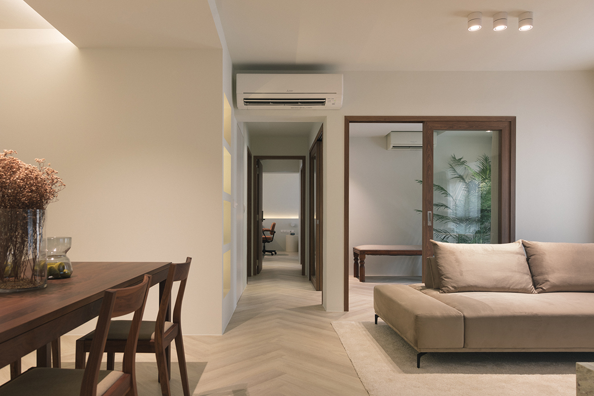
Newlyweds Daryl and Candise had a simple vision for their first home together: a calming and restful abode for themselves, with a spacious and flexible layout to host family and friends. Taken by the idea of wabi-sabi, the Japanese aesthetic that embraces the imperfect, the couple was inspired to infuse elements that invoke this concept into the design of their 1,206sq ft five-room home.
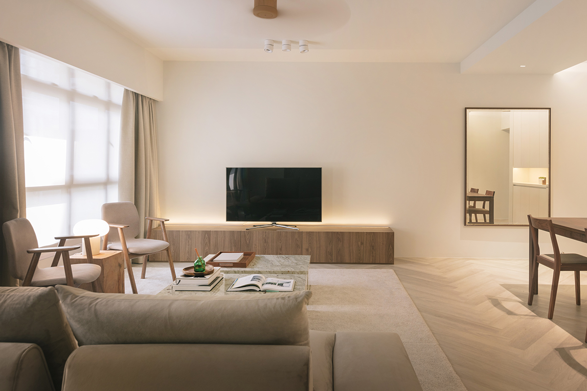
They were initially inclined towards the Muji signature scheme of white and light oak, but Candise’s architect brother curated a more bespoke palette for them. Soothing ivory walls were chosen to evoke a cosy ambience, whilst complementary pairings of light beech and darker walnut produce a refreshing layered wood look.
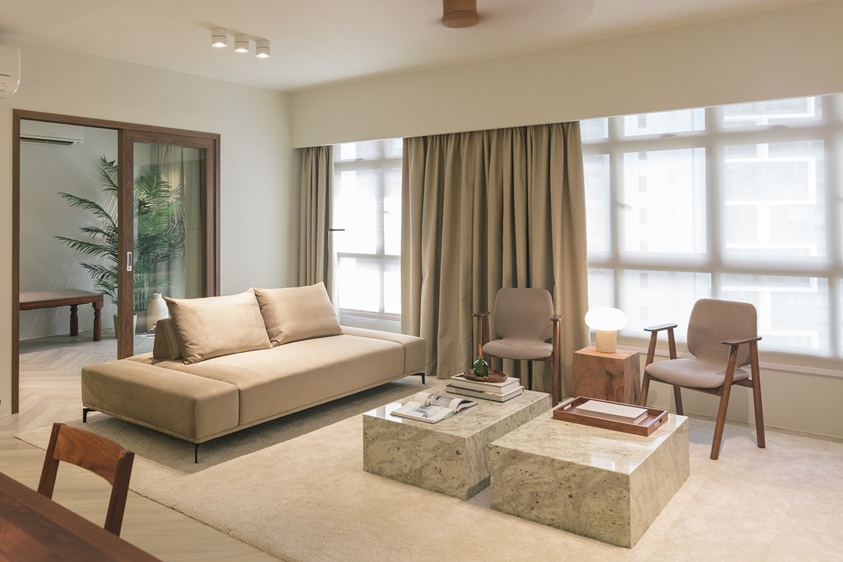
In the living room, the owners furnished the space with pieces composed of organic materials and shapes that align with the wabi-sabi vibe—herringbone wood-effect vinyl floors are framed with a sand carpet in the sitting area, with twin custom granite coffee tables at the centre and a solid teak side table tastefully filling the space.
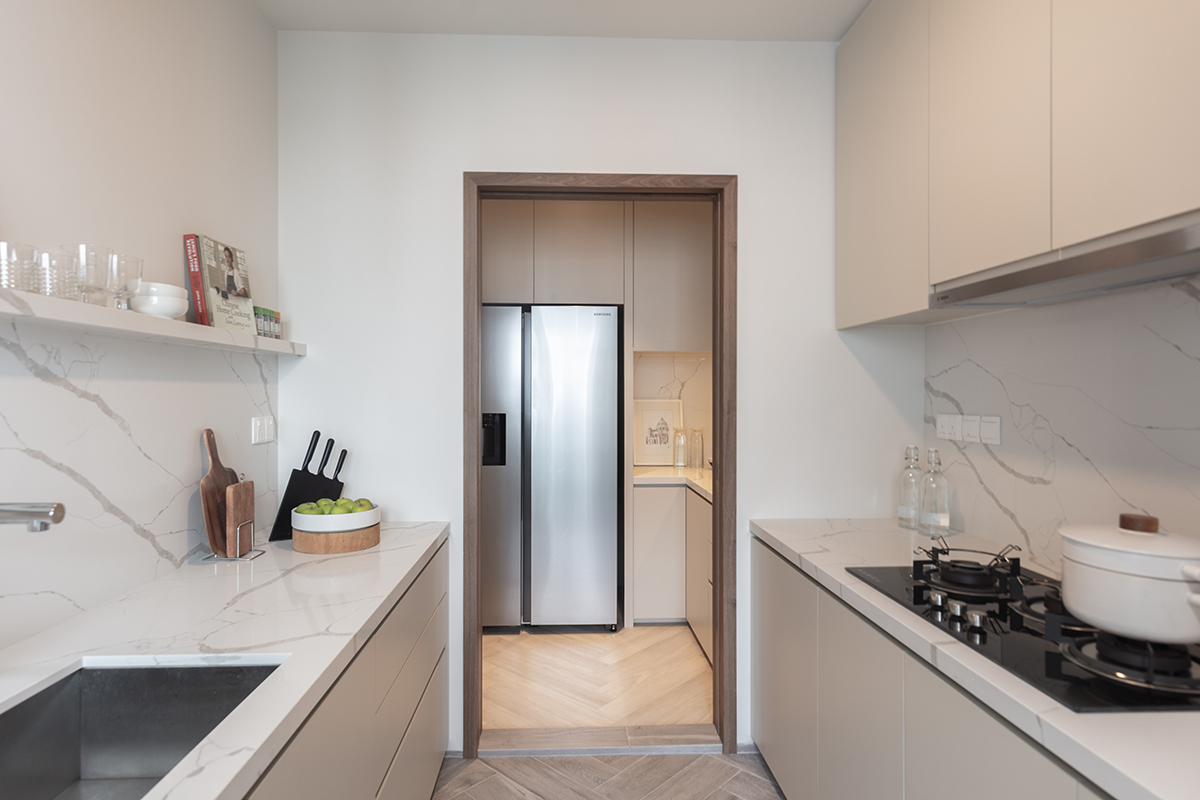
It can be hard to tell, even by looking at the original and current floor plan of the apartment, but the private spaces of the home have undergone a subtle but significant spatial tweak. The long hallway has made a shift towards the windows, by 60cm, resulting in a simultaneous narrowing of the window-facing common bedrooms and expansion of the bathrooms opposite by that dimension.
This tweak has functionally resolved many challenges, specifically the need for more space in the main bathroom and a study corner in the main bedroom.
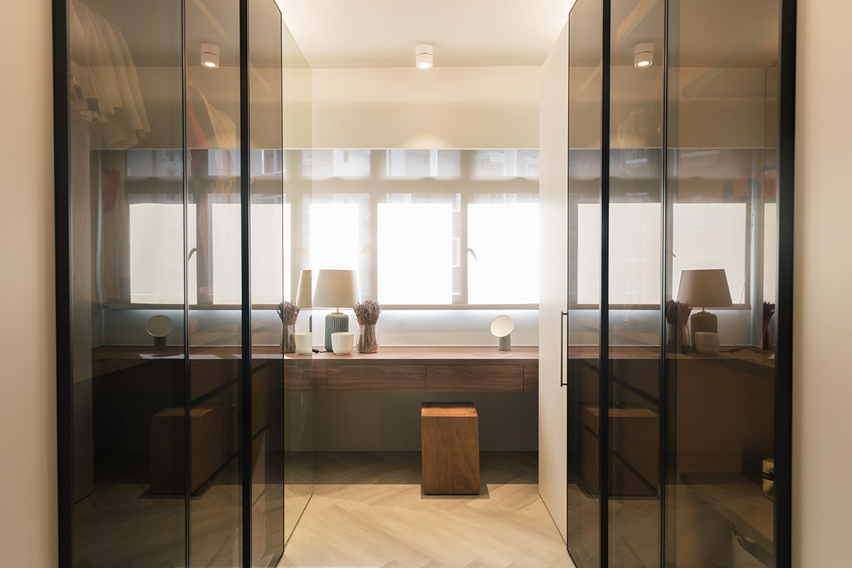
Proposed by Darren, the couple agreed to this modification as they were willing to reduce the footprint of the common bedrooms. The one adjacent to the communal spaces has been kept as a flexible guest bedroom, whilst the other bedroom beside it is now a walk-in wardrobe that has been subsumed into the main suite.
The walk-in wardrobe has been designed to maximise the reduced footprint of the space—the geometrical symmetry of the facing full-height wardrobes creates generous storage space whilst maintaining a chic clean-cut appearance. A simple floating rectilinear block right under the windows forms the dressing table.
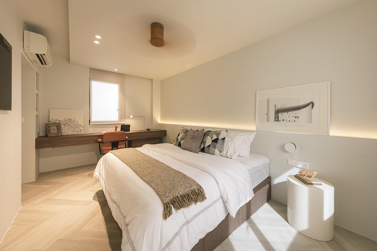
The ivory and wood tones of the communal zones extend to the main suite, its soothing hues setting the scene for restful sleep. The added space to the walled end of the primary bedroom has allowed for a generous study desk to be built in. It replicates the same rectilinear form of the wardrobe dressing table, with an added concealed compartment underneath to tuck Daryl’s computer CPU out of sight.
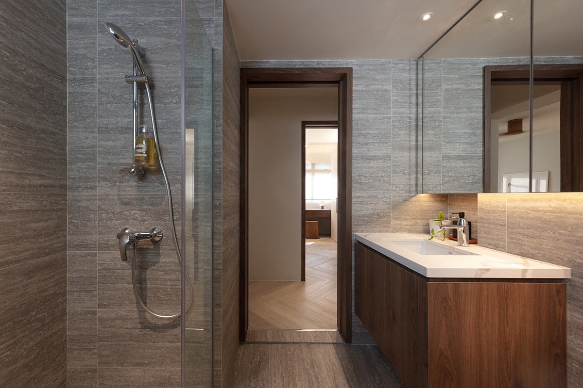
In the primary bathroom, the extra room has allowed for a “condo-style” layout to be achieved. The vanity, which has been shifted next to the door, now sports storage space overhead and under the washbasin—a feature that would have been impossible with the original layout. Pocket sliding doors conserve precious space and allow the bathroom and opposite wardrobe to be visually connected when opened.
Renovations, which commenced in December 2020, ended in March the following year. With the expert help of Candise’s brother and their eye for complementary furnishings, the owners were able to realise the quiet and calming home of their dreams.
This post was adapted from an article originally published in the March 2022 issue of SquareRooms.


