Stepping into this four-room unit in Toa Payoh, one can’t help but notice that the apartment is entirely bathed in a rosy glow. As the matrimonial home of a young newlywed couple, the doting husband gave his wife free rein over all the design decisions, and the duo commissioned local design-and-build firm Mr Shopper Studio to help them flesh out her ideas.
With the lady owner having an affinity for pink tones, the project brief given to the design team was to carve out a space that featured a light-filled, pastel-coloured Scandinavian theme. As such, a consistent colour palette of light wood, neutrals, rose gold and pink was used throughout the home. However, for an aesthetic twist to the typical Scandi-style, the designers took inspiration from the interiors of a particular Aesop store they visited – a skincare brand that the owners like – and utilised clean lines and curvatures as their key direction for the home’s design.
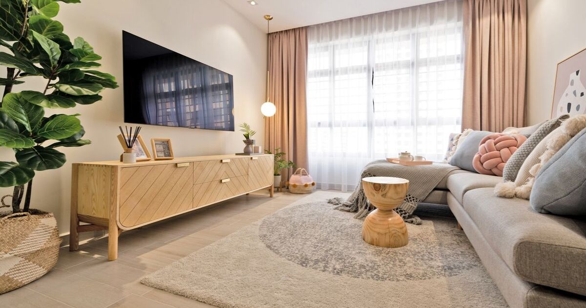
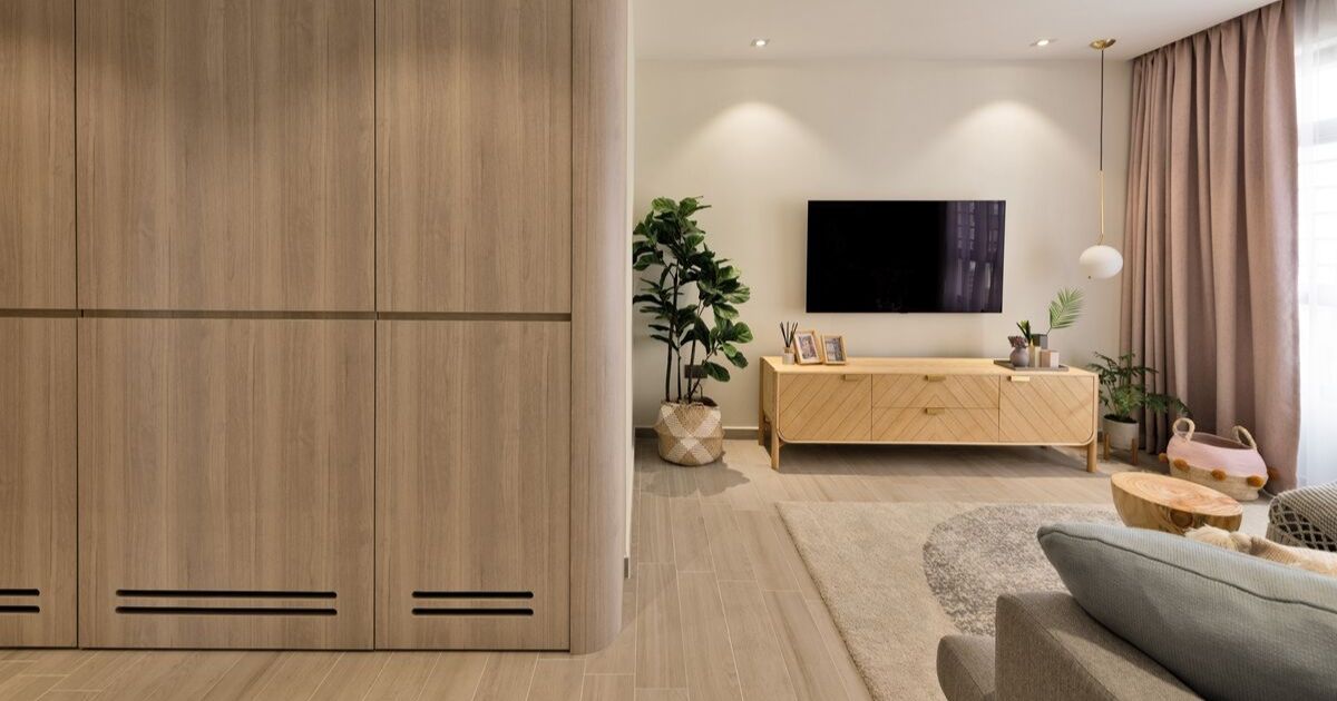
Right by the home’s entrance, a floor-to-ceiling cabinet comes into view. As a way to fully maximise previously unused space while concealing the boxy entrance to the unit’s bomb shelter, this customised woodgrain-laminated fixture provides ample storage units for the homeowners’ shoes. Further in, the living room has been dotted with Scandinavian-style furniture, of which most notably is the grey fabric sectional sofa as well as a wood-accented television console.
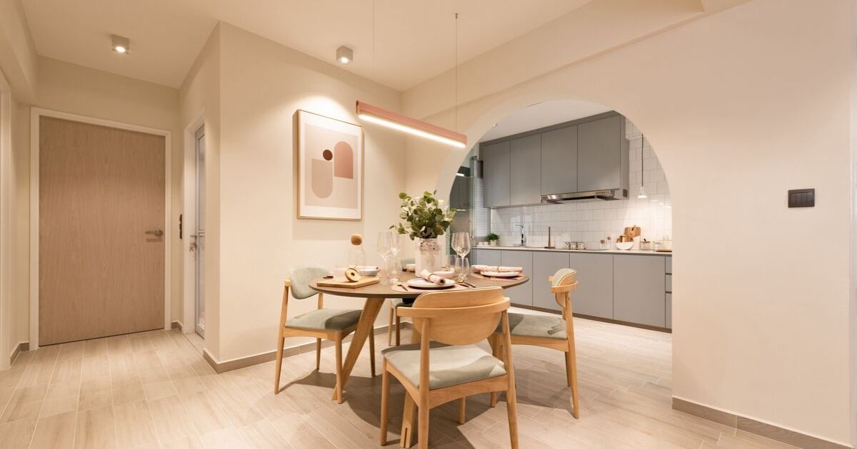
Over in the dining area, the space was simply furnished with a curated selection of a round wood-accented dining table and accompanying dining chairs, which are contrasted with a rose gold pendant light. By keeping things unfussy, attention is drawn towards the huge archway at the back. Adding a more graceful rhythm to the eating zone, this curved shape was created by adding partition boards that have been cut to the desired structure to the corners of the pre-existing open-concept kitchen.
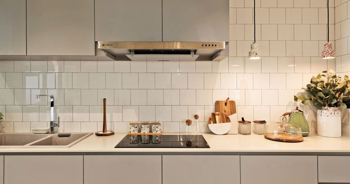
Given that the owners don’t cook frequently, the kitchen’s design was kept basic. Although there are cabinets lining both the upper and lower portions of the kitchen wall, the top cabinets were actually shorter in length as the owners did not require that much storage. By doing so, the empty space was able to accommodate a pair of terrazzo-finished pendant lights that inject character and charm into the utilitarian zone. On closer inspection, it is also easily noticeable that items on the inside of these cabinets are accessed through recessed grooves instead of protruding door handles, which make for a neater and streamlined profile.
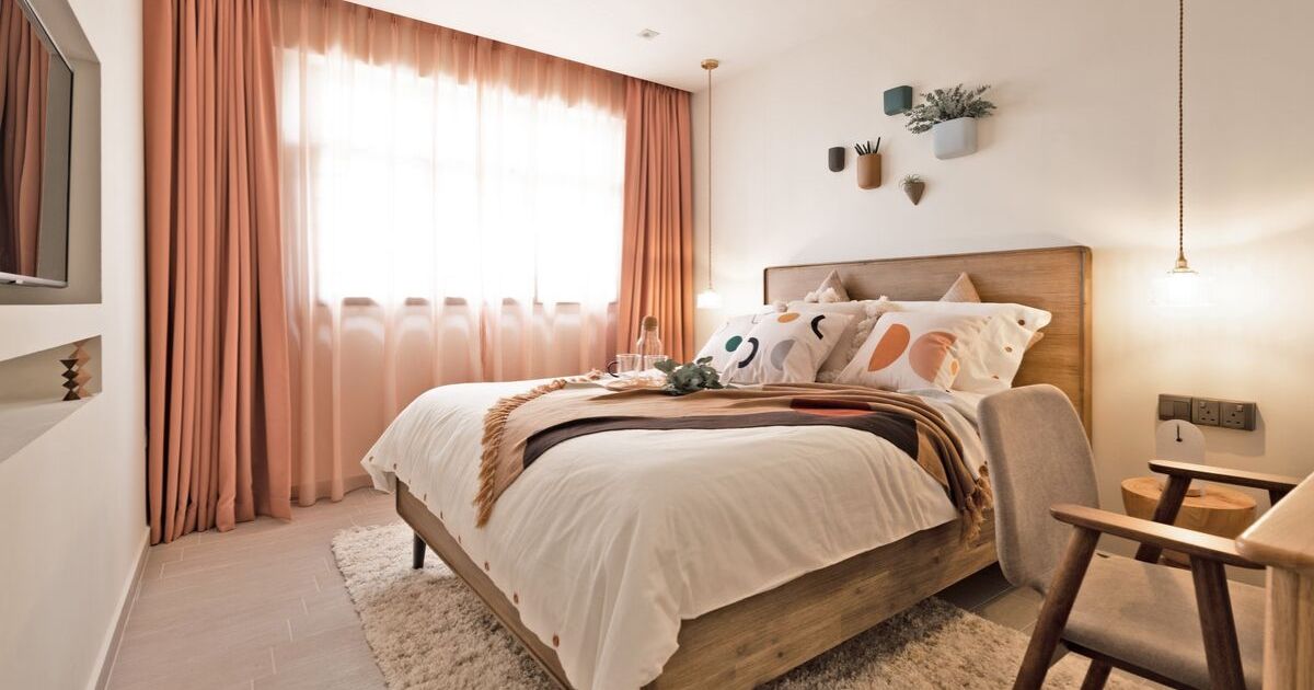
For their private chambers, the couple carefully handpicked a selection of loose furniture pieces to create a light and airy atmosphere in the room. With the absence of any custom-made built-in fixtures, the sleeping zone does not feel tight or boxed in. However, one major tweak that was done to this space was that the wall facing the bed was rebuilt with a pair of differently-sized recessed niches that serve as a landing spot for the occupants’ television set and other media devices. By having these devices sit nicely in the niches rather than simply mounted on the wall, the room feels slightly more spacious as there is nothing encroaching into the walking space in front of the wall.
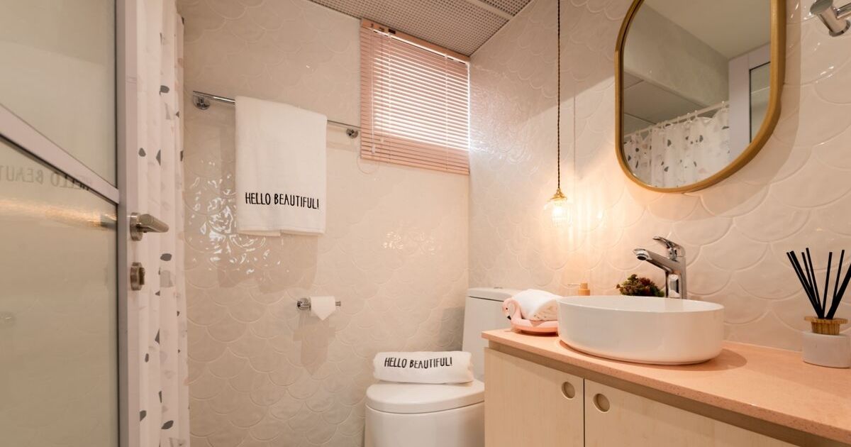
Moving into their en suite bathroom, the main challenge the designers had here was to figure out how to brighten up the space. To solve this, the standard issue door from the HDB was swapped out for a reed glass door that allows more natural light to filter into the shower zone. Continuing the design theme from the outer communal areas, the bathroom also boasts plenty of curved detailing, which can be seen from the scalloped tiles on the walls, the round basin, hanging mirror and the cabinet’s recessed pulls.
With plenty of clothing and accessories that needed storing, one of the smaller bedrooms was converted into a walk-in wardrobe. As the main priority was to maximise storage capacity, the entrance was swapped from the default swing door to a glass sliding door, which allowed for the interior to be fitted with additional built-in storages as the latter did not eat into the floor area as much as its counterpart would have. Concurrently, the dresser table was kept to a compact extended ledge mounted at the end of one side of the wardrobe units, with just enough space for the female occupant’s daily grooming needs.
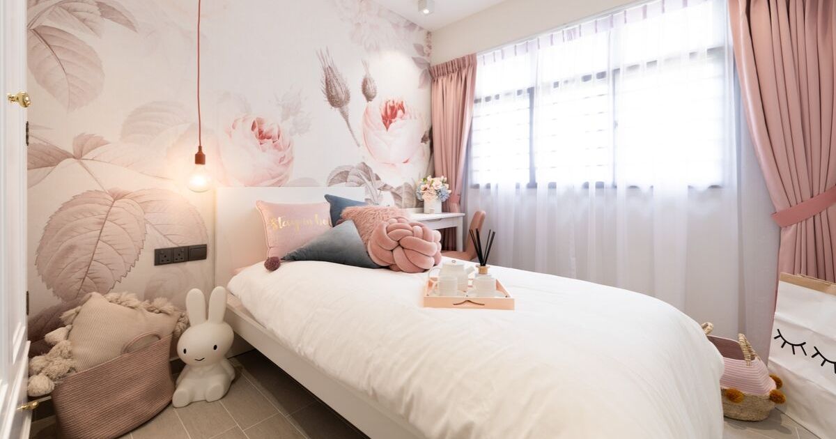
In part to fulfil a childhood dream for the lady of the house, the final spare bedroom was converted into a “dream room” where she can have quiet moments to herself in. Boasting a pink floral interior, this bedroom also occasionally doubles up as an alternative guest room when the need arises. Furnished with a well-curated collection of loose furnishings, the space is characterised by a striking feature wall behind the bed. With the female owner’s favourite flower in mind, the designers customised the wallpaper with varying shades of this image as a key design element for the room.
Even though the amount of work that went into this revamp meant that it was a two-month-long wait before the couple was able to move in, it was all definitely worth it in the end because now, this unit is not just a house, but a home that’s fully equipped and perfectly made for its occupants.
This was adapted from an article originally published in the August 2019 issue of SquareRooms. Photo credits: Mr Shopper Studio


