After a one-of-a-kind renovation, these creative homeowners get to express their love of art and sentimental collectables through their home interiors.
When Roxane and Max viewed the resale flat that eventually became their home, they knew they would be making quite a few changes to the space. There was nothing wrong with the five-year-old flat, but the couple wanted to tweak the cookie-cutter HDB layout to maximise the space and fit their preferences. Incorporating materials and colours that suited their personalities better became a priority for the renovation as well.
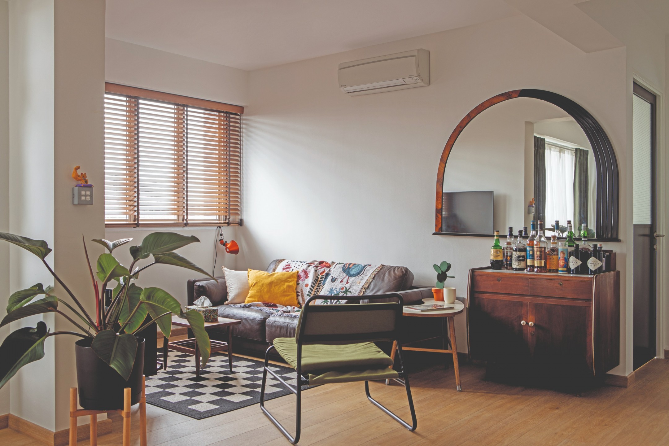
So what theme did they decide to go for? No particular theme, actually. “When people ask what the theme of our home is, we say ‘within budget,’” the homeowners joke. “A few pieces of furniture were adopted from family members’ past homes, and filling it up with newer items was a seamless process where our styles naturally blended together.”
This is where interior design agency Threehaus Works stepped in to enact the homeowners’ requirements and make sense of their creative ideas.
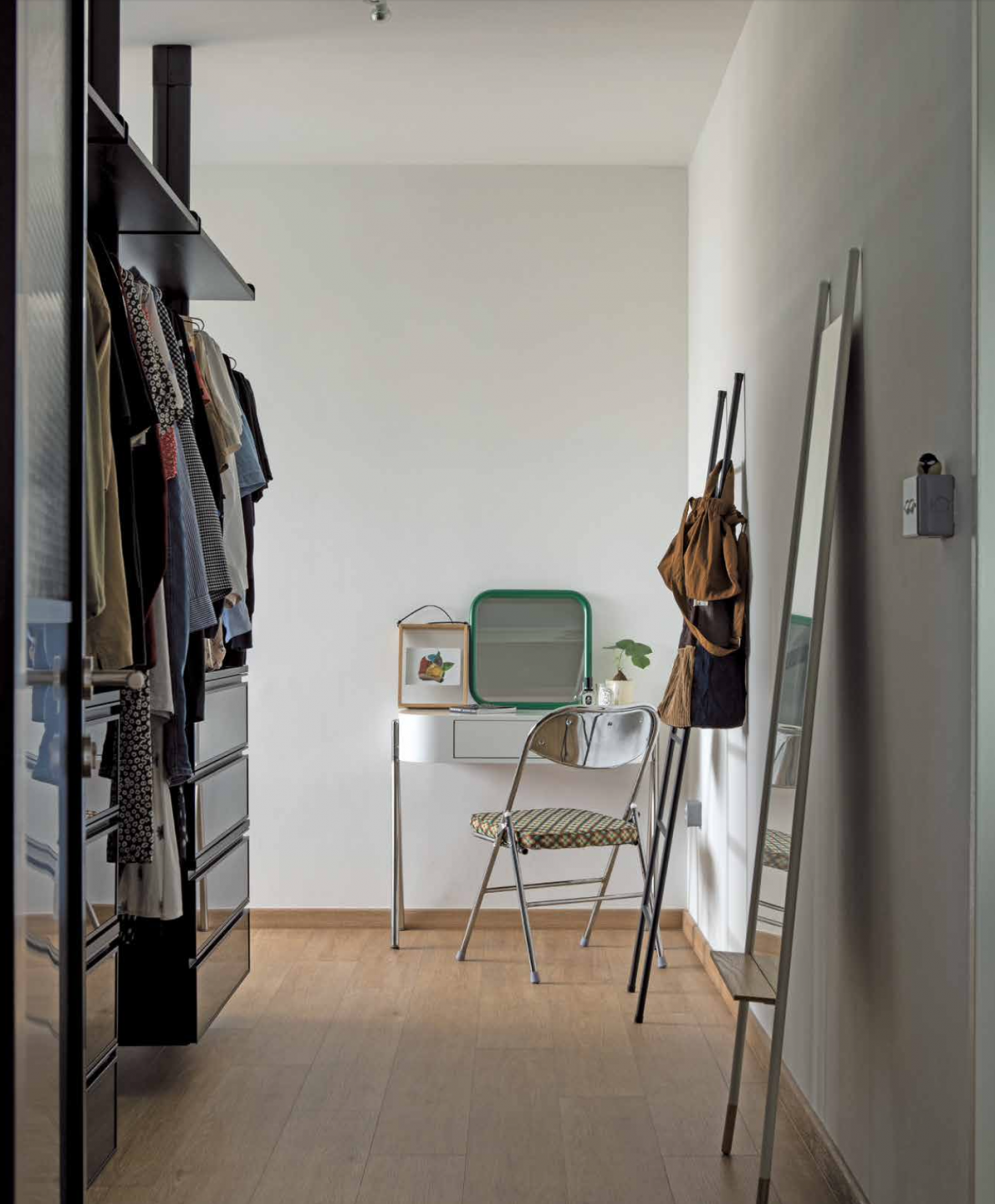
“We took a modern-meets-retro approach because we noticed that our clients were drawn to old-school elements and even had some hand-me-down furniture that they intended to bring to their new home,” says Joshua Wee, the project’s interior designer. “We wanted to incorporate these pieces and make sure that they blend in well with the fairly new home.”
Eclectic transformation
The kitchen went through the most extensive transformation and was even fitted with a new entertaining area for the homeowners. A wall that separated the kitchen and service yard was hacked, creating a single larger space, with an extended foyer beyond the main kitchen.
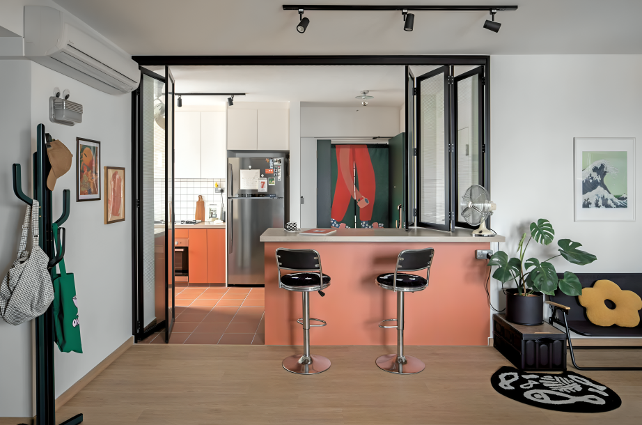
The peninsula and the glass windows and doors now serve as the cut-off between the new kitchen and the living area. The designers suggested adding the bar counter and stools at the kitchen’s edge as it provides extra counter space plus additional seating when the homeowners host guests.
Another set of stools accompanies the counter at the back, implemented to allow the homeowners to relax with a drink and enjoy the view from the service yard. Roxane and Max reveal that this is their favourite transformation in the flat as they really wanted something resembling a balcony.
“This house was never meant to be a plain house.” – Joshua
While the top cabinets in the kitchen are white, the bottom row introduces a splash of colour. As Joshua puts it, “This house was never meant to be a plain house.” The EDL terracotta laminate used in the kitchen is now the owners’ favourite colourful element in the home, matching the terracotta tiles that extend out to the foyer.
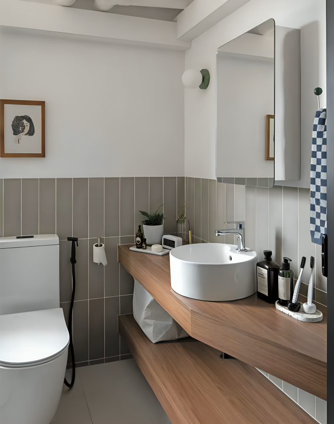
Moving into the private spaces of the home, one of the bedroom walls was partially hacked to accommodate a larger wardrobe, which now also serves to separate the sleeping area from the bathroom.
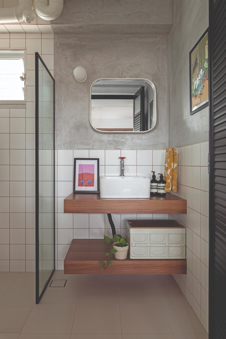
Both bathrooms were clad in new tiles, while certain walls were cemented for a colour-blocked finish with rich textures. The original, old-school windows were retained, partly due to budget constraints but also because the designers felt that they fit right in with the vibe of the home.
Cosy and personalised
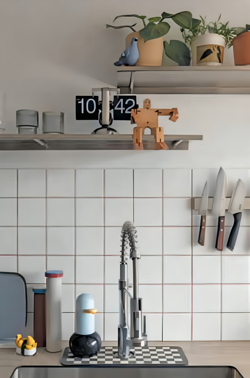
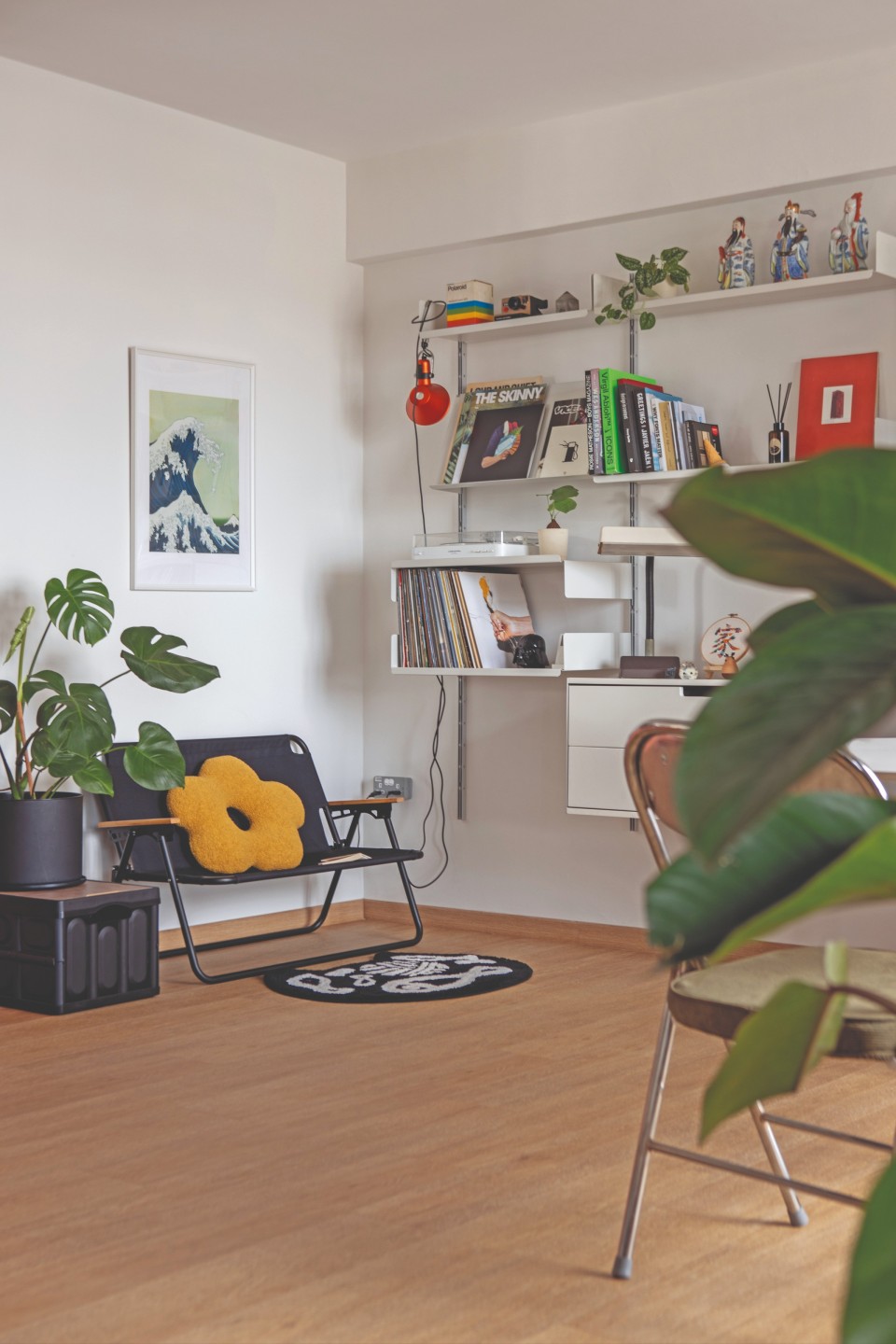
The homeowners have certainly personalised their space now, with gifts, old collectables and artworks displayed all around the flat. For example, you’ll find little figurines displayed on shelves or chilling on light switches, many of which were gifts from their friends.
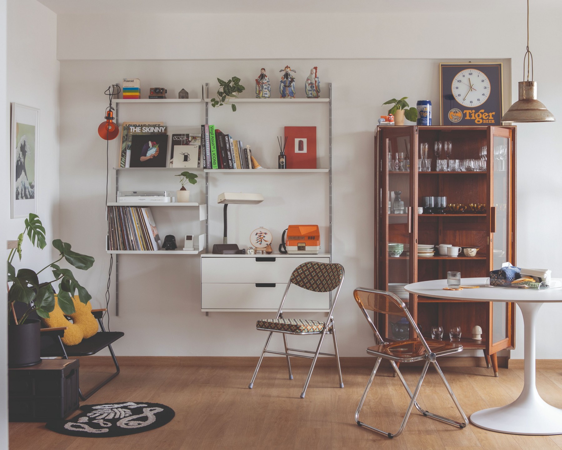
“Little things like these bring us joy whenever we walk past them in the house,” they share. “We also love how many of our close friends contributed and are also a part of our home, and there’s comfort in having these gifts scattered around.”
Vintage items are a favourite too, such as the orange public pay phone, an icon of Singapore’s past. There’s also an old-school display cabinet in the living room, which was given to them by a family member. “My cousin used to collect vintage pieces and he knew I had an obsession with pencil-legged furniture and the charm of second-hand goods. He knew it would fit right in.”
Roxane’s handmade embroidery piece is another small but significant highlight of the home. “During our friendship and dating phase, we bonded over drinks—Tiger Beer in particular,” she shares. “I made the Tiger Beer embroidery for our third anniversary, which is why it subtly reads ‘Ti3er’ instead.”
As for artworks, their favourite art piece in the home is revealed to be a poster by the kozyndan duo, putting a twist on a famous Japanese woodblock print, The Great Wave off Kanagawa. They were told they needed water in their home—maybe not the most conventional but certainly a creative way of incorporating it!


